“2026 Paint Color Trends: Why They Matter in Denver Homes and How to Choose Wisely”
Most “trending color” articles are useless the moment real light hits the wall. That is exactly why paint color trends 2026 matter less as a list of fashionable names and more as a strategy for how color behaves in actual homes, offices, and retail spaces. In Denver-area properties, where altitude, sun exposure, open-concept layouts, and sharp seasonal light shifts can dramatically change a paint color, choosing the right palette is no longer a cosmetic decision—it is a performance decision.
Table of Contents
- Why 2026 Paint Color Trends Are Different
- The Defining Paint Color Trends of 2026
- How Denver Light Changes Everything
- Where These Colors Work Best Inside and Out
- How to Choose the Right Finish, Brand, and Application Method
- The Biggest Mistakes Homeowners Make With Trend Colors
- Frequently Asked Questions
Why 2026 Paint Color Trends Are Different
The era of one-note gray is over. Not because gray disappeared, but because homeowners and property managers have become more sophisticated. They want colors that feel warmer, more grounded, and more tailored to architecture. The strongest paint color trends of 2026 reflect that shift: less sterile minimalism, more depth, more mineral influence, and more colors that can handle natural light without washing out.
Major brands like Sherwin-Williams, Benjamin Moore, Behr, and PPG continue to move toward complex neutrals, earthy greens, clay-inspired tones, smoky blues, and softened off-whites. That is not an accident. People are asking for rooms that feel calmer, richer, and less obviously designed around a social media trend. In other words, the market is growing up.
That change is especially relevant for homeowners planning interior painting services. A color now has to do more than look attractive on a fan deck. It needs to transition from morning to evening, coordinate across connected rooms, and hold up against wood floors, black fixtures, stone counters, and large windows. A trend color that fails in real conditions is not a trend worth following.
Commercial spaces are shifting too. Offices, boutiques, hospitality settings, and professional suites want palettes that project confidence without feeling cold. That is one reason why muted green-grays, mushroom tones, deep blue-charcoals, and warm modern neutrals are showing up more often in commercial painting services. They create character without turning the space into a design experiment.
What is driving these color choices?
- Wellness-focused design that favors calm, low-stimulation environments
- Natural material influence from stone, wood, plaster, clay, and linen
- Open-plan living that requires flexible, connected color stories
- Higher expectations for resale appeal and long-term livability
- Regional adaptation as homeowners realize color behaves differently in Denver than it does in coastal or Southern markets
That last point is routinely ignored by generic design content. A shade celebrated online might look perfect in filtered East Coast daylight and completely overexposed in Colorado sun. Trend awareness is useful. Blind imitation is expensive.
The Defining Paint Color Trends of 2026
If you strip away the hype, the most important paint color trends 2026 can be grouped into a few clear categories. These are not random. They reflect what actually performs well in residential and commercial settings.
1. Warm off-whites that do not feel yellow
Cool builder whites are losing ground. Homeowners still want brightness, but they want it with softness. Shades similar to Sherwin-Williams Alabaster, Benjamin Moore White Dove, and other warm whites remain popular because they create a cleaner backdrop for modern finishes without feeling clinical. The winning white in 2026 is not icy. It is edited, creamy, and balanced.
These tones work especially well in living rooms, kitchens, hallways, and whole-home repaints where continuity matters. They are also ideal when clients want a fresh look without committing to obvious color. If you are evaluating options, a professional color consultation can prevent the common mistake of choosing a white that turns pink, yellow, or blue in changing light.
2. Earthy greens with gray or olive undertones
Green is no longer an accent-only color. In 2026, it is a true neutral when handled correctly. Think soft sage, dried herb, muted olive, and green-gray tones. These shades pair beautifully with natural wood, matte black hardware, brass, and stone. They are especially effective in bedrooms, offices, mudrooms, powder rooms, and cabinetry.
Not all greens are equal, though. Bright, trendy greens often age poorly. The best-performing versions have enough gray, brown, or mineral character to feel architectural rather than decorative. That distinction matters if you want the room to feel elevated five years from now, not just “current” for one season.
3. Clay, taupe, mushroom, and other complex neutrals
Beige is back, but the lazy version is not. The modern neutral family is far more nuanced: mushroom, putty, greige-taupe hybrids, dusty clay, and soft sand. These shades answer the widespread fatigue with cold gray while preserving the versatility homeowners still want. They are warmer, smarter, and much more forgiving.
These colors also complement many Denver-area homes that feature stone fireplaces, warm wood flooring, and transitional architecture. When clients ask for something “safe” but not boring, this category usually offers the strongest answers.
4. Deep moody blues and blue-charcoals
Accent walls are more selective now, but richly pigmented blues are still powerful when used with discipline. Navy, storm blue, and smoky blue-black tones remain strong for dining rooms, studies, built-ins, front doors, and commercial feature walls. They communicate depth and confidence without the heaviness of pure black.
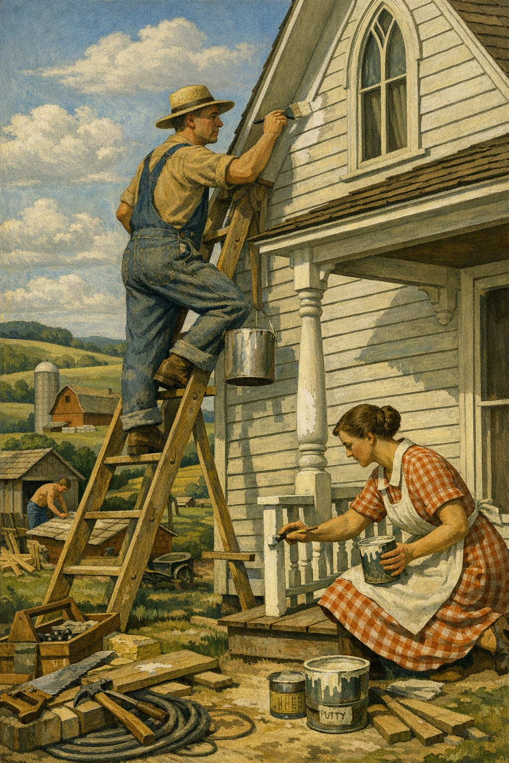
For exteriors, deeper blues are also gaining traction for front doors, shutters, and selective siding accents. Homeowners exploring exterior painting services are increasingly drawn to colors that feel classic but not predictable.
5. Soft terracotta and mineral-inspired statement colors
Here is where many brands are subtly converging: colors drawn from limewash, plaster, clay, and natural pigment traditions. Soft terracotta, dusty rose-brown, weathered ochre, and muted rust are showing up in carefully chosen spaces. These are not loud Southwestern throwbacks. The successful versions are desaturated and sophisticated.
This is one of the boldest predictions for 2026: as more homeowners look beyond flat white walls, mineral-inspired tones will move from niche design circles into mainstream bedrooms, dining areas, entryways, and boutique commercial interiors.
The best paint trend is not the color everyone is posting. It is the color that still looks right at 7 a.m., 2 p.m., and 9 p.m. in your actual space.
— 1 of a Kind Painting
How Denver Light Changes Everything
Denver, Centennial, Glendale, Brighton, and Aurora do not experience paint color the way many national trend articles assume. Colorado light is stronger, cleaner, and often less forgiving. High altitude and abundant sunshine can make pale colors look brighter, cool colors look colder, and undertones far more obvious than they appeared in the store.
Why samples fail so often in the Denver metro
Most homeowners test a tiny square on one wall and make a final decision too quickly. That approach is flawed anywhere, but it is especially risky in the Front Range. A color that seems perfect on a north wall may look dramatically warmer on a west-facing wall by late afternoon. Open-concept homes magnify the problem because colors shift visually as you move from kitchen to dining room to living area.
That is why professional painters insist on larger sample areas, multiple viewing times, and sheen-specific testing. Color is not static. It is environmental. If the room has large windows, reflective countertops, hardwood floors, or nearby exterior greenery, those elements will alter what you think you are seeing.
Best practices for choosing colors in Colorado homes
- Test large samples on more than one wall
- View the color morning, midday, and evening
- Evaluate next to flooring, cabinetry, and trim
- Confirm the sheen, because eggshell and matte can display differently
- Check exterior-adjacent rooms carefully, especially those with strong reflected light
For homeowners seeking painting services in Denver, CO, this local context matters more than broad national trend forecasting. A color that works in a dim urban condo may not work in a bright suburban home with vaulted ceilings and southern exposure.
If you want proof that application and lighting can transform a color, browse our project gallery. Real-world spaces tell a more useful story than any brand mood board ever will.
Where These Colors Work Best Inside and Out
The strongest trend colors are versatile, but they are not universal. Room function still matters. So do traffic levels, cleaning needs, fixed finishes, and the emotional tone you want the space to create.
Best 2026 color directions by interior space
| Area | Best Color Direction | Why It Works | Recommended Finish |
|---|---|---|---|
| Living Room | Warm off-white, mushroom, soft greige | Flexible backdrop for layered furnishings and changing light | Matte or eggshell |
| Kitchen | Balanced white, muted green-gray, light taupe | Pairs well with stone, wood, and painted cabinetry | Eggshell or satin |
| Bedroom | Sage, blue-gray, warm neutral | Creates a calmer, less reflective environment | Matte or eggshell |
| Bathroom | Soft green, mineral blue, clean warm white | Fresh without feeling harsh under vanity lighting | Satin |
| Home Office | Moody blue, olive-gray, refined taupe | Adds focus and sophistication | Eggshell |
| Exterior | Warm greige, soft white, deep blue accents | Timeless curb appeal with enough contrast | Exterior low-lustre or satin |
Exterior trend colors are getting smarter too
Exterior palettes in 2026 are moving toward softer body colors with stronger trim or door contrast. Warm whites, stone-inspired grays, dusty taupes, and greige exteriors remain highly effective across many Denver neighborhoods. Deep charcoal, muted navy, and olive-black are increasingly popular for doors, shutters, and selective accents.
But this is where weak industry advice causes damage. A dramatic exterior color is only as good as the preparation beneath it. No premium coating can hide failed caulk, chalking surfaces, peeling paint, or moisture intrusion. Proper washing, scraping, sanding, priming, and repair are not optional upgrades. They are the job.
That is particularly important in Colorado, where freeze-thaw cycles, hail exposure, UV intensity, and dry air can punish exterior coatings. Homeowners considering a repaint should think beyond color chips and start with substrate condition. A beautifully selected shade on a poorly prepared home is just an expensive countdown to failure.
Commercial spaces need trend awareness, not trend addiction
For offices, retail spaces, and hospitality interiors, the best trend colors are the ones that support branding while staying practical. Muted greens, dark blues, warm whites, and elevated neutrals all work because they create a polished environment without overpowering signage, lighting, merchandise, or client-facing areas.
The smartest commercial color plan looks intentional, not theatrical. That is one reason so many businesses are rejecting flashy palettes in favor of grounded, premium-looking colors that photograph well and age gracefully.
How to Choose the Right Finish, Brand, and Application Method
Color gets the attention, but finish and application decide whether the final result looks premium or amateur. A great color in the wrong sheen can look cheap. The same is true when cut lines are sloppy, drywall flaws are ignored, or coverage is uneven.
Finish matters more than homeowners think
Flat and matte finishes are popular because they soften wall imperfections and create a modern look. Eggshell remains a strong all-around choice for many living spaces. Satin is often best for bathrooms, trim, and higher-moisture zones. Semi-gloss still has a place, but many contractors overuse it, especially on walls where it emphasizes every defect.
Premium brands such as Sherwin-Williams Emerald, Benjamin Moore Regal Select, Behr Dynasty, and certain PPG lines offer excellent options, but brand alone does not guarantee success. Surface prep, primer selection, environmental conditions, and application skill all affect performance.
Sprayer vs. roller vs. brush
There is a lot of misinformation around this topic. Sprayers are not automatically better, and rollers are not outdated. Each tool has a purpose.
- Sprayers excel on exteriors, trim packages, cabinetry, and large commercial areas when properly masked and back-rolled as needed
- Rollers remain ideal for many interior wall surfaces and help achieve consistent film build
- Brushes are essential for detailed cutting, trim work, and areas that demand precision
The best painters are not loyal to one tool. They are loyal to the right result. That is a meaningful difference when evaluating bids, especially if one contractor is promising speed while avoiding questions about prep, masking, or the number of coats.
Why professional execution still beats DIY in most trend-driven projects
Homeowners can absolutely paint a room themselves. But trend colors often expose mistakes faster because they involve subtle undertones, darker pigments, or smoother modern finishes that make lap marks, flashing, and uneven coverage more obvious. If the project includes tall walls, stairwells, trim transitions, cabinetry, texture repair, or demanding color changes, hiring a professional usually saves time, frustration, and redo costs.
That is also where trust matters. If you are comparing contractors, take time to read what our clients are saying. The difference between a neat, durable finish and a disappointing one often comes down to habits the homeowner never sees: masking discipline, patching standards, moisture awareness, and crew oversight.
The Biggest Mistakes Homeowners Make With Trend Colors
The problem is rarely the trend itself. It is how people apply it. The most common failures are predictable, avoidable, and expensive.
Choosing color before evaluating fixed materials
Countertops, flooring, tile, brick, and cabinets are not background details. They are major color forces. A beautiful trend shade can clash badly if you ignore those permanent elements. The right sequence is simple: evaluate what stays first, then choose paint.
Copying online inspiration without testing undertones
Photos lie. Filters lie more. Even professionally shot interiors are not reliable enough to support a final paint decision. What reads as a neutral taupe online may be noticeably pink, green, or lavender in person. If you do not test undertones, you are guessing.
Using bold colors without enough contrast planning
Moody walls, clay tones, and deep blues can look spectacular, but they need thoughtful support from trim color, lighting, furnishings, and sheen selection. Without that structure, a dramatic color can make the room feel flat or oppressive instead of refined.
Hiring based on the lowest bid
This is where many projects go sideways. The lowest estimate often cuts corners on prep, product quality, labor time, or protection of surrounding surfaces. That may not be obvious on day one. It becomes obvious when touch-ups flash, corners peel, or the finish fails far earlier than expected.
Homeowners in Aurora, Glendale, Centennial, and surrounding communities are becoming more aware of this gap. They want craftsmanship, not just paint on the wall. If you are planning a project and want a clearer sense of scope, finish, and timing, you can get in touch with our team for guidance specific to your space.
The painting industry still has too many contractors selling speed as quality. Speed has value only when the process is controlled. Otherwise, it is just a shortcut with a nicer invoice.
Frequently Asked Questions
Q: What are the top paint color trends for 2026?
The strongest paint color trends for 2026 include warm off-whites, earthy green-grays, mushroom and taupe neutrals, deep moody blues, and soft mineral-inspired tones like clay and muted terracotta. These colors are gaining traction because they feel more grounded and adaptable than the cool grays that dominated previous years.
Q: What paint colors work best in Denver homes?
In Denver homes, colors with balanced undertones usually perform best because bright Colorado light can exaggerate warmth or coolness. Warm whites, soft greiges, sage greens, and muted taupes often hold up well across changing daylight conditions. Large samples are essential before making a final decision.
Q: Are gray paint colors still in style in 2026?
Yes, but the harsh blue-gray versions are fading. In 2026, the more successful grays are warmer, softer, and often blended with beige, taupe, or green undertones. The goal is a more natural, livable neutral rather than a cold, overly modern look.
Q: Should I follow paint trends or choose timeless colors?
The smartest approach is to use trends selectively within a timeless framework. Choose durable base colors for large surfaces and bring in stronger trend influence through accent walls, cabinetry, powder rooms, doors, or decorative features. That gives you flexibility without making the whole home feel dated quickly.
Q: What is the best finish for interior walls?
Matte and eggshell are the most common choices for interior walls because they balance appearance and practicality. Matte offers a softer, modern look and hides imperfections better, while eggshell adds a little more washability for active living spaces. Bathrooms, trim, and other high-moisture or high-contact areas often benefit from satin.
Q: Is it worth hiring a professional painter for a color trend update?
Yes, especially when the project involves subtle neutrals, dark colors, cabinetry, high walls, or exterior surfaces. Professional painters help with prep, color accuracy, finish selection, and application consistency, which all matter more when using modern trend colors that can reveal flaws. The result is usually cleaner, longer-lasting, and less stressful.
Paint color trends 2026 are not really about chasing novelty. They are about choosing colors with enough depth, flexibility, and environmental intelligence to work in real spaces. Warm whites, earthy greens, nuanced neutrals, and moody accents are winning because they solve practical design problems while still feeling current.
For homeowners and property managers across the Denver metro area, that means color selection should always be tied to architecture, light, surface condition, and finish quality. Whether the project is a full-home refresh, a targeted commercial update, or an exterior repaint designed for stronger curb appeal, the best outcomes come from a disciplined process rather than trend-chasing guesswork.
1 of a Kind Painting brings that process to every project, from color selection and prep standards to final application. If you are planning a repaint in Denver, Centennial, Glendale, Brighton, or nearby communities, the goal is not just to pick a popular color. The goal is to choose a color plan that looks exceptional, performs well, and still feels right long after the trend cycle moves on.
Ready to Transform Your Space?
Whether you’re refreshing your home’s interior, updating your exterior curb appeal, or tackling a commercial repaint anywhere in the Denver metro area, 1 of a Kind Painting has the experience, craftsmanship, and attention to detail to deliver results that truly stand out.
👉 Interior Painting
|
👉 Exterior Painting
|
👉 Contact Us Today