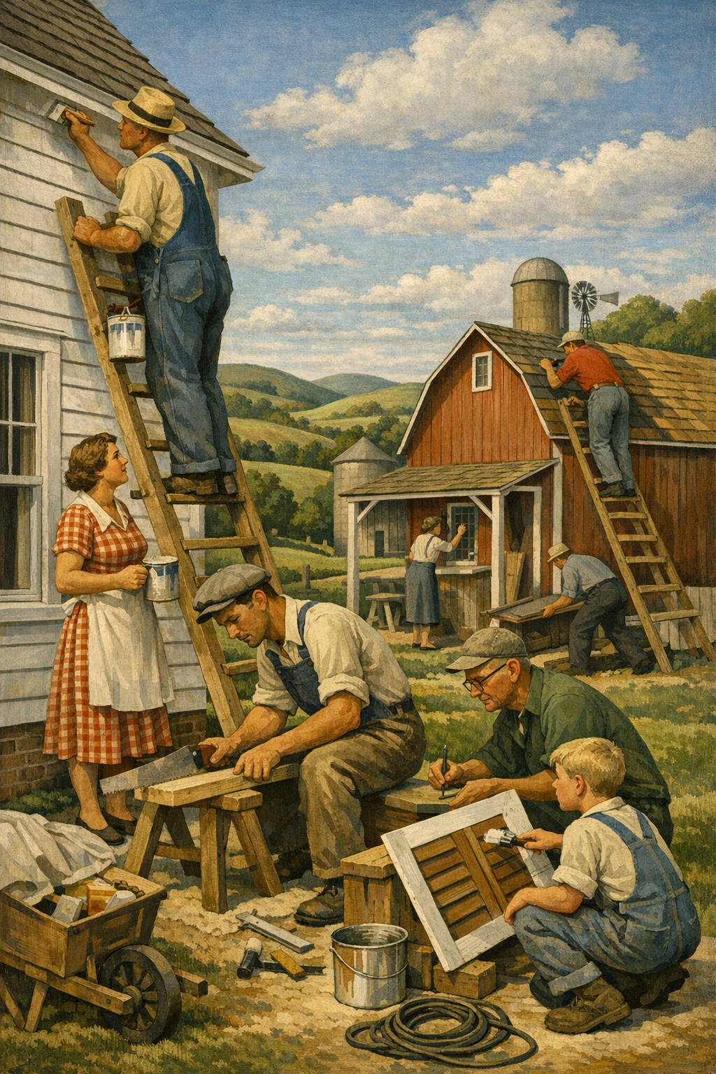
White walls are no longer the safe choice they once were. The biggest shift in residential painting right now is color drenching: using one cohesive color across walls, trim, doors, and sometimes ceilings to create a richer, more intentional room. In Denver-area homes, this trend is moving from designer showrooms into everyday living rooms, offices, bedrooms, and renovated basements because homeowners are tired of flat, forgettable spaces that look like every other listing on the block.
Color drenching is not just “painting a room dark.” That lazy definition misses the point. True color drenching means wrapping a room in a unified palette so the architecture, trim profile, and even awkward corners feel deliberate rather than broken up by contrast.
In practice, that often means using the same hue on walls, baseboards, crown molding, window trim, built-ins, and sometimes the ceiling. The finish may vary slightly from surface to surface, but the color remains consistent. This is why the effect feels immersive rather than chaotic.
Designers have been pushing this concept for years, but now it is gaining mainstream attention because homeowners want interiors with personality. Open-concept homes, builder-grade trim packages, and endless gray paint created a decade of spaces that felt clean but forgettable. Color drenching pushes back against that sameness.
It also solves a problem that many people do not realize they have: too much contrast can visually chop up a room. If you have average ceiling heights, multiple soffits, or inconsistent natural light, a unified palette can actually make the room feel calmer and more architectural. That is one reason clients exploring our interior painting services often discover that a bolder, more cohesive approach looks more polished than the old white-trim formula.
Why the trend feels fresh instead of risky
There is a myth in the painting industry that neutral always means safer. That is only half true. Neutral can help resale, but bland rarely creates emotional impact. Buyers and homeowners respond to spaces that feel finished, and color drenching delivers that finished quality when it is executed with discipline.
Current paint collections from Sherwin-Williams, Benjamin Moore, Behr, and PPG all reflect this shift. You see more earthy greens, smoky blues, warm clay tones, muted mauves, deep browns, and soft mineral shades designed to work across multiple surfaces. The trend is not randomness; it is tonal consistency.
Why This Trend Is Taking Off in Denver Homes
Denver homeowners are uniquely positioned for color drenching because local light behaves differently than in many other markets. The region’s high altitude, strong sun, and seasonal shifts can make paint colors read sharper, cleaner, and sometimes harsher than expected. A color that seems subtle on a swatch can look dramatically brighter on the wall by noon.
That is exactly why a thoughtful whole-room approach matters. Instead of fighting the light with a patchwork of white trim, off-white ceilings, beige walls, and accent colors that clash, homeowners are starting to embrace more controlled palettes. In neighborhoods across the metro, including clients seeking painting services in Denver, CO, we are seeing stronger demand for rooms that feel grounded, warm, and intentional.
Denver design preferences are changing
For years, Colorado interiors leaned heavily rustic: tan walls, red undertones, heavy wood, faux Tuscan finishes, and oil-rubbed bronze everything. Then the market swung hard in the opposite direction with cool grays and stark whites. Both extremes aged faster than many homeowners expected.
Now the pendulum is settling into a more sophisticated middle ground:
Warm whites instead of icy whites
Earth-based greens instead of generic sage
Blue-grays and stormy navies instead of bright primary blues
Clay, mushroom, taupe, and putty tones instead of flat greige
Moody charcoals and espresso browns used strategically rather than everywhere
These colors make sense in Denver, Centennial, Glendale, Brighton, and Aurora because they connect well with the landscape, natural wood flooring, mountain-modern architecture, and the region’s strong indoor-outdoor lifestyle.
People want rooms that feel designed, not merely painted
The average homeowner is more visually informed than ever. Social media, remodeling content, and real estate photography have raised expectations. People can now spot the difference between a room that was simply repainted and one that was intentionally designed. Color drenching closes that gap without requiring a full remodel.
If you are unsure which tone works with your light, flooring, cabinetry, and furnishings, a professional color consultation can prevent the expensive mistake of choosing a fashionable color that fights your actual home.
Best Rooms and Best Colors for Color Drenching
Not every room needs the same level of intensity. The smartest approach is to use color drenching where it adds mood, softness, or architectural coherence. Some spaces practically beg for it.
Home offices
Home offices are one of the best candidates for color drenching because they benefit from visual depth. A saturated green, moody blue, or complex brown can make the room feel focused and expensive. White trim in these rooms often looks unfinished, especially against built-ins or bookshelves.
Dining rooms
Dining rooms thrive on atmosphere. This is where richer tones outperform safe neutrals almost every time. Consider olive, ink blue, aubergine, warm charcoal, or muted terracotta. A dining room should feel intentional, not apologetic.
Bedrooms
Bedrooms benefit from enveloping tones that create calm. Soft blue-green, mushroom, dusty mauve, muted slate, and warm putty shades can make the room feel quieter and more restorative. The trick is choosing colors with enough complexity to shift gracefully throughout the day.
Powder rooms
This may be the easiest place to be bold. Smaller rooms can handle dramatic treatments because the experience is brief and memorable. Deep teal, plum, graphite, or blackened green can look stunning when the walls, trim, and ceiling are treated as one composition.
Basements and media rooms
Basements in the Denver metro often suffer from awkward light and low visual energy. Color drenching can make them feel cozy instead of cave-like, especially with the right lighting plan. A medium-to-deep tone with a soft sheen usually performs better than a lifeless builder beige.
Trending colors that actually have staying power
Not every viral paint color deserves your walls. Some shades photograph beautifully and live terribly. The better long-term choices tend to be colors with subtle undertones and broad compatibility with fixed finishes.
Color Family
Best Rooms
Why It Works
Watch Out For
Muted Olive Green
Offices, dining rooms, bedrooms
Grounded, elegant, nature-connected
Can skew muddy in low-quality lighting
Stormy Blue
Bedrooms, studies, basements
Calm, tailored, versatile with wood tones
May read cold if undertones are too gray
Warm Taupe/Mushroom
Living rooms, bedrooms, halls
Soft, sophisticated alternative to beige
Can look flat without proper sheen contrast
Clay/Terracotta
Dining rooms, powder rooms, accent spaces
Warm, inviting, distinctive
Too much orange can date the room quickly
Charcoal/Brown-Black
Media rooms, powder rooms, offices
High drama, architectural feel
Poor prep work becomes very visible
Want proof that these richer palettes can feel refined rather than overwhelming? Browse our project gallery and pay attention to how trim, walls, and lighting work together. Strong color only looks easy when the prep and execution are exact.
The biggest mistake in modern painting is treating color like decoration instead of architecture. When walls, trim, and ceilings work together, the room stops looking painted and starts looking designed.
— 1 of a Kind Painting
The Paint Finishes, Prep Work, and Technique That Make It Work
This is where color drenching either becomes luxurious or looks like a rushed landlord special. The color gets the attention, but the finish quality determines whether the room feels custom.
Finish selection matters more than people think
Using one color everywhere does not mean using one sheen everywhere. That is a common misunderstanding. Walls may perform best in matte or eggshell, while trim, doors, and millwork often need satin or semi-gloss depending on the substrate, traffic, and desired contrast.
However, overly shiny finishes can ruin the effect. High gloss on every surface reflects too much light and exaggerates imperfections. For most homes, the most balanced approach is:
Walls: matte or low-sheen eggshell
Trim and doors: satin
Ceilings: flat or specialty low-sheen ceiling finish
Prep is non-negotiable
Dark or mid-tone saturation exposes every flaw. Nail pops, caulk gaps, roller stipple, sanding scratches, patched corners, and rough trim joints all become more visible. That is why proper prep is not an upsell. It is the foundation of the final result.
Clean the surfaces thoroughly
Patch dents, cracks, and settlement issues
Sand for uniform texture
Caulk trim transitions cleanly
Prime repairs and stain-prone areas correctly
Apply consistent topcoats with the right spread rate
Cheap shortcuts show up fast, especially with saturated colors. Flashing, lap marks, and weak coverage become obvious. This is one reason homeowners who attempt the look themselves often call professionals midway through the project.
Brand and product quality make a real difference
Sherwin-Williams Emerald Designer Edition, Benjamin Moore Regal Select or Aura, certain PPG premium lines, and comparable high-end products usually offer better hide, richer pigmentation, and more predictable touch-up performance than bargain paints. You can absolutely waste premium labor with cheap paint.
Low-VOC and zero-VOC formulas have also improved dramatically. That matters for occupied homes, nurseries, bedrooms, and clients sensitive to odor. Eco-friendlier coatings are no longer the compromise they once were, provided the product is chosen for the right substrate and wear conditions.
Common Mistakes Homeowners Make
Some trends fail not because the idea is bad, but because the execution is weak. Color drenching is a perfect example. When done poorly, people blame the trend when they should blame the process.
Picking a color from a phone screen
This is one of the worst habits in the industry. Digital inspiration is useful, but every screen lies. Light, exposure, editing, and surrounding materials distort the result. Always test large samples in morning light, afternoon light, and nighttime lamp light.
Ignoring undertones
A gray-green can read elegant in one room and swampy in another. A taupe can feel cozy or pink depending on flooring and orientation. Undertones are where good decisions live or die.
Skipping the ceiling decision
Many homeowners commit to walls and trim, then panic and default to plain white ceilings. Sometimes that contrast works, but often it breaks the immersive effect. A lighter related tone or the same hue overhead can be the move, especially in smaller rooms.
Using low-quality tools
A premium coating applied with poor rollers, worn brushes, or the wrong sprayer setup will not perform like a premium system. If the finish matters, the application method matters too.
Assuming bold equals dark
Color drenching does not require a dramatic dark room. Soft plaster pink, dusty blue, warm beige, or mineral green can create the same unified effect with a brighter overall feeling. The point is cohesion, not theatrical gloom.
And if you are vetting contractors for a project like this, do not just compare estimates. Compare process, communication, surface prep standards, and past client experience. You can learn a lot from what our clients are saying about reliability, cleanliness, and finish quality.
DIY vs. Hiring a Professional Painter
Here is the blunt truth: color drenching is not the best place to test your painting confidence. A simple white wall repaint is forgiving. A saturated, multi-surface room with trim, doors, cut lines, and sheen coordination is not.
When DIY can work
You may be able to handle it yourself if the room is small, the surfaces are already in excellent condition, and you are using a moderate color with limited trim detail. Patience matters more than speed.
When a professional is the smarter call
Hire a pro if any of the following apply:
The room has damaged walls or extensive trim
You are using deep or highly pigmented color
You want doors, built-ins, and ceilings included
You need clean transitions around fixtures and cabinetry
You care about a furniture-grade finish rather than basic coverage
For homeowners balancing aesthetics, durability, and scheduling, professional execution usually costs less than a failed DIY plus repaint. That is especially true when the room is central to daily life.
If your project extends beyond one room into whole-home updates, it also helps to work with a team that can coordinate interiors, high-traffic spaces, and even business environments through experienced commercial painting services when needed.
How to Tie Interior Trends to Exterior Curb Appeal
A smart home does not have to match inside and out, but it should feel related. If your interior is moving toward warmer, deeper, more intentional color, your exterior should not be stuck in a washed-out palette from 2012.
Exterior color is becoming more nuanced too
Across Denver neighborhoods, we are seeing more demand for sophisticated curb appeal: softer whites, warmer greiges, smoky greens, charcoal accents, and carefully selected door colors. The same principle behind color drenching applies outside: contrast should feel controlled, not accidental.
That does not mean every house should be dark or trendy. It means body color, trim, fascia, masonry, roofing, and landscape should work as a system. A cohesive exterior reads as higher-end even when the palette is restrained. If your home needs that level of coordination, our exterior painting services can help align curb appeal with the interior direction of your home.
Local climate changes the conversation
Colorado sun, freeze-thaw cycles, hail exposure, and dry air punish exteriors differently than interiors. That is why product selection, substrate prep, and coating build matter so much. The prettiest palette in the world will still fail if it is applied over peeling paint, chalky siding, or neglected caulk joints.
Interior trends may drive the inspiration, but exterior success depends on technical discipline. The strongest painting firms understand both the design side and the performance side.
Frequently Asked Questions
Q: What is color drenching in painting?
Color drenching is the practice of using the same or very closely related paint color on multiple surfaces in a room, including walls, trim, doors, and sometimes the ceiling. The goal is to create a more immersive, cohesive look rather than breaking the room up with sharp contrast. It can work with dark, medium, or even light colors when the undertones are chosen carefully.
Q: Is color drenching a good idea for small rooms?
Yes, small rooms often respond especially well to color drenching because the unified palette can reduce visual breaks and make the space feel more intentional. Powder rooms, offices, and small bedrooms are some of the best places to try it. The key is choosing a color that works with the room’s lighting and existing finishes.
Q: Should trim be the same color as the walls?
If you want a true color-drenched effect, trim is often painted the same color as the walls, sometimes in a different sheen. This helps the architecture feel quieter and more refined. In some homes, a slightly lighter or darker version of the same hue can also work well.
Q: What are the best paint colors for Denver homes right now?
Denver homeowners are gravitating toward warm whites, earthy greens, stormy blues, mushroom taupes, and richer charcoals. These colors tend to work well with Colorado’s bright natural light and the region’s preference for natural materials and mountain-modern design. The best choice still depends on exposure, flooring, cabinetry, and your home’s architectural style.
Q: Can I do color drenching myself, or should I hire a painter?
A confident DIYer can handle a simple version of the look in a small room with good wall conditions. But when trim, doors, ceilings, repairs, and deep colors are involved, professional application usually produces a much cleaner result. Saturated color tends to reveal prep issues and application mistakes very quickly.
Q: Does color drenching hurt resale value?
Not necessarily. Well-chosen, professionally applied color can make a home feel more current and custom, especially when used in the right rooms. Extremely personal or poorly executed colors can limit appeal, but sophisticated tones with broad design compatibility often enhance the impression of quality.
Color drenching is popular for a reason: it gives ordinary rooms more presence, more mood, and more architectural clarity without requiring a full renovation. When the color is right and the finish work is sharp, the result feels elevated rather than trendy. That is the difference between design-led painting and paint that merely covers drywall.
For homeowners throughout Denver and nearby communities, the opportunity is not just to follow a trend but to make better decisions about how color, light, texture, and finish work together. Whether you are refining one office, rethinking an entire main floor, or coordinating inside and outside updates, the smartest projects begin with a clear plan and honest craftsmanship.
If you are weighing options for your own home, 1 of a Kind Painting brings the technical prep, product knowledge, and local experience needed to execute these higher-end looks properly. From sample evaluation to final walkthrough, we help clients avoid rushed choices, weak prep, and disappointing finishes. If you are ready to explore the next step, get in touch with our team to talk through your project.
Ready to Transform Your Space?
Whether you’re refreshing your home’s interior, updating your exterior curb appeal, or tackling a commercial repaint anywhere in the Denver metro area, 1 of a Kind Painting has the experience, craftsmanship, and attention to detail to deliver results that truly stand out.
White walls are no longer the safe choice people think they are. The biggest shift in interior painting trends is happening in plain sight: homeowners are moving away from timid contrast and embracing color drenching, the bold strategy of painting walls, trim, ceilings, and sometimes even doors in one unified hue. In Denver-area homes, where bright light, shifting seasons, and open-concept layouts can make rooms feel disconnected, this trend is proving far more practical than many skeptics expected.
Color drenching is not just painting a room dark. It is the deliberate use of one color, or very close tonal variations of one color, across multiple architectural elements to create immersion, cohesion, and depth. That usually means walls, trim, crown molding, baseboards, built-ins, and ceilings all share the same color family. Sometimes radiators, shelving, and doors join in too.
The reason this works is simple: contrast is not always your friend. For years, the default formula was predictable—white trim, white ceiling, a cautious wall color, and maybe an accent wall if someone felt adventurous. That approach can still work, but in many homes it also chops up the space visually. Color drenching softens those hard edges and allows the architecture to feel more intentional.
Designers and premium paint brands like Sherwin-Williams, Benjamin Moore, Farrow & Ball, Behr, and PPG have all pushed richer, more enveloping palettes in recent forecasts. Earthy greens, smoky blues, warm taupes, cocoa browns, clay reds, and muted charcoals are leading the movement. These shades feel grounded rather than flashy, which is why the trend has staying power.
It also helps that modern paints are better than they used to be. Higher quality low-VOC and zero-VOC formulations make it easier to use more color indoors without the overwhelming odor and finish inconsistency that used to scare people away from bold choices. When paired with proper prep and application, a drenched room can feel luxurious instead of heavy.
Why the trend feels fresh instead of gimmicky
Unlike the accent wall craze, color drenching is not a trick. It is a full-room strategy rooted in proportion, light behavior, and finish control. A well-drenched room can make awkward soffits disappear, low ceilings feel more integrated, and ornate trim feel more sculptural. It solves visual problems instead of creating distractions.
If you are considering a whole-home refresh, this is exactly where expert interior painting services can make the difference between a designer look and a room that feels unexpectedly flat.
Why This Trend Is Taking Over Denver Homes
Denver’s natural light is a major reason this trend works so well locally. Homes in the metro area often get strong daylight, especially at elevation, and that can wash out weak paint colors. A color that looked soft and elegant on a chip can turn bland on the wall. Color drenching counters that problem by committing to saturation and creating a complete visual environment rather than a single painted surface.
There is also a practical side. Open layouts are common across newer homes in Denver, Centennial, Aurora, and Brighton, but open concept can easily become visually chaotic. When every transition gets a new trim color, ceiling break, or contrasting feature, the home loses calm. Color drenching restores order. It helps adjacent rooms feel connected without making the entire house feel identical.
Older homes in neighborhoods with more architectural character benefit too. Picture a study with built-in shelving, a dining room with crown molding, or a bedroom with angled ceilings. Painting those features in separate whites and off-whites often makes the room feel busier. A unified palette gives those details confidence.
Denver climate and lifestyle matter more than people think
Colorado homeowners live with strong sun, dry air, dust, and seasonal shifts that affect how colors read throughout the day. Morning light can bring out cool undertones. Evening light can make the same room feel warmer and moodier. This is why testing paint in a controlled way matters so much. The wrong undertone becomes obvious fast in Denver.
That is also why many homeowners benefit from a professional color consultation. Choosing a drenched palette is not about bravery; it is about understanding undertones, sheen, lighting direction, and how furnishings will interact with the painted envelope.
Local homeowners looking for painting services in Denver, CO are increasingly asking for spaces that feel curated rather than generic. That makes sense. People are spending more time at home, entertaining more intentionally, and expecting more from every room. The era of “builder beige plus bright white trim” is fading for a reason.
The safest paint choice is often the one that dates your home the fastest. Rooms with conviction age better than rooms designed to offend no one.
— 1 of a Kind Painting
Best Colors, Finishes, and Surfaces for Color Drenching
Not every color is a great candidate, and not every finish should be used the same way. The best color-drenched rooms are built on nuance, not brute force. You want a hue with enough depth to shift beautifully in changing light, but not so much intensity that the room feels oppressive.
Top color families for a drenched look
Olive and moss greens: Sophisticated, calming, and especially strong in offices, dining rooms, and bedrooms.
Blue-grays and stormy navies: Great for libraries, dens, powder rooms, and spaces where you want atmosphere.
Warm taupes and mushroom tones: Ideal for homeowners who want richness without obvious color.
Clay, terracotta, and muted burgundy: Bold but grounded, particularly effective in dining rooms and accent spaces.
Soft charcoal and deep brown: Dramatic, current, and far more versatile than many people assume.
Popular examples often include Sherwin-Williams Evergreen Fog, Urbane Bronze, and Iron Ore; Benjamin Moore’s Knoxville Gray, Chelsea Gray, and Revere Pewter in deeper companion palettes; and Farrow & Ball tones that are known for strong pigment complexity. Brand matters less than undertone control and application quality.
Finish selection is where many projects succeed or fail
A color-drenched room does not mean every surface gets the exact same sheen. In fact, that is usually a mistake. Professionals often use subtle sheen shifts to preserve durability while keeping the visual effect unified.
Surface
Recommended Finish
Why It Works
Walls
Matte or eggshell
Softens light reflection and creates a rich, even field of color
Ceilings
Flat or matte
Keeps the ceiling integrated and reduces glare from overhead light
Trim and doors
Satin or low sheen
Adds durability while maintaining tonal continuity
Cabinetry or built-ins
Satin or semi-gloss, depending on use
Improves cleanability and highlights craftsmanship
Cheap paint and poor sheen planning ruin this look. Uneven flashing, roller marks, lap lines, or a dull trim finish will stand out more when the whole room is unified in one color family. This is where premium products and disciplined prep work matter.
Best rooms for color drenching
Powder rooms are the gateway project because they are compact and naturally suited to drama. Offices and studies are another excellent choice because the enveloping feel improves focus. Bedrooms benefit when the chosen color is calm and soft rather than loud. Dining rooms can look stunning, especially when paired with warm lighting and natural wood tones.
Living rooms are more complex but can be spectacular when there is enough architectural definition. Built-ins, fireplaces, alcoves, and ceiling beams all benefit from tonal unity. If you want to see how these transformations look in real homes, browsing our project gallery is a smart place to start.
Where Homeowners Get It Wrong
The internet has made color drenching look easier than it is. Social media shows the reveal, not the messy middle: patching walls, sanding trim, correcting texture, masking clean lines, and balancing sheen. Too many homeowners jump straight to the fun part—the color—while ignoring the substrate underneath.
Mistake #1: Skipping surface repair
Color drenching magnifies flaws because your eye is no longer interrupted by contrast. Nail pops, patched dents, caulk gaps, poorly filled joints, and rough trim all become more noticeable in a monochromatic room. Proper preparation may include:
Drywall repair and sanding
Caulking trim transitions
Deglossing or sanding glossy surfaces
Spot priming stains and repairs
Full priming when shifting to deeper tones
Prep is not optional labor padding. It is the difference between a premium result and a paint job that looks tired before the furniture goes back in.
Mistake #2: Choosing color from a phone screen
Digital inspiration is useful, but it is not color matching. A green that looks soft online can go muddy in person. A warm gray can turn violet under Colorado daylight. Always test real samples on multiple walls and observe them morning, afternoon, and night.
Mistake #3: Using one formula for every room
Some rooms should be drenched. Some should not. Kitchens with varied countertop materials, tile, and cabinetry require more coordination. High-traffic family rooms may need more washable finishes. Kids’ rooms can handle bold color, but the exact saturation should reflect age, use, and lighting. Trend-chasing without context is how expensive repainting happens.
Mistake #4: Ignoring adjacent spaces
A dramatic office is fantastic until it clashes with the hallway, flooring, and nearby rooms. The best projects look intentional from one space to the next. That is why professionals build palette flow across the home rather than selecting rooms in isolation.
For homeowners who care about confidence as much as color, reading what our clients are saying often reveals the real difference: communication, prep discipline, clean execution, and honest guidance when a trendy idea needs refining.
DIY vs. Hiring a Professional Painter
This is the part where the industry should be more honest. A simple repaint can be a reasonable DIY project. A true color-drenched space usually is not—at least not if you want crisp lines, balanced sheen, durable coverage, and a finish that looks intentional instead of improvised.
What makes color drenching more technical than standard painting
When walls, trim, ceilings, and doors all participate in the same visual story, every defect becomes easier to detect. Coverage must be consistent. Cut lines must be sharp. Surface transitions must feel seamless. Darker or more saturated colors often require careful priming, strategic back-rolling, and product-specific dry-time control.
Professionals also know when to spray, when to roll, and when to brush. Trim and doors may benefit from fine-finish spray application. Walls may need a roller technique that preserves uniform texture. Ceilings require their own method to prevent flashing and lap marks. The tools matter as much as the color.
When DIY can work
A small powder room with minimal trim detail
A low-contrast neutral palette
Surfaces already in excellent condition
Homeowners with the patience to prep thoroughly and let coatings cure properly
When you should hire a professional
Detailed trim, built-ins, paneling, or crown molding
High ceilings or difficult access
Major color changes
Visible drywall or woodwork imperfections
Luxury finishes where the result must look polished from every angle
That is where experienced interior painting services earn their value. Homeowners are not just paying for labor; they are paying for surface judgment, product knowledge, and the ability to deliver consistency room after room.
And yes, trust matters. If you are hiring someone to transform your home, you should expect professionalism, clean worksites, clear timelines, and results that justify the investment. If you are ready to discuss your project, you can get in touch with our team and start with a realistic conversation instead of guesswork.
How Color Drenching Connects to Exterior and Commercial Design
While color drenching is primarily an interior trend, the larger lesson applies beyond the living room: cohesion beats random contrast. That same design logic is influencing exterior palettes and commercial environments across the Denver metro area.
Exterior painting is moving toward cleaner palette control
On the outside of the home, homeowners are becoming more selective about body color, trim color, and accent placement. The old formula of multiple competing tones is giving way to tighter palettes with more confidence. Deep olive siding, warm greige trim, and muted charcoal accents can create a sophisticated look without turning the façade into a patchwork.
Of course, exterior work in Colorado brings completely different technical demands. UV exposure, freeze-thaw cycles, moisture management, and substrate movement all matter. A dramatic exterior color means nothing if the caulking fails or the coating system was applied over weak prep. For that reason, anyone considering a curb appeal upgrade should explore professional exterior painting services rather than treating exterior paint like a purely decorative decision.
Commercial spaces are embracing immersive color too
Offices, hospitality spaces, boutique retail, and wellness environments are also using immersive color more strategically. Conference rooms in muted blue-green can feel calmer and more focused. Restaurants and salons are using monochromatic palettes to create brand identity. Medical and professional environments are moving beyond sterile whites toward soft, confidence-building neutrals.
The point is not to make every commercial space dramatic. The point is to be intentional. Businesses that want visual credibility are increasingly turning to commercial painting services that understand scheduling, durability, low-odor products, and the importance of finish consistency in public-facing spaces.
Workforce quality still shapes the outcome
Here is an uncomfortable truth for the painting industry: great design ideas are often sabotaged by rushed execution. Labor shortages, uneven training, and low-bid shortcuts are real problems. Quality-minded companies invest in systems, standards, and skilled crews because premium work does not happen by accident. For professionals interested in the trade and craftsmanship side of the industry, there are also subcontractor opportunities with companies that value doing the work right.
Whether the project is a dramatic office in Glendale, a refreshed family room in Centennial, or a full-home repaint in Brighton, the same rule applies: color has to be supported by craftsmanship. Otherwise it is just expensive optimism.
Frequently Asked Questions
Q: What is color drenching in interior painting?
Color drenching is the practice of using one color, or closely related tones of one color, on walls, trim, ceiling, doors, and other architectural elements. The goal is to create a more immersive, cohesive look instead of relying on strong contrast. When done well, it can make a room feel larger, calmer, or more dramatic depending on the shade selected.
Q: Does color drenching make a room look smaller?
Not necessarily. In many cases, painting trim and ceiling the same color as the walls removes visual breaks and can actually make the room feel more expansive. The effect depends on lighting, undertones, sheen, and how the color interacts with furnishings and flooring.
Q: What are the best paint finishes for a color-drenched room?
Matte or eggshell is often best for walls, while ceilings usually perform well in flat or matte. Trim, doors, and built-ins often need satin or another washable low-sheen finish for durability. Using the same color with carefully selected sheen changes is usually more effective than using the exact same product on every surface.
Q: Is color drenching a good idea for Denver homes?
Yes, especially because Denver homes often receive strong natural light that can flatten weak paint colors. A well-chosen drenched palette can hold its character throughout the day and make open-concept spaces feel more cohesive. Testing samples in the room is still essential because Colorado light can shift undertones quickly.
Q: Can I color drench a room myself, or should I hire a professional painter?
A small, simple room may be manageable for an experienced DIYer, but most color-drenched spaces demand more precision than standard painting. Surface prep, priming, finish selection, and consistent application all matter more when every element is visually connected. If the room has detailed trim, dark colors, built-ins, or visible imperfections, hiring a professional is usually the smarter move.
Q: Which rooms are best for color drenching?
Powder rooms, offices, bedrooms, dining rooms, and libraries are often the strongest candidates. These spaces benefit from mood and cohesion, and they usually have manageable lighting conditions. Larger living spaces can also work beautifully, but they require more careful color planning and finish control.
Color drenching is more than a trend headline. It reflects a broader shift toward intentional, immersive design and away from the cautious paint formulas that have dominated homes for years. When the color is right, the prep is thorough, and the finish strategy is smart, the result feels custom, calm, and unmistakably elevated.
For homeowners across Denver, Centennial, Glendale, Brighton, and nearby communities, that matters. Paint is one of the fastest ways to change how a space feels, but it is also one of the easiest places to waste money if the execution falls short. The best results come from understanding light, architecture, product performance, and the difference between a social media trend and a finish that will still look strong years from now.
That is where 1 of a Kind Painting brings real value. From refined interior updates to durable exterior work and larger-scale commercial projects, the team understands how to translate big ideas into polished, lasting results. If you are considering a color-drenched room or a broader repaint anywhere in the metro area, the next step is simple: get in touch with our team and start planning a finish that suits your space, your light, and your goals.
Ready to Transform Your Space?
Whether you’re refreshing your home’s interior, updating your exterior curb appeal, or tackling a commercial repaint anywhere in the Denver metro area, 1 of a Kind Painting has the experience, craftsmanship, and attention to detail to deliver results that truly stand out.
Most “trending paint color” articles are wrong the minute they’re published. The real story is not about one flashy shade taking over Instagram, but about how paint color trends are shifting toward warmer, more grounded, more livable palettes that actually work in real homes across the Denver metro area. In 2026, homeowners are moving past cold gray fatigue and choosing color schemes that feel architectural, natural, and resilient enough to handle Colorado light.
Why Paint Color Trends Are Warmer and More Practical
The age of default gray is over. That does not mean cool colors are gone forever, but the mass-market obsession with sterile greige walls and icy white trim is fading fast. Homeowners want spaces that feel more personal, softer in natural light, and better connected to wood flooring, stone surfaces, and layered furnishings.
Major brands such as Sherwin-Williams, Benjamin Moore, Behr, and PPG have all moved in a similar direction: warm whites, earthy greens, muted clay tones, blue-grays with depth, and complex beiges that do not read flat. That is not a coincidence. It reflects what people actually want after years of overly safe, builder-grade color choices.
In the Denver area, this shift makes even more sense. Colorado homes often get intense sun, high-altitude brightness, and dramatic seasonal contrast. A color that looks balanced in a low-light coastal market can look washed out, chalky, or aggressively cool here. That is why homeowners researching professional color consultation are usually not asking for “the trendiest color.” They are asking for a color that still looks right at 8 a.m., 2 p.m., and sunset.
What is driving the trend shift?
Several forces are shaping current paint color trends:
Warm minimalism replacing stark modernism
Natural materials like oak, walnut, limewash textures, and matte stone finishes
Health-conscious product choices, including low-VOC and zero-VOC paints
Higher renovation costs, which push homeowners toward colors with longer design life
Social media fatigue, where people are rejecting spaces designed more for photos than for living
Good color is no longer about chasing novelty. It is about building rooms and exteriors that feel intentional, cohesive, and durable.
The Top 2026 Paint Color Trends for Denver Homes
If you want the short version, here it is: warm whites, soft earth tones, moody greens, dusty blues, and mineral-inspired neutrals are winning. The strongest palettes are refined rather than loud. They have undertones that create depth without overwhelming a room.
1. Warm whites that do not feel clinical
Homeowners are still asking for white walls, but not the bright-blue whites that dominated for years. Shades such as Sherwin-Williams Alabaster, Benjamin Moore White Dove, and similar creamy whites remain popular because they soften harsh daylight and work with a wider range of trims, cabinets, and flooring.
Bright white can be brutal in Colorado sun. It reflects aggressively, exposes wall flaws, and often creates a flat, overexposed look in open-concept rooms. Warm white, by contrast, feels cleaner because it looks balanced rather than glaring.
2. Earthy greens with architectural depth
Muted sage, olive, eucalyptus, and deeper heritage greens continue to dominate feature walls, cabinets, offices, and exteriors. These shades pair naturally with black metal accents, warm wood, and stone veneer. They also align with broader design interest in biophilic spaces and nature-connected interiors.
We are seeing this especially in dining rooms, mudrooms, and kitchen islands, where homeowners want color but do not want something trendy in a disposable way. A good green reads as confident, grounded, and expensive.
3. Clay, mushroom, and taupe-based neutrals
Beige is back, but smarter. The new neutrals are not yellowed 1990s tans. They are layered colors with gray, pink, or brown undertones that create warmth without looking muddy. Mushroom, putty, taupe, and pale clay shades are especially effective in bedrooms and living spaces where people want softness without going dark.
These tones also perform well in homes throughout painting services in Denver, CO because they bridge modern and traditional architecture better than cool gray ever did.
4. Dusty blue and stormy blue-gray
Blue is still relevant, but the high-energy navy craze has matured. More homeowners are selecting dusty denim, slate blue, or stormy blue-gray shades that feel quieter and more versatile. These colors work particularly well in bedrooms, bathrooms, and front doors.
The best blues today act like neutrals. They support the room rather than dominate it.
5. Soft black and deep charcoal accents
Accent walls are not dead, but random accent walls probably should be. The stronger move is using dark color with purpose: built-ins, interior doors, fireplace surrounds, kitchen islands, powder rooms, or exterior trim. Soft black and charcoal add contrast, but they need crisp prep and excellent application quality to look intentional.
Color Family
Best Uses
Why It Works in Denver
Warm White
Whole-home interiors, trim, ceilings
Softens intense sunlight and reduces glare
Muted Green
Cabinets, offices, dining rooms, exteriors
Pairs well with stone, wood, and mountain-inspired design
Mushroom/Taupe
Living rooms, bedrooms, hallways
Adds warmth without turning yellow in bright light
Dusty Blue
Bathrooms, bedrooms, doors, built-ins
Feels calm and balanced under changing daylight
Soft Black/Charcoal
Trim, accents, modern exteriors
Creates contrast against snow, stucco, and natural stone
How Colorado Light Changes Everything
If you ignore lighting, you are not choosing paint color. You are gambling. Denver, Centennial, Glendale, Brighton, and Aurora all share a key condition that many national trend roundups barely address: strong, high-altitude light can distort undertones fast.
A warm greige may suddenly look pink. A soft white may flash yellow at sunset. A blue-gray may turn cold and lifeless on a north wall. That is why testing paint in multiple conditions matters more than staring at a fan deck under showroom bulbs.
What homeowners should test before finalizing color
Morning and afternoon light
North-facing vs. south-facing rooms
How color interacts with flooring, countertops, brick, and roofing
How sheen changes reflectivity
How exterior colors appear in snow, shade, and bright sun
This is one reason many homeowners who start with online inspiration eventually turn to interior painting services that include real-world guidance. Digital mood boards are useful. They are not reality. Reality is a west-facing living room in July or a stucco exterior under winter sun.
A paint color is not a trend if it fails on your actual walls, in your actual light, with your actual finishes.
— 1 of a Kind Painting
Why undertones matter more than the color name
Paint names sell emotion. Undertones determine success. A color called “Swiss Coffee,” “Accessible Beige,” or “Pewter Green” may sound appealing, but what matters is whether it leans yellow, pink, green, blue, or violet once it hits your surfaces. That is the difference between polished and accidental.
For homeowners comparing samples, the smartest move is to evaluate colors beside the permanent elements you are not changing: cabinetry, tile, stone, brick, hardwood, and roofing. Trend awareness helps, but surface context decides everything.
Interior vs. Exterior: Where Trends Actually Work
One of the biggest mistakes in the painting industry is pretending a color trend should apply everywhere. It should not. The right interior color strategy is often different from the right exterior color strategy, even if both belong to the same home.
Interior trends that are working right now
Inside the home, current paint color trends favor comfort and subtle contrast. Homeowners want rooms that feel layered, not monochromatic in a lifeless way. Popular combinations include warm white walls with creamy trim, green cabinetry with brass hardware, and soft taupe bedrooms with matte black accents.
Paint finish also matters. Flat and matte finishes are popular for walls because they soften color and reduce glare, while satin or semi-gloss still make sense on trim, doors, and cabinetry where washability and durability matter. A professional team can help match the right finish to the right room rather than applying one sheen everywhere just because it is easier.
If you want to see how these combinations perform in real homes rather than staged examples, browse our project gallery. Finished work tells the truth faster than trend predictions do.
Exterior trends that make sense in Colorado
Exterior palettes are becoming more sophisticated, with stronger contrast and more confidence. Homeowners are pairing body colors such as soft greige, mushroom, olive-gray, or warm off-white with dark trim, stained wood, or black accents. On brick and stucco homes, the goal is often to enhance architectural character rather than flatten it.
That said, exterior color should never be chosen as a pure fashion move. Colorado UV exposure, dust, temperature swings, and substrate condition all affect how a finish performs over time. The wrong product system can fail long before the color goes out of style.
This is where quality prep separates serious contractors from quick-turn painters. Proper washing, scraping, sanding, caulking, priming, and product selection are not optional on exterior work. Homeowners exploring exterior painting services should pay as much attention to surface preparation and coating specifications as they do to the final color.
Commercial spaces are following a different trend line
Commercial interiors are trending warmer too, but with a different purpose. Offices, retail spaces, hospitality environments, and professional suites are using calmer neutral palettes with selective accent colors to improve comfort, focus, and brand presence. In commercial repainting, durability and maintenance matter as much as aesthetics, especially in high-traffic areas where eggshell, satin, scrubbable acrylics, or specialty coatings may be required.
For property managers and business owners, smart color strategy is often part of a broader maintenance plan, which is why many turn to experienced commercial painting services instead of treating paint as a last-minute cosmetic patch.
The Biggest Color Mistakes Homeowners Still Make
The painting industry still loves shortcuts, and homeowners often pay for them twice. First with a disappointing result, then with a repaint. Here are the mistakes that keep repeating.
Picking from a phone screen
Digital previews are useful for narrowing options, but they are wildly unreliable for final decisions. Screen brightness, room lighting, camera processing, and adjacent colors all distort what you see. If you are not sampling on the actual surface, you are still in the guessing stage.
Following national trends without local context
A coastal white that looks effortless in California may feel blinding in Aurora. A moody charcoal that looks elegant in a dense urban neighborhood may feel too heavy on a sun-drenched suburban exterior. Local climate, architectural style, and neighborhood context still matter.
Ignoring prep and blaming the color
Sometimes the issue is not the color at all. Poor drywall repair, flashing from uneven patches, low-quality rollers, dirty surfaces, skipped primer, and cheap caulk lines can make even premium paint look bad. A trend color cannot overcome weak workmanship.
Choosing trendy before durable
Homeowners sometimes get swept up in dramatic colors for cabinets, trim, or exteriors without considering maintenance. Dark colors show dust, lap marks, and touch-ups more easily. Ultra-flat trendy finishes may scuff badly in active households. The right choice balances style and performance.
Hiring based on price alone
The cheapest painting quote is often the most expensive one in disguise. If a contractor is light on prep, vague on product specifications, or dismissive about color sampling, that is a warning sign. Trust matters in this industry, which is why many homeowners check what our clients are saying before making a final decision.
Should You Follow Trends or Choose Timeless Paint Colors?
The honest answer is both. The best paint color trends are simply timeless colors, reintroduced with better context. Warm white is not new. Olive green is not new. Taupe is not new. What has changed is how they are being used together, and how much more intentional homeowners have become.
When trend-forward color makes sense
You can afford to be bolder in spaces with smaller visual commitment or strong personality:
Powder rooms
Home offices
Front doors
Built-ins and cabinetry
Accent architectural details
These are ideal places to explore deeper greens, stormy blues, or dramatic charcoals without locking the whole home into a narrower design lane.
When timeless is smarter
For open-concept main levels, resale-sensitive exteriors, and large-scale repaints, a more enduring palette usually wins. That does not mean boring. It means selecting colors with flexibility, depth, and broad compatibility with furniture, décor, and future updates.
Homeowners in neighborhoods from Glendale to Centennial often benefit from this balanced approach: keep the core palette versatile, then introduce trend energy through selected features. If you are planning a broader transformation and want paint choices that support architecture rather than fight it, working with painters who understand both execution and design is the safer move.
What we expect to keep growing
Looking ahead, several patterns are likely to continue:
More low-VOC and zero-VOC product demand
Greater interest in natural-looking finishes and textured walls
More customized color planning instead of one-size-fits-all neutrals
Stronger alignment between paint color and long-term property value
That last point matters. Paint remains one of the highest-visibility upgrades in any home, but only when it is done well. The difference between average and exceptional is rarely the color chip alone. It is the combination of product knowledge, prep discipline, finish quality, and color judgment.
Frequently Asked Questions
Q: What are the most popular paint color trends for 2026?
The strongest 2026 paint color trends include warm whites, earthy greens, mushroom neutrals, dusty blues, and soft black accents. These colors feel more livable than the cool gray palettes that dominated for years. They also pair better with natural wood, stone, and layered interior finishes.
Q: Are gray walls out of style?
Not completely, but flat, cold gray walls are losing ground fast. Homeowners are choosing warmer greiges, taupes, and complex neutrals that feel softer and more adaptable. Gray still works when it has enough depth and the right undertone for the room’s lighting.
Q: What paint colors work best in Denver homes?
Denver homes often benefit from warm whites, muted greens, soft taupes, and dusty blues because Colorado sunlight can make cooler colors look harsh. The best choice depends on your home’s orientation, fixed finishes, and exterior materials. Sampling in real light is essential before committing.
Q: Should I use the same paint color trend inside and outside my home?
Usually no. Interior and exterior surfaces respond differently to light, weather, scale, and surrounding materials. A color that feels perfect in a bedroom may look completely different on siding, stucco, or brick.
Q: Is it better to hire a professional for color selection and painting?
If you want fewer mistakes, better finish quality, and a result that holds up over time, yes. Professional painters can evaluate surface condition, recommend the right products and sheen levels, and help test colors in actual lighting conditions. That is especially valuable for full interiors, exteriors, cabinets, and challenging open-concept spaces.
Q: What is the best way to start a painting project in the Denver metro area?
Start by defining your goals: refresh, resale, modernization, or full transformation. Then narrow your palette, test samples in your home’s light, and speak with an experienced local painting company about prep, products, scheduling, and finish options. For project-specific guidance, the simplest next step is to get in touch with our team.
Paint color trends are useful when they solve real design problems, not when they create new ones. The best current palettes feel warmer, more grounded, and better suited to the way people actually live. In a place like the Denver metro area, where sunlight is strong and architecture varies widely from neighborhood to neighborhood, successful color selection takes more than copying a national trend report.
That is where experience matters. From helping homeowners compare warm whites and green-grays to executing durable repaints with careful prep, 1 of a Kind Painting understands how color, surface condition, product choice, and craftsmanship work together. Whether you are planning a modern interior refresh, a curb-appeal upgrade, or evaluating options for painting services in Centennial, CO, the goal is the same: choose colors that look right, last well, and elevate the property rather than date it.
If you are ready to move beyond generic trend advice and make decisions with more confidence, 1 of a Kind Painting can help you do it the right way. From design guidance to final coat, the team brings the kind of detail-driven approach that keeps a paint project from becoming an expensive guess.
Ready to Transform Your Space?
Whether you’re refreshing your home’s interior, updating your exterior curb appeal, or tackling a commercial repaint anywhere in the Denver metro area, 1 of a Kind Painting has the experience, craftsmanship, and attention to detail to deliver results that truly stand out.
Most homes do not need more color—they need better color decisions. That is exactly why interior paint trends 2026 matter more than another impulsive weekend repaint. In Denver-area homes, the difference between a timeless, elevated interior and a trendy mistake usually comes down to undertones, finish selection, and whether the paint was chosen for real light conditions rather than a five-second look at a swatch.
The era of cold, sterile interiors is fading. Homeowners are pulling away from harsh whites and flat gray rooms because those palettes often feel underfurnished, overexposed, and emotionally thin. The strongest interior paint trends 2026 are leaning toward warmth, depth, and colors that create mood rather than just reflecting light.
That shift is not random. Major brands including Sherwin-Williams, Benjamin Moore, Behr, and PPG have spent the last few seasons moving toward earthy neutrals, softened greens, clay-inspired tones, muted blues, and richer accent colors that feel grounded. Designers are also responding to post-pandemic habits that never fully disappeared: people still want their homes to function as offices, retreats, gathering spaces, and personal sanctuaries. Paint now has to do more than look clean. It has to support the way a room feels.
In practical terms, that means fewer one-note whole-house color schemes and more intentional transitions from room to room. A bright kitchen may still benefit from an airy neutral, but a dining room can now handle a moodier olive, and a bedroom can carry a cocooning blue-gray or mushroom tone without feeling dated. Homeowners looking for interior painting services are increasingly asking not just, “What color is popular?” but, “What color will still feel right two years from now?” That is a much smarter question.
Trend forecasting is useful, but blind copying is not
One of the weakest habits in the painting industry is treating trend reports like universal prescriptions. A color that photographs beautifully in a coastal California remodel can look flat, green, or strangely pink in a Denver home with high-altitude sun. Trend forecasts should guide direction, not override site conditions, architecture, flooring, cabinetry, or fixed finishes.
This is where a professional color consultation becomes valuable. The best color plans account for orientation, natural light, LED temperature, ceiling height, trim contrast, and the homeowner’s real furniture—not an idealized social media version of their space.
The Colors Leading 2026 Interior Design
The winning colors of 2026 are not loud for the sake of being noticed. They are layered, mature, and adaptable. That is why earthy modern palettes are outperforming sharper trend cycles. Homeowners want colors that look current without making the room feel like a short-term experiment.
Warm whites and nuanced neutrals
Bright builder white is losing ground to warmer, more forgiving whites with creamy, beige, or greige undertones. Shades like Sherwin-Williams Alabaster, Benjamin Moore White Dove, and similar softened whites remain popular because they pair well with wood floors, black accents, brass fixtures, and natural textiles. These tones work especially well in open-plan spaces where light changes throughout the day.
Nuanced neutrals are also expanding. Mushroom, putty, taupe, sand, and clay-inspired colors are appearing in living rooms, hallways, and bedrooms because they add depth without overwhelming the architecture. These are not “safe” colors in the boring sense—they are strategic colors.
Soft greens, olive, and botanical tones
Muted greens continue to dominate because they bridge modern and traditional interiors with unusual ease. Sage, eucalyptus, olive, and dusty botanical hues feel calm without becoming sleepy. They complement natural wood, stone, brushed metals, and off-white trim. In kitchens, they are especially effective on walls near white cabinetry or as part of cabinet refinishing projects.
For homeowners who want color but fear commitment, green is often the gateway tone that works. It feels fresher than beige and more livable than a saturated jewel tone. When used correctly, green reads sophisticated, not trendy.
Dusty blues and moody tones
Blue is still relevant, but the icy grays and overused navy accent walls are being replaced by more complex shades. Think storm blue, slate, ink, mineral, and softened denim. These colors do excellent work in bedrooms, offices, powder rooms, and dining spaces where mood matters.
Done well, a moody room feels intentional and luxurious. Done badly, it feels like a lighting problem. That distinction usually comes down to prep, sheen, trim contrast, and whether the walls were professionally finished to avoid flashing, lap marks, and visible repairs.
Terracotta, rust, and mineral warmth
One of the bolder interior paint trends 2026 is the rise of mineral and clay-inspired warmth. Dusty terracotta, muted rust, cinnamon, and adobe tones are showing up in accent walls, niche spaces, and even full-room applications. In Denver, these shades feel especially appropriate because they connect naturally to the surrounding landscape, sunlight, and mountain-modern design preferences.
Color Family
Best Room Types
Why It Works in 2026
Watch Out For
Warm White
Living rooms, kitchens, hallways
Clean but softer than stark white
Yellow undertones under warm LEDs
Earthy Neutral
Whole-home palettes, bedrooms
Timeless depth and flexibility
Can look muddy without contrast
Muted Green
Bedrooms, offices, kitchens
Calm, natural, design-forward
Can skew gray or olive depending on light
Dusty Blue
Bedrooms, dining rooms, powder rooms
Moody without feeling heavy
Needs balanced trim and sheen
Terracotta/Clay
Accent walls, dining rooms, studies
Warm, architectural, distinctive
Too much saturation can feel dated fast
How Denver Light Changes Everything
If you ignore local light, you are guessing. And in the Denver metro area, guessing is expensive. The altitude, intense sunlight, and seasonal shifts across neighborhoods from downtown Denver to Centennial, Glendale, Brighton, and Aurora create conditions that can dramatically alter how paint appears on the wall.
Paint colors often read cleaner, brighter, and more contrast-heavy in Denver than they do in lower-light regions. A neutral that feels perfectly balanced in a showroom may appear washed out by midday sun or too cool in a north-facing room. That is why paint selection should always happen with large-format samples tested on multiple walls and viewed morning, afternoon, and evening.
South-facing and west-facing rooms need discipline
South-facing rooms receive abundant warm light, which can make creamy whites feel yellower and warm neutrals feel richer than expected. West-facing rooms can swing dramatically as afternoon and sunset light intensify warm undertones. Homeowners often think they selected the wrong paint when the real issue is that they never tested the color in realistic conditions.
For homes seeking painting services in Denver, CO, this is one of the biggest reasons to avoid making color decisions from a phone screen. Digital renderings are useful. They are not reality.
Open-concept homes need color flow, not color repetition
Another Denver-area challenge is the popularity of open-concept floor plans. Many homeowners respond by painting everything one color to avoid mistakes. That approach is understandable, but often lazy. Color flow is not the same thing as monotony.
A better strategy is to build a palette with controlled variation:
Main common areas: warm white or soft greige
Bedrooms: muted green, mushroom, or dusty blue
Dining room or office: deeper, moodier statement color
Trim and ceilings: coordinated but not necessarily identical whites
That kind of layered plan creates movement without chaos. If you want to see how these transitions look in completed spaces, exploring our project gallery can help turn abstract color theory into something tangible.
The biggest painting mistake is not choosing a bold color. It is choosing a color with no point of view.
— 1 of a Kind Painting
Paint Finish, Prep, and Product Choices That Matter
Trend colors get the attention, but finish and preparation determine whether the job looks premium or painfully average. A stunning color applied over poor patchwork, weak caulking, or the wrong sheen will never look high-end. It will look expensive and disappointing.
Best sheens for modern interiors
Flat and matte finishes continue to gain popularity because they create a softer, more architectural look, especially on walls with subtle color depth. Premium washable matte products from brands like Sherwin-Williams Emerald, Benjamin Moore Regal Select, and Behr Dynasty have made low-sheen walls more practical than they were a decade ago.
Still, not every room should use the same finish:
Living rooms and bedrooms: matte or eggshell
Hallways and family spaces: washable matte or eggshell
Bathrooms and kitchens: satin in moisture-prone areas when needed
Trim and doors: satin, semi-gloss, or specialty urethane enamel depending on the desired look
Low-VOC and zero-VOC products are now baseline expectations
Eco-conscious paint selection is no longer a niche concern. Homeowners increasingly expect low-odor, low-VOC, or zero-VOC options, particularly in occupied homes, nurseries, bedrooms, and commercial settings. That is a good development. There is no reason a modern repaint should leave a home smelling harsh for days if the right products are used.
That said, “eco-friendly” should not be treated as a marketing shortcut. Performance still matters. Premium low-VOC products from trusted manufacturers now offer excellent hide, durability, and washability, but product selection should match substrate, traffic, and existing coating conditions.
Prep work is where professionals separate themselves
No trend discussion is complete without a blunt truth: many failed paint jobs are prep failures wearing a color problem as a disguise. Before paint goes on, surfaces may require patching, sanding, stain blocking, caulking, priming, and dust removal. Textured walls need different handling than smooth walls. Repaired drywall needs proper spot priming. Previously glossy surfaces need deglossing or bond-promoting primer.
This same principle applies outdoors. Homeowners planning a full refresh often coordinate interior improvements with exterior painting services so the entire property feels cohesive. But exterior success also depends on prep—washing, scraping, sanding, caulking, and substrate-specific primer are not optional extras.
Where Homeowners Still Get Color Wrong
The paint industry has made color easier to buy, but not easier to choose well. Peel-and-stick samples, online visualizers, and social media inspiration boards have helped, but they have also created false confidence. Homeowners now have more tools than ever and still make the same five mistakes.
1. Choosing by trend before architecture
A trend should never overpower the home’s style. A historic Denver bungalow, a sleek Glendale condo, and a new-build in Centennial do not all want the same palette. The architecture should lead. Trend should refine.
2. Ignoring fixed elements
Flooring, countertops, tile, brick, stone fireplaces, cabinetry, and large furniture pieces all influence what a paint color will do. Paint does not exist in isolation. If the room has warm oak floors and a taupe sectional, a cool gray wall may fight the space no matter how trendy it seemed online.
3. Underestimating trim color
Trim is not just background. A crisp white trim can sharpen a muted wall color, while a softer trim can create a more seamless, contemporary look. The wall and trim relationship often determines whether the room feels custom or generic.
4. Using accent walls as a shortcut
Accent walls are not automatically wrong, but many are lazy design decisions. If a room only works with one darker wall, that usually means the palette was never fully resolved. A complete room strategy is almost always stronger than a token accent wall added for “interest.”
5. Hiring based on price alone
Cheap painting is often expensive painting in disguise. Homeowners usually discover this after streaky coverage, rough cut lines, flashing repairs, or peeling around trim and bathrooms. If trust matters, reading what our clients are saying is often more revealing than comparing bids line by line.
DIY vs. Professional Painting in Trend-Driven Projects
DIY painting is not the villain. Bad DIY assumptions are. If you are repainting a spare bedroom in a forgiving neutral and the walls are in excellent shape, a careful homeowner may do fine. But trend-driven interiors with nuanced colors, darker hues, premium matte finishes, high walls, detailed trim, or visible repairs leave far less room for error.
When DIY can work
Small rooms with minimal wall damage
Simple color changes with strong coverage
Homeowners willing to spend time on prep and masking
Projects where minor imperfections are acceptable
When a professional is the smarter call
Open-concept areas where consistency matters
Deep or moody colors that show lap marks and flashing
Wall and ceiling repairs before repainting
Cabinet, trim, and door refinishing
Occupied homes where speed and cleanliness matter
Commercial spaces that cannot afford downtime
For retail, office, hospitality, and multi-use properties, trend alignment also matters. Commercial interiors are moving toward warmer, more welcoming palettes instead of generic gray-and-white boxes. Businesses exploring updated environments can benefit from experienced commercial painting services that understand durability, scheduling, and brand presentation—not just wall coverage.
At the residential level, professional painters also offer something many DIY projects lack: accountability. Proper estimates, sample testing, prep standards, clean lines, and finish consistency are not glamorous, but they are what make trend colors look intentional. If you are comparing options for a repaint in Denver or nearby communities, the right contractor should be able to explain product choices, finish recommendations, surface preparation, and realistic timelines without hiding behind vague promises.
That professionalism matters across the metro area, whether the project is a whole-home refresh in Aurora, a contemporary repaint in Glendale, or a family home update in Centennial. The best results come from teams that treat color selection and execution as connected decisions rather than separate phases.
Frequently Asked Questions
Q: What are the most popular interior paint colors for 2026?
The strongest 2026 color directions include warm whites, earthy neutrals, muted greens, dusty blues, and clay-inspired tones. These colors are popular because they create depth and comfort without feeling overly trendy. The best choice still depends on your lighting, fixed finishes, and the mood you want in the room.
Q: Do paint colors look different in Denver homes?
Yes. Denver’s high-altitude sunlight can make colors appear brighter, warmer, or sharper than they do in showrooms or online photos. That is why testing large samples on-site at different times of day is essential before committing to a full repaint.
Q: Are gray walls out of style in 2026?
Not entirely, but flat, cold grays are losing favor. Homeowners are moving toward warmer greiges, taupes, and more complex neutrals that feel softer and more livable. Gray still works when it has the right undertones and fits the room’s lighting and finishes.
Q: What paint finish is best for interior walls?
For most living spaces, a quality matte or eggshell finish offers the best balance of appearance and durability. Kitchens, bathrooms, and higher-traffic areas may benefit from satin or washable matte products depending on moisture and wear. The right finish depends on the room, the substrate, and the quality of surface prep.
Q: Is it better to hire a painter or do it yourself?
DIY can work for small, straightforward projects, but professionally painted spaces usually show better prep, cleaner lines, stronger consistency, and more durable finishes. If you are using darker colors, premium matte paints, or repainting large visible areas, hiring a professional is often the more cost-effective decision long term.
Q: Should I use a color consultant before repainting my home?
Yes, especially if your home has open-concept spaces, difficult lighting, or fixed finishes that limit your palette. A color consultant can help you avoid undertone mistakes, create room-to-room flow, and choose colors that will feel current without dating the home too quickly.
Interior paint trends 2026 are not really about chasing fashion. They are about making homes feel more intentional, more comfortable, and more aligned with how people actually live. The strongest palettes this year favor warmth, complexity, and context over sterile sameness.
For homeowners across the Denver metro area, that means paint decisions should be based on more than a fan deck or an influencer’s living room. Light exposure, architecture, surface condition, product quality, and finish selection all shape the final result. Whether the project involves a refined whole-home repaint, a dramatic office update, or coordination with exterior improvements, professional execution matters as much as the color itself.
1 of a Kind Painting brings that practical perspective to homes and businesses throughout the region, from Denver to Centennial and beyond. If you want help selecting colors that work in the real world and finishes that hold up beautifully over time, get in touch with our team to start the conversation.
Ready to Transform Your Space?
Whether you’re refreshing your home’s interior, updating your exterior curb appeal, or tackling a commercial repaint anywhere in the Denver metro area, 1 of a Kind Painting has the experience, craftsmanship, and attention to detail to deliver results that truly stand out.
Most homes do not need more color—they need better color decisions. That is the uncomfortable truth behind so many disappointing remodels, rushed repaints, and trend-chasing updates. The biggest shift in interior paint color trends right now is not about finding one miracle shade; it is about choosing colors, finishes, and applications that actually work with light, architecture, and the way people live in Denver-area homes.
The old way of talking about paint trends was lazy. Every year, brands released a “color of the year,” social media repeated it, and homeowners were expected to believe one hue would somehow fit a downtown Glendale condo, a Centennial family home, and a historic Denver bungalow equally well. That approach is finally losing credibility.
Today’s interior paint color trends are being driven by something far more practical: livability. Homeowners want rooms that feel calm but not sterile, warm but not muddy, current but not trendy in a way that looks embarrassing two years later. That is why the market is moving away from extreme cool grays and overly stark whites and toward nuanced tones with depth.
Major paint brands such as Sherwin-Williams, Benjamin Moore, Behr, and PPG have all leaned into earth-based neutrals, softened greens, clay-inspired tones, and complex blue-grays because those colors respond better to real-life interiors. They are more forgiving with changing daylight, they pair well with wood flooring and black or brass fixtures, and they support the layered look people now want from furniture, tile, and textiles.
Another reason these trends are evolving is that homes are working harder than ever. Open-concept layouts now serve as offices, classrooms, entertaining zones, and recovery spaces. Paint has to do more than look good on a swatch. It has to create separation, mood, and visual flow without making the house feel chopped up.
That is exactly where a skilled painting company brings value. A quality finish starts with product selection, sheen choice, surface preparation, and color placement—not just the paint itself. If you are planning a full refresh, professional interior painting services can help translate trend inspiration into rooms that still make sense five years from now.
The Colors Homeowners Are Actually Choosing
If you strip away the hype, a few categories are clearly dominating current interior paint color trends. The common thread is balance. People want warmth, but they do not want orange. They want softness, but they do not want bland.
Warm Off-Whites That Do Not Feel Clinical
Bright, icy whites had a long run, but many of them now feel flat and harsh, especially under LED lighting. Homeowners are gravitating toward off-whites with creamy, greige, or subtle taupe undertones. Think Sherwin-Williams Alabaster, Benjamin Moore White Dove, or Behr Swiss Coffee used thoughtfully and tested in the actual space.
These colors are popular because they create a cleaner backdrop than beige while still feeling welcoming. In Denver metro homes with intense natural light, they also avoid the sterile, overexposed look that pure whites often create.
Muted Greens That Read Sophisticated, Not Themed
Sage, olive, eucalyptus, and smoky green are still strong—and for good reason. Used properly, they connect interior spaces to nature without turning a room into a cliché. Cabinets, mudrooms, powder baths, offices, and dining rooms are all seeing more green because the color is grounding and flexible.
Benjamin Moore October Mist, Sherwin-Williams Evergreen Fog, and PPG’s soft botanical greens work especially well with natural oak, warm metals, and stone-look surfaces. Green is not a passing internet obsession anymore; it has become a modern neutral.
Earthy Neutrals and Clay Tones
Beige is back, but not the lifeless builder beige of the early 2000s. The new version includes sand, mushroom, putty, camel, and muted terracotta. These shades add richness and feel more intentional than default gray walls. They are especially effective in bedrooms, entryways, and living spaces where homeowners want softness without going pale.
Clay-inspired tones also pair beautifully with limewash finishes, textured plaster looks, and matte black or bronze accents. In the right room, they create an elevated, almost boutique-hotel atmosphere.
Moody Blues and Carbon-Toned Accent Colors
For homeowners who want drama, navy and near-black blues remain popular. The difference now is where they are used. Instead of coating entire open floor plans in dark color, designers and painters are applying them strategically on built-ins, islands, offices, fireplaces, and accent walls with architectural purpose.
That restraint matters. Dark color used well feels confident. Dark color used randomly feels like a mistake.
If you are unsure how these shades will behave in your home, a professional color consultation is often the smartest first step. Trend colors are only “right” when they fit the room’s orientation, fixed finishes, and your long-term goals.
How Denver Light Changes Every Paint Decision
One reason online paint advice fails so often is that it ignores geography. Denver-area light is different. The altitude, strong sun, seasonal brightness, and mix of modern and traditional architecture all influence how paint reads from morning to evening.
A color that looks soft and balanced in a coastal inspiration photo may appear washed out, yellow, or oddly cold in Colorado. South-facing rooms can intensify warmth. North-facing rooms can flatten subtle hues and make them feel grayer. Open-concept homes common in newer parts of Aurora, Brighton, and Centennial create even more complexity because one wall color may stretch across several lighting conditions.
What Works Well in Front Range Homes
Complex off-whites that hold depth in bright sunlight
Warm greiges and taupes that avoid looking pink or purple
Muted greens that stay organic instead of minty
Dusty blue-grays that bring contrast without feeling icy
Earth-based accent colors that complement wood, stone, and mountain-modern finishes
What Often Goes Wrong
Homeowners often choose colors under artificial store lighting, paint a tiny sample patch, and make a final decision far too quickly. That is how you end up with whites that turn yellow at noon, grays that read lavender at dusk, or “safe” neutrals that suddenly look muddy next to existing trim and flooring.
The smarter process is simple:
Test larger samples on multiple walls.
View them morning, afternoon, and evening.
Compare them against flooring, cabinetry, countertops, and textiles.
Evaluate sheen as well as color.
For homeowners looking for localized expertise, working with a team experienced in painting services in Denver, CO can make a measurable difference. Regional light, local architecture, and common substrate conditions all affect the final result.
The paint industry loves to sell color as impulse. Great painters treat color as strategy.
— 1 of a Kind Painting
The Finishes and Techniques Defining Modern Interiors
Color gets most of the attention, but finish selection is where many projects are won or lost. A beautiful color in the wrong sheen can make a room look cheaper, not better. Current interior paint color trends are closely tied to a broader movement toward softer, lower-luster surfaces and more tactile design.
Lower Sheen, Higher Sophistication
Flat and matte finishes are increasingly popular in living rooms, bedrooms, and ceilings because they absorb light and create a more refined look. Eggshell still has a place on many walls because it offers a practical balance of durability and softness. Satin and semi-gloss remain useful, but they are being used more selectively, especially where washability and moisture resistance matter.
Area
Recommended Finish
Why It Works
Living Rooms & Bedrooms
Flat or Matte
Soft appearance, hides minor wall imperfections
Hallways & Family Rooms
Eggshell
Balanced durability with a low-sheen look
Kitchens & Bathrooms
Satin
Better moisture resistance and easier cleaning
Trim, Doors & Baseboards
Semi-Gloss or Satin
Durable finish with crisp visual contrast
Ceilings
Flat
Minimizes glare and surface irregularities
Limewash, Roman Clay, and Venetian Plaster Looks
Decorative finishes are no longer limited to luxury show homes. More homeowners are asking for subtle texture, old-world depth, and handcrafted character. Limewash and Venetian plaster-inspired walls are especially appealing because they soften large spaces and add visual movement without loud patterns.
These finishes are not for every room, and they are definitely not beginner-friendly. Surface prep, product compatibility, and application technique matter enormously. When done badly, they look patchy and contrived. When done well, they feel timeless.
Cabinet Color as a Design Anchor
Cabinet painting remains one of the highest-impact upgrades in the home improvement market, and it intersects directly with interior paint color trends. Warm whites, mushroom tones, muted greens, and deep charcoal blues continue to dominate kitchen and bath cabinetry because they refresh the space without the cost of a full remodel.
The catch is that cabinet painting is one of the most overconfident DIY categories in the industry. Brush marks, adhesion failure, poor degreasing, and bad topcoat selection are everywhere. Proper sanding, cleaning, priming, and curing are non-negotiable if you want a factory-like finish.
If you want to compare possibilities before committing, browsing our project gallery can help you see how different tones, finishes, and trim contrasts perform in real spaces rather than staged mockups.
Trend Mistakes That Date a Home Fast
Paint trends can modernize a home, but they can also age it almost instantly when applied without discipline. Some of the most common mistakes are not bold—they are simply careless.
Following Social Media Instead of the House
A viral color is not automatically a smart color. A room’s orientation, architecture, flooring, countertop material, and trim profile should drive the decision. When homeowners copy a trend without respecting the room, the result often feels off even if they cannot explain why.
Overusing Gray Because It Feels “Safe”
Cool gray was once the default answer to every paint question. Now, in many interiors, it feels tired. Not always wrong—but tired. Gray still works when it has warmth, depth, or a clear architectural purpose. The problem is the habit of using generic gray as a substitute for actual design thinking.
Ignoring Prep to Save Time
No trend can rescue poor preparation. Nail pops, patched drywall flashing, glossy surfaces without deglossing, weak caulking, and skipped primer all lead to disappointing results. This is just as true for walls as it is for trim and cabinetry. Strong color and ultra-flat finishes often reveal defects even more than mid-tone neutrals do.
Choosing Exterior and Interior Colors in Isolation
Homeowners often think of their interior and exterior as separate projects, but there should be a relationship between them. A modernized interior paired with an outdated exterior palette creates visual disconnect. If your home is due for a full refresh, coordinated planning between exterior painting services and interior updates can create a more cohesive result.
Hiring Based Only on the Lowest Bid
This is where many projects fall apart. The lowest quote often means thin prep, lower-grade materials, rushed labor, or vague scope. Homeowners then pay twice: once for the bad job and again to fix it. If trust matters to you, it is smart to review what our clients are saying before choosing a contractor. Reputation is not a luxury in painting—it is a predictor of finish quality, communication, and accountability.
When to DIY and When to Hire a Professional
There is nothing wrong with a DIY mindset. Some paint projects are manageable for a patient homeowner with the right tools and realistic expectations. But the industry also has a bad habit of pretending that every paint job is just “weekend work.” It is not.
DIY Usually Makes Sense For:
Small bedrooms or guest rooms with good wall condition
Single accent walls with minimal cutting-in complexity
Simple repainting when the new color is similar to the old one
Hire a Professional For:
Cabinet painting and refinishing
High ceilings, stairwells, and multi-story interiors
Drywall repair, texture issues, or staining
Dark-to-light or light-to-dark color changes
Decorative finishes such as limewash or Venetian plaster
Occupied commercial spaces needing scheduling flexibility and durability
Commercial interiors deserve special mention. Offices, retail spaces, restaurants, and multifamily properties are increasingly using residential-style palettes—warmer neutrals, muted greens, and branded accent colors—to create a more inviting environment. But these settings demand tougher coatings, tighter timelines, and better logistics. That is where dedicated commercial painting services become essential.
For homeowners and property managers across Denver, Centennial, Glendale, Brighton, and Aurora, the best painting outcomes usually come from a simple formula: better prep, better products, better judgment. The trend itself matters less than the quality of execution.
Frequently Asked Questions
Q: What interior paint colors are trending most right now?
The strongest interior paint color trends include warm off-whites, muted greens, earthy taupes, clay-inspired neutrals, and selective moody blues. These colors are popular because they feel more grounded and livable than stark white or flat cool gray. They also adapt better to mixed lighting and layered interior design.
Q: Are gray walls still in style?
Gray is not completely out, but generic cool gray is losing ground fast. Warmer grays, greiges, and gray-greens still work when they fit the architecture and lighting. The key is choosing a shade with enough depth and warmth to avoid a dated, overly cold look.
Q: How do I choose the right paint color for Denver sunlight?
Test large samples on multiple walls and review them throughout the day. Denver’s bright light can make whites feel harsher, warm tones brighter, and subtle undertones more obvious. A color that looks perfect online may behave very differently in a high-altitude, sun-filled room.
Q: What paint finish is best for interior walls?
For many homes, eggshell offers the best mix of durability and appearance on everyday walls. Matte and flat finishes look more refined in low-traffic spaces, while satin performs better in kitchens, bathrooms, and other moisture-prone areas. The right finish depends on both function and the condition of the surface.
Q: Is cabinet painting worth it compared to replacing cabinets?
Yes, cabinet painting is often one of the best value upgrades in the home when the cabinet boxes and doors are still structurally sound. A professional process can dramatically modernize a kitchen or bathroom for far less than replacement. The result depends heavily on prep, primer, and topcoat quality.
Q: Should I hire a painter or do it myself?
DIY can work for small, straightforward rooms with minimal repair needs. Professional painters are usually the smarter choice for cabinets, stairwells, vaulted spaces, decorative finishes, major color changes, and any project where finish quality matters. Hiring the right team can save time, prevent mistakes, and deliver a longer-lasting result.
The best interior paint color trends are not about copying a showroom wall or a viral reel. They are about choosing colors and finishes that make your home feel more intentional, more functional, and more valuable over time. Warm complexity, softer sheens, and thoughtful contrast are replacing formulaic gray and one-size-fits-all advice.
That matters even more in the Denver metro area, where intense natural light, varied architecture, and fast-moving design preferences can expose weak paint decisions quickly. A well-executed project accounts for surface condition, product performance, room orientation, and long-term style—not just what is popular this month.
If you are planning a repaint and want guidance that goes beyond swatches and guesswork, 1 of a Kind Painting brings practical expertise to every stage of the process. From color planning to prep to final finish, our team helps homeowners and businesses make smart decisions that hold up beautifully. To talk through your space, timeline, and goals, get in touch with our team.
Ready to Transform Your Space?
Whether you’re refreshing your home’s interior, updating your exterior curb appeal, or tackling a commercial repaint anywhere in the Denver metro area, 1 of a Kind Painting has the experience, craftsmanship, and attention to detail to deliver results that truly stand out.