Here are strong headline options. The first is the best pick, followed by shareable alternatives. Best pick: – Denver Interiors: Warmer Neutrals, Grounded Greens, and Thoughtful Color Decisions That Make a Home Feel Better Alternatives: – Stop Chasing Viral Colors: Denver’s Warmer Neutrals and Grounded Greens Shape Today’s Best Interior Paint – Why Denver Homes Are Embracing Warm Neutrals and Calm Blues Over Icy Gray – From Trend to Timber: How Colorado Light Redefines Interior Paint Color in 2026 – Color with Purpose: Denver’s Guide to Warm, Durable Finishes That Age Well – The Smart Paint Move for Denver Homes: Subtle Palettes, Strategic Finishes, Lasting Impact Want me to tailor for SEO (keywords, meta description) or for social share?
Most homes do not need more color—they need better color decisions. That is the real story behind today’s interior paint color trends. In Denver-area homes, the shift is no longer about chasing a viral shade from social media; it is about using warmer neutrals, grounded greens, muted blues, and low-sheen finishes in ways that actually improve how a room feels, performs, and ages over time.
Table of Contents
- Why Interior Paint Color Trends Are Changing
- The Colors Homeowners Are Actually Choosing
- How Finish, Light, and Surface Prep Change Everything
- What Denver Homes Need From Color Right Now
- DIY vs. Professional Results in Trend-Driven Interiors
- How to Choose a Trend Without Regretting It in Two Years
- Frequently Asked Questions
Why Interior Paint Color Trends Are Changing
The era of icy gray walls is not just fading—it is being actively rejected. Homeowners are realizing that many of the “safe” colors pushed over the last decade made rooms feel flat, cold, and interchangeable. The current movement in interior paint color trends is a reaction to that fatigue. People want warmth, depth, and a stronger connection between color and architecture.
The shift from sterile to livable
Major paint brands like Sherwin-Williams, Benjamin Moore, Behr, and PPG have all leaned into warmer, softer, more nuanced palettes. That does not mean dark or dramatic colors are disappearing. It means homeowners are becoming more selective. Instead of painting every wall the same generic greige, they are using color to solve specific design problems: brightening north-facing rooms, softening open-concept layouts, or giving older homes more character.
This is a smarter trend cycle than the industry usually delivers. Better color selection is being driven by function as much as aesthetics. In kitchens, warmer whites and putty tones hide real-life wear better than stark whites. In bedrooms, muted blue-greens and clay neutrals support a calmer atmosphere. In living areas, earthy mid-tones create contrast without making a room feel heavy.
Why paint trends matter more now
Paint is still one of the highest-impact, lowest-disruption upgrades a homeowner can make. That matters in a market where many Denver homeowners are improving the homes they already have instead of moving. A well-planned repaint can modernize trim, update cabinetry, improve resale presentation, and make everyday spaces feel more intentional without the cost of a full renovation.
That is why interior painting services have become such a practical design tool. Paint is no longer the finishing touch at the end of a remodel. In many homes, it is the strategy that makes everything else work.
The Colors Homeowners Are Actually Choosing
Trends sound glamorous, but the winning colors are usually the ones that survive morning light, evening shadows, fingerprints, and second thoughts. The shades gaining traction now are versatile, layered, and more forgiving than the hyper-trendy tones that dominate social feeds.
Warm whites and off-whites
Warm whites remain dominant, but the best versions are not yellow or creamy in the outdated sense. They have subtle undertones that soften walls and trim without looking dingy. Shades similar to Sherwin-Williams Alabaster, Benjamin Moore White Dove, and Behr Blank Canvas keep showing up because they adapt well to changing natural light and mixed finishes.
These whites also pair better with natural wood, matte black hardware, brushed brass, and stone surfaces than bright blue-based whites. That flexibility is exactly why they keep winning.
Grounded greens
Soft sage, olive-gray, eucalyptus, and moody heritage greens have moved from “accent color” into mainstream use. They work in offices, dining rooms, cabinetry, mudrooms, and even entire living spaces when balanced correctly. Green is popular because it feels restorative without being predictable.
For homeowners who want color without chaos, green is often the best bridge. It feels current, but it also has staying power. That is especially true when paired with a professional color consultation that considers flooring, exposure, and fixed finishes instead of treating the wall color as an isolated choice.
Muted blues and stormy neutrals
Blue has matured. The loud coastal blues and trendy navy overload of past years have given way to more complex shades: dusty slate, gray-blue, mineral blue, and softened denim tones. These shades can make bedrooms, studies, and bathrooms feel layered and calm without becoming theme-driven.
Earth tones with modern restraint
Clay, mushroom, taupe, sand, and brown-based neutrals are back, but in a much cleaner form. They are less orange than older Tuscan palettes and less flat than generic beige. The best of these colors feel architectural. They add warmth without stealing attention from millwork, furniture, or art.
| Color Family | Best Rooms | Why It Works | Common Mistake |
|---|---|---|---|
| Warm White | Living rooms, kitchens, hallways | Bright, flexible, pairs with most finishes | Choosing a white that turns gray or yellow in local light |
| Sage/Muted Green | Bedrooms, offices, cabinets, dining rooms | Calm, natural, current without feeling trendy | Using too much yellow-green in bright sun |
| Dusty Blue | Bathrooms, bedrooms, studies | Creates depth and softness | Going too dark in low-light rooms |
| Greige/Taupe | Open floor plans, transitional spaces | Bridges warm and cool elements | Picking a muddy undertone that clashes with flooring |
| Clay/Mushroom | Accent walls, dining rooms, powder rooms | Adds warmth and character | Overcommitting without testing against trim and ceiling color |
If you want to see how these palettes look in real projects rather than filtered mockups, browsing our project gallery is far more useful than guessing from a phone screen.
How Finish, Light, and Surface Prep Change Everything
A trend color can fail spectacularly if the sheen is wrong, the drywall is rough, or the prep work is lazy. This is where too many painting conversations fall apart. People debate colors endlessly while ignoring the technical choices that make those colors look expensive.
Finish matters more than most people think
Flat and matte finishes are more popular now because they create a softer, more contemporary look. They reduce glare and help rich colors read as more sophisticated. But not every room should be painted dead flat. High-traffic areas, bathrooms, kitchens, and family spaces may need an eggshell or washable matte product that balances durability with aesthetics.
Cheap advice often sounds like this: “Use eggshell everywhere.” That is not a strategy. That is a shortcut. Room use, wall condition, natural light, and product quality all matter.
Denver light changes color dramatically
Homes in the Denver metro area often get strong, shifting light because of elevation, exposure, and large window layouts. A color that looks creamy in one room can look nearly beige in another. A gray-green can suddenly appear blue. A warm neutral can go pink against certain flooring.
That is why sample boards, large-format test patches, and room-by-room evaluation matter. A color selected under store lighting can mislead you badly once it hits your walls in real conditions.
Prep separates premium work from average work
No trend survives bad prep. Nail pops, uneven texture, flashing, roller marks, telegraphing seams, and weak cut lines will make even premium paint look cheap. Professional painters spend real time on patching, sanding, caulking, priming, dust control, masking, and product matching because surface preparation is not optional overhead—it is the job.
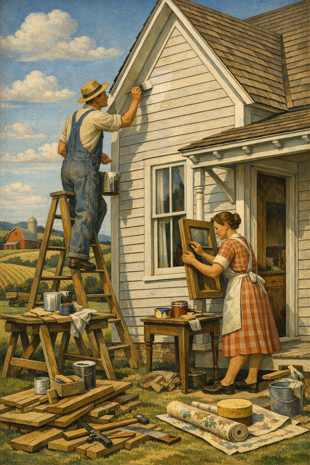
This same principle applies outside. If your project also includes curb appeal upgrades, quality exterior painting services require the same discipline in prep, repair, and coating selection.
The paint color gets the credit, but the prep work earns the result.
— 1 of a Kind Painting
What Denver Homes Need From Color Right Now
National trends do not automatically translate to Colorado homes. Interior paint color trends need local interpretation. Denver, Centennial, Glendale, Brighton, and Aurora all include a mix of newer builds, mid-century homes, remodel-heavy neighborhoods, and investment properties. The architecture varies, the light varies, and the design goals vary.
Open-concept homes need visual structure
Many newer homes in the metro area have large open layouts where the kitchen, dining area, and living room flow together. That creates flexibility, but it also creates sameness. One washed-out neutral across every wall can make the entire main floor feel undefined.
Better solutions include:
- Using tonal variation between connected rooms instead of one flat color everywhere
- Painting trim, built-ins, or islands in a contrasting but coordinated tone
- Using softer ceilings and wall colors to reduce glare in bright spaces
- Selecting colors based on exposure rather than trend charts alone
Older homes benefit from depth, not just brightness
In established neighborhoods, homeowners often assume they must use pale colors to modernize a home. That is not always true. Older homes can look far more refined with medium-depth neutrals, historic-inspired greens, or warm mineral tones that complement original trim, plaster texture, or wood details.
That is especially relevant for homeowners exploring painting services in Denver, CO, where many neighborhoods reward character more than generic resale-safe choices. The strongest color plans usually respect the architecture instead of trying to erase it.
Commercial spaces are following the same pattern
Even in offices, retail spaces, and hospitality environments, the trend is toward calmer, more human palettes. Harsh white boxes and overly branded accent walls are losing ground to warmer neutrals, strategic contrast, and low-odor coatings that allow faster reoccupancy. For businesses planning tenant improvements or image updates, professional commercial painting services can help align aesthetics, durability, and scheduling without shutting down operations longer than necessary.
DIY vs. Professional Results in Trend-Driven Interiors
DIY painting is not automatically a mistake, but trend-sensitive painting exposes every weakness. The more refined the color, the more obvious the flaws. That soft green you loved online can look blotchy on a poorly primed wall. That luxe matte finish can highlight every patch seam if the substrate was not corrected properly.
Where DIY often goes wrong
Most DIY issues are not dramatic disasters. They are small technical misses that add up:
- Skipping primer when changing from dark to light colors
- Using low-quality rollers that leave stipple or lint
- Choosing a sheen based on habit instead of room use
- Cutting in slowly and leaving visible banding
- Underestimating how much prep trim, doors, and repairs require
- Picking paint from a sample chip without testing it at scale
Why homeowners still hire professionals
Professional painting is not just about saving time. It is about reducing expensive uncertainty. An experienced crew understands product compatibility, moisture issues, patching standards, line quality, masking discipline, and how colors shift under real light. That is why homeowners often check what our clients are saying before trusting someone with a full interior repaint. They want to know whether the final result actually matched the promise.
The truth is simple: trend-forward interiors leave less room for average workmanship. If you are repainting a primary living area, cabinetry, stairwell, or vaulted space, a professional team often saves money by preventing rework, wasted material, and disappointing color outcomes.
How to Choose a Trend Without Regretting It in Two Years
The best trend choices are edited, not copied. Homeowners get into trouble when they treat a paint trend as a universal formula. A color can be popular and still be wrong for your home. The goal is not to mimic a showroom. The goal is to create a finished environment that feels intentional in your space.
Use trends as direction, not commands
If warmer neutrals are trending, that does not mean every room should become beige. If green is having a moment, that does not mean your whole main floor needs olive walls. Use the broader movement to guide undertones and mood, then choose specific colors based on your home’s conditions.
Test colors with discipline
A smart process looks like this:
- Identify fixed elements such as flooring, counters, tile, stone, and large furniture
- Narrow the palette by undertone, not just by lightness or darkness
- Sample in multiple rooms and check morning, afternoon, and evening light
- Choose trim and ceiling strategy early so the palette feels cohesive
- Match the sheen to the wall condition and room use
Think beyond the wall color
One of the strongest interior paint color trends is not a color at all. It is the move toward whole-room coordination. Walls, trim, ceilings, doors, built-ins, cabinetry, and accent elements are being treated as a system. That is how homes get the polished look people admire in magazines and custom remodels.
For homeowners in surrounding areas such as Centennial, Glendale, Brighton, and Aurora, the same rule applies: the best paint plan is one that fits the architecture, the lifestyle, and the light. If you are weighing ideas and want expert guidance on product choice, finish, and sequencing, the most efficient next step is to get in touch with our team.
Frequently Asked Questions
Q: What are the most popular interior paint colors right now?
The most popular choices right now include warm whites, soft greiges, muted sage greens, dusty blues, and earthy taupe or mushroom tones. These colors feel more livable and layered than the stark grays that dominated past trend cycles. They also adapt better to changing light and mixed materials.
Q: Are gray walls out of style?
Not completely, but cool, flat grays have lost momentum. Gray still works when it has warmth, complexity, or is used strategically with the right trim, flooring, and natural light. The bigger shift is away from default gray as the automatic safe choice.
Q: What paint finish is best for interior walls?
For many living areas, a quality matte or low-sheen eggshell offers the best balance of appearance and durability. Kitchens, bathrooms, and high-traffic zones may need a more washable product. The right finish depends on wall condition, room use, and the look you want to achieve.
Q: Should I test paint colors before painting an entire room?
Yes, always. Paint colors can shift significantly based on natural light, artificial lighting, surrounding materials, and sheen. Large samples viewed at different times of day are far more reliable than tiny swatches or online photos.
Q: Is it worth hiring a professional painter for interior color changes?
If the project involves large living spaces, detailed trim, repairs, difficult color transitions, or premium finishes, hiring a professional is often worth it. Pros deliver better prep, cleaner lines, more consistent coverage, and fewer costly mistakes. That matters even more when using nuanced trend colors that show imperfections easily.
Q: How do Denver’s light and climate affect interior paint color choices?
Denver homes often receive strong natural light that can make colors appear brighter, cooler, or more washed out depending on exposure. Because of that, undertones matter more than many homeowners expect. Testing colors in the actual space is essential before making a final decision.
Interior paint color trends are getting better because homeowners are getting smarter. The strongest palettes today are warmer, more nuanced, and more responsive to how people actually live. They are not about blindly following the annual “color of the year.” They are about choosing shades, finishes, and preparation methods that make a room feel complete.
That is especially true across the Denver metro area, where strong natural light, varied architecture, and active households demand more than generic paint advice. Whether the goal is updating one room or coordinating a full-home transformation, thoughtful planning makes the difference between a trendy paint job and a lasting improvement.
At 1 of a Kind Painting, that work is approached with the seriousness it deserves—from color guidance and meticulous prep to clean application and durable finishes. If you are ready to move beyond guesswork and create a home that feels intentional, refined, and built for the way you live, the next step is simple.
Ready to Transform Your Space?
Whether you’re refreshing your home’s interior, updating your exterior curb appeal, or tackling a commercial repaint anywhere in the Denver metro area, 1 of a Kind Painting has the experience, craftsmanship, and attention to detail to deliver results that truly stand out.
👉 Interior Painting
|
👉 Exterior Painting
|
👉 Contact Us Today