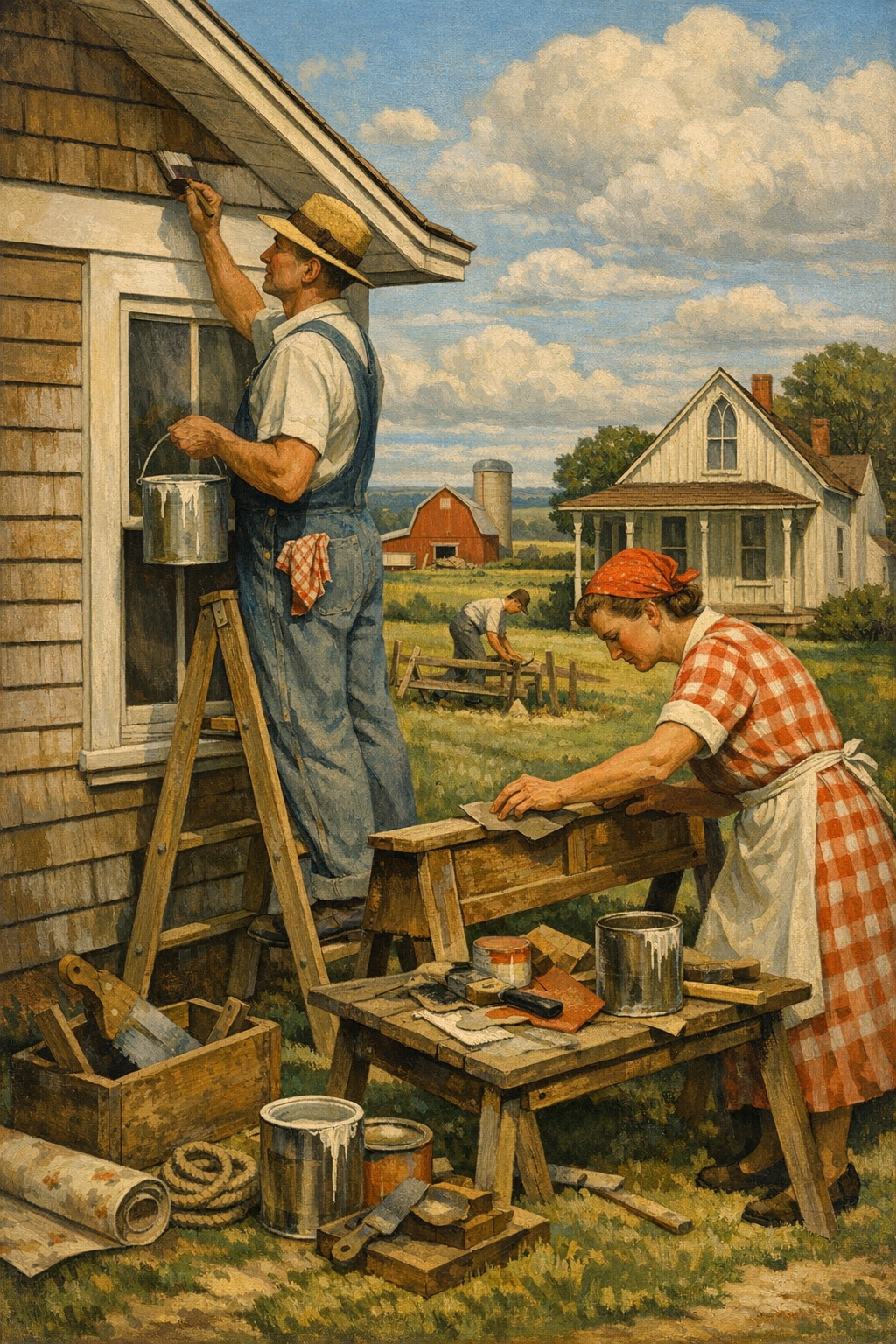
Most paint trend articles get one thing completely wrong: they obsess over a color chip and ignore the way people actually live. In 2026, paint color trends are less about chasing a viral shade and more about creating homes that feel grounded, flexible, and durable enough for real life in Denver’s bright sun, dry air, and fast-moving housing market.
Why 2026 Paint Color Trends Are More Practical Than Trendy
The biggest shift in 2026 is simple: homeowners are tired of disposable design. After years of hyper-white interiors, gray-everything flips, and social-media trend cycles that lasted about six months, people want paint colors that still look right in the morning, at night, in winter, and under Colorado’s intense daylight.
That is especially true across the Denver metro area, where architecture varies wildly from historic brick homes to new suburban builds in Aurora, modern townhomes in Glendale, and family homes in Centennial and Brighton. A paint color that looks sophisticated on a curated Instagram post can look flat, sterile, or overly yellow once it hits a real wall with western exposure.
The most relevant 2026 paint color trends are rooted in livability. That means warmer neutrals, earthy greens, nuanced blues, softened clay tones, and exterior palettes that feel architectural instead of flashy. Homeowners are also asking smarter questions about sheen, washability, VOC levels, and long-term maintenance. That is a good thing. Paint is not wallpaper for your feed. It is a finish system that has to perform.
If you are planning an update, the smartest place to start is with the room, the light, and the surface condition, not a trend board. That is why many Denver-area homeowners begin with professional color consultation before committing to a palette that may look very different once it is actually on the wall.
Why Denver changes the conversation
Colorado light is brutally honest. It reveals undertones, lap marks, drywall flaws, and cheap cut-rate paint jobs faster than softer climates do. A color that feels calm in a showroom can turn icy, pink, or muddy in a Denver living room, especially with big windows and snow-reflected winter light.
That local reality is why trend-driven decisions need to be tested against:
Natural light direction
Existing flooring, cabinetry, stone, and trim
Room function and traffic level
Desired maintenance level
Exterior sun exposure and weathering
For homeowners researching painting services in Denver, CO, this is where professional guidance separates a polished result from an expensive repaint six months later.
The Biggest Interior Paint Color Trends for 2026
Warmth is back, but not the muddy beige of the early 2000s. The best interior paint color trends of 2026 are refined, layered, and intentionally soft. Think mineral-inspired neutrals, muted olive, smoked blue, warm off-whites, and earthy tones that create depth without making a room feel dark or heavy.
1. Warm off-whites are replacing stark whites
Bright white still has a place, but cold, clinical white walls are losing ground. Homeowners want interiors that feel cleaner and calmer, not harsher. Shades with subtle cream, greige, or beige undertones are winning because they work better with wood floors, warmer countertops, and black or bronze fixtures.
Popular directions include colors similar to Sherwin-Williams Alabaster, Benjamin Moore White Dove, and softer Behr and PPG whites that avoid the blue cast many homeowners regret after installation. These tones pair beautifully with modern trim, natural textiles, and painted cabinetry.
2. Earthy greens have moved from accent wall to whole-home color
Green is no longer the “risky” option. In 2026, it is one of the most versatile. Sage, olive, eucalyptus, and muted moss tones are dominating bedrooms, offices, mudrooms, and kitchen cabinetry. They read as restful, elevated, and surprisingly neutral when balanced with stone, white oak, matte black, or brushed brass.
The mistake amateurs make is choosing a green that is too pastel or too saturated. The strongest results come from dirty, complex greens with gray or brown depth. That complexity helps the color stay sophisticated as light changes throughout the day.
3. Soft blues are becoming the new neutral
Blue used to be treated as a “kid room” or “bathroom” color. That thinking is outdated. Dusty blue-grays and slate-adjacent blues are now acting like neutrals in dining rooms, studies, and primary bedrooms. They create mood without screaming for attention.
This is one reason premium interior painting services matter so much. Deep or nuanced blues show surface flaws, roller marks, and poor cut lines more than safe off-whites do. If the prep and application are weak, the color will expose it.
4. Clay, sand, and muted terracotta are getting more sophisticated
Homeowners are warming up to desert-inspired colors, but the good versions are subtle. The trend is not orange walls. It is soft clay, sunbaked beige, dusty tan, and mineral terracotta used with restraint. These shades work exceptionally well in homes that need warmth but cannot handle yellow undertones.
They also align with a bigger design movement toward tactile finishes, including limewash-inspired textures and matte surfaces that add softness without relying on loud color.
5. Dark trim and moody rooms are still relevant, but only when done well
Moody rooms are not dead. They are just harder to fake. Deep charcoal, brown-black, aubergine, and dark green still look exceptional in dining rooms, powder baths, libraries, and offices. But dark paint punishes bad prep. Nail pops, rough patches, caulk shrinkage, and sheen inconsistency become impossible to ignore.
Room Type
Trending 2026 Color Direction
Recommended Finish
Why It Works
Living Room
Warm off-white or greige
Eggshell
Soft, versatile, and forgiving in changing light
Kitchen
Muted green, warm neutral, or soft white
Satin
Better cleanability with balanced sheen
Primary Bedroom
Dusty blue or earthy green
Eggshell
Creates a calm, grounded mood
Bathroom
Mineral blue, soft greige, or pale clay
Satin or semi-gloss trim
Handles moisture while keeping visual depth
Home Office
Moody green, charcoal, or muted blue
Eggshell
Improves focus and adds sophistication
Exterior Paint Color Trends Taking Over Denver Neighborhoods
Exterior paint color trends in 2026 are getting smarter, not louder. Homeowners are moving away from high-contrast gimmicks and toward palettes that feel tied to the home’s structure, roofline, masonry, and landscape. That is especially important in Colorado, where strong UV exposure can make an aggressive palette feel even more aggressive after a few months outdoors.
Nature-based neutrals are leading the way
Warm taupe, stone gray, soft mushroom, mineral beige, and muted olive are showing up across neighborhoods because they complement both natural and manufactured materials. They work on stucco, wood, engineered siding, brick accents, and composite trim without feeling trend-chased.
Flat gray exteriors are fading fast. They often looked “modern” for about a year and then started to feel cold, generic, and disconnected from the landscape. In Denver and surrounding communities, homes usually benefit from more warmth and more material sensitivity.
Dark exteriors still work, but the details matter
Charcoal, deep bronze, and blackened green exteriors remain attractive, but they are not universal solutions. South- and west-facing elevations absorb serious heat, and darker colors can amplify surface stress if prep, caulking, primer selection, and product choice are poor. A dramatic color does not forgive a weak coating system.
That is why homeowners considering bold curb appeal upgrades should pay close attention to product quality and prep through experienced exterior painting services. Sun exposure, altitude, substrate condition, and prior coating failure all matter more outside than most trend articles admit.
Trim contrast is becoming more restrained
One of the clearest exterior shifts is the move away from extreme white trim against dark body colors. The newer approach is lower contrast: soft trim, tonal layering, stained wood accents, and front doors that add color without hijacking the whole elevation. It looks more custom because it is more architectural.
For homeowners in communities such as Centennial and nearby suburbs, balanced palettes often age better than trend-heavy combinations. If you are planning a repaint in the south metro area, exploring painting services in Centennial, CO can help you evaluate which colors will hold up visually and physically in local conditions.
The worst reason to choose a paint color is that it looked good on someone else’s house. Light, materials, elevation, and craftsmanship decide whether a color feels custom or completely wrong.
— 1 of a Kind Painting
What the Major Paint Brands Are Signaling
If you watch Sherwin-Williams, Benjamin Moore, Behr, and PPG closely, the message is consistent: the market is moving toward complex, comforting, nature-driven color. The exact “Color of the Year” may vary, but the broader direction is unmistakable.
Sherwin-Williams
Sherwin-Williams has leaned into rich neutrals, grounded greens, and nuanced earth tones that feel usable rather than theatrical. Their stronger palettes recognize that homeowners want flexibility. A living room color cannot just look current. It has to coordinate with adjacent spaces, trim packages, cabinetry, and resale expectations.
Benjamin Moore
Benjamin Moore continues to influence high-end residential interiors with balanced, designer-friendly hues that read soft but layered. Their best trend-adjacent colors tend to have subtle undertones and excellent adaptability, which makes them favorites for whole-home repaints and premium finish work.
Behr and PPG
Behr and PPG are also tracking the same consumer preference: softer warmth, natural influence, and versatile depth. Their broad retail visibility matters because it reflects what everyday homeowners are actually buying, not just what designers are posting. The mainstream market has clearly moved past icy gray.
Why brand matters less than execution
Good paint is essential, but brand alone does not save a bad process. Surface prep, moisture management, patching quality, primer compatibility, sheen selection, and application technique determine whether a beautiful color looks expensive or disappointing.
For commercial spaces, this becomes even more critical. Offices, retail environments, multifamily properties, and light industrial settings often need coatings that balance appearance, durability, low odor, and tight scheduling. That is where experienced commercial painting services can make color strategy and logistics work together instead of competing.
How to Choose the Right Trend for Your Home
Trend awareness is helpful. Blind trend adoption is expensive. The right paint color is never chosen in isolation. It has to respond to the architecture, finishes, lighting, and purpose of the space.
Start with fixed elements first
Your flooring, countertops, tile, brick, fireplace surround, and cabinetry should drive the conversation. If those elements are warm, a cool white may fight them. If your home has a lot of gray stone or black metal, a warm neutral may need enough depth to avoid looking dingy.
Test large samples in real conditions
Small chips are almost useless for nuanced colors. Paint large sample boards and move them around the room at different times of day. Morning, afternoon, evening, and lamplight can all shift the perception dramatically. If you skip this step, you are guessing.
Think in transitions, not isolated rooms
One of the biggest mistakes homeowners make is choosing each room independently. A better approach is to think in sequences. Hallways, sightlines, stairwells, and connected open-plan areas need visual flow. That does not mean every room has to match. It means the palette should make sense as you move through the home.
Know where to spend and where to simplify
Accent walls are often a distraction from bigger design problems. In many homes, it is more effective to improve trim contrast, repaint ceilings, refinish cabinets, or unify an awkward floor plan with a stronger whole-home palette. If you want to see how cohesive color planning changes a property, browse our project gallery to compare surface updates that rely on strategy, not gimmicks.
Trust reactions, not hype
A good color should keep getting better as you live with it. It should not feel exciting for one day and exhausting by the end of the week. The best trend is the one that still feels intentional a few years from now.
Why Application Matters More Than the Color Itself
This is the part the internet usually skips. Paint color trends do not fail because the colors are bad. They fail because the execution is bad. Even premium paint cannot hide poor drywall repair, dirty surfaces, rushed caulking, flashing patches, or mismatched sheen.
Prep is the real luxury
Homeowners often assume “high-end” means designer colors. It usually means something less glamorous: better sanding, sharper lines, smoother patching, cleaner masking, better primer decisions, and proper dry times. That is what makes a finish look expensive.
For exteriors, prep includes scraping failures, repairing substrate damage, sealing vulnerable joints, and choosing products that can tolerate Colorado’s freeze-thaw cycles and intense sun. For interiors, it includes stain blocking, texture blending, and understanding when to spray, brush, or roll.
Low-VOC and zero-VOC products are now standard expectations
More homeowners want lower-odor, lower-emission products, especially for nurseries, occupied homes, and commercial settings that cannot shut down for long. Fortunately, many modern low-VOC and zero-VOC paints perform well when selected correctly. Eco-conscious does not have to mean lower quality anymore. But product choice still has to match the substrate and use case.
DIY has limits that trend articles rarely admit
There is nothing wrong with a DIY spirit. But dark colors, cabinet refinishing, stairwells, exterior elevations, high-visibility trim, and large open interiors are where DIY shortcuts become obvious. Many homeowners end up paying twice: once for the initial attempt and again to fix it.
That is one reason trust matters. Before hiring any painter, look closely at finish quality, consistency, and client experience. Reading what our clients are saying can reveal whether a company communicates well, protects the property, and follows through when the details get demanding.
For painting contractors and skilled tradespeople following industry shifts, workforce quality remains a major issue. The companies that invest in craftsmanship will keep winning while the low-bid crowd keeps apologizing. If that side of the trade interests you, 1 of a Kind Painting also shares subcontractor opportunities for professionals who take the work seriously.
Frequently Asked Questions
Q: What are the most popular paint color trends for 2026?
The strongest 2026 trends include warm off-whites, earthy greens, dusty blues, mineral-inspired neutrals, and softened clay tones. These colors are popular because they feel calmer, more flexible, and more natural than the stark whites and cool grays that dominated previous years.
Q: Are gray walls still in style in 2026?
Pure cool gray is losing relevance in many homes, especially when it feels flat or sterile. Warmer grays, greiges, and more complex neutrals still work well, but they need to coordinate with the home’s lighting and fixed finishes to avoid looking dated.
Q: What exterior paint colors work best in Denver, Colorado?
In the Denver area, warm neutrals, muted earth tones, soft greiges, and carefully chosen dark colors tend to perform best visually. Colorado’s strong sun can exaggerate undertones, so exterior colors should always be tested on-site before full application.
Q: Should I follow paint trends or choose timeless colors?
The smartest approach is a blend of both. Use current trends as direction, then select colors that fit your architecture, light, and lifestyle so the result still feels right years from now rather than looking like a short-lived design experiment.
Q: Do I need a professional color consultation before painting?
If you are painting multiple rooms, updating an exterior, or working with challenging light, a professional color consultation is often worth it. It helps you avoid undertone mistakes, improves whole-home cohesion, and reduces the risk of repainting after the job is complete.
Q: Is it better to hire a painter for dark or trendy colors?
Yes, especially for deep greens, blues, charcoals, and large open walls. Trend-forward colors often reveal surface flaws and application mistakes more easily, so professional prep, priming, and finish work make a noticeable difference.
Paint color trends in 2026 are finally moving in the right direction. They are less performative, more grounded, and far better suited to the way people actually use their homes. The real winners are not the loudest colors or the most viral posts. They are the palettes that respect light, materials, architecture, and finish quality.
For homeowners across Denver, Aurora, Centennial, Glendale, and Brighton, that means choosing colors with more intention and applying them with more discipline. Whether the goal is a warmer interior, a more refined exterior, or a full-property refresh, professional process matters just as much as color selection.
1 of a Kind Painting helps clients navigate those decisions with the kind of craftsmanship that keeps trend-driven choices from becoming expensive regrets. If you are ready to test colors, compare finishes, or plan your next repaint with confidence, get in touch with our team to talk through your project.
Ready to Transform Your Space?
Whether you’re refreshing your home’s interior, updating your exterior curb appeal, or tackling a commercial repaint anywhere in the Denver metro area, 1 of a Kind Painting has the experience, craftsmanship, and attention to detail to deliver results that truly stand out.
Most exterior paint jobs fail long before the color goes out of style. The real problem is usually bad prep, weak product choices, and homeowners chasing generic national trends that ignore local climate. In 2026, exterior house painting trends in Denver are being shaped as much by sun exposure, freeze-thaw cycles, and HOA expectations as they are by what’s showing up in designer mood boards.
Why Denver Is Changing the Rules on Exterior Color
National paint trend reports are useful, but Denver does not behave like the rest of the country. A color that looks soft and sophisticated in the Pacific Northwest can look washed out under Colorado’s intense sunlight. A deep charcoal that feels dramatic on a shaded East Coast home can absorb serious heat on a south-facing wall along the Front Range.
That is why the smartest homeowners are no longer asking, “What’s trending?” They’re asking, “What holds up here?” That shift matters. In neighborhoods across Denver, Aurora, Centennial, Glendale, and Brighton, the best exterior projects are balancing style with durability, architecture, and local light conditions.
We’re seeing more clients use trend forecasting as a starting point rather than a final decision. Brands like Sherwin-Williams, Benjamin Moore, Behr, and PPG continue to push earthy greens, warm off-whites, and moody neutrals, but the winning projects are the ones that translate those palettes to the realities of siding type, masonry, trim detail, and UV exposure.
If you are planning a repaint, this is also the moment to think beyond color alone. Sheen, substrate condition, caulking quality, and coating system matter just as much as the final swatch. Homeowners exploring exterior painting services are often surprised to learn that two homes painted the same color can age very differently based on prep and application quality.
The climate factor most homeowners underestimate
Colorado sun is brutal on paint. High elevation means stronger UV exposure, and that accelerates fading, chalking, and film breakdown. Add snow, hail, rapid temperature swings, and occasional wind-driven moisture, and you have a harsh test for any coating system. This is why low-price bids often turn expensive later: they usually cut corners on washing, scraping, sanding, priming, or material selection.
Good exterior painting in Denver is not just decorative. It is building protection. Paint is your first line of defense against moisture intrusion, substrate deterioration, and curb-appeal decline.
The Top Exterior House Painting Trends for 2026
The biggest trend in 2026 is not flashy color. It’s restraint. Homeowners want exteriors that feel current without looking like they were copied from a social media reel that will feel dated in two years. That has pushed several clear directions to the front.
1. Warm whites instead of stark whites
Bright, cold whites had a strong run, but many of them look too harsh in Colorado sun. The shift now is toward warmer whites and soft mineral tones that read cleaner, richer, and more architectural. Think Sherwin-Williams Alabaster, Benjamin Moore White Dove, or similarly balanced whites with creamy undertones.
These shades work especially well on newer builds, brick-painted homes, and exteriors with black or bronze accents. They also pair beautifully with natural wood doors and stained porch ceilings.
2. Earthy greens are moving from “accent” to “main character”
Sage, olive, and muted green-gray exteriors are no longer niche. They’ve become one of the most reliable ways to make a home look current while still feeling grounded in the Colorado landscape. These tones work particularly well near open space, mature trees, and neighborhoods where homeowners want distinction without going overly dark.
Used correctly, green is versatile. Used poorly, it turns muddy. That is exactly why color testing matters so much, especially in direct afternoon light. If you need help narrowing options, a professional color consultation can save you from a very expensive guess.
3. Rich greige and taupe are beating cool gray
Cool gray exteriors are losing ground. They often feel flat, overused, and slightly disconnected from the warmer direction of current design. In their place, we’re seeing richer greige, mushroom, taupe, and clay-influenced neutrals. These colors give homes more depth and tend to complement stone, roofing, and concrete more naturally.
This is one of the smartest trend shifts of the year. Cool grays were frequently chosen because they felt “safe,” but they often created a sterile look. Warmer neutrals do the same job with far more character.
4. Dark trim is still popular, but only when it’s earned
Black and near-black trim remains popular, but the lazy version of this trend is fading. Not every house needs black accents. On some elevations, dark trim sharpens the architecture. On others, it feels forced and heavy. The better approach is selective contrast: dark shutters, entry doors, garage doors, or window trim where the structure benefits from definition.
Colors like Sherwin-Williams Iron Ore, Tricorn Black, and deep bronze-adjacent hues remain strong choices. But they should support the home, not dominate it.
5. Natural-looking finishes are influencing exterior palettes
Even when homeowners are not using limewash or masonry staining, they increasingly want exteriors that feel organic, textured, and believable. That means fewer synthetic-looking colors and more nuanced tones inspired by stone, clay, sand, bark, and weathered wood.
This influence is coming from the broader design world, where Venetian plaster, limewash walls, and tactile finishes have elevated the appetite for surfaces with depth. Exterior paint color is following that same logic.
The era of picking an exterior color from a 2-inch swatch and hoping for the best should be over. In Denver, light changes everything, and bad assumptions are one of the costliest mistakes in residential painting.
— 1 of a Kind Painting
Color Choices That Actually Work in Colorado Light
Choosing from the latest exterior house painting trends is easy. Choosing a color that looks right at 9 a.m., 2 p.m., and sunset is harder. Colorado light exaggerates undertones. Beige can turn yellow. Gray can go blue. White can look blinding. That is why successful color selection has to be done outdoors, on the home, in multiple lighting conditions.
Best-performing color families for Denver-area homes
Warm whites: Ideal for modern farmhouse, transitional, and updated traditional homes.
Soft greige: A strong all-around choice for resale appeal and compatibility with stone and roofing.
Muted sage and olive: Great for homes with landscaping, wood details, or mountain-adjacent aesthetics.
Dusty taupe and mushroom: Excellent for homeowners who want warmth without obvious beige.
Deep charcoal accents: Best used strategically on trim, shutters, or doors rather than entire elevations in high-sun exposure.
What homeowners get wrong about samples
Peel-and-stick samples are helpful, but they are not enough. They can’t fully replicate sheen, texture, substrate absorption, or how the color reads across larger surfaces. Real brush-out samples on the actual siding or trim tell the truth faster.
This matters even more when a home has multiple materials like fiber cement, stucco, engineered wood, brick, and metal accents. Each surface reflects light differently. One color can read cohesive on paper and disjointed in practice.
Homeowners in neighborhoods looking for painting services in Denver, CO are often dealing with another factor too: local neighborhood standards. The best painters know how to create a distinctive look without fighting the architectural rhythm of the block.
Finish matters more than most people think
Exterior sheen affects both appearance and maintenance. A finish that is too flat can hold dirt and look tired faster. One that is too shiny can highlight every surface imperfection.
Exterior Surface
Recommended Finish
Why It Works
Siding
Low Lustre / Satin
Balances durability, washability, and visual softness
Trim
Satin / Semi-Gloss
Adds definition and improves moisture resistance
Front Door
Semi-Gloss
Enhances color depth and stands up to touch and weather
Masonry or Stucco
Flat / Low Sheen Masonry Coating
Helps hide texture variations and gives a more natural look
If you want to see how finish and color decisions come together on real homes, browse our project gallery. The gap between a theoretical color palette and a well-executed exterior is bigger than most people expect.
Prep, Products, and the Difference Between a 3-Year Paint Job and a 10-Year One
Here is the blunt truth: too many paint contractors still sell color, not systems. They talk about brand names and trendy shades while barely discussing wood repair, moisture management, or primer selection. That is backwards.
The longest-lasting exterior projects start with a disciplined process. Washing removes chalking, dirt, mildew, and airborne contaminants. Scraping removes loose failure. Sanding feathers rough transitions. Caulking closes vulnerable joints. Priming stabilizes repairs and bare areas. Then, and only then, does the finish coat have a chance to perform.
Products homeowners should ask about
Not all premium paint lines perform the same way on all surfaces. Sherwin-Williams Duration and Emerald, Benjamin Moore Aura Exterior and Regal Select Exterior, Behr Dynasty, and select PPG exterior products can all be excellent when matched correctly to substrate and condition. The product is only “right” when it suits the surface, exposure, and scope.
Homeowners should ask specific questions:
Will bare wood, patched areas, or exposed substrate be spot-primed or fully primed?
What caulk will be used on joints and trim gaps?
How will peeling edges be feather-sanded?
Will damaged boards be repaired or painted over?
How many coats are included, and on which surfaces?
Low-VOC and eco-conscious options are no longer compromises
The old assumption that low-VOC products are weaker is outdated. Modern low-VOC exterior coatings can deliver excellent durability and color retention when used properly. For homeowners sensitive to odor, focused on sustainability, or simply wanting better indoor-outdoor air quality during a project, this is an increasingly attractive option.
That said, greenwashing is real. “Eco-friendly” only means something if the product data sheet, durability expectations, and application conditions support the claim. Good contractors don’t sell buzzwords; they explain tradeoffs honestly.
Surface repair is where cheap bids hide their shortcuts
A low estimate often looks appealing until you realize it excludes carpentry repair, extensive scraping, high-build primers, or proper masking. Painting over deterioration is not efficiency. It is camouflage. When the coating fails early, the homeowner pays twice.
This is one reason many property owners trust established crews with proven systems and documented work. If you want to understand how clients judge consistency, communication, and final results, take a look at what our clients are saying.
DIY vs. Professional Exterior Painting
DIY exterior painting is not impossible. It is just far less forgiving than interior painting. A missed wall spot in a guest room is annoying. A missed joint, failed caulk line, or under-prepped south-facing facade can lead to early breakdown, moisture intrusion, and visible peeling.
When DIY can work
DIY can make sense on small, low-risk projects such as a shed, a fence, a single door, or touch-up work on easily accessible trim. Homeowners with the right ladders, safety habits, prep discipline, and time can sometimes do respectable work on limited scopes.
When hiring a professional is the smarter move
Professional help is the better choice when the home has multiple stories, deteriorated surfaces, extensive prep needs, color changes, stucco or masonry considerations, or tight weather windows. It is also the better choice when you care deeply about lines, consistency, and longevity.
Exterior painting demands more than labor. It requires planning, sequencing, weather awareness, and the judgment to adapt in real time. That is where true pros separate themselves from both DIY efforts and bargain crews.
Homeowners comparing painting options often start with interiors and eventually realize the quality standards should be the same outside. The same craftsmanship that matters in interior painting services matters even more on an exterior where the elements never stop testing the work.
The labor market factor few homeowners consider
The painting industry is also dealing with a skilled-labor gap. That makes crew quality more important than ever. A company’s systems, training, and standards determine whether the finished product looks sharp and lasts. In a market that needs more qualified tradespeople, professional development and subcontractor opportunities matter because workmanship does not improve by accident.
What Denver-Area Homeowners Should Do Before Painting This Year
If your home is due for a repaint in 2026, the smartest move is not to start with Instagram. Start with condition, exposure, and architecture. Then layer in color trends that support those realities.
A practical checklist before choosing a color
Walk the exterior slowly. Look for peeling, cracked caulk, soft wood, fading, and failed touch-ups.
Note your sun patterns. South- and west-facing walls usually take the hardest beating.
Consider permanent elements. Roofing, stone, brick, driveways, and neighboring homes all affect how color reads.
Test large samples outdoors. Evaluate them morning, afternoon, and evening.
Choose a painting partner based on process, not just price.
Timing matters in Colorado
Denver-area scheduling should respect temperature swings, precipitation risk, and product cure windows. Spring through fall remains prime season, but the best schedule is the one that matches the coating system and weather conditions, not just the homeowner’s calendar. Rushing into marginal conditions is one of the easiest ways to reduce performance.
This is especially true for larger homes and projects in surrounding communities like Centennial and Glendale, where architectural styles and exposure conditions can vary significantly. If your property needs a tailored plan, whether in the city core or nearby suburbs, professional crews familiar with local conditions can make a major difference.
For homeowners ready to move from ideas to action, the smartest next step is simple: get in touch with our team. A serious exterior project deserves more than a rough estimate and a color fan deck.
Frequently Asked Questions
Q: What exterior paint colors are trending in Denver right now?
The strongest exterior color trends in Denver include warm whites, earthy greens, greige, taupe, and selective dark accents. These colors work well because they complement Colorado’s bright natural light and the region’s stone, stucco, and mixed-material architecture. The best choice still depends on your home’s exposure, roofing, and neighborhood context.
Q: How often should a house be repainted in Colorado?
Many Denver-area homes need exterior repainting roughly every 7 to 10 years, though some surfaces fail sooner due to UV exposure, poor prep, or lower-grade materials. South- and west-facing elevations often show wear first. Wood trim, stucco, and heavily exposed siding may require closer monitoring.
Q: Is it better to use satin or flat paint on an exterior?
Satin or low-lustre finishes are typically the best choice for exterior siding because they offer a good balance of durability, washability, and appearance. Flat finishes can work well on masonry or stucco where texture hiding is important. Trim and doors usually benefit from satin or semi-gloss for added durability and definition.
Q: Are low-VOC exterior paints durable enough for Colorado weather?
Yes, many modern low-VOC exterior paints are highly durable when properly matched to the surface and applied under the right conditions. Premium lines from major brands now offer strong adhesion, color retention, and weather resistance. Product quality still matters, and prep remains just as important as VOC level.
Q: Can I paint my house exterior myself, or should I hire a professional?
Small exterior projects may be manageable for experienced DIY homeowners, but full-house painting is usually better handled by professionals. Exterior work involves ladders, weather timing, extensive prep, safety considerations, and coating decisions that directly affect longevity. Hiring a pro often delivers better durability, cleaner lines, and fewer costly mistakes.
Q: What is the biggest mistake homeowners make when choosing an exterior paint color?
The biggest mistake is choosing color from a small sample without testing it on the home in natural light. Colorado sun can dramatically shift undertones and make colors appear much brighter or flatter than expected. Large exterior samples viewed at different times of day produce far better decisions.
Exterior house painting trends in 2026 are moving in a better direction. Homeowners are becoming more selective, less reactive, and more interested in results that last. Warm whites, nuanced greens, richer neutrals, and carefully chosen accents are leading the market, but the real upgrade is a more disciplined approach to prep, product selection, and climate-specific decision-making.
For homeowners across Denver and nearby communities, the best-looking exterior is rarely the one chasing the loudest trend. It is the one that respects the home’s architecture, the reality of Colorado weather, and the craft required to execute the work correctly. That is true whether you are planning a full repaint, updating trim and accents, or pairing an exterior refresh with interior improvements.
At 1 of a Kind Painting, that practical mindset guides every project, from modernized suburban homes to more traditional properties throughout the metro area. If you’re comparing colors, evaluating failing paint, or planning a full refresh, the goal is simple: make sure the work looks exceptional now and continues to protect the home for years to come.
Ready to Transform Your Space?
Whether you’re refreshing your home’s interior, updating your exterior curb appeal, or tackling a commercial repaint anywhere in the Denver metro area, 1 of a Kind Painting has the experience, craftsmanship, and attention to detail to deliver results that truly stand out.
Most “trending color” articles are useless the moment real light hits the wall. That is exactly why paint color trends 2026 matter less as a list of fashionable names and more as a strategy for how color behaves in actual homes, offices, and retail spaces. In Denver-area properties, where altitude, sun exposure, open-concept layouts, and sharp seasonal light shifts can dramatically change a paint color, choosing the right palette is no longer a cosmetic decision—it is a performance decision.
The era of one-note gray is over. Not because gray disappeared, but because homeowners and property managers have become more sophisticated. They want colors that feel warmer, more grounded, and more tailored to architecture. The strongest paint color trends of 2026 reflect that shift: less sterile minimalism, more depth, more mineral influence, and more colors that can handle natural light without washing out.
Major brands like Sherwin-Williams, Benjamin Moore, Behr, and PPG continue to move toward complex neutrals, earthy greens, clay-inspired tones, smoky blues, and softened off-whites. That is not an accident. People are asking for rooms that feel calmer, richer, and less obviously designed around a social media trend. In other words, the market is growing up.
That change is especially relevant for homeowners planning interior painting services. A color now has to do more than look attractive on a fan deck. It needs to transition from morning to evening, coordinate across connected rooms, and hold up against wood floors, black fixtures, stone counters, and large windows. A trend color that fails in real conditions is not a trend worth following.
Commercial spaces are shifting too. Offices, boutiques, hospitality settings, and professional suites want palettes that project confidence without feeling cold. That is one reason why muted green-grays, mushroom tones, deep blue-charcoals, and warm modern neutrals are showing up more often in commercial painting services. They create character without turning the space into a design experiment.
What is driving these color choices?
Wellness-focused design that favors calm, low-stimulation environments
Natural material influence from stone, wood, plaster, clay, and linen
Open-plan living that requires flexible, connected color stories
Higher expectations for resale appeal and long-term livability
Regional adaptation as homeowners realize color behaves differently in Denver than it does in coastal or Southern markets
That last point is routinely ignored by generic design content. A shade celebrated online might look perfect in filtered East Coast daylight and completely overexposed in Colorado sun. Trend awareness is useful. Blind imitation is expensive.
The Defining Paint Color Trends of 2026
If you strip away the hype, the most important paint color trends 2026 can be grouped into a few clear categories. These are not random. They reflect what actually performs well in residential and commercial settings.
1. Warm off-whites that do not feel yellow
Cool builder whites are losing ground. Homeowners still want brightness, but they want it with softness. Shades similar to Sherwin-Williams Alabaster, Benjamin Moore White Dove, and other warm whites remain popular because they create a cleaner backdrop for modern finishes without feeling clinical. The winning white in 2026 is not icy. It is edited, creamy, and balanced.
These tones work especially well in living rooms, kitchens, hallways, and whole-home repaints where continuity matters. They are also ideal when clients want a fresh look without committing to obvious color. If you are evaluating options, a professional color consultation can prevent the common mistake of choosing a white that turns pink, yellow, or blue in changing light.
2. Earthy greens with gray or olive undertones
Green is no longer an accent-only color. In 2026, it is a true neutral when handled correctly. Think soft sage, dried herb, muted olive, and green-gray tones. These shades pair beautifully with natural wood, matte black hardware, brass, and stone. They are especially effective in bedrooms, offices, mudrooms, powder rooms, and cabinetry.
Not all greens are equal, though. Bright, trendy greens often age poorly. The best-performing versions have enough gray, brown, or mineral character to feel architectural rather than decorative. That distinction matters if you want the room to feel elevated five years from now, not just “current” for one season.
3. Clay, taupe, mushroom, and other complex neutrals
Beige is back, but the lazy version is not. The modern neutral family is far more nuanced: mushroom, putty, greige-taupe hybrids, dusty clay, and soft sand. These shades answer the widespread fatigue with cold gray while preserving the versatility homeowners still want. They are warmer, smarter, and much more forgiving.
These colors also complement many Denver-area homes that feature stone fireplaces, warm wood flooring, and transitional architecture. When clients ask for something “safe” but not boring, this category usually offers the strongest answers.
4. Deep moody blues and blue-charcoals
Accent walls are more selective now, but richly pigmented blues are still powerful when used with discipline. Navy, storm blue, and smoky blue-black tones remain strong for dining rooms, studies, built-ins, front doors, and commercial feature walls. They communicate depth and confidence without the heaviness of pure black.
For exteriors, deeper blues are also gaining traction for front doors, shutters, and selective siding accents. Homeowners exploring exterior painting services are increasingly drawn to colors that feel classic but not predictable.
5. Soft terracotta and mineral-inspired statement colors
Here is where many brands are subtly converging: colors drawn from limewash, plaster, clay, and natural pigment traditions. Soft terracotta, dusty rose-brown, weathered ochre, and muted rust are showing up in carefully chosen spaces. These are not loud Southwestern throwbacks. The successful versions are desaturated and sophisticated.
This is one of the boldest predictions for 2026: as more homeowners look beyond flat white walls, mineral-inspired tones will move from niche design circles into mainstream bedrooms, dining areas, entryways, and boutique commercial interiors.
The best paint trend is not the color everyone is posting. It is the color that still looks right at 7 a.m., 2 p.m., and 9 p.m. in your actual space.
— 1 of a Kind Painting
How Denver Light Changes Everything
Denver, Centennial, Glendale, Brighton, and Aurora do not experience paint color the way many national trend articles assume. Colorado light is stronger, cleaner, and often less forgiving. High altitude and abundant sunshine can make pale colors look brighter, cool colors look colder, and undertones far more obvious than they appeared in the store.
Why samples fail so often in the Denver metro
Most homeowners test a tiny square on one wall and make a final decision too quickly. That approach is flawed anywhere, but it is especially risky in the Front Range. A color that seems perfect on a north wall may look dramatically warmer on a west-facing wall by late afternoon. Open-concept homes magnify the problem because colors shift visually as you move from kitchen to dining room to living area.
That is why professional painters insist on larger sample areas, multiple viewing times, and sheen-specific testing. Color is not static. It is environmental. If the room has large windows, reflective countertops, hardwood floors, or nearby exterior greenery, those elements will alter what you think you are seeing.
Best practices for choosing colors in Colorado homes
Test large samples on more than one wall
View the color morning, midday, and evening
Evaluate next to flooring, cabinetry, and trim
Confirm the sheen, because eggshell and matte can display differently
Check exterior-adjacent rooms carefully, especially those with strong reflected light
For homeowners seeking painting services in Denver, CO, this local context matters more than broad national trend forecasting. A color that works in a dim urban condo may not work in a bright suburban home with vaulted ceilings and southern exposure.
If you want proof that application and lighting can transform a color, browse our project gallery. Real-world spaces tell a more useful story than any brand mood board ever will.
Where These Colors Work Best Inside and Out
The strongest trend colors are versatile, but they are not universal. Room function still matters. So do traffic levels, cleaning needs, fixed finishes, and the emotional tone you want the space to create.
Best 2026 color directions by interior space
Area
Best Color Direction
Why It Works
Recommended Finish
Living Room
Warm off-white, mushroom, soft greige
Flexible backdrop for layered furnishings and changing light
Matte or eggshell
Kitchen
Balanced white, muted green-gray, light taupe
Pairs well with stone, wood, and painted cabinetry
Eggshell or satin
Bedroom
Sage, blue-gray, warm neutral
Creates a calmer, less reflective environment
Matte or eggshell
Bathroom
Soft green, mineral blue, clean warm white
Fresh without feeling harsh under vanity lighting
Satin
Home Office
Moody blue, olive-gray, refined taupe
Adds focus and sophistication
Eggshell
Exterior
Warm greige, soft white, deep blue accents
Timeless curb appeal with enough contrast
Exterior low-lustre or satin
Exterior trend colors are getting smarter too
Exterior palettes in 2026 are moving toward softer body colors with stronger trim or door contrast. Warm whites, stone-inspired grays, dusty taupes, and greige exteriors remain highly effective across many Denver neighborhoods. Deep charcoal, muted navy, and olive-black are increasingly popular for doors, shutters, and selective accents.
But this is where weak industry advice causes damage. A dramatic exterior color is only as good as the preparation beneath it. No premium coating can hide failed caulk, chalking surfaces, peeling paint, or moisture intrusion. Proper washing, scraping, sanding, priming, and repair are not optional upgrades. They are the job.
That is particularly important in Colorado, where freeze-thaw cycles, hail exposure, UV intensity, and dry air can punish exterior coatings. Homeowners considering a repaint should think beyond color chips and start with substrate condition. A beautifully selected shade on a poorly prepared home is just an expensive countdown to failure.
Commercial spaces need trend awareness, not trend addiction
For offices, retail spaces, and hospitality interiors, the best trend colors are the ones that support branding while staying practical. Muted greens, dark blues, warm whites, and elevated neutrals all work because they create a polished environment without overpowering signage, lighting, merchandise, or client-facing areas.
The smartest commercial color plan looks intentional, not theatrical. That is one reason so many businesses are rejecting flashy palettes in favor of grounded, premium-looking colors that photograph well and age gracefully.
How to Choose the Right Finish, Brand, and Application Method
Color gets the attention, but finish and application decide whether the final result looks premium or amateur. A great color in the wrong sheen can look cheap. The same is true when cut lines are sloppy, drywall flaws are ignored, or coverage is uneven.
Finish matters more than homeowners think
Flat and matte finishes are popular because they soften wall imperfections and create a modern look. Eggshell remains a strong all-around choice for many living spaces. Satin is often best for bathrooms, trim, and higher-moisture zones. Semi-gloss still has a place, but many contractors overuse it, especially on walls where it emphasizes every defect.
Premium brands such as Sherwin-Williams Emerald, Benjamin Moore Regal Select, Behr Dynasty, and certain PPG lines offer excellent options, but brand alone does not guarantee success. Surface prep, primer selection, environmental conditions, and application skill all affect performance.
Sprayer vs. roller vs. brush
There is a lot of misinformation around this topic. Sprayers are not automatically better, and rollers are not outdated. Each tool has a purpose.
Sprayers excel on exteriors, trim packages, cabinetry, and large commercial areas when properly masked and back-rolled as needed
Rollers remain ideal for many interior wall surfaces and help achieve consistent film build
Brushes are essential for detailed cutting, trim work, and areas that demand precision
The best painters are not loyal to one tool. They are loyal to the right result. That is a meaningful difference when evaluating bids, especially if one contractor is promising speed while avoiding questions about prep, masking, or the number of coats.
Why professional execution still beats DIY in most trend-driven projects
Homeowners can absolutely paint a room themselves. But trend colors often expose mistakes faster because they involve subtle undertones, darker pigments, or smoother modern finishes that make lap marks, flashing, and uneven coverage more obvious. If the project includes tall walls, stairwells, trim transitions, cabinetry, texture repair, or demanding color changes, hiring a professional usually saves time, frustration, and redo costs.
That is also where trust matters. If you are comparing contractors, take time to read what our clients are saying. The difference between a neat, durable finish and a disappointing one often comes down to habits the homeowner never sees: masking discipline, patching standards, moisture awareness, and crew oversight.
The Biggest Mistakes Homeowners Make With Trend Colors
The problem is rarely the trend itself. It is how people apply it. The most common failures are predictable, avoidable, and expensive.
Choosing color before evaluating fixed materials
Countertops, flooring, tile, brick, and cabinets are not background details. They are major color forces. A beautiful trend shade can clash badly if you ignore those permanent elements. The right sequence is simple: evaluate what stays first, then choose paint.
Copying online inspiration without testing undertones
Photos lie. Filters lie more. Even professionally shot interiors are not reliable enough to support a final paint decision. What reads as a neutral taupe online may be noticeably pink, green, or lavender in person. If you do not test undertones, you are guessing.
Using bold colors without enough contrast planning
Moody walls, clay tones, and deep blues can look spectacular, but they need thoughtful support from trim color, lighting, furnishings, and sheen selection. Without that structure, a dramatic color can make the room feel flat or oppressive instead of refined.
Hiring based on the lowest bid
This is where many projects go sideways. The lowest estimate often cuts corners on prep, product quality, labor time, or protection of surrounding surfaces. That may not be obvious on day one. It becomes obvious when touch-ups flash, corners peel, or the finish fails far earlier than expected.
Homeowners in Aurora, Glendale, Centennial, and surrounding communities are becoming more aware of this gap. They want craftsmanship, not just paint on the wall. If you are planning a project and want a clearer sense of scope, finish, and timing, you can get in touch with our team for guidance specific to your space.
The painting industry still has too many contractors selling speed as quality. Speed has value only when the process is controlled. Otherwise, it is just a shortcut with a nicer invoice.
Frequently Asked Questions
Q: What are the top paint color trends for 2026?
The strongest paint color trends for 2026 include warm off-whites, earthy green-grays, mushroom and taupe neutrals, deep moody blues, and soft mineral-inspired tones like clay and muted terracotta. These colors are gaining traction because they feel more grounded and adaptable than the cool grays that dominated previous years.
Q: What paint colors work best in Denver homes?
In Denver homes, colors with balanced undertones usually perform best because bright Colorado light can exaggerate warmth or coolness. Warm whites, soft greiges, sage greens, and muted taupes often hold up well across changing daylight conditions. Large samples are essential before making a final decision.
Q: Are gray paint colors still in style in 2026?
Yes, but the harsh blue-gray versions are fading. In 2026, the more successful grays are warmer, softer, and often blended with beige, taupe, or green undertones. The goal is a more natural, livable neutral rather than a cold, overly modern look.
Q: Should I follow paint trends or choose timeless colors?
The smartest approach is to use trends selectively within a timeless framework. Choose durable base colors for large surfaces and bring in stronger trend influence through accent walls, cabinetry, powder rooms, doors, or decorative features. That gives you flexibility without making the whole home feel dated quickly.
Q: What is the best finish for interior walls?
Matte and eggshell are the most common choices for interior walls because they balance appearance and practicality. Matte offers a softer, modern look and hides imperfections better, while eggshell adds a little more washability for active living spaces. Bathrooms, trim, and other high-moisture or high-contact areas often benefit from satin.
Q: Is it worth hiring a professional painter for a color trend update?
Yes, especially when the project involves subtle neutrals, dark colors, cabinetry, high walls, or exterior surfaces. Professional painters help with prep, color accuracy, finish selection, and application consistency, which all matter more when using modern trend colors that can reveal flaws. The result is usually cleaner, longer-lasting, and less stressful.
Paint color trends 2026 are not really about chasing novelty. They are about choosing colors with enough depth, flexibility, and environmental intelligence to work in real spaces. Warm whites, earthy greens, nuanced neutrals, and moody accents are winning because they solve practical design problems while still feeling current.
For homeowners and property managers across the Denver metro area, that means color selection should always be tied to architecture, light, surface condition, and finish quality. Whether the project is a full-home refresh, a targeted commercial update, or an exterior repaint designed for stronger curb appeal, the best outcomes come from a disciplined process rather than trend-chasing guesswork.
1 of a Kind Painting brings that process to every project, from color selection and prep standards to final application. If you are planning a repaint in Denver, Centennial, Glendale, Brighton, or nearby communities, the goal is not just to pick a popular color. The goal is to choose a color plan that looks exceptional, performs well, and still feels right long after the trend cycle moves on.
Ready to Transform Your Space?
Whether you’re refreshing your home’s interior, updating your exterior curb appeal, or tackling a commercial repaint anywhere in the Denver metro area, 1 of a Kind Painting has the experience, craftsmanship, and attention to detail to deliver results that truly stand out.
White walls are no longer the “safe” choice they used to be. Across the Denver metro area, homeowners are moving toward color drenching and richer, more intentional interiors because flat, builder-grade palettes often make beautiful homes feel forgettable. If you are planning interior painting in 2026, the real trend is not just picking a new shade—it is using color with enough confidence to shape how a room feels, functions, and photographs.
Why Color Drenching Is Defining Interior Painting in 2026
Color drenching means painting more than just the walls. In many cases, the trim, doors, ceiling, built-ins, and sometimes even shelving are coated in the same color or in closely related tones. It sounds dramatic because it is dramatic—but when executed correctly, it feels sophisticated rather than loud.
The reason this trend is exploding is simple: people are tired of interiors that look copied from the same social media template. Years of gray walls, bright white trim, and cautious beige have created homes that are broadly acceptable but rarely memorable. Color drenching pushes back against that formula. It creates depth, softens visual clutter, and makes a room feel designed rather than merely painted.
That does not mean every room should be dark green or moody blue. The smarter takeaway is that cohesion is replacing contrast. Instead of highlighting every edge with stark white trim, homeowners are embracing tonal rooms that feel calm, immersive, and higher-end. This is especially true in living rooms, dining rooms, offices, and powder rooms where personality matters.
We are also seeing this trend connect naturally with professional color consultation because the margin for error is smaller. A color that looks elegant on one wall can feel oppressive when used on walls, ceiling, and trim. The difference between stunning and regrettable often comes down to undertones, sheen, and natural light.
Why the trend works so well visually
When fewer surfaces compete for attention, a room often appears more intentional and even larger. Strong color on all surfaces can blur hard edges, making awkward architecture look cleaner. That matters in older Denver homes with uneven transitions, and it matters just as much in newer builds where every room risks feeling a little too standardized.
It reduces harsh contrast between walls and trim.
It highlights furnishings and art instead of turning trim into the main event.
It creates mood fast, whether the goal is cozy, dramatic, airy, or grounded.
It photographs beautifully, which is one reason designers and real estate professionals keep leaning into it.
The biggest mistake in modern painting is treating color like a risk and blandness like a strategy. Safe choices often age faster than bold ones because they are built around hesitation, not design intent.
— 1 of a Kind Painting
The Best Rooms for This Trend
Not every room needs the same level of drama, but several spaces are ideal for color drenching because they already benefit from atmosphere and visual unity. The best projects start by matching the trend to the purpose of the room, not by copying a photo from Pinterest.
Home offices
Home offices are one of the strongest candidates for saturated color. A deep olive, charcoal blue, or earthy brown can make a workspace feel focused and polished. Because offices usually have defined furniture zones and less visual clutter than family rooms, a full tonal treatment tends to look deliberate instead of heavy.
Dining rooms
Dining rooms have always been underrated opportunities for bold paint. They are used in shorter bursts, often in evening light, and they benefit from richer tone. If you want one room in the house to feel expensive without a full remodel, start here.
Powder rooms
Powder rooms are where caution should go to die. Small spaces can handle stronger color, and because they are enclosed, the immersive effect feels intentional. Limewash-inspired finishes, moody jewel tones, and even lower-sheen blacks can turn a forgettable bathroom into a standout detail.
Bedrooms
Bedrooms work especially well with drenching when the chosen color is muted and complex rather than bright. Dusty blue-greens, warm taupes, mushroom grays, and soft clay tones create a cocooning effect. This is a good place to rethink the old rule that ceilings must stay white. Frequently, a ceiling painted in the same color at a different sheen feels softer and more restful.
Built-ins and cabinetry
While wall color gets most of the attention, built-ins, bookshelves, and cabinets are often where the transformation becomes memorable. If you want to see how these layered finishes look in real homes, browse our project gallery for examples of how cohesive color can sharpen architectural detail rather than hide it.
Which Paint Colors and Brands Are Leading the Shift
The trend is not about random boldness. It is about nuanced, livable color. Across Sherwin-Williams, Benjamin Moore, Behr, and PPG, the most influential shades continue to lean earthy, grounded, and slightly softened. That includes deep greens, warm off-blacks, clay neutrals, muted blue-grays, and updated browns that feel far richer than the chocolate tones of the early 2000s.
Colors gaining traction
Sherwin-Williams continues to influence the market with sophisticated greens and layered neutrals, while Benjamin Moore remains strong in designer-favorite shades with subtle undertones. Behr and PPG have also leaned into warmer, more natural palettes that fit both contemporary and traditional homes.
Deep green: ideal for offices, libraries, and dining rooms
Warm taupe and greige: better than cold gray for most Denver interiors
Blue-gray with green undertones: calming without feeling coastal
Muted terracotta and clay: excellent in southwest-facing light
Soft black and charcoal: dramatic, especially in powder rooms and entryways
Cold gray is fading for a reason. In many Colorado homes, especially those with intense natural sunlight, crisp gray can feel sterile by midday and flat by evening. Warmer neutrals and more complex hues simply adapt better to changing mountain light. That is one reason more homeowners are seeking interior painting services that include real guidance on undertones, sheen, and sample placement rather than a quick coat and a receipt.
How to choose the right color for your home
The smartest approach is to test color based on orientation, flooring, fixed finishes, and intended mood. North-facing rooms can flatten cool shades. South-facing rooms can intensify warm ones. Open-concept layouts require even more discipline because a beautiful standalone color may clash with nearby spaces once the whole visual field is considered.
Room Type
Best Color Direction
Recommended Sheen
Why It Works
Home Office
Deep green, blue-gray, warm charcoal
Eggshell on walls, satin on trim
Supports focus and creates visual depth
Dining Room
Moody neutral, clay, olive
Eggshell or matte
Enhances evening atmosphere and formality
Bedroom
Muted blue-green, taupe, mushroom
Matte or eggshell
Feels soft, restful, and cohesive
Powder Room
Soft black, jewel tone, saturated brown
Eggshell or satin in high-moisture areas
Small footprint can handle bold color
Finish, Prep, and Application: Where Good Ideas Go Wrong
Most failed paint projects are not color failures. They are preparation failures. Color drenching is unforgiving because it minimizes contrast and draws attention to surface quality. Nail pops, flashing, roller stipple, rough caulk lines, and lazy cut-ins all become obvious when one color wraps the room.
Surface prep matters more than people want to admit
If the walls have dents, patched areas, old sheen inconsistencies, smoke residue, or grease, the final result will suffer. Professionals know that cleaning, sanding, patching, caulking, spot-priming, and in some cases full priming are not “extras.” They are the job.
That same principle applies outdoors. Homeowners often focus on interior trends and forget that curb appeal still affects overall value. If your exterior looks faded, chalky, or weather-beaten, strong interior design can only do so much. Quality exterior painting services protect siding, trim, and masonry from Colorado’s sun, snow, and freeze-thaw cycles while keeping the entire property visually consistent.
Choosing the right sheen
Too much sheen is the fastest way to cheapen a sophisticated color. High reflectivity can exaggerate texture and create uneven light bounce across walls and ceilings. For most color-drenched interiors, matte or eggshell on walls works well, while satin is often reserved for trim, doors, and higher-contact surfaces.
There is also a health and comfort angle. Many premium coatings now offer low-VOC or zero-VOC formulas without the performance tradeoffs homeowners used to fear. Products from Sherwin-Williams, Benjamin Moore, and Behr have made it easier to prioritize indoor air quality, especially in bedrooms, nurseries, and occupied homes where downtime matters.
Sprayer vs. roller vs. brush
There is no universal winner. Sprayers produce beautiful, factory-like finishes on trim, doors, and cabinets when properly masked and back-rolled where needed. Rollers remain ideal for many wall applications. Brushes still matter for precision. The red flag is any contractor who uses one method for every substrate because it is faster for them.
How Denver Homes Are Influencing the Trend
National design trends never land in Denver exactly as advertised. Local architecture, elevation, and sunlight change everything. A color that reads soft and moody in a coastal photo can look brighter, flatter, or more contrast-heavy under Colorado light. That is why homeowners researching painting services in Denver, CO should care less about viral photos and more about how color behaves in actual Front Range conditions.
Natural light changes the conversation
Denver, Centennial, Glendale, Brighton, and Aurora all share a common reality: strong sunlight exposes weak paint decisions. Undertones become more obvious. Flat workmanship becomes easier to spot. Exterior colors can appear a full step lighter than expected. Indoors, rooms with big windows may need more muted or earthier versions of trend colors to avoid visual fatigue.
Open-concept homes need discipline
Many newer homes in the metro area have open layouts where the kitchen, dining, and living spaces visually connect. That does not kill the color-drenching trend; it just requires better planning. Often the best move is to create one immersive room—an office, dining room, or den—while keeping adjoining spaces lighter and complementary. Trying to turn an entire open-plan main floor into one giant moody box is usually a design mistake, not a bold statement.
Older homes can benefit even more
In older neighborhoods, especially where homes have unique trim profiles, plaster walls, or built-in details, tonal painting can make craftsmanship shine. Instead of forcing old architecture into a generic white-and-gray palette, a more tailored color plan honors the structure. That is one reason tailored projects and specialty finishes continue to gain interest among homeowners who want character rather than resale blandness.
DIY vs. Professional Results
DIY painting is not always a bad idea. DIY expectations usually are. A single accent wall in a guest room is one thing. A full color-drenched space with clean ceiling transitions, corrected wall texture, crisp trim work, and a consistent finish film is something else entirely.
Where DIY often falls short
Insufficient prep leads to visible patching and flashing.
Poor sampling results in the wrong undertone once the entire room is painted.
Cheap tools create lint, streaking, and uneven coverage.
Weak sequencing causes lap marks, drips, and cut-in inconsistencies.
Underestimating labor turns a weekend plan into a two-week disruption.
Professional crews bring process, not just paint. They know when primer is mandatory, how humidity affects dry times, why caulk lines fail, and how to stage a project so the result feels seamless. They also understand that customer experience matters. If you are weighing whether to hire help, reading what our clients are saying can tell you far more than a low estimate ever will.
When hiring a pro makes the most sense
You should seriously consider a professional when the room has damaged surfaces, extensive trim, vaulted ceilings, dark-to-light or light-to-dark color changes, occupied family schedules, or premium materials that are expensive to waste. These are not vanity concerns. They directly affect finish quality, timeline, and long-term durability.
For homeowners planning broader updates, it also helps to work with a company that can coordinate interior and exterior priorities rather than treating them as unrelated tasks. That is especially useful during larger seasonal refreshes across the metro area, where project timing can affect everything from paint cure to contractor availability.
If you want to discuss a project with people who understand both trend direction and technical execution, you can get in touch with our team for guidance tailored to your home, your lighting, and your goals.
Frequently Asked Questions
Q: What is color drenching in interior painting?
Color drenching is the technique of painting multiple surfaces in a room—such as walls, trim, doors, and sometimes ceilings—in the same color or closely related shades. The result is a more immersive, cohesive look that often feels calmer and more upscale than a high-contrast palette.
Q: Does painting the ceiling the same color as the walls make a room look smaller?
Not necessarily. In many cases, painting the ceiling the same color can soften transitions and make the room feel more unified. The effect depends on the color depth, lighting, ceiling height, and finish sheen, which is why sampling is essential.
Q: What are the best paint finishes for color-drenched rooms?
Matte and eggshell are usually the strongest choices for walls because they reduce glare and support a softer, more architectural look. Satin can work well on trim and doors, especially in higher-traffic areas where durability and wipeability matter.
Q: Which paint colors are trending most for Denver-area homes?
Deep greens, warm taupes, earthy browns, muted blue-grays, and soft charcoals are all trending strongly. In Denver-area homes, these shades often perform better than cold grays because they respond more naturally to intense sunlight and changing daily light conditions.
Q: Is color drenching a good DIY project?
It can be, but only if the surfaces are in good condition and you are comfortable with careful prep, clean cut-ins, and correct sheen selection. Because this trend makes surface flaws and application mistakes more visible, professional help is often worth the investment.
Q: Should I hire a painter or use a designer for color selection?
The best results often come from combining both skill sets, especially when the painter offers a structured color consultation process. A qualified painting professional can evaluate light, surface condition, product compatibility, and finish performance while helping you narrow color choices that work in your actual home.
Trends come and go, but intentional paint choices outlast trend cycles. That is the real lesson behind color drenching. Homeowners are not just chasing bold rooms; they are rejecting generic ones. When color is chosen with discipline, paired with the right sheen, and supported by serious prep, the result feels timeless rather than trendy.
For Denver-area homes, that discipline matters even more because our light is strong, our seasons are demanding, and our homes range from sleek new builds to character-rich older properties. A successful paint project has to respect architecture, lifestyle, and regional conditions all at once. That is true whether you are updating a single office, rethinking your whole interior palette, or balancing inside upgrades with outdoor protection.
At 1 of a Kind Painting, we believe great painting is equal parts design judgment and technical execution. From thoughtful color planning to polished finishes and long-term durability, our team helps homeowners make confident decisions without guesswork. If you are ready to create a space that feels more personal, more current, and more refined, we are here to help.
Ready to Transform Your Space?
Whether you’re refreshing your home’s interior, updating your exterior curb appeal, or tackling a commercial repaint anywhere in the Denver metro area, 1 of a Kind Painting has the experience, craftsmanship, and attention to detail to deliver results that truly stand out.
White walls are no longer the safe choice people think they are. Across high-end remodels, design magazines, and real homes in Colorado, color drenching has become the paint trend that instantly makes a space feel more intentional, more architectural, and far less forgettable. Homeowners who still treat paint as a background detail are missing one of the fastest, smartest ways to transform a room without moving a single wall.
Color drenching is the practice of painting multiple surfaces in the same room the same color, or in very closely related tones, to create a fully immersive effect. That usually means walls, trim, doors, and sometimes ceilings all receive the same hue. In some of the strongest versions of the look, radiators, built-ins, shelving, and even crown molding are painted to match.
It is not just “painting everything one color”
The reason the trend works is that it changes how the eye reads a room. Instead of bouncing from white baseboards to colored walls to another contrasting ceiling line, the eye moves more smoothly through the space. That creates a room that feels richer, calmer, and often bigger, even when the chosen color is dark.
Design brands such as Sherwin-Williams, Benjamin Moore, Farrow & Ball, Behr, and PPG have all leaned into this broader movement with moody greens, earthy browns, warm neutrals, clay tones, muted blues, and softened reds. The shift reflects a wider design fatigue with sterile gray interiors and cookie-cutter builder finishes.
Why trim contrast is starting to feel dated
For years, the default formula was simple: colored walls, bright white trim, white ceiling. It still works in the right house, but it is no longer the automatic mark of good taste. In many spaces, harsh contrast can chop up architecture rather than improve it. Color drenching softens transitions and makes older trim details, paneling, and millwork feel more integrated.
That is one reason homeowners exploring interior painting services are increasingly asking not just for a new color, but for a more complete room strategy. They want a finished look, not a patchwork of disconnected surfaces.
Why This Trend Is Taking Over in 2026
Color drenching is popular because it solves three modern design problems at once: bland interiors, visual clutter, and weak architectural presence. It delivers drama without requiring expensive renovation, and it gives ordinary rooms the kind of editorial depth people usually associate with custom design.
People want warmth again
Minimalism had a long run, but many homes ended up looking flat instead of refined. The newest paint trend forecasts show a clear move toward cocooning colors and emotionally resonant spaces. Warm taupes, olive greens, terracotta-inspired browns, charcoal blues, burgundy accents, and muted mushroom tones are replacing icy whites and one-note gray.
That shift is not random. After years of high-contrast social media interiors, homeowners are craving spaces that feel grounded and livable. Paint is now expected to create mood, not just cleanliness. This is where color drenching dominates. It turns a room into an atmosphere.
It flatters architecture better than trendy accent walls
Accent walls often look like a compromise. Done well, they can work. Done badly, they look like someone lost confidence halfway through the paint project. Color drenching is stronger because it commits. A room with original molding, built-ins, sloped ceilings, arches, or detailed casings gains far more presence when those elements are unified instead of isolated.
That same principle is visible in luxury hospitality, boutique retail, and office design, which is why the approach has crossed into selective commercial painting services as well. Restaurants, private offices, salons, and reception spaces are using immersive color to create a memorable first impression.
It works with today’s materials and lighting
Another reason this trend has staying power is that modern finishes, LED lighting, and premium paint lines make it easier to execute well. Low-VOC and zero-VOC formulations from major manufacturers allow for better indoor air quality, while improved coverage and leveling help create the seamless, enveloping look color drenching requires.
The biggest painting mistake of the past decade was treating trim, walls, and ceilings like separate decisions when the room only works if they read as one design statement.
— 1 of a Kind Painting
Best Rooms, Colors, and Finishes for Color Drenching
Not every room needs the same level of saturation, and not every color behaves the same under natural or artificial light. The strongest color drenched spaces are not chosen by trend alone. They are chosen based on orientation, architecture, use, and finish performance.
Best rooms for color drenching
Home offices: Deep greens, blue-grays, and warm browns create focus and reduce visual distraction.
Dining rooms: A drenched dining room feels polished, intimate, and intentionally dramatic.
Bedrooms: Soft blue-green, mushroom, taupe, and muted mauve tones create a cocooning effect.
Powder rooms: Smaller spaces are ideal for bolder experimentation because the commitment is lower and the impact is higher.
Libraries, dens, and media rooms: These rooms benefit most from saturation and lower contrast.
Colors that are leading the trend
In real-world projects, a few color families keep outperforming the rest:
Olive and moss greens: Sophisticated, grounded, and highly adaptable.
Warm earth tones: Clay, camel, cocoa, cinnamon, and soft terracotta feel current without screaming for attention.
Dusty blues: More refined than navy and easier to live with long term.
Deep neutrals: Mushroom, taupe, greige-brown, and charcoal create subtle luxury.
Muted reds and plums: Best used in powder rooms, dining spaces, and statement areas.
If you are exploring these shades and want a result that works with flooring, cabinetry, fixed finishes, and Colorado light conditions, a professional color consultation is often the difference between a confident design move and an expensive repaint.
Finish selection matters more than people realize
Same color does not mean same sheen. In many rooms, the smartest execution uses the same color across surfaces with adjusted sheens to balance durability and appearance. Walls may be in matte or eggshell, trim in satin, and ceilings in flat. The color remains unified, but the finish supports function.
Surface
Recommended Finish
Why It Works
Ceilings
Flat
Reduces glare and hides minor surface irregularities
Walls
Matte or Eggshell
Creates depth while balancing washability
Trim and Doors
Satin or Soft Semi-Gloss
Adds durability without creating harsh contrast
Built-ins and Cabinets
Satin or Cabinet-Grade Enamel
Improves leveling, hardness, and long-term cleanability
Premium products like Sherwin-Williams Emerald Designer Edition, Benjamin Moore Regal Select, Aura, Scuff-X, and Advance, or specialized trim and cabinet coatings, can make a measurable difference in a project like this. Cheap paint can ruin the whole concept because color drenching depends on consistency, surface prep, and finish quality.
The Mistakes That Make Color Drenching Look Cheap
A bold concept does not excuse sloppy execution. In fact, immersive paint schemes expose weak prep and poor application faster than standard wall-only repaints. This is where many DIY attempts fall apart.
Skipping prep because “dark colors hide flaws”
They do not. Dark and saturated colors often highlight surface defects, flashing, roller marks, dents, caulk gaps, and uneven sheen. Nail pops, cracked corners, rough repairs, and telegraphed patches become more obvious when a room has a continuous field of color.
That is why serious painting teams spend time on sanding, patching, caulking, dust removal, spot priming, and substrate evaluation before opening the finish coat. If trim has layers of old paint, if doors are nicked, or if ceilings have texture issues, those defects need to be addressed up front.
Using the wrong white primer under every color
Primer tint matters. Many deep greens, browns, reds, and blues cover better and look more even over a properly tinted primer. Using a generic white base under every project is one of those lazy industry habits that wastes labor and compromises color depth.
Ignoring sheen transitions
A room can be the same color and still look awkward if the sheen strategy is wrong. Too much gloss creates hot spots and visual chop. Too little durability on trim or doors leads to early wear. The right finish plan is what makes a drenched room feel luxurious instead of muddy.
Forgetting the importance of lighting
North-facing rooms in Denver can pull cool. South-facing spaces can amplify warmth dramatically. LED temperature, window size, and mountain light all affect how a color reads throughout the day. A green that feels serene in a showroom can look swampy in the wrong room. A taupe that appears elegant in morning light can turn pink at sunset.
When homeowners want to see how a concept performs before committing, reviewing our project gallery and testing large-format samples on multiple walls is a smarter move than trusting a two-inch paint chip.
DIY vs. Professional Results
There are painting projects a careful homeowner can handle. A full color drenching project is rarely the best place to test your confidence. This trend is unforgiving because every transition line, every roller pattern, and every prep shortcut stays visible.
Where DIY usually goes wrong
Inconsistent cut lines between trim, ceiling, and walls
Insufficient sanding on glossy trim or doors
Wrong nap selection, causing texture mismatch
Visible lap marks from stopping and starting in saturated colors
Underestimating how long doors, trim, and built-ins take
Choosing wall paint where enamel is required
What a professional crew brings to the table
A strong painting crew does more than apply paint. They sequence the project correctly, protect floors and furnishings, identify repair issues, select compatible primers and topcoats, and manage drying and recoat conditions. They also understand when to spray, when to roll, and when brushwork is the cleanest option.
That matters for both interiors and curb appeal. Homeowners updating interiors often end up refreshing the outside as well, especially when the goal is a more intentional whole-home look. If that is on your radar, it helps to coordinate with experienced exterior painting services rather than treating the exterior as a separate afterthought.
The cost of repainting a failed trend experiment
The cheapest bid and the cheapest materials often become the most expensive decision. If a drenched room has adhesion failure, visible flashing, drips on trim, or a color that was never tested properly, the correction usually costs more than doing it right the first time. That is why so many homeowners look at what our clients are saying before trusting a painter with detail-heavy work.
How Color Drenching Works in Denver-Area Homes
Denver-area homes present a mix of conditions that make this trend especially interesting. You might have a newer home in a planned community, a mid-century ranch with low ceilings, a historic property with trim detail, or a townhome with open-concept main living spaces. Each one responds differently to immersive color.
Open layouts need restraint, not fear
In Aurora, Centennial, and Brighton, many newer homes have broad open-concept layouts. Some homeowners assume color drenching is too intense for these spaces. Often the opposite is true. A carefully selected warm neutral or muted green across walls and trim can make a large open area feel more cohesive and less like a builder-grade box.
The key is transition planning. You do not have to drench the entire house. A study, dining room, mudroom, powder room, or primary bedroom is often enough to create contrast with adjacent lighter spaces. For homeowners looking for painting services in Denver, CO, that room-by-room strategy is often the smartest starting point.
Older homes benefit from architectural unity
In established neighborhoods and character homes, color drenching can make original trim, doors, and millwork feel intentional rather than fussy. It is particularly effective where rooms have picture rail, crown molding, wainscoting, or plaster walls. Instead of fighting those details with bright contrast, the color wraps them into one stronger composition.
Colorado light changes everything
Denver metro sunlight is intense, elevation affects color perception, and seasonal shifts matter. A paint color that reads soft and earthy in a cloudy coastal market can feel much brighter and drier here. Sample boards, sheen control, and real-time viewing across daylight and evening conditions are essential.
That is one reason local experience matters. A painter who understands how products perform in this climate, how light behaves in Front Range homes, and how to balance trend with resale value will usually steer you better than a generic internet color list.
Trend-forward does not mean impractical
Good paint decisions still respect daily life. Homes with children, pets, frequent entertaining, or high-use areas need durable coatings and realistic maintenance expectations. Matte walls in a formal dining room can be beautiful. Flat paint in a busy hallway is often a bad call. Strong style and practical performance should never be treated like opposites.
If you are in Glendale, Centennial, Brighton, or nearby communities and want the trend interpreted for your actual house, not a social media fantasy, working with a local team that specializes in premium prep and finish work makes the process far less risky. Whether the project is a single office or a full-home refresh, professional planning changes the result.
Frequently Asked Questions
Q: What is color drenching in interior painting?
Color drenching is a painting technique where walls, trim, doors, and sometimes ceilings are painted the same color or closely related shades. The goal is to create a more immersive, cohesive room with fewer visual breaks. It can make a room feel more dramatic, more sophisticated, or more calming depending on the color chosen.
Q: Does color drenching make a room look smaller?
Not necessarily. In many cases, color drenching actually makes a room feel larger because it removes stark contrast lines between surfaces. Dark colors can still feel expansive when the finish selection, lighting, and prep work are handled correctly.
Q: Should the ceiling be the same color as the walls?
It can be, especially in a true color drenched room. Many designers use the same color on the ceiling in a flat finish to reduce glare while preserving the immersive effect. The decision depends on ceiling height, room size, and how bold you want the final result to feel.
Q: What paint finish is best for color drenching?
A mix of finishes usually performs best. Walls often look strongest in matte or eggshell, ceilings in flat, and trim or doors in satin or a soft enamel. Using one color with different sheens helps preserve the look while improving durability where it matters.
Q: Is color drenching a good idea for Denver homes?
Yes, but it should be planned around Denver’s strong natural light and the home’s architecture. Colors can read brighter or warmer here than expected, so large samples and product selection matter. It works especially well in offices, bedrooms, dining rooms, and powder rooms across both newer and older homes.
Q: Can I do color drenching myself, or should I hire a professional painter?
A careful DIY painter can attempt it, but the technique is less forgiving than a standard repaint. Saturated colors reveal patching errors, sheen problems, lap marks, and weak trim prep quickly. Hiring a professional is often the safer choice if you want a polished, high-end finish.
Color drenching is not a gimmick. It is a smart, design-driven response to years of bland, over-standardized interiors. When the color is chosen well, the sheen is planned correctly, and the surfaces are properly prepared, the effect is elegant rather than trendy.
For homeowners across Denver, Aurora, Centennial, Glendale, and Brighton, this approach offers a way to add personality without structural renovation. It works in modern homes, traditional homes, and selective commercial spaces because it is rooted in something bigger than a trend cycle: a better understanding of how color shapes experience.
If you are considering a room transformation and want it handled with the level of prep and finish quality this look demands, 1 of a Kind Painting brings the local experience to guide the process from color selection through final coat. To talk through your project, get in touch with our team. For homeowners in nearby communities looking for local expertise, our painting services in Centennial, CO are a strong place to start.
Ready to Transform Your Space?
Whether you’re refreshing your home’s interior, updating your exterior curb appeal, or tackling a commercial repaint anywhere in the Denver metro area, 1 of a Kind Painting has the experience, craftsmanship, and attention to detail to deliver results that truly stand out.