Here are strong headline options. If you want one, I recommend the first as the best pick. Best pick: – Paint Color Trends 2026: Warmer Neutrals, Moody Earth Tones, and Professional Prep Redefine Denver Homes Alternatives: – 2026 Paint Trends Explained: Warm Whites, Greige Neutrals, and the Power of Expert Application in Denver – From Gray to Warmth: Why 2026 Paint Colors Are About Depth, Texture, and Longevity in Denver Homes – Color That Feels Intentional: Denver’s 2026 Paint Trends Are About Warmth, Performance, and Craft – The 2026 Denver Paint Playbook: Warmer Palettes, Durable Finishes, and Color Decisions That Last
Most homes do not need a bigger renovation budget—they need a smarter paint strategy. The biggest shift in paint color trends 2026 is not about chasing one “color of the year,” but about using warmer neutrals, moody earth tones, and high-performance finishes in ways that make rooms feel more valuable, more intentional, and far less generic. In the Denver metro area, where bright sun, changing seasons, and design-savvy homeowners all influence the final result, color has become a renovation decision—not an afterthought.
Table of Contents
- Why Paint Color Trends in 2026 Look Different
- The Top 2026 Interior Paint Colors Homeowners Are Choosing
- How Denver Light and Climate Change Color Decisions
- Exterior Paint Trends for 2026 That Actually Last
- What the Industry Still Gets Wrong About Color Selection
- Professional Application Matters More Than Trendy Paint Names
- Frequently Asked Questions
Why Paint Color Trends in 2026 Look Different
The conversation around paint has changed. A few years ago, homeowners mostly asked which white was popular. Now they ask a better question: Which color will still look right in this room, with this light, on this architecture, three years from now? That is real progress.
The strongest paint color trends 2026 are being shaped by three forces at once: color psychology, performance expectations, and regional lifestyle. National brands such as Sherwin-Williams, Benjamin Moore, Behr, and PPG are all moving away from sterile, blue-leaning grays and toward colors that feel grounded. Think clay, mushroom, olive, warm taupe, softened terracotta, mineral blue, charcoal green, and creamy off-whites with actual depth.
That shift makes sense. After years of ultra-minimal interiors, homeowners want spaces that feel finished rather than flat. Builders and flippers overused cold gray because it was safe. The problem is that safe often photographs better than it lives. A room can look clean online and still feel lifeless every day in person.
In homes across Denver, Centennial, Glendale, Brighton, and Aurora, people are leaning into color palettes that feel warmer and more architectural. That does not mean every room has to go dark or dramatic. It means the new standard is intention. If you are planning a full refresh, professional interior painting services can help ensure those nuanced colors read correctly from wall to wall instead of turning muddy, patchy, or uneven.
What brands are signaling in 2026
While each manufacturer packages trends differently, the overlap is telling. Sherwin-Williams continues to favor sophisticated natural tones. Benjamin Moore remains strong in complex neutrals and blue-green families. Behr has pushed approachable earthy palettes for mainstream homeowners, while PPG is still emphasizing livable, low-stress color environments. The common thread is warmth, softness, and subtle complexity.
- Warm whites replacing stark whites in living spaces
- Greige and taupe evolving into richer putty and mushroom shades
- Green staying strong, especially sage, olive, and smoky eucalyptus
- Blue shifting from coastal brightness to mineral, slate, and muted navy
- Earth colors like clay, sand, rust, and muted terracotta gaining ground
That is not trend hype. It is a direct response to how people want their spaces to feel: calmer, less clinical, and more custom.
The Top 2026 Interior Paint Colors Homeowners Are Choosing
The best interior colors in 2026 are not random. They solve common design problems. They warm up north-facing rooms, soften open-concept layouts, and work better with wood floors, stone counters, matte black hardware, brass fixtures, and natural textiles. Good paint now has to cooperate with the whole house.
Warm whites that do not feel sterile
Bright white is not dead, but it is no longer the automatic answer. Many homeowners are choosing softer whites like Sherwin-Williams Alabaster, Benjamin Moore White Dove, and similar creamy neutrals because they handle shifting light better. In Colorado homes with intense daytime sun, harsh whites can look almost glaring. A warmer white creates a cleaner finish without the showroom coldness.
These shades work especially well in living rooms, hallways, and kitchens where natural light changes dramatically throughout the day. If you are comparing swatches, this is where a professional color consultation can save you from expensive second-guessing.
Greens that act like neutrals
Sage, olive, and muted green-gray tones have matured from “accent wall colors” into whole-home options. Used properly, they behave like neutrals while adding far more character than beige or gray. They pair beautifully with white oak, walnut, brushed brass, black steel, and natural stone. Green has become the grown-up alternative to gray.
Bedrooms, home offices, powder rooms, and dining rooms are especially good candidates. In older Denver bungalows and updated suburban homes alike, a green with gray or earthy undertones can feel current without screaming for attention.
Mushroom, taupe, and complex beige are back
Beige never really disappeared. It was just buried under a decade of gray marketing. The 2026 version is more refined: mushroom, putty, flax, café cream, and warm stone. These shades are excellent for homeowners who want warmth but do not want obvious color.
They also work well with current cabinet trends. If you are repainting kitchen or bath cabinetry, walls in a soft taupe or mineral white can create a more layered result than flat contractor white. Homeowners looking for inspiration can browse our project gallery to see how these combinations translate in real spaces rather than on a paint chip.
Moody colors in the right rooms
Charcoal green, muted navy, iron ore, and deep brown-black are still strong, but there is a right way to use them. Too many painters treat dark colors like a style shortcut. They are not. Dark walls expose surface flaws, lap marks, weak cut lines, and cheap prep instantly. A dramatic color without serious prep is just a very visible mistake.
When used with proper priming, patching, sanding, and premium paint, dark tones can transform offices, media rooms, dining spaces, built-ins, and front doors. When rushed, they look amateur in a week.
| Room Type | Trending 2026 Color Direction | Recommended Finish | Why It Works |
|---|---|---|---|
| Living Room | Warm white, soft mushroom, muted greige | Eggshell | Balances natural light and hides minor wall texture |
| Kitchen | Creamy white, sage, light taupe | Satin | Improves cleanability and supports cabinetry finishes |
| Bedroom | Olive-gray, dusty blue, warm neutral | Eggshell | Creates a softer, more restful atmosphere |
| Bathroom | Mineral blue, soft green, warm white | Satin or semi-gloss trim | Handles moisture better and adds crisp contrast |
| Office | Moody green, slate blue, charcoal accent | Eggshell | Reduces glare and adds visual depth |
How Denver Light and Climate Change Color Decisions
One reason national color advice often falls short is simple: Denver light is not average light. High elevation, strong UV exposure, and big swings between bright sun and snow reflection can distort undertones fast. A color that looks calm in a showroom can look far warmer, cooler, or brighter once it is on your wall.
This is especially true in open-concept homes and south-facing rooms. Whites can appear yellow. Cool grays can go icy. Beige can turn pink. Exterior colors can read washed out by afternoon sun and then dramatically darker at dusk. That is why large test patches and informed placement matter so much in Colorado.
Why undertones matter more here
Undertones are where expensive mistakes live. Two taupes can look nearly identical on a fan deck and read completely differently in a real room. One may lean violet. Another may pull green. In Denver-area homes with abundant natural light, those hidden undertones become obvious.
That is one reason homeowners seeking painting services in Denver, CO often benefit from expert testing and surface-specific recommendations rather than quick color guesses. Paint is not just color. It is color plus sheen plus substrate plus lighting plus surrounding materials.
Colorado architecture rewards restraint
Many homes in the region feature stone, brick, warm wood, black window frames, or mixed exterior materials. The best palettes do not fight those elements. They support them. In interiors, that often means quieter body colors with stronger accents through trim, cabinetry, doors, or feature walls. On exteriors, it means avoiding trendy colors that look fashionable for six months and awkward for six years.
The worst color choice is rarely the bold one—it is the lazy one that ignores light, materials, and architecture.
— 1 of a Kind Painting
Exterior Paint Trends for 2026 That Actually Last
Exterior paint trends are becoming more disciplined, and that is a good thing. Homeowners still want personality, but they also want a finish that survives intense sun, freeze-thaw cycles, wind, and occasional hail. On exteriors, style without durability is just deferred maintenance.
The dominant exterior palette in 2026
The most durable-looking exterior palettes this year center on softened contrast. Instead of bright white body paint with black trim, many homeowners are choosing warmer body colors paired with grounded accents. Popular directions include:
- Soft greige or mushroom siding with charcoal or bronze accents
- Muted sage or olive-gray paired with creamy trim
- Warm off-white body colors with natural wood doors
- Deep mineral blue or blue-gray for selective architectural styles
- Black and near-black used sparingly on shutters, doors, and modern trim details
These combinations age better because they do not rely on extremes. Pure white and ultra-dark exteriors can look stunning at first, but they are less forgiving under Colorado conditions. Bright whites show dirt and weathering quickly. Dark colors absorb more heat and can stress certain substrates if the product system and prep are not right.
Prep is the real trend nobody advertises
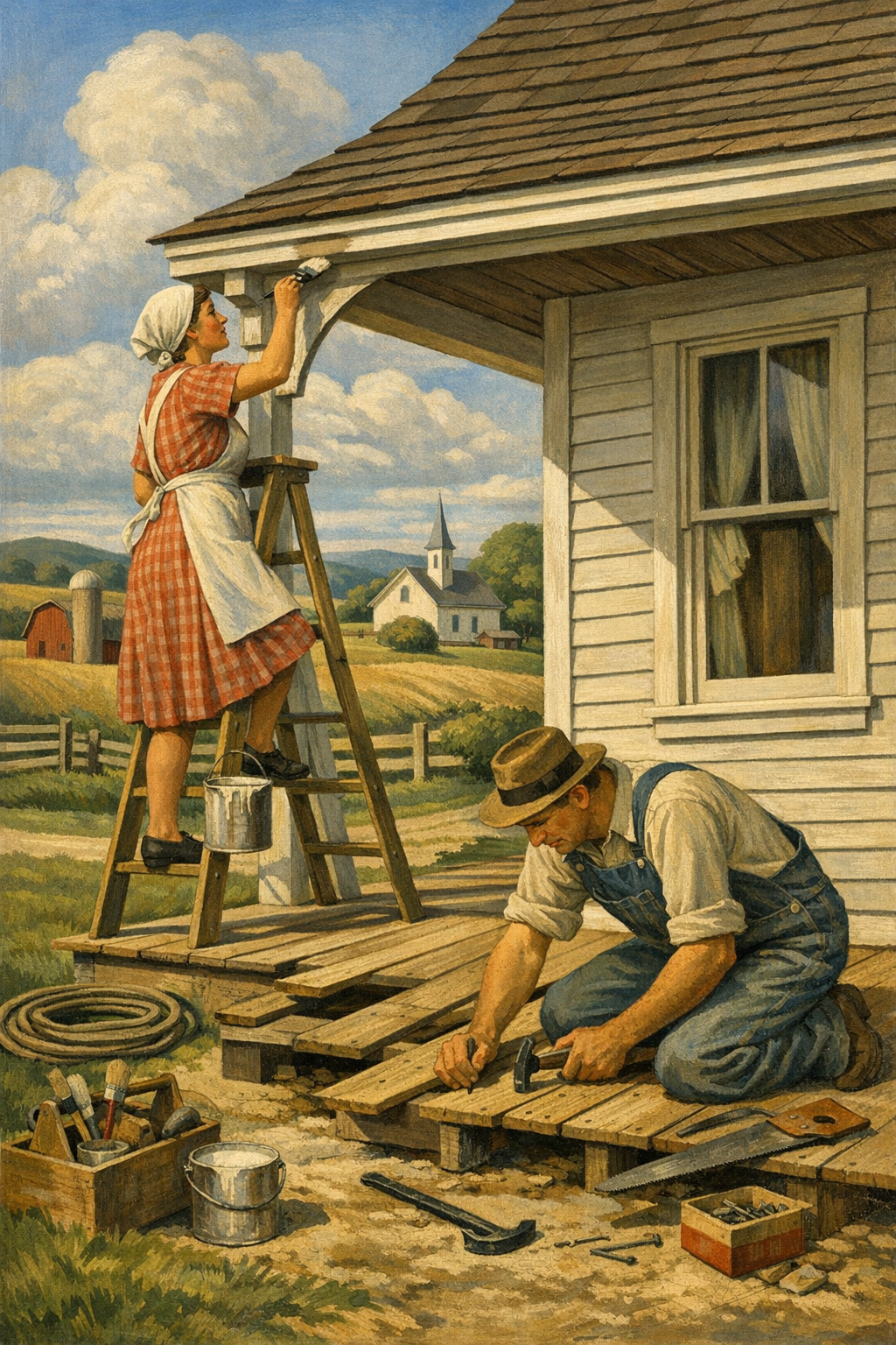
Here is the blunt truth: the industry still oversells color and undersells preparation. Exterior painting success depends on washing, scraping, sanding, caulking, spot priming, substrate repair, and using the correct product for wood, stucco, fiber cement, or masonry. A premium topcoat cannot rescue a weak surface.
If your home is due for a repaint, high-quality exterior painting services matter more than the trend label on the swatch. In neighborhoods across Glendale and surrounding communities, the best-looking homes are usually the ones where prep was taken seriously before a brush or sprayer ever came out.
Low-VOC and premium coatings are now expected
Homeowners are increasingly asking about low-VOC and zero-VOC products, and that is a healthy shift. Indoors, these formulas can improve comfort during and after painting. Outdoors, modern premium coatings from top brands now offer impressive color retention, adhesion, mildew resistance, and washability. The old trade-off between healthier products and performance is getting smaller every year.
What the Industry Still Gets Wrong About Color Selection
Too many painting projects fail before the first coat because the decision process is backwards. People pick a color from a phone screen, buy the cheapest quote, and expect premium results. That is not how professional finishes work.
Paint chips are not enough
A fan deck is a starting point, not a verdict. Colors need to be tested at scale, on the actual surface, in the actual room, and observed in morning, afternoon, and evening light. This matters even more with the subtle, complex hues driving paint color trends 2026. Warm neutrals, smoky greens, and mineral blues all shift visibly depending on exposure and nearby materials.
Cheap bids create expensive walls
Many low-price painters cut labor where it hurts most: prep, masking, repairs, primer, and dry-time discipline. Then the homeowner blames the color when the real issue is workmanship. Uneven sheen, flashing, roller texture inconsistency, weak coverage, and visible patching are not “normal.” They are symptoms of a rushed process.
That is why homeowners often look at what our clients are saying before choosing a painter. Trust matters because you are not just hiring someone to apply paint. You are hiring a process, a standard, and a set of decisions that will remain visible every day.
Trend chasing is not design strategy
There is nothing wrong with using trend forecasts. The problem comes when they are used blindly. A color can be nationally popular and still be wrong for your home’s fixed finishes, trim profile, ceiling height, or natural light. The smartest projects borrow from trends without becoming controlled by them.
For homeowners balancing resale, personal taste, and long-term livability, the best palette is usually one that feels current but not fragile. That means sophistication over novelty and consistency over social-media drama.
Professional Application Matters More Than Trendy Paint Names
Paint color trends 2026 may grab the headlines, but application quality still determines whether the finished room looks elegant or disappointing. A beautiful color with poor cut lines, drips, holidays, or texture inconsistency is still a poor result. Execution is what turns trend into value.
Tools, finish selection, and surface prep change everything
Professionals know when to spray, when to roll, and when to combine both. They know that a flat finish can hide wall imperfections but may not suit a high-traffic hallway. They know when drywall repairs need sealing primer and when trim needs a harder enamel. They know that dark colors often require more careful sequencing and back-rolling to achieve uniformity.
That technical judgment becomes even more important in remodels, occupied homes, cabinet projects, and commercial spaces. Businesses evaluating commercial painting services face the same truth: color matters, but preparation, scheduling, durability, and consistency matter more.
Why local experience matters in the Denver metro area
There is a clear advantage to working with painters who understand local housing stock, weather patterns, and buyer preferences. A 1920s Denver bungalow, a Centennial two-story, a Glendale townhome, and a Brighton new build do not respond to the same palette or product system in the same way. Local experience helps translate national trends into practical decisions that hold up in real homes.
If you want a better sense of how professional execution affects the final result, viewing completed projects and speaking with local homeowners is far more useful than scrolling endless inspiration photos. And when you are ready to move from ideas to planning, the easiest step is to get in touch with our team for guidance tailored to your home, your surfaces, and your goals.
Frequently Asked Questions
Q: What are the most popular paint color trends for 2026?
The biggest paint color trends for 2026 include warm whites, mushroom neutrals, sage and olive greens, muted blue-grays, and earthy clay-inspired tones. These colors feel softer and more architectural than the cold grays that dominated previous years. The strongest trend is not one single shade, but a move toward warmer, more layered palettes.
Q: Are gray walls still in style in 2026?
Gray is not completely gone, but the cooler, blue-based grays are losing ground. In 2026, homeowners are choosing warmer grays, greiges, taupes, and mushroom tones that feel more natural and easier to live with. Gray still works when it has the right undertones and suits the room’s lighting.
Q: Which paint colors work best in Denver homes?
Denver homes often benefit from colors that can handle strong natural light and shifting seasonal conditions. Warm whites, muted greens, soft taupes, and balanced blue-grays tend to perform well because they do not become overly harsh or washed out as easily. Large test samples are especially important in Colorado’s bright light.
Q: What exterior paint colors are trending in 2026?
Trending exterior colors for 2026 include warm greige, soft mushroom, olive-gray, creamy off-white, and selective use of charcoal or deep blue accents. Homeowners are moving away from extreme contrast and choosing more natural combinations that age better. Durability and fade resistance are just as important as style on exteriors.
Q: Should I choose paint colors myself or hire a professional color consultant?
If you are selecting multiple colors, repainting a large area, or working with tricky light, a professional color consultant is often worth it. A trained expert can identify undertones, test colors properly, and match the palette to your fixed finishes and architecture. That usually prevents costly repainting and second-guessing later.
Q: Do trendy paint colors hurt resale value?
Trendy colors only hurt resale when they are too extreme, too personal, or poorly applied. Thoughtful, current colors that work with the home’s style can actually improve perceived value and make a property feel more updated. The safest approach is to use trend-forward colors in a restrained, cohesive way.
Paint color trends 2026 are more sophisticated than the market often admits. Homeowners are no longer satisfied with generic gray walls and one-size-fits-all white trim. They want colors that respond to real life—sunlight, architecture, daily use, mood, maintenance, and long-term value.
That is especially true across the Denver metro area, where light, climate, and design expectations all raise the stakes. Whether the goal is a warmer interior palette, a smarter exterior repaint, or a more polished finish in a high-traffic commercial space, the right result comes from pairing strong color decisions with disciplined prep and skilled application.
1 of a Kind Painting helps homeowners and businesses navigate those decisions with a practical, high-craft approach. From fresh interiors and durable exteriors to color guidance rooted in how spaces actually function, the goal is simple: deliver results that feel current now and still look right years from now.
Ready to Transform Your Space?
Whether you’re refreshing your home’s interior, updating your exterior curb appeal, or tackling a commercial repaint anywhere in the Denver metro area, 1 of a Kind Painting has the experience, craftsmanship, and attention to detail to deliver results that truly stand out.
👉 Interior Painting
|
👉 Exterior Painting
|
👉 Contact Us Today