Denver Paint Color Trends 2026: How to Use Bold, Climate‑Smart Neutrals for Stunning Interiors and Durable Exteriors in Denver Homes
Safe paint colors are officially losing the room. The biggest shift in paint color trends is not a single trendy shade, but a more confident approach to using color with purpose, depth, and architectural intent. Homeowners and property managers across the Denver metro area are moving away from flat, forgettable palettes and toward richer interiors, smarter exteriors, and finishes that actually respond to how a space is used.
Table of Contents
- Why Paint Color Trends Are Getting Bolder
- The Top Interior Paint Color Trends Homeowners Are Choosing
- Exterior Paint Color Trends in Denver’s Climate
- How Finish, Light, and Surface Prep Change the Final Result
- DIY vs. Professional Results: Where Paint Trends Go Wrong
- How to Choose a Trend That Still Looks Good in Five Years
- Frequently Asked Questions
Why Paint Color Trends Are Getting Bolder
The era of default gray is fading. That does not mean neutral paint is dead, but it does mean homeowners are demanding more personality from their walls, cabinets, and exterior color schemes. Major brands like Sherwin-Williams, Benjamin Moore, Behr, and PPG have all leaned into warmer neutrals, earthy greens, moody blues, clay tones, and soft off-blacks because people want homes that feel intentional rather than staged for resale.
Part of that shift is emotional. People now spend more time noticing how a room feels at 7 a.m., at midday, and under lamps at night. A cold gray that once looked “clean” can now feel sterile, especially in open-concept homes with hard flooring and limited texture. Color psychology matters more than trend forecasting alone. Soft olive can calm a bedroom, deep navy can ground a dining room, and warm beige can make a north-facing living room feel far more welcoming than a standard builder white.
The other reason trends are changing is practical. Better paints, better primers, and more informed consumers have raised expectations. Clients are asking sharper questions about sheen, washability, low-VOC options, and whether a color will hold up under Denver’s bright natural light. That is a healthy development. Paint should not just look good on a swatch; it should perform on an actual wall.
What the major brands are signaling
While annual color forecasts vary, a few clear themes keep showing up:
- Warmer whites replacing stark, blue-based whites
- Earth-driven greens inspired by sage, olive, and eucalyptus
- Deep blues and blue-grays for cabinetry, offices, and exteriors
- Muted terracotta and clay tones for accent walls and front doors
- Complex neutrals with undertones that shift beautifully in daylight
These directions are not random. They reflect a broader move toward homes that feel layered, tactile, and less disposable. If you are exploring professional color consultation, this is exactly where expert guidance pays off: not in chasing trends blindly, but in identifying which trend actually fits your home’s architecture, lighting, and finishes.
The Top Interior Paint Color Trends Homeowners Are Choosing
Interior paint color trends are becoming more immersive. Instead of treating walls as background, homeowners are using paint to define mood, create contrast, and make basic rooms feel custom. That includes color drenching, tone-on-tone trim packages, darker cabinet colors, and subtle decorative finishes that add character without becoming gimmicks.
Color drenching is no longer a designer-only move
Color drenching means using one color across walls, trim, doors, and sometimes even ceilings. Done badly, it can feel oppressive. Done well, it makes a room feel deliberate, high-end, and surprisingly calm. This works especially well in studies, powder rooms, dining rooms, and primary bedrooms where a cocooning effect is welcome.
In Denver homes with strong natural light, color drenching often performs better than people expect. Bright daylight reveals depth and prevents rich shades from turning muddy. In the evening, the same room becomes more intimate. That range is a feature, not a flaw. Flat, one-note paint colors cannot do that.
Warm whites are replacing cold whites
One of the clearest paint color trends is the move toward warm whites like Sherwin-Williams Alabaster, Benjamin Moore White Dove, and other soft whites with creamy or greige undertones. Homeowners still want a fresh backdrop, but fewer are willing to live with a white that feels clinical against wood flooring, stone counters, or black fixtures.
Warm whites are particularly effective in kitchens, hallways, and living spaces because they play better with mixed materials. They also work beautifully in homes preparing for a refresh through interior painting services, especially when the goal is a clean update that still feels livable.
Green is no longer “risky”
Sage, olive, moss, and smoky green have moved from trend reports to real-world walls. Green works because it behaves almost like a neutral when the undertone is balanced. It complements wood, brass, black, and natural stone, and it feels at home in both traditional and modern interiors.
We are also seeing green used more often on cabinets, built-ins, and entry doors. That makes sense. Color belongs on surfaces that deserve emphasis. A kitchen island in a muted green or a mudroom built-in in a deeper olive can carry more visual weight than an accent wall that feels like an afterthought.
Decorative finishes are returning, but with restraint
Yes, decorative painting is back. No, not in the faux-Tuscan way people regretted twenty years ago. Limewash, Venetian plaster-inspired finishes, and subtle mineral looks are gaining traction because they add movement and softness that standard paint sometimes lacks.
These finishes are especially effective in dining rooms, feature walls, boutique commercial spaces, and upscale residential projects where clients want distinction without loud pattern. If you want to see how nuanced finish work transforms a space, browsing our project gallery can help you understand the difference between a color on paper and a finish executed correctly in a real room.
A trend is only worth following if it survives real light, real traffic, and real daily use.
— 1 of a Kind Painting
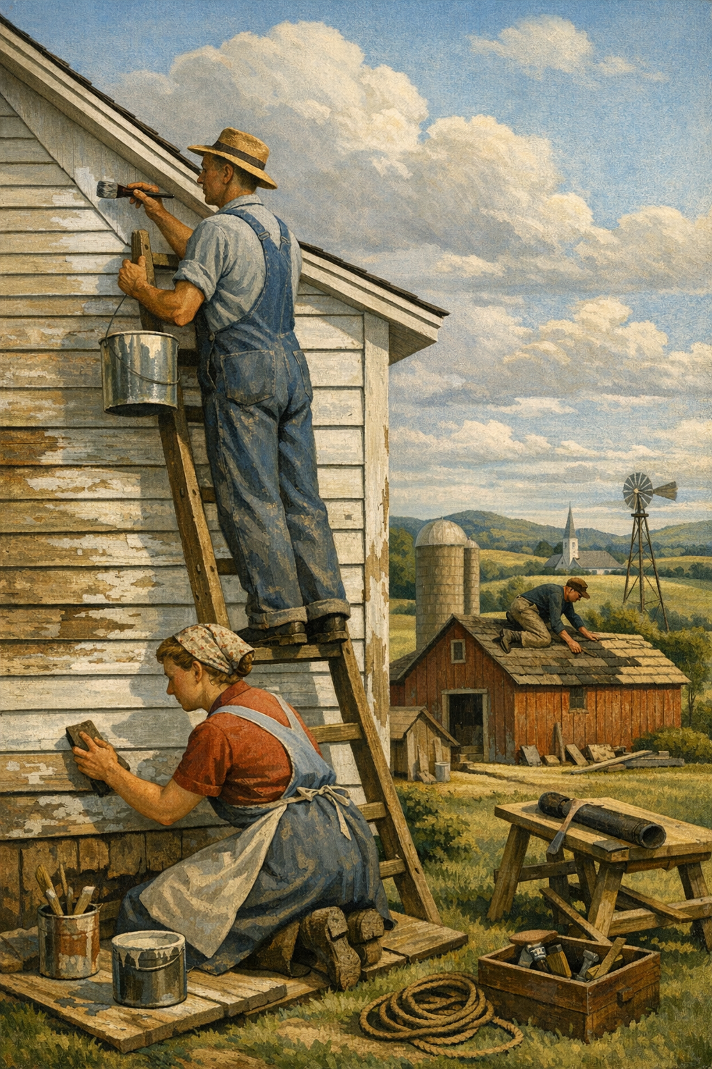
Exterior Paint Color Trends in Denver’s Climate
Exterior color selection in Colorado is not just about style. It is about sun exposure, altitude, substrate condition, and how a color reads against roofing, masonry, landscaping, and snow glare. A color that looks elegant in a coastal market can look washed out or oddly harsh in Denver’s intense light.
That is why current exterior paint color trends in the region favor grounded palettes: warm whites, softened taupes, charcoals, muted greens, blue-grays, and darker accent trim. Homeowners want curb appeal, but they also want stability. Wild exterior color decisions age fast. Balanced, climate-aware palettes age much better.
What works in Denver, Aurora, Centennial, Glendale, and Brighton
The Denver metro area includes a wide range of home styles, from classic brick ranches to newer suburban builds in Centennial and Brighton. In Glendale and Aurora, mixed architectural styles make context even more important. A strong exterior palette should account for:
- Brick and stone undertones
- Direct UV exposure
- HOA restrictions
- Dust, weather swings, and seasonal contrast
- Trim, fascia, soffit, and door relationships
Warm greige siding with a charcoal front door often performs better than trendy high-contrast black-and-white schemes that can look overly stark in bright Colorado sun. Likewise, muted greens and earthy taupes tend to integrate well with natural landscapes and mountain-adjacent aesthetics.
If your home needs a full exterior refresh, professional planning matters as much as application. A quality exterior project starts long before the first coat, and homeowners looking for durable results should explore exterior painting services that prioritize washing, scraping, repairs, priming, and climate-appropriate products.
Commercial properties are trending cleaner and more brand-aware
Commercial painting trends are also shifting. Retail, office, hospitality, and mixed-use properties are moving toward color systems that feel cleaner, more modern, and more aligned with brand identity. Flat beige commercial interiors are being replaced with strategic contrast, durable eggshell or satin systems, and accent zones that help with wayfinding and customer experience.
For property managers and business owners, the smartest trend is not dramatic color. It is consistency, maintenance planning, and coatings that support the actual function of the building. For offices, medical spaces, retail environments, and tenant improvements, commercial painting services should focus on durability, low-odor scheduling, and minimal disruption to operations.
Local conditions matter here too. Whether you need painting services in Denver, CO or are coordinating work in nearby communities, the right color strategy should balance branding, traffic, and long-term maintenance.
How Finish, Light, and Surface Prep Change the Final Result
Most color failures are not actually color failures. They are prep failures, sheen mistakes, or lighting misreads. The same paint color can look refined in one home and disappointing in another depending on substrate condition, texture, and the amount of natural or artificial light hitting the surface.
Sheen can make or break a trend color
A beautiful color in the wrong finish will expose every flaw. Higher sheen highlights texture, patches, lap marks, and drywall imperfections. Lower sheen softens surfaces but may reduce scrub resistance in high-traffic spaces. Here is a practical overview:
| Finish | Best Use | Pros | Potential Drawback |
|---|---|---|---|
| Flat/Matte | Bedrooms, ceilings, low-traffic walls | Soft look, hides imperfections well | Less washable in busy areas |
| Eggshell | Living rooms, hallways, dining rooms | Balanced appearance and durability | Can still reveal poor patchwork |
| Satin | Kitchens, baths, trim in some homes | More washable, slightly luminous | Shows surface flaws more readily |
| Semi-Gloss | Trim, doors, cabinets | Durable and easy to clean | Highlights dents and brush marks |
Trend-forward colors need disciplined prep. Deep blues, greens, and off-blacks are less forgiving than generic beige. They can flash, streak, or absorb light unevenly if the wall is not sanded, patched, and primed correctly. The same goes for cabinet painting, where adhesion systems, degreasing, and cure time separate durable work from a peeling mess six months later.
Low-VOC and zero-VOC products are now the expectation
Eco-friendly paint is no longer a niche preference. Homeowners routinely ask for low-VOC and zero-VOC products because they want better indoor air quality, especially in occupied homes with children, pets, or sensitive occupants. Fortunately, many premium lines from leading brands now offer excellent coverage, durability, and lower odor without sacrificing appearance.
That said, “eco-friendly” is sometimes used as a lazy marketing label. The real conversation should include total system performance: primer compatibility, cure time, washability, touch-up behavior, and how the product performs on repaired surfaces. Good paint helps, but good process matters more.
DIY vs. Professional Results: Where Paint Trends Go Wrong
The internet has made painting look easier than it is. Watching a thirty-second transformation video is not the same as understanding substrate prep, moisture issues, product selection, masking, cut lines, or dry-time windows. This is where many trend-driven projects go sideways.
The biggest DIY mistakes with modern paint trends
- Skipping test samples in the actual room
- Choosing color from a phone screen instead of real light
- Using the wrong nap, brush, or sprayer setup
- Painting over glossy or damaged surfaces without proper prep
- Underestimating the importance of primer and caulking
- Assuming one coat is enough for saturated colors
Many of the boldest paint color trends demand tighter execution, not looser. Dark trim requires crisp lines. Cabinet refinishing requires controlled environments and coating discipline. Exterior transformations require moisture awareness, substrate inspection, and weather timing. Cheap shortcuts are painfully visible in paint.
This is also why reputation matters when hiring a contractor. A polished estimate means very little if the crew cuts corners on prep or rushes cure time. Before committing to a company, read what our clients are saying and look for proof of consistency, cleanliness, communication, and follow-through.
Professional painters are not just applying color
A true professional is solving a chain of problems before they become visible. That includes identifying failing caulk, hairline cracks, water staining, peeling coatings, tannin bleed, drywall inconsistencies, and sheen mismatches from prior work. When trend colors are involved, that expertise becomes even more valuable because stronger colors and specialty finishes expose weak workmanship quickly.
The painting industry also depends on skilled labor, training, and accountability. When the conversation turns to craftsmanship and the future of the trade, workforce quality matters. Strong companies invest in systems and people rather than treating painting like unskilled labor. That is one reason conversations around subcontractor opportunities and trade standards are increasingly important in maintaining quality across the industry.
How to Choose a Trend That Still Looks Good in Five Years
The smartest way to use paint color trends is selective adoption. Do not ask whether a color is trending. Ask whether it belongs in your home, on your architecture, under your lighting, and alongside your fixed finishes. Trend relevance matters far less than contextual fit.
A practical framework for choosing paint colors
Before finalizing a color, consider these five filters:
- Light: How does the color look morning, afternoon, and evening?
- Undertone: Does it fight your flooring, counters, tile, or brick?
- Sheen: Will the finish support the room’s traffic and wall condition?
- Scale: Is the color best for a whole room, trim, cabinets, or one focal area?
- Longevity: Will you still like it once the trend cycle moves on?
For many homeowners, the answer is not to avoid bold color. It is to place it strategically. A moody office, a richly painted powder room, or a sophisticated front door can satisfy trend appetite without overcommitting the whole house. Meanwhile, the main living envelope can stay anchored in complex neutrals that adapt well over time.
That balanced approach is especially helpful in fast-moving local markets. Whether you are renovating in Aurora, refreshing a family home in Centennial, or updating a property near Glendale or Brighton, thoughtful paint choices can increase perceived quality without making the home feel overly personalized.
Paint should never feel accidental. The best projects look effortless only because someone made disciplined decisions about color, prep, finish, and application. If you want a result that feels current without becoming dated next season, the right process matters every bit as much as the right swatch.
Frequently Asked Questions
Q: What are the biggest paint color trends right now?
The strongest paint color trends include warm whites, earthy greens, deep blues, clay-inspired accents, and complex neutrals with soft undertones. Homeowners are also embracing color drenching and richer cabinet colors instead of relying on flat gray palettes.
Q: Which exterior paint colors work best in Denver, Colorado?
In Denver’s bright sunlight and variable climate, warm whites, greiges, muted greens, blue-grays, and balanced charcoals tend to perform well. The best choice depends on your roof color, masonry, landscaping, and how intense sun exposure affects the way the paint reads.
Q: Is color drenching a good idea for smaller rooms?
Yes, especially in powder rooms, offices, and bedrooms where a cohesive, enveloping feel is desirable. Using one color across walls, trim, and sometimes the ceiling can make a room feel more intentional and architectural rather than chopped up.
Q: Are low-VOC paints durable enough for busy homes?
Yes, many premium low-VOC and zero-VOC products now offer excellent durability, coverage, and washability. Performance still depends on proper surface preparation, the right primer, and using the appropriate finish for the room.
Q: Should I follow paint trends if I plan to sell my home?
Yes, but selectively. The best strategy is usually a timeless base palette with carefully placed trend-forward accents, because that keeps the home feeling current without narrowing buyer appeal.
Q: When should I hire a professional painter instead of doing it myself?
Hire a professional when the project involves exterior work, cabinets, dark colors, damaged surfaces, large square footage, or a finish that needs to look consistently sharp. Those situations demand stronger prep, better tools, and more precise application than most DIY jobs can deliver.
The real lesson behind current paint color trends is simple: people are no longer satisfied with paint that merely covers. They want paint that shapes mood, improves curb appeal, respects architecture, and holds up under real use. That means warmer neutrals, smarter bold colors, better exterior palettes, and a much sharper understanding of how light, sheen, and preparation affect the final outcome.
For homeowners and property managers across the Denver metro area, that shift is a good thing. It rewards thoughtful decisions and exposes lazy workmanship. Whether the project is a subtle interior refresh, a full exterior transformation, or a commercial repaint, the details matter. The right team can help translate a trend into something more durable, more functional, and more personal than a generic color forecast ever could.
If you are weighing options for your next project, from whole-home updates to targeted improvements in Centennial, Glendale, Aurora, Brighton, or Denver, 1 of a Kind Painting brings the kind of preparation, craftsmanship, and product knowledge that trend-driven projects actually require. If you are ready to compare ideas, review finishes, or plan your next repaint, get in touch with our team to start the conversation.
Ready to Transform Your Space?
Whether you’re refreshing your home’s interior, updating your exterior curb appeal, or tackling a commercial repaint anywhere in the Denver metro area, 1 of a Kind Painting has the experience, craftsmanship, and attention to detail to deliver results that truly stand out.
👉 Interior Painting
|
👉 Exterior Painting
|
👉 Contact Us Today