Recommended headline: – Color Strategy, Not Color Chaos: 2026 Paint Trends That Elevate Denver Homes Alternatives (optional): – Warmth with Purpose: The 2026 Paint Trends Denver Homes Can’t Ignore – Beyond Beige: How 2026 Paint Colors Shape Mood, Durability, and Resale in Denver – From Chips to Strategy: The 2026 Color Playbook for Denver–Area Homes – Elevate Your Space with Color Strategy: 2026 Trends for Denver, Aurora, and Beyond
Most homes do not need more color—they need better color strategy. That is exactly why paint color trends 2026 are shifting away from safe, forgettable beige and toward warmer, more intentional palettes that actually change how a room feels, photographs, and ages over time. For homeowners and property managers across Denver, Aurora, Centennial, Glendale, and Brighton, this is more than a style conversation; it is a decision that affects resale appeal, maintenance, mood, and long-term satisfaction.
Table of Contents
- Why Paint Color Trends Matter More Than Ever
- The Biggest Paint Color Trends for 2026
- How Denver Homes Change the Way Colors Behave
- The Finishes, Products, and Prep Work That Separate Great Results from Cheap Work
- DIY vs. Hiring a Professional for Trend-Driven Color Updates
- How to Choose the Right Trending Color Without Regretting It
- Frequently Asked Questions
Why Paint Color Trends Matter More Than Ever
Paint color trends are not trivial. They influence how large a room feels, how clean a property appears, how natural light is reflected, and how current a home or business looks to visitors, buyers, and tenants. In a market like the Denver metro area, where design preferences are increasingly shaped by mountain-modern architecture, natural materials, and high-contrast interiors, paint is no longer just a finishing touch. It is a design system.
That matters because too many painting projects still begin with an outdated approach: pick a color chip under fluorescent lighting, hope for the best, and assume the painter can “make it work.” That is how people end up with icy whites that look blue at sunset, muddy greiges that kill natural light, or trendy greens that suddenly feel oppressive in north-facing rooms. The industry has normalized rushed color selection, and homeowners pay for that mistake twice—once in labor and again in disappointment.
The better approach is to treat paint color as part of a larger performance equation:
- Lighting orientation changes undertones dramatically
- Sheen level affects how color reads on walls and trim
- Surface preparation influences final uniformity
- Local climate and dust affect exterior durability and curb appeal
- Existing materials like stone, flooring, cabinets, and countertops must coordinate
Homeowners planning a full refresh often start with interior painting services, while those updating curb appeal or weather-worn siding may need exterior painting services. In both cases, trend awareness only matters if execution is disciplined.
The Biggest Paint Color Trends for 2026
The biggest story in paint color trends 2026 is warmth with restraint. Major brands such as Sherwin-Williams, Benjamin Moore, Behr, and PPG have all continued moving away from stark grayscale minimalism and toward earthy neutrals, softened greens, clay tones, mineral blues, and complex off-whites. The days of defaulting to bright builder white everywhere are fading. That trend is not bold rebellion—it is overdue correction.
Warm whites are replacing cold whites
Clean white walls are not disappearing, but the preferred version is changing. Homeowners are choosing whites with subtle cream, sand, or mushroom undertones over sterile blue-based whites. Think Sherwin-Williams Alabaster, Benjamin Moore White Dove, or other softened whites that hold up better in Colorado daylight. These shades feel calmer, richer, and far more livable.
Earthy greens continue to dominate
Sage, olive, eucalyptus, and muted moss tones remain strong because they connect interiors to nature without becoming loud. Used in offices, bedrooms, kitchens, and even cabinetry, these shades work especially well with white oak, black hardware, warm brass, and natural stone. The mistake is assuming every green is timeless. Some trend well on social media and fail miserably on actual walls. The successful choices are usually grayed down and balanced, not neon-fresh or overly yellow.
Clay, terracotta, and mineral-inspired neutrals are gaining ground
Expect to see more warm taupes, rosy browns, dusty terracottas, and muted adobe-inspired colors in dining rooms, powder baths, accent walls, and hospitality spaces. This shift makes sense in Colorado, where regional architecture, sunlight, and landscape all support warmer, desert-adjacent color stories. In the right setting, these shades feel grounded rather than trendy.
Deep blue and charcoal are still strong for cabinetry and feature areas
While whole-house dark walls remain a niche choice, deep navy, inky blue, iron charcoal, and graphite continue to perform well on kitchen islands, built-ins, office cabinetry, and commercial focal areas. The appeal is simple: they create contrast without shouting. Used correctly, they look custom. Used everywhere, they look heavy.
Exterior palettes are becoming more architectural
For exteriors, color trends are moving toward layered neutrals: warm white body colors, greige or bronze trim, natural wood accents, and darker doors in black, green, or blue-gray. This works especially well in neighborhoods where mountain modern, updated ranch, and transitional styles dominate. Property owners seeking painting services in Denver, CO are increasingly prioritizing palettes that feel current without becoming risky resale decisions.
The era of choosing paint colors from a tiny chip and calling it design is over. Real color selection now requires context, testing, and the courage to reject bad trends before they hit your walls.
— 1 of a Kind Painting
How Denver Homes Change the Way Colors Behave
Denver light is unforgiving in the best and worst ways. The region’s altitude, bright sun, seasonal shifts, and dry climate can make beautiful paint colors look exceptional—or expose every undertone mistake in a matter of hours. That is why national trend reports are useful, but they are not enough on their own. A color that looks balanced in a coastal showroom may look harsh, washed out, or oddly yellow in a Denver living room.
High-altitude light amplifies contrast
Rooms with abundant sun often make pale colors appear brighter and sharper than expected. Crisp whites can feel clinical. Cool grays can read colder. Strong accent colors can look more saturated. That is one reason many Denver-area homes are embracing warmer neutrals and soft earth tones. They hold up better in intense natural light and feel less brittle across changing seasons.
Snow, stucco, brick, and landscaping matter outside
Exterior painting in Colorado is not just about body color. Snow reflection, red brick, tan stone, evergreen landscaping, and intense UV exposure all affect perception. A soft beige that looks elegant in theory may disappear against a dusty lot. A cool gray may clash with warm masonry. A dark paint color on the wrong elevation may absorb heat and show fading faster. Exterior color is part design, part environmental strategy.
Neighborhood context still matters
Homeowners in Centennial may want a cleaner transitional look, while Glendale properties may lean more urban and contrast-driven. Brighton homes often benefit from palettes that handle open light and dust gracefully, and Aurora neighborhoods can vary dramatically depending on home age and architectural style. Looking at our project gallery can help homeowners see how paint behaves on real properties rather than idealized marketing images.
For color-focused projects, a professional color consultation is often the difference between a polished result and a costly repaint. That is not upselling—it is damage prevention.
The Finishes, Products, and Prep Work That Separate Great Results from Cheap Work
Color gets the attention, but preparation and product selection decide whether the job actually looks premium. Too many painters still cut corners on cleaning, patching, sanding, spot priming, and caulking, then blame the paint when the finish flashes, peels, or looks uneven. Trendy colors do not rescue weak craftsmanship. In fact, they expose it faster.
Low-VOC and premium formulations are no longer optional for many projects
Eco-conscious paint choices are now mainstream, especially for occupied homes, nurseries, offices, and commercial interiors. Premium low-VOC and zero-VOC products from Sherwin-Williams, Benjamin Moore, Behr, and PPG offer better indoor comfort without sacrificing washability or color depth. The old excuse that cleaner paint means weaker performance is largely outdated. Modern premium coatings have closed that gap significantly.
Sheen selection is a technical decision, not a habit
One of the laziest habits in the industry is using the same sheen in every room. Different surfaces need different levels of durability, washability, and light reflection. Here is a practical comparison:
| Area | Recommended Sheen | Why It Works |
|---|---|---|
| Living rooms and bedrooms | Matte or eggshell | Soft look, low glare, forgiving on minor wall imperfections |
| Kitchens and bathrooms | Eggshell or satin | Better moisture resistance and easier cleaning |
| Trim and doors | Satin or semi-gloss | Highlights detail and improves scrub resistance |
| Cabinets | Satin, semi-gloss, or specialty cabinet finish | Improves durability and creates a smoother furniture-like look |
| Commercial high-traffic spaces | Eggshell to semi-gloss depending on use | Balances maintenance needs with appearance |
Surface prep is where premium results are won
Walls should be cleaned, repaired, and sanded. Stains need proper blocking primer. Glossy surfaces need deglossing or abrasion. Exterior substrates need pressure washing, scraping, feather sanding, and correct caulking. Wood trim and cabinets demand especially careful prep if the goal is a smooth modern finish. Anyone promising dramatic transformation without prep is selling fantasy.
Commercial spaces have different coating demands
Retail, office, industrial, and multifamily settings often require faster scheduling, odor control, durability, and coatings tailored to traffic or substrate type. For businesses planning updates, commercial painting services should involve more than color application; they should include workflow planning, product matching, and finish expectations that hold up under daily use.
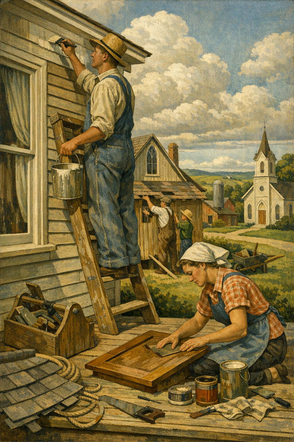
DIY vs. Hiring a Professional for Trend-Driven Color Updates
DIY painting is not always a mistake—but trend-driven painting projects are less forgiving than people think. A simple bedroom repaint in an established color may be manageable for a careful homeowner. Whole-home color transitions, exterior repaints, cabinet refinishing, stairwells, vaulted spaces, and dark-to-light conversions are a different category entirely.
Why DIY often goes sideways
The biggest DIY failures are rarely caused by effort. They are caused by sequencing, material selection, and false confidence. Homeowners underestimate how much time is spent on masking, patching, sanding, dust control, priming, and cut lines. They also overestimate the accuracy of online color previews. By the time they realize the undertone is wrong, they are already committed.
What professionals actually bring to the table
Professional painters bring process. That means sample testing, substrate evaluation, better tools, cleaner lines, efficient scheduling, and products matched to the job. It also means accountability. If you are comparing estimates, look beyond price and ask how the company handles prep, sample approvals, primer, sheen guidance, and cleanup. Reading what our clients are saying can reveal whether a contractor consistently delivers the result they promise.
The hidden cost of cheap painting
The cheapest bid is often the most expensive outcome. Thin coverage, skipped prep, rushed crews, mismatched touch-ups, and improper caulking create cosmetic defects that keep showing up long after the invoice is paid. This is especially true with modern trend colors, where depth, undertone, and finish consistency matter more than ever. A premium room painted badly never looks premium.
The painting trade also depends on skilled labor, training, and craftsmanship. Companies investing in strong crews and standards help elevate the industry, and for professionals interested in the trade, there are even subcontractor opportunities tied to that level of workmanship.
How to Choose the Right Trending Color Without Regretting It
The smartest way to use paint color trends 2026 is not to chase them literally. It is to understand the direction of the market and then adapt it to your home, your light, and your architecture. Trend awareness is useful. Trend obedience is not.
Start with fixed elements first
Before choosing wall color, look at flooring, countertops, cabinets, tile, fireplace stone, brick, roofing, and large furniture. These elements are expensive to change and will either support or sabotage a paint choice. If your home has warm wood floors and creamy stone, forcing a cool gray palette usually creates tension instead of sophistication.
Sample on multiple walls, not just one spot
Colors shift throughout the day. Test large samples on different walls and check them in morning, afternoon, evening, and lamplight conditions. A color that feels balanced in direct sun may go flat in shade. A beige that seems safe may suddenly read pink. Small swatches lie. Bigger samples tell the truth.
Use trends in layers
You do not need to paint every room olive or every exterior trim piece black. Often the best way to bring in a trend is through strategic applications:
- Accent walls in offices or dining rooms
- Cabinet updates in soft green, navy, or mushroom tones
- Interior doors in deep charcoal or muted blue
- Powder rooms with richer, more adventurous color
- Exterior doors and shutters for modernized curb appeal
Do not ignore the emotional function of each room
Bedrooms usually benefit from softer, lower-stimulation tones. Kitchens can handle cleaner contrast. Home offices often improve with colors that feel grounded and focused rather than sleepy. Commercial settings need to consider brand identity, customer movement, and maintenance. Good color selection is psychological as much as visual.
Homeowners comparing palettes for renovations in surrounding communities often benefit from localized guidance, whether they need painting services in Centennial, CO or help coordinating colors across multiple spaces. The goal is never just to be current. The goal is to look intentionally current.
Frequently Asked Questions
Q: What are the most popular paint color trends for 2026?
The strongest paint color trends for 2026 include warm whites, earthy greens, clay-inspired neutrals, muted blues, and layered exterior palettes with natural contrast. The overall move is away from cold grays and toward colors that feel softer, more grounded, and more architectural.
Q: Are gray walls still in style in 2026?
Gray is not completely gone, but flat, cool gray is losing favor in many homes. More homeowners are choosing warmer greiges, taupes, and off-whites because they feel more natural in everyday living spaces and work better with current flooring and wood tones.
Q: What paint colors work best in Denver homes?
Denver homes often benefit from warm whites, balanced greiges, muted greens, and mineral-inspired colors because intense natural light can make cool tones feel harsher. The right choice depends on elevation, room orientation, existing materials, and whether the space gets strong sun or shade.
Q: Should I hire a painter for a color trend update or do it myself?
A simple single-room repaint may be manageable for a skilled DIYer, but whole-home updates, cabinets, exteriors, and trend-sensitive colors usually benefit from professional execution. Painters can help with prep, product selection, sample testing, and finish consistency, which reduces the risk of costly mistakes.
Q: What is the best paint finish for interior walls?
Matte and eggshell are common choices for most interior walls because they balance appearance and usability. Kitchens, bathrooms, trim, and doors usually need more washable finishes such as satin or semi-gloss depending on moisture, traffic, and cleaning needs.
Q: Do low-VOC paints actually perform well?
Yes, many modern low-VOC and zero-VOC paints perform extremely well when the right product is used for the right surface. Premium lines from major brands now offer strong coverage, durability, and color retention while reducing odor and improving indoor comfort during and after painting.
Paint trends are useful when they sharpen judgment, not when they replace it. The most successful projects in 2026 will not be the loudest or the most aggressively “designer.” They will be the ones where color, light, architecture, finish, and preparation are aligned from the start. That is what creates a result that still feels right a year from now, not just impressive on day one.
For homeowners and property managers across the Denver metro area, that means thinking beyond chips, social media screenshots, and bargain bids. Whether the goal is a warmer interior palette, a more architectural exterior, or a commercial repaint that reflects a stronger brand image, execution matters as much as taste. If you want guidance tailored to your home, your lighting, and your goals, get in touch with our team to talk through the next step.
At 1 of a Kind Painting, thoughtful color selection and disciplined craftsmanship go hand in hand. From modern interiors to durable exteriors and high-performance commercial spaces, the right process turns a trend into a lasting improvement rather than a passing experiment.
Ready to Transform Your Space?
Whether you’re refreshing your home’s interior, updating your exterior curb appeal, or tackling a commercial repaint anywhere in the Denver metro area, 1 of a Kind Painting has the experience, craftsmanship, and attention to detail to deliver results that truly stand out.
👉 Interior Painting
|
👉 Exterior Painting
|
👉 Contact Us Today