Here are five strong headline options you can use: – Color Drenching in Denver: How One Hue Across Walls, Trim, and Ceilings Is Redefining Home Interiors – From White Walls to Immersive Color: The Denver Trend That Unifies Spaces With One Rich Palette – The Color Drenching Revolution: Why Denver Homes Are Embracing Saturated, Cohesive Rooms – Denver Interiors Go Bold: Mastering Color Drenching for Depth, Cohesion, and Calm – One Color, Whole Room: The Practical Guide to Color Drenching for Denver Homes
White walls are no longer the safe choice people think they are. The biggest shift in interior painting trends is happening in plain sight: homeowners are moving away from timid contrast and embracing color drenching, the bold strategy of painting walls, trim, ceilings, and sometimes even doors in one unified hue. In Denver-area homes, where bright light, shifting seasons, and open-concept layouts can make rooms feel disconnected, this trend is proving far more practical than many skeptics expected.
Table of Contents
What Color Drenching Really Means
Color drenching is not just painting a room dark. It is the deliberate use of one color, or very close tonal variations of one color, across multiple architectural elements to create immersion, cohesion, and depth. That usually means walls, trim, crown molding, baseboards, built-ins, and ceilings all share the same color family. Sometimes radiators, shelving, and doors join in too.
The reason this works is simple: contrast is not always your friend. For years, the default formula was predictable—white trim, white ceiling, a cautious wall color, and maybe an accent wall if someone felt adventurous. That approach can still work, but in many homes it also chops up the space visually. Color drenching softens those hard edges and allows the architecture to feel more intentional.
Designers and premium paint brands like Sherwin-Williams, Benjamin Moore, Farrow & Ball, Behr, and PPG have all pushed richer, more enveloping palettes in recent forecasts. Earthy greens, smoky blues, warm taupes, cocoa browns, clay reds, and muted charcoals are leading the movement. These shades feel grounded rather than flashy, which is why the trend has staying power.
It also helps that modern paints are better than they used to be. Higher quality low-VOC and zero-VOC formulations make it easier to use more color indoors without the overwhelming odor and finish inconsistency that used to scare people away from bold choices. When paired with proper prep and application, a drenched room can feel luxurious instead of heavy.
Why the trend feels fresh instead of gimmicky
Unlike the accent wall craze, color drenching is not a trick. It is a full-room strategy rooted in proportion, light behavior, and finish control. A well-drenched room can make awkward soffits disappear, low ceilings feel more integrated, and ornate trim feel more sculptural. It solves visual problems instead of creating distractions.
If you are considering a whole-home refresh, this is exactly where expert interior painting services can make the difference between a designer look and a room that feels unexpectedly flat.
Why This Trend Is Taking Over Denver Homes
Denver’s natural light is a major reason this trend works so well locally. Homes in the metro area often get strong daylight, especially at elevation, and that can wash out weak paint colors. A color that looked soft and elegant on a chip can turn bland on the wall. Color drenching counters that problem by committing to saturation and creating a complete visual environment rather than a single painted surface.
There is also a practical side. Open layouts are common across newer homes in Denver, Centennial, Aurora, and Brighton, but open concept can easily become visually chaotic. When every transition gets a new trim color, ceiling break, or contrasting feature, the home loses calm. Color drenching restores order. It helps adjacent rooms feel connected without making the entire house feel identical.
Older homes in neighborhoods with more architectural character benefit too. Picture a study with built-in shelving, a dining room with crown molding, or a bedroom with angled ceilings. Painting those features in separate whites and off-whites often makes the room feel busier. A unified palette gives those details confidence.
Denver climate and lifestyle matter more than people think
Colorado homeowners live with strong sun, dry air, dust, and seasonal shifts that affect how colors read throughout the day. Morning light can bring out cool undertones. Evening light can make the same room feel warmer and moodier. This is why testing paint in a controlled way matters so much. The wrong undertone becomes obvious fast in Denver.
That is also why many homeowners benefit from a professional color consultation. Choosing a drenched palette is not about bravery; it is about understanding undertones, sheen, lighting direction, and how furnishings will interact with the painted envelope.
Local homeowners looking for painting services in Denver, CO are increasingly asking for spaces that feel curated rather than generic. That makes sense. People are spending more time at home, entertaining more intentionally, and expecting more from every room. The era of “builder beige plus bright white trim” is fading for a reason.
The safest paint choice is often the one that dates your home the fastest. Rooms with conviction age better than rooms designed to offend no one.
— 1 of a Kind Painting
Best Colors, Finishes, and Surfaces for Color Drenching
Not every color is a great candidate, and not every finish should be used the same way. The best color-drenched rooms are built on nuance, not brute force. You want a hue with enough depth to shift beautifully in changing light, but not so much intensity that the room feels oppressive.
Top color families for a drenched look
- Olive and moss greens: Sophisticated, calming, and especially strong in offices, dining rooms, and bedrooms.
- Blue-grays and stormy navies: Great for libraries, dens, powder rooms, and spaces where you want atmosphere.
- Warm taupes and mushroom tones: Ideal for homeowners who want richness without obvious color.
- Clay, terracotta, and muted burgundy: Bold but grounded, particularly effective in dining rooms and accent spaces.
- Soft charcoal and deep brown: Dramatic, current, and far more versatile than many people assume.
Popular examples often include Sherwin-Williams Evergreen Fog, Urbane Bronze, and Iron Ore; Benjamin Moore’s Knoxville Gray, Chelsea Gray, and Revere Pewter in deeper companion palettes; and Farrow & Ball tones that are known for strong pigment complexity. Brand matters less than undertone control and application quality.
Finish selection is where many projects succeed or fail
A color-drenched room does not mean every surface gets the exact same sheen. In fact, that is usually a mistake. Professionals often use subtle sheen shifts to preserve durability while keeping the visual effect unified.
| Surface | Recommended Finish | Why It Works |
|---|---|---|
| Walls | Matte or eggshell | Softens light reflection and creates a rich, even field of color |
| Ceilings | Flat or matte | Keeps the ceiling integrated and reduces glare from overhead light |
| Trim and doors | Satin or low sheen | Adds durability while maintaining tonal continuity |
| Cabinetry or built-ins | Satin or semi-gloss, depending on use | Improves cleanability and highlights craftsmanship |
Cheap paint and poor sheen planning ruin this look. Uneven flashing, roller marks, lap lines, or a dull trim finish will stand out more when the whole room is unified in one color family. This is where premium products and disciplined prep work matter.
Best rooms for color drenching
Powder rooms are the gateway project because they are compact and naturally suited to drama. Offices and studies are another excellent choice because the enveloping feel improves focus. Bedrooms benefit when the chosen color is calm and soft rather than loud. Dining rooms can look stunning, especially when paired with warm lighting and natural wood tones.
Living rooms are more complex but can be spectacular when there is enough architectural definition. Built-ins, fireplaces, alcoves, and ceiling beams all benefit from tonal unity. If you want to see how these transformations look in real homes, browsing our project gallery is a smart place to start.
Where Homeowners Get It Wrong
The internet has made color drenching look easier than it is. Social media shows the reveal, not the messy middle: patching walls, sanding trim, correcting texture, masking clean lines, and balancing sheen. Too many homeowners jump straight to the fun part—the color—while ignoring the substrate underneath.
Mistake #1: Skipping surface repair
Color drenching magnifies flaws because your eye is no longer interrupted by contrast. Nail pops, patched dents, caulk gaps, poorly filled joints, and rough trim all become more noticeable in a monochromatic room. Proper preparation may include:
- Drywall repair and sanding
- Caulking trim transitions
- Deglossing or sanding glossy surfaces
- Spot priming stains and repairs
- Full priming when shifting to deeper tones
Prep is not optional labor padding. It is the difference between a premium result and a paint job that looks tired before the furniture goes back in.
Mistake #2: Choosing color from a phone screen
Digital inspiration is useful, but it is not color matching. A green that looks soft online can go muddy in person. A warm gray can turn violet under Colorado daylight. Always test real samples on multiple walls and observe them morning, afternoon, and night.
Mistake #3: Using one formula for every room
Some rooms should be drenched. Some should not. Kitchens with varied countertop materials, tile, and cabinetry require more coordination. High-traffic family rooms may need more washable finishes. Kids’ rooms can handle bold color, but the exact saturation should reflect age, use, and lighting. Trend-chasing without context is how expensive repainting happens.
Mistake #4: Ignoring adjacent spaces
A dramatic office is fantastic until it clashes with the hallway, flooring, and nearby rooms. The best projects look intentional from one space to the next. That is why professionals build palette flow across the home rather than selecting rooms in isolation.
For homeowners who care about confidence as much as color, reading what our clients are saying often reveals the real difference: communication, prep discipline, clean execution, and honest guidance when a trendy idea needs refining.
DIY vs. Hiring a Professional Painter
This is the part where the industry should be more honest. A simple repaint can be a reasonable DIY project. A true color-drenched space usually is not—at least not if you want crisp lines, balanced sheen, durable coverage, and a finish that looks intentional instead of improvised.
What makes color drenching more technical than standard painting
When walls, trim, ceilings, and doors all participate in the same visual story, every defect becomes easier to detect. Coverage must be consistent. Cut lines must be sharp. Surface transitions must feel seamless. Darker or more saturated colors often require careful priming, strategic back-rolling, and product-specific dry-time control.
Professionals also know when to spray, when to roll, and when to brush. Trim and doors may benefit from fine-finish spray application. Walls may need a roller technique that preserves uniform texture. Ceilings require their own method to prevent flashing and lap marks. The tools matter as much as the color.
When DIY can work
- A small powder room with minimal trim detail
- A low-contrast neutral palette
- Surfaces already in excellent condition
- Homeowners with the patience to prep thoroughly and let coatings cure properly
When you should hire a professional
- Detailed trim, built-ins, paneling, or crown molding
- High ceilings or difficult access
- Major color changes
- Visible drywall or woodwork imperfections
- Luxury finishes where the result must look polished from every angle
That is where experienced interior painting services earn their value. Homeowners are not just paying for labor; they are paying for surface judgment, product knowledge, and the ability to deliver consistency room after room.
And yes, trust matters. If you are hiring someone to transform your home, you should expect professionalism, clean worksites, clear timelines, and results that justify the investment. If you are ready to discuss your project, you can get in touch with our team and start with a realistic conversation instead of guesswork.
How Color Drenching Connects to Exterior and Commercial Design
While color drenching is primarily an interior trend, the larger lesson applies beyond the living room: cohesion beats random contrast. That same design logic is influencing exterior palettes and commercial environments across the Denver metro area.
Exterior painting is moving toward cleaner palette control
On the outside of the home, homeowners are becoming more selective about body color, trim color, and accent placement. The old formula of multiple competing tones is giving way to tighter palettes with more confidence. Deep olive siding, warm greige trim, and muted charcoal accents can create a sophisticated look without turning the façade into a patchwork.
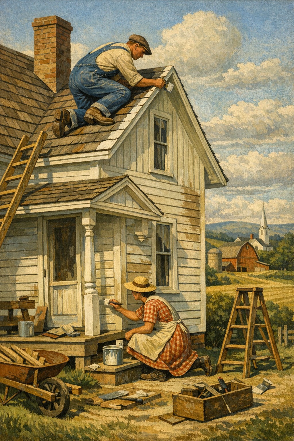
Of course, exterior work in Colorado brings completely different technical demands. UV exposure, freeze-thaw cycles, moisture management, and substrate movement all matter. A dramatic exterior color means nothing if the caulking fails or the coating system was applied over weak prep. For that reason, anyone considering a curb appeal upgrade should explore professional exterior painting services rather than treating exterior paint like a purely decorative decision.
Commercial spaces are embracing immersive color too
Offices, hospitality spaces, boutique retail, and wellness environments are also using immersive color more strategically. Conference rooms in muted blue-green can feel calmer and more focused. Restaurants and salons are using monochromatic palettes to create brand identity. Medical and professional environments are moving beyond sterile whites toward soft, confidence-building neutrals.
The point is not to make every commercial space dramatic. The point is to be intentional. Businesses that want visual credibility are increasingly turning to commercial painting services that understand scheduling, durability, low-odor products, and the importance of finish consistency in public-facing spaces.
Workforce quality still shapes the outcome
Here is an uncomfortable truth for the painting industry: great design ideas are often sabotaged by rushed execution. Labor shortages, uneven training, and low-bid shortcuts are real problems. Quality-minded companies invest in systems, standards, and skilled crews because premium work does not happen by accident. For professionals interested in the trade and craftsmanship side of the industry, there are also subcontractor opportunities with companies that value doing the work right.
Whether the project is a dramatic office in Glendale, a refreshed family room in Centennial, or a full-home repaint in Brighton, the same rule applies: color has to be supported by craftsmanship. Otherwise it is just expensive optimism.
Frequently Asked Questions
Q: What is color drenching in interior painting?
Color drenching is the practice of using one color, or closely related tones of one color, on walls, trim, ceiling, doors, and other architectural elements. The goal is to create a more immersive, cohesive look instead of relying on strong contrast. When done well, it can make a room feel larger, calmer, or more dramatic depending on the shade selected.
Q: Does color drenching make a room look smaller?
Not necessarily. In many cases, painting trim and ceiling the same color as the walls removes visual breaks and can actually make the room feel more expansive. The effect depends on lighting, undertones, sheen, and how the color interacts with furnishings and flooring.
Q: What are the best paint finishes for a color-drenched room?
Matte or eggshell is often best for walls, while ceilings usually perform well in flat or matte. Trim, doors, and built-ins often need satin or another washable low-sheen finish for durability. Using the same color with carefully selected sheen changes is usually more effective than using the exact same product on every surface.
Q: Is color drenching a good idea for Denver homes?
Yes, especially because Denver homes often receive strong natural light that can flatten weak paint colors. A well-chosen drenched palette can hold its character throughout the day and make open-concept spaces feel more cohesive. Testing samples in the room is still essential because Colorado light can shift undertones quickly.
Q: Can I color drench a room myself, or should I hire a professional painter?
A small, simple room may be manageable for an experienced DIYer, but most color-drenched spaces demand more precision than standard painting. Surface prep, priming, finish selection, and consistent application all matter more when every element is visually connected. If the room has detailed trim, dark colors, built-ins, or visible imperfections, hiring a professional is usually the smarter move.
Q: Which rooms are best for color drenching?
Powder rooms, offices, bedrooms, dining rooms, and libraries are often the strongest candidates. These spaces benefit from mood and cohesion, and they usually have manageable lighting conditions. Larger living spaces can also work beautifully, but they require more careful color planning and finish control.
Color drenching is more than a trend headline. It reflects a broader shift toward intentional, immersive design and away from the cautious paint formulas that have dominated homes for years. When the color is right, the prep is thorough, and the finish strategy is smart, the result feels custom, calm, and unmistakably elevated.
For homeowners across Denver, Centennial, Glendale, Brighton, and nearby communities, that matters. Paint is one of the fastest ways to change how a space feels, but it is also one of the easiest places to waste money if the execution falls short. The best results come from understanding light, architecture, product performance, and the difference between a social media trend and a finish that will still look strong years from now.
That is where 1 of a Kind Painting brings real value. From refined interior updates to durable exterior work and larger-scale commercial projects, the team understands how to translate big ideas into polished, lasting results. If you are considering a color-drenched room or a broader repaint anywhere in the metro area, the next step is simple: get in touch with our team and start planning a finish that suits your space, your light, and your goals.
Ready to Transform Your Space?
Whether you’re refreshing your home’s interior, updating your exterior curb appeal, or tackling a commercial repaint anywhere in the Denver metro area, 1 of a Kind Painting has the experience, craftsmanship, and attention to detail to deliver results that truly stand out.
👉 Interior Painting
|
👉 Exterior Painting
|
👉 Contact Us Today