White walls are no longer the safe choice they once were. The fastest-rising conversation in residential painting is color drenching: the practice of painting walls, trim, doors, and sometimes even ceilings in one cohesive hue to create a richer, more intentional room. In Denver-area homes, where bright light, open floor plans, and mountain-modern architecture can make interiors feel visually scattered, color drenching is becoming one of the smartest ways to make a space feel designed instead of merely painted.
Why Color Drenching Is Leading Interior Paint Trends
Color drenching is popular for a reason: it solves problems that standard accent-wall thinking never really fixed. For years, homeowners were told to break up a room with one bold wall and keep everything else neutral. That formula often created visual interruption rather than sophistication. A room can end up looking smaller, cheaper, and less cohesive when color is used as a gimmick instead of a design system.
Color drenching flips that approach. Instead of treating trim, ceiling, built-ins, and walls as separate elements fighting for attention, it wraps the room in one controlled tone. The result is often more elegant, more architectural, and more calming. In libraries, dining rooms, bedrooms, powder rooms, and home offices, the effect can be dramatic without being chaotic.
This trend also aligns with how people actually live now. Homes are no longer just places to sleep and store furniture. They are workspaces, entertainment spaces, retreats, and social settings. Homeowners want rooms that feel immersive, not generic. That is why deep greens, smoky blues, warm taupes, muted terracottas, and sophisticated charcoals are replacing flat contractor beige.
At the same time, color drenching is not only about dark paint. Soft clay tones, mushroom hues, dusty sage, and warm greige can create the same enveloping effect in a subtler way. The key is unity. When the color wraps the room correctly, architectural features stop looking chopped up and start looking intentional.
If you are planning a full interior refresh, this is exactly the kind of project that benefits from skilled interior painting services because consistent coverage, sharp cut lines, and sheen control matter much more when every surface is visually connected.
The design shift behind the trend
Part of the rise in color drenching comes from broader design fatigue. Homeowners are tired of interiors that feel copied from a short-lived social media template. The all-white look can still work, but it no longer reads as automatically upscale. In many homes, it now feels unfinished. People want personality back, but they want it executed with restraint.
That is exactly where color drenching wins. It feels bold, but disciplined. It can support traditional homes, contemporary condos, craftsman layouts, and transitional remodels. It can also elevate existing furniture and art because the room stops competing with itself.
How Color Drenching Actually Works in Real Homes
Good color drenching is not just “paint everything the same and hope for the best.” It depends on proportion, natural light, undertone control, and finish selection. A room with north-facing light will read cooler than a room flooded with Denver afternoon sun. A warm olive can look moody and grounded in one home and muddy in another.
Surfaces commonly included
Depending on the room and the intended effect, color drenching may include:
Walls
Trim and baseboards
Interior doors
Ceilings
Built-in shelving and cabinetry
Window casings
The point is not rigid rules. The point is visual immersion. In some rooms, painting the ceiling the same color is what makes the concept work. In others, using the same hue but adjusting sheen between walls and trim gives enough subtle contrast to preserve detail while maintaining that cocooning effect.
Rooms that benefit most
Not every room needs this treatment, but several room types are especially effective candidates:
Home offices because unified color reduces distraction and adds focus
Dining rooms because saturated color feels intimate and elevated
Bedrooms because low-contrast surroundings can feel restful
Powder rooms because smaller spaces can handle more drama
Libraries and dens because darker palettes highlight millwork and texture
We also see this work well in higher-end remodels where the homeowner wants something more custom than “new paint.” If you want to understand how a unified palette translates from concept to finished room, browsing our project gallery can help clarify how color, sheen, and surface prep come together in real spaces.
The biggest mistake in modern painting is treating color like decoration instead of architecture. When the palette supports the room’s structure, the room instantly looks more expensive.
— 1 of a Kind Painting
Best Paint Colors and Finishes for the Look
The best color-drenched rooms are built on undertones, not impulse. Trend forecasts from major brands like Sherwin-Williams, Benjamin Moore, Behr, and PPG continue to show movement toward warmer, earthier, more expressive colors. But not every trending swatch belongs on every wall. Denver’s altitude and strong natural light can intensify color, so testing matters.
Color families that perform well
The most successful color-drenched palettes tend to fall into a few categories:
Moody greens such as olive, forest, eucalyptus, and heritage green
Complex blues like slate, stormy navy, and gray-blue
Warm neutrals including mushroom, taupe, putty, camel, and greige
Earth tones such as clay, rust, terracotta, and muted cinnamon
Soft black and charcoal for dramatic dining rooms, offices, and entryways
Brands matter less than the right formula and surface prep, but product quality does influence finish consistency, touch-up behavior, and washability. Premium lines from Sherwin-Williams Duration or Emerald, Benjamin Moore Regal Select or Aura, and comparable products from Behr and PPG often provide the depth and leveling needed for a polished result.
Why sheen selection matters more than people think
Sheen can either elevate color drenching or ruin it. Too much shine on imperfect walls will spotlight every patch, seam, and repair. Too little durability in busy areas will leave scuffs and burnishing. The goal is balance.
Surface
Recommended Sheen
Why It Works
Walls
Matte or eggshell
Soft visual depth with controlled light reflection
Trim and doors
Satin or semi-gloss
Durability and subtle definition without breaking the palette
Ceilings
Flat or matte
Reduces glare and helps the room feel enveloping
Built-ins
Satin
Highlights craftsmanship and improves cleanability
This is also where a professional color consultation can prevent expensive hesitation. Homeowners often spend weeks stuck between two nearly identical colors when the real issue is undertone and finish, not boldness.
Where Homeowners Get It Wrong
The trend is strong, but the execution is often weak. A lot of disappointing results come from copying images online without accounting for the home’s light, texture, trim profile, or furniture. A color that looks refined in a magazine may look flat, overly blue, or aggressively dark in a real room with different exposure.
Mistake 1: Ignoring surface preparation
Color drenching creates a continuous field of color, which means flaws become more noticeable, not less. Nail pops, patched drywall, flashing, rough caulk lines, and old brush marks all stand out when a room is wrapped in a saturated tone. Prep is not a side task. It is the foundation of the whole effect.
Proper prep often includes:
Cleaning and deglossing where needed
Drywall and wood repair
Caulking gaps
Spot priming stains and repairs
Sanding trim and patch transitions
Using the right primer under deep or finicky colors
Mistake 2: Choosing the wrong white to “balance” the room
Many homeowners get nervous halfway through the decision process and leave the ceiling or trim bright white. Sometimes that works. Often it kills the mood. The room suddenly looks cut apart again. If the goal is immersion, stark contrast is usually the enemy.
Mistake 3: Underestimating application skill
Deep colors reveal lap marks, roller stipple inconsistency, and weak cut lines. Doors and trim need smooth leveling. Ceilings need uniformity. Brush and roller selection, product open time, and sequence of operations all matter. That is one reason clients looking for premium finishes often compare what our clients are saying before hiring a painter. Reliability and technique count when the finish leaves nowhere to hide.
Why Denver Homes Respond So Well to This Trend
Denver homes are uniquely suited to color drenching because the regional light is strong, clean, and revealing. That can be a problem for bland paint schemes and a huge advantage for layered color. Saturated but well-chosen tones often look alive here rather than heavy.
Across neighborhoods in the metro area, homeowners are moving away from generic flips and toward interiors with more identity. In city neighborhoods, mountain-modern homes, suburban remodels, and even traditional two-stories, there is growing demand for paint that feels curated. That is especially true for clients seeking painting services in Denver, CO, where architecture and lifestyle trends are pushing interiors beyond basic neutral palettes.
How local conditions affect paint color
Denver-area altitude and sunlight can make color appear brighter and cleaner than expected. South-facing rooms may feel warm and expansive. North-facing rooms can cool off quickly and make gray-based colors feel colder. In places like Centennial, Glendale, Brighton, and Aurora, newer homes with open layouts also create sightline challenges. A color that works in isolation still has to work from one room into the next.
That is why thoughtful transitions matter. A color-drenched office can sit next to a softer neutral hallway. A dramatic dining room can connect to a lighter kitchen through shared undertones. The goal is not to make every room the same. The goal is to make the house feel intentionally edited.
Local design pairing ideas
In the Denver metro area, color drenching often pairs well with:
White oak flooring
Black window frames
Warm brass or bronze hardware
Natural stone and textured tile
Soft boucle, leather, and linen furnishings
Those materials thrive when the paint color supports them instead of fading into the background. The right room color can make cabinetry, art, flooring, and trim feel more expensive without changing any of them.
DIY vs. Professional Application
This is one of those projects that looks easy on social media and gets expensive when done twice. There is nothing wrong with DIY painting when the room is simple, the expectations are modest, and the surfaces are forgiving. Color drenching usually does not fit that category.
What DIY painters often underestimate
Most DIY painters budget for paint and maybe rollers. They do not budget for the hidden variables:
Primer needs for dark or high-chroma colors
Extra coats for uniform saturation
Trim prep and door removal
Ceiling cut-ins and line consistency
Product compatibility across surfaces
Time lost to rework
A pro crew brings process. That means protecting floors and furnishings, correcting substrate defects, using the right masking systems, selecting proper nap and brush materials, and maintaining consistency from wall to trim to ceiling. For homeowners comparing estimates, the cheapest bid is often cheap because it quietly excludes the very prep work that makes the finish look premium.
When hiring a professional is the smarter move
If the room has high ceilings, extensive trim, built-ins, visible patching, or expensive furnishings, the risk of cutting corners rises fast. The same applies if you are trying to match a design vision from a sample or inspiration photo. In those cases, experienced commercial painting services standards can actually be useful in residential work: disciplined prep, product knowledge, and finish consistency are not just for offices and retail spaces.
And if you are ready to plan a project instead of guessing your way through it, the most direct next step is simple: get in touch with our team to talk through your surfaces, colors, and goals before the first gallon is opened.
How to Tie Bold Interiors to the Rest of the Property
A dramatic interior should not feel disconnected from the outside of the house. This does not mean your exterior color must match your dining room, but your home should still feel coherent from curb to interior. That is where many remodels miss the mark. They treat outside and inside as separate design universes.
Creating flow from entry to interior
A color-drenched foyer, office, or dining room works best when the transition from exterior materials and entry experience feels considered. If your home has a warm brick façade, charcoal roofing, or natural wood accents, your interior palette should acknowledge those cues. Strong design is rarely random.
That is one reason exterior planning still matters, even in an article focused on interior trends. A thoughtful repaint using professional exterior painting services can improve the way your whole property reads, especially when the entry and interior palette are meant to feel connected. Denver’s climate also demands exterior products and prep methods that can handle sun exposure, freeze-thaw cycles, and substrate movement.
Cabinets, built-ins, and specialty finishes
Color drenching can also extend beyond standard walls. Built-ins, fireplace surrounds, and cabinetry can be integrated into the same palette for a fully tailored effect. In some cases, specialty finishes like limewash-inspired texture or brushed enamel details add depth without breaking the color story. The key is restraint. Texture should enrich the palette, not compete with it.
Homeowners who want a one-of-a-kind result often discover that the difference is not the color itself. It is the discipline of the execution: the prep, the sequencing, the sheen balance, and the willingness to reject weak shortcuts.
Frequently Asked Questions
Q: What is color drenching in interior painting?
Color drenching is the practice of painting multiple surfaces in a room—typically walls, trim, doors, and sometimes ceilings—in the same color or a closely related variation. The goal is to create a more immersive, cohesive look that highlights the room’s architecture instead of breaking it apart with contrast.
Q: Does color drenching make a room look smaller?
Not necessarily. In many cases, it can actually make a room feel more unified and sophisticated because the eye is not stopping at contrasting trim or ceiling lines. Darker colors can feel intimate, while softer drenched tones can make a room feel calm and expansive.
Q: Should you paint the ceiling the same color as the walls?
Sometimes yes, especially if you want a true color-drenched effect. Painting the ceiling the same color can make the room feel more complete and less visually choppy. The best choice depends on ceiling height, natural light, and the room’s overall design goals.
Q: What paint finish is best for color drenching?
Matte or eggshell is often best for walls because it gives rich color depth without excessive glare. Trim and doors usually perform better in satin or semi-gloss for durability and subtle definition. Finish should always be chosen based on the condition of the surfaces and how the room is used.
Q: Is color drenching a good idea for Denver homes?
Yes, especially because Denver’s strong natural light can bring depth and clarity to well-chosen paint colors. The key is selecting hues that respond well to the home’s exposure and architecture. Testing and professional guidance are especially valuable in bright, high-altitude conditions.
Q: Can I color drench trim and doors with standard wall paint?
Usually no. Trim and doors often need a different product with better hardness, leveling, and washability. Even when the color is the same, professionals frequently use different formulations and sheens for walls, trim, and ceilings to get the right finish on each surface.
Color drenching is not a fad built on novelty. It is a smarter, more architectural way to use paint in a home that deserves more than generic white walls and random contrast. When the color, finish, prep, and lighting are handled correctly, the result feels deeper, calmer, and far more intentional than the old accent-wall formula.
For homeowners across Denver, Centennial, Glendale, Brighton, and Aurora, this trend offers a practical way to personalize a space without resorting to clutter or overdesign. It works in contemporary homes, classic homes, remodeled homes, and even tricky transitional layouts. The difference is not just bold color. The difference is disciplined execution.
1 of a Kind Painting helps homeowners navigate those decisions with the kind of surface preparation, product knowledge, and craftsmanship that keeps bold ideas from turning into expensive do-overs. Whether you are planning one immersive room or coordinating a larger repaint, experienced guidance can make the final result feel polished from the first brushstroke to the last walkthrough.
Ready to Transform Your Space?
Whether you’re refreshing your home’s interior, updating your exterior curb appeal, or tackling a commercial repaint anywhere in the Denver metro area, 1 of a Kind Painting has the experience, craftsmanship, and attention to detail to deliver results that truly stand out.
Most homes do not need more color—they need better color strategy. That is exactly why paint color trends 2026 are shifting away from safe, forgettable beige and toward warmer, more intentional palettes that actually change how a room feels, photographs, and ages over time. For homeowners and property managers across Denver, Aurora, Centennial, Glendale, and Brighton, this is more than a style conversation; it is a decision that affects resale appeal, maintenance, mood, and long-term satisfaction.
Paint color trends are not trivial. They influence how large a room feels, how clean a property appears, how natural light is reflected, and how current a home or business looks to visitors, buyers, and tenants. In a market like the Denver metro area, where design preferences are increasingly shaped by mountain-modern architecture, natural materials, and high-contrast interiors, paint is no longer just a finishing touch. It is a design system.
That matters because too many painting projects still begin with an outdated approach: pick a color chip under fluorescent lighting, hope for the best, and assume the painter can “make it work.” That is how people end up with icy whites that look blue at sunset, muddy greiges that kill natural light, or trendy greens that suddenly feel oppressive in north-facing rooms. The industry has normalized rushed color selection, and homeowners pay for that mistake twice—once in labor and again in disappointment.
The better approach is to treat paint color as part of a larger performance equation:
Sheen level affects how color reads on walls and trim
Surface preparation influences final uniformity
Local climate and dust affect exterior durability and curb appeal
Existing materials like stone, flooring, cabinets, and countertops must coordinate
Homeowners planning a full refresh often start with interior painting services, while those updating curb appeal or weather-worn siding may need exterior painting services. In both cases, trend awareness only matters if execution is disciplined.
The Biggest Paint Color Trends for 2026
The biggest story in paint color trends 2026 is warmth with restraint. Major brands such as Sherwin-Williams, Benjamin Moore, Behr, and PPG have all continued moving away from stark grayscale minimalism and toward earthy neutrals, softened greens, clay tones, mineral blues, and complex off-whites. The days of defaulting to bright builder white everywhere are fading. That trend is not bold rebellion—it is overdue correction.
Warm whites are replacing cold whites
Clean white walls are not disappearing, but the preferred version is changing. Homeowners are choosing whites with subtle cream, sand, or mushroom undertones over sterile blue-based whites. Think Sherwin-Williams Alabaster, Benjamin Moore White Dove, or other softened whites that hold up better in Colorado daylight. These shades feel calmer, richer, and far more livable.
Earthy greens continue to dominate
Sage, olive, eucalyptus, and muted moss tones remain strong because they connect interiors to nature without becoming loud. Used in offices, bedrooms, kitchens, and even cabinetry, these shades work especially well with white oak, black hardware, warm brass, and natural stone. The mistake is assuming every green is timeless. Some trend well on social media and fail miserably on actual walls. The successful choices are usually grayed down and balanced, not neon-fresh or overly yellow.
Clay, terracotta, and mineral-inspired neutrals are gaining ground
Expect to see more warm taupes, rosy browns, dusty terracottas, and muted adobe-inspired colors in dining rooms, powder baths, accent walls, and hospitality spaces. This shift makes sense in Colorado, where regional architecture, sunlight, and landscape all support warmer, desert-adjacent color stories. In the right setting, these shades feel grounded rather than trendy.
Deep blue and charcoal are still strong for cabinetry and feature areas
While whole-house dark walls remain a niche choice, deep navy, inky blue, iron charcoal, and graphite continue to perform well on kitchen islands, built-ins, office cabinetry, and commercial focal areas. The appeal is simple: they create contrast without shouting. Used correctly, they look custom. Used everywhere, they look heavy.
Exterior palettes are becoming more architectural
For exteriors, color trends are moving toward layered neutrals: warm white body colors, greige or bronze trim, natural wood accents, and darker doors in black, green, or blue-gray. This works especially well in neighborhoods where mountain modern, updated ranch, and transitional styles dominate. Property owners seeking painting services in Denver, CO are increasingly prioritizing palettes that feel current without becoming risky resale decisions.
The era of choosing paint colors from a tiny chip and calling it design is over. Real color selection now requires context, testing, and the courage to reject bad trends before they hit your walls.
— 1 of a Kind Painting
How Denver Homes Change the Way Colors Behave
Denver light is unforgiving in the best and worst ways. The region’s altitude, bright sun, seasonal shifts, and dry climate can make beautiful paint colors look exceptional—or expose every undertone mistake in a matter of hours. That is why national trend reports are useful, but they are not enough on their own. A color that looks balanced in a coastal showroom may look harsh, washed out, or oddly yellow in a Denver living room.
High-altitude light amplifies contrast
Rooms with abundant sun often make pale colors appear brighter and sharper than expected. Crisp whites can feel clinical. Cool grays can read colder. Strong accent colors can look more saturated. That is one reason many Denver-area homes are embracing warmer neutrals and soft earth tones. They hold up better in intense natural light and feel less brittle across changing seasons.
Snow, stucco, brick, and landscaping matter outside
Exterior painting in Colorado is not just about body color. Snow reflection, red brick, tan stone, evergreen landscaping, and intense UV exposure all affect perception. A soft beige that looks elegant in theory may disappear against a dusty lot. A cool gray may clash with warm masonry. A dark paint color on the wrong elevation may absorb heat and show fading faster. Exterior color is part design, part environmental strategy.
Neighborhood context still matters
Homeowners in Centennial may want a cleaner transitional look, while Glendale properties may lean more urban and contrast-driven. Brighton homes often benefit from palettes that handle open light and dust gracefully, and Aurora neighborhoods can vary dramatically depending on home age and architectural style. Looking at our project gallery can help homeowners see how paint behaves on real properties rather than idealized marketing images.
For color-focused projects, a professional color consultation is often the difference between a polished result and a costly repaint. That is not upselling—it is damage prevention.
The Finishes, Products, and Prep Work That Separate Great Results from Cheap Work
Color gets the attention, but preparation and product selection decide whether the job actually looks premium. Too many painters still cut corners on cleaning, patching, sanding, spot priming, and caulking, then blame the paint when the finish flashes, peels, or looks uneven. Trendy colors do not rescue weak craftsmanship. In fact, they expose it faster.
Low-VOC and premium formulations are no longer optional for many projects
Eco-conscious paint choices are now mainstream, especially for occupied homes, nurseries, offices, and commercial interiors. Premium low-VOC and zero-VOC products from Sherwin-Williams, Benjamin Moore, Behr, and PPG offer better indoor comfort without sacrificing washability or color depth. The old excuse that cleaner paint means weaker performance is largely outdated. Modern premium coatings have closed that gap significantly.
Sheen selection is a technical decision, not a habit
One of the laziest habits in the industry is using the same sheen in every room. Different surfaces need different levels of durability, washability, and light reflection. Here is a practical comparison:
Area
Recommended Sheen
Why It Works
Living rooms and bedrooms
Matte or eggshell
Soft look, low glare, forgiving on minor wall imperfections
Kitchens and bathrooms
Eggshell or satin
Better moisture resistance and easier cleaning
Trim and doors
Satin or semi-gloss
Highlights detail and improves scrub resistance
Cabinets
Satin, semi-gloss, or specialty cabinet finish
Improves durability and creates a smoother furniture-like look
Commercial high-traffic spaces
Eggshell to semi-gloss depending on use
Balances maintenance needs with appearance
Surface prep is where premium results are won
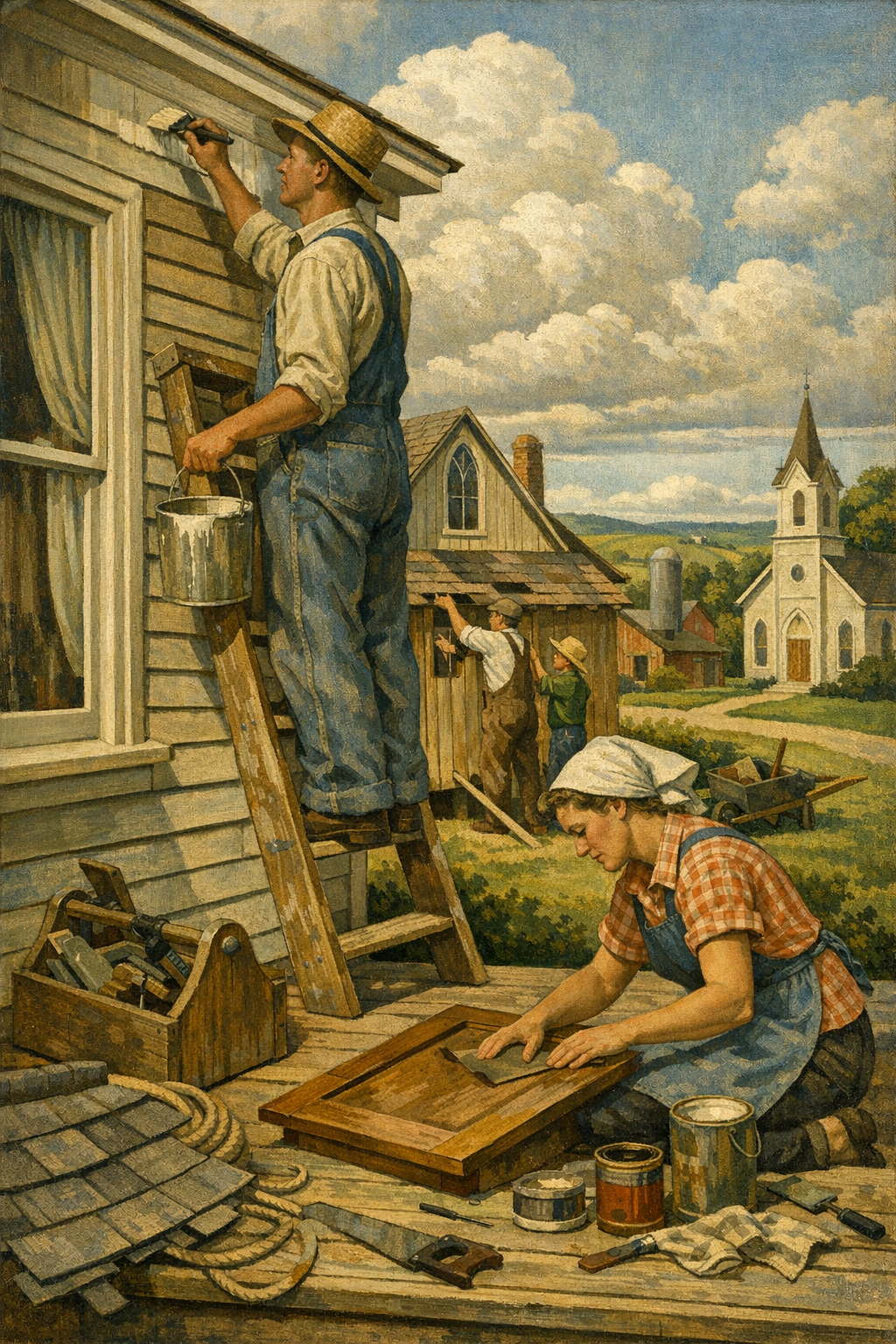
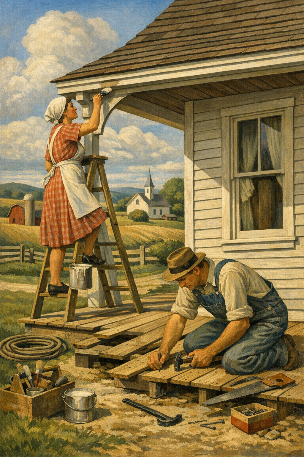
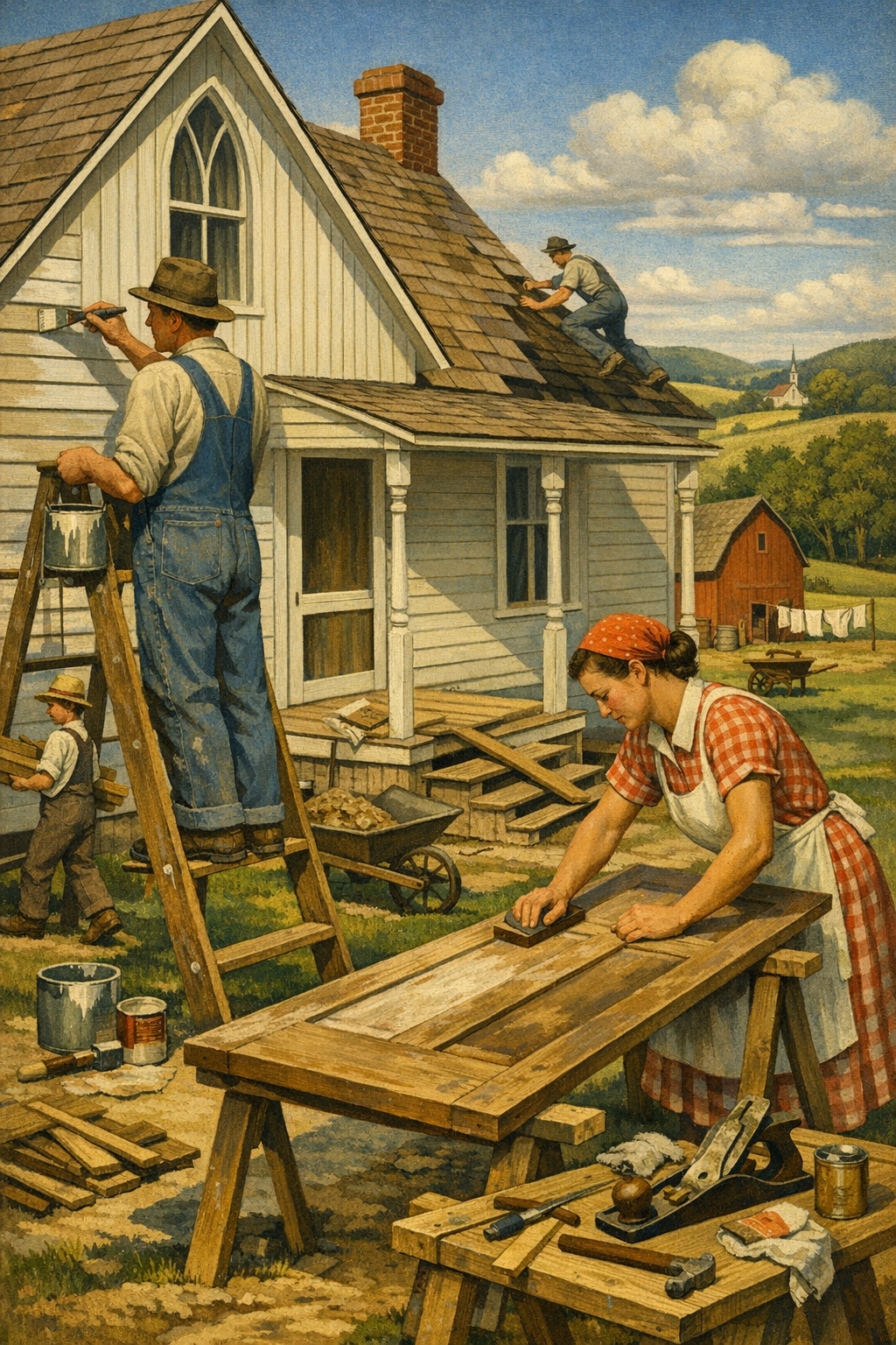
Walls should be cleaned, repaired, and sanded. Stains need proper blocking primer. Glossy surfaces need deglossing or abrasion. Exterior substrates need pressure washing, scraping, feather sanding, and correct caulking. Wood trim and cabinets demand especially careful prep if the goal is a smooth modern finish. Anyone promising dramatic transformation without prep is selling fantasy.
Commercial spaces have different coating demands
Retail, office, industrial, and multifamily settings often require faster scheduling, odor control, durability, and coatings tailored to traffic or substrate type. For businesses planning updates, commercial painting services should involve more than color application; they should include workflow planning, product matching, and finish expectations that hold up under daily use.
DIY vs. Hiring a Professional for Trend-Driven Color Updates
DIY painting is not always a mistake—but trend-driven painting projects are less forgiving than people think. A simple bedroom repaint in an established color may be manageable for a careful homeowner. Whole-home color transitions, exterior repaints, cabinet refinishing, stairwells, vaulted spaces, and dark-to-light conversions are a different category entirely.
Why DIY often goes sideways
The biggest DIY failures are rarely caused by effort. They are caused by sequencing, material selection, and false confidence. Homeowners underestimate how much time is spent on masking, patching, sanding, dust control, priming, and cut lines. They also overestimate the accuracy of online color previews. By the time they realize the undertone is wrong, they are already committed.
What professionals actually bring to the table
Professional painters bring process. That means sample testing, substrate evaluation, better tools, cleaner lines, efficient scheduling, and products matched to the job. It also means accountability. If you are comparing estimates, look beyond price and ask how the company handles prep, sample approvals, primer, sheen guidance, and cleanup. Reading what our clients are saying can reveal whether a contractor consistently delivers the result they promise.
The hidden cost of cheap painting
The cheapest bid is often the most expensive outcome. Thin coverage, skipped prep, rushed crews, mismatched touch-ups, and improper caulking create cosmetic defects that keep showing up long after the invoice is paid. This is especially true with modern trend colors, where depth, undertone, and finish consistency matter more than ever. A premium room painted badly never looks premium.
The painting trade also depends on skilled labor, training, and craftsmanship. Companies investing in strong crews and standards help elevate the industry, and for professionals interested in the trade, there are even subcontractor opportunities tied to that level of workmanship.
How to Choose the Right Trending Color Without Regretting It
The smartest way to use paint color trends 2026 is not to chase them literally. It is to understand the direction of the market and then adapt it to your home, your light, and your architecture. Trend awareness is useful. Trend obedience is not.
Start with fixed elements first
Before choosing wall color, look at flooring, countertops, cabinets, tile, fireplace stone, brick, roofing, and large furniture. These elements are expensive to change and will either support or sabotage a paint choice. If your home has warm wood floors and creamy stone, forcing a cool gray palette usually creates tension instead of sophistication.
Sample on multiple walls, not just one spot
Colors shift throughout the day. Test large samples on different walls and check them in morning, afternoon, evening, and lamplight conditions. A color that feels balanced in direct sun may go flat in shade. A beige that seems safe may suddenly read pink. Small swatches lie. Bigger samples tell the truth.
Use trends in layers
You do not need to paint every room olive or every exterior trim piece black. Often the best way to bring in a trend is through strategic applications:
Accent walls in offices or dining rooms
Cabinet updates in soft green, navy, or mushroom tones
Interior doors in deep charcoal or muted blue
Powder rooms with richer, more adventurous color
Exterior doors and shutters for modernized curb appeal
Do not ignore the emotional function of each room
Bedrooms usually benefit from softer, lower-stimulation tones. Kitchens can handle cleaner contrast. Home offices often improve with colors that feel grounded and focused rather than sleepy. Commercial settings need to consider brand identity, customer movement, and maintenance. Good color selection is psychological as much as visual.
Homeowners comparing palettes for renovations in surrounding communities often benefit from localized guidance, whether they need painting services in Centennial, CO or help coordinating colors across multiple spaces. The goal is never just to be current. The goal is to look intentionally current.
Frequently Asked Questions
Q: What are the most popular paint color trends for 2026?
The strongest paint color trends for 2026 include warm whites, earthy greens, clay-inspired neutrals, muted blues, and layered exterior palettes with natural contrast. The overall move is away from cold grays and toward colors that feel softer, more grounded, and more architectural.
Q: Are gray walls still in style in 2026?
Gray is not completely gone, but flat, cool gray is losing favor in many homes. More homeowners are choosing warmer greiges, taupes, and off-whites because they feel more natural in everyday living spaces and work better with current flooring and wood tones.
Q: What paint colors work best in Denver homes?
Denver homes often benefit from warm whites, balanced greiges, muted greens, and mineral-inspired colors because intense natural light can make cool tones feel harsher. The right choice depends on elevation, room orientation, existing materials, and whether the space gets strong sun or shade.
Q: Should I hire a painter for a color trend update or do it myself?
A simple single-room repaint may be manageable for a skilled DIYer, but whole-home updates, cabinets, exteriors, and trend-sensitive colors usually benefit from professional execution. Painters can help with prep, product selection, sample testing, and finish consistency, which reduces the risk of costly mistakes.
Q: What is the best paint finish for interior walls?
Matte and eggshell are common choices for most interior walls because they balance appearance and usability. Kitchens, bathrooms, trim, and doors usually need more washable finishes such as satin or semi-gloss depending on moisture, traffic, and cleaning needs.
Q: Do low-VOC paints actually perform well?
Yes, many modern low-VOC and zero-VOC paints perform extremely well when the right product is used for the right surface. Premium lines from major brands now offer strong coverage, durability, and color retention while reducing odor and improving indoor comfort during and after painting.
Paint trends are useful when they sharpen judgment, not when they replace it. The most successful projects in 2026 will not be the loudest or the most aggressively “designer.” They will be the ones where color, light, architecture, finish, and preparation are aligned from the start. That is what creates a result that still feels right a year from now, not just impressive on day one.
For homeowners and property managers across the Denver metro area, that means thinking beyond chips, social media screenshots, and bargain bids. Whether the goal is a warmer interior palette, a more architectural exterior, or a commercial repaint that reflects a stronger brand image, execution matters as much as taste. If you want guidance tailored to your home, your lighting, and your goals, get in touch with our team to talk through the next step.
At 1 of a Kind Painting, thoughtful color selection and disciplined craftsmanship go hand in hand. From modern interiors to durable exteriors and high-performance commercial spaces, the right process turns a trend into a lasting improvement rather than a passing experiment.
Ready to Transform Your Space?
Whether you’re refreshing your home’s interior, updating your exterior curb appeal, or tackling a commercial repaint anywhere in the Denver metro area, 1 of a Kind Painting has the experience, craftsmanship, and attention to detail to deliver results that truly stand out.
Most homes do not need a bigger renovation budget—they need a smarter paint strategy. The biggest shift in paint color trends 2026 is not about chasing one “color of the year,” but about using warmer neutrals, moody earth tones, and high-performance finishes in ways that make rooms feel more valuable, more intentional, and far less generic. In the Denver metro area, where bright sun, changing seasons, and design-savvy homeowners all influence the final result, color has become a renovation decision—not an afterthought.
The conversation around paint has changed. A few years ago, homeowners mostly asked which white was popular. Now they ask a better question: Which color will still look right in this room, with this light, on this architecture, three years from now? That is real progress.
The strongest paint color trends 2026 are being shaped by three forces at once: color psychology, performance expectations, and regional lifestyle. National brands such as Sherwin-Williams, Benjamin Moore, Behr, and PPG are all moving away from sterile, blue-leaning grays and toward colors that feel grounded. Think clay, mushroom, olive, warm taupe, softened terracotta, mineral blue, charcoal green, and creamy off-whites with actual depth.
That shift makes sense. After years of ultra-minimal interiors, homeowners want spaces that feel finished rather than flat. Builders and flippers overused cold gray because it was safe. The problem is that safe often photographs better than it lives. A room can look clean online and still feel lifeless every day in person.
In homes across Denver, Centennial, Glendale, Brighton, and Aurora, people are leaning into color palettes that feel warmer and more architectural. That does not mean every room has to go dark or dramatic. It means the new standard is intention. If you are planning a full refresh, professional interior painting services can help ensure those nuanced colors read correctly from wall to wall instead of turning muddy, patchy, or uneven.
What brands are signaling in 2026
While each manufacturer packages trends differently, the overlap is telling. Sherwin-Williams continues to favor sophisticated natural tones. Benjamin Moore remains strong in complex neutrals and blue-green families. Behr has pushed approachable earthy palettes for mainstream homeowners, while PPG is still emphasizing livable, low-stress color environments. The common thread is warmth, softness, and subtle complexity.
Warm whites replacing stark whites in living spaces
Greige and taupe evolving into richer putty and mushroom shades
Green staying strong, especially sage, olive, and smoky eucalyptus
Blue shifting from coastal brightness to mineral, slate, and muted navy
Earth colors like clay, sand, rust, and muted terracotta gaining ground
That is not trend hype. It is a direct response to how people want their spaces to feel: calmer, less clinical, and more custom.
The Top 2026 Interior Paint Colors Homeowners Are Choosing
The best interior colors in 2026 are not random. They solve common design problems. They warm up north-facing rooms, soften open-concept layouts, and work better with wood floors, stone counters, matte black hardware, brass fixtures, and natural textiles. Good paint now has to cooperate with the whole house.
Warm whites that do not feel sterile
Bright white is not dead, but it is no longer the automatic answer. Many homeowners are choosing softer whites like Sherwin-Williams Alabaster, Benjamin Moore White Dove, and similar creamy neutrals because they handle shifting light better. In Colorado homes with intense daytime sun, harsh whites can look almost glaring. A warmer white creates a cleaner finish without the showroom coldness.
These shades work especially well in living rooms, hallways, and kitchens where natural light changes dramatically throughout the day. If you are comparing swatches, this is where a professional color consultation can save you from expensive second-guessing.
Greens that act like neutrals
Sage, olive, and muted green-gray tones have matured from “accent wall colors” into whole-home options. Used properly, they behave like neutrals while adding far more character than beige or gray. They pair beautifully with white oak, walnut, brushed brass, black steel, and natural stone. Green has become the grown-up alternative to gray.
Bedrooms, home offices, powder rooms, and dining rooms are especially good candidates. In older Denver bungalows and updated suburban homes alike, a green with gray or earthy undertones can feel current without screaming for attention.
Mushroom, taupe, and complex beige are back
Beige never really disappeared. It was just buried under a decade of gray marketing. The 2026 version is more refined: mushroom, putty, flax, café cream, and warm stone. These shades are excellent for homeowners who want warmth but do not want obvious color.
They also work well with current cabinet trends. If you are repainting kitchen or bath cabinetry, walls in a soft taupe or mineral white can create a more layered result than flat contractor white. Homeowners looking for inspiration can browse our project gallery to see how these combinations translate in real spaces rather than on a paint chip.
Moody colors in the right rooms
Charcoal green, muted navy, iron ore, and deep brown-black are still strong, but there is a right way to use them. Too many painters treat dark colors like a style shortcut. They are not. Dark walls expose surface flaws, lap marks, weak cut lines, and cheap prep instantly. A dramatic color without serious prep is just a very visible mistake.
When used with proper priming, patching, sanding, and premium paint, dark tones can transform offices, media rooms, dining spaces, built-ins, and front doors. When rushed, they look amateur in a week.
Room Type
Trending 2026 Color Direction
Recommended Finish
Why It Works
Living Room
Warm white, soft mushroom, muted greige
Eggshell
Balances natural light and hides minor wall texture
Kitchen
Creamy white, sage, light taupe
Satin
Improves cleanability and supports cabinetry finishes
Bedroom
Olive-gray, dusty blue, warm neutral
Eggshell
Creates a softer, more restful atmosphere
Bathroom
Mineral blue, soft green, warm white
Satin or semi-gloss trim
Handles moisture better and adds crisp contrast
Office
Moody green, slate blue, charcoal accent
Eggshell
Reduces glare and adds visual depth
How Denver Light and Climate Change Color Decisions
One reason national color advice often falls short is simple: Denver light is not average light. High elevation, strong UV exposure, and big swings between bright sun and snow reflection can distort undertones fast. A color that looks calm in a showroom can look far warmer, cooler, or brighter once it is on your wall.
This is especially true in open-concept homes and south-facing rooms. Whites can appear yellow. Cool grays can go icy. Beige can turn pink. Exterior colors can read washed out by afternoon sun and then dramatically darker at dusk. That is why large test patches and informed placement matter so much in Colorado.
Why undertones matter more here
Undertones are where expensive mistakes live. Two taupes can look nearly identical on a fan deck and read completely differently in a real room. One may lean violet. Another may pull green. In Denver-area homes with abundant natural light, those hidden undertones become obvious.
That is one reason homeowners seeking painting services in Denver, CO often benefit from expert testing and surface-specific recommendations rather than quick color guesses. Paint is not just color. It is color plus sheen plus substrate plus lighting plus surrounding materials.
Colorado architecture rewards restraint
Many homes in the region feature stone, brick, warm wood, black window frames, or mixed exterior materials. The best palettes do not fight those elements. They support them. In interiors, that often means quieter body colors with stronger accents through trim, cabinetry, doors, or feature walls. On exteriors, it means avoiding trendy colors that look fashionable for six months and awkward for six years.
The worst color choice is rarely the bold one—it is the lazy one that ignores light, materials, and architecture.
— 1 of a Kind Painting
Exterior Paint Trends for 2026 That Actually Last
Exterior paint trends are becoming more disciplined, and that is a good thing. Homeowners still want personality, but they also want a finish that survives intense sun, freeze-thaw cycles, wind, and occasional hail. On exteriors, style without durability is just deferred maintenance.
The dominant exterior palette in 2026
The most durable-looking exterior palettes this year center on softened contrast. Instead of bright white body paint with black trim, many homeowners are choosing warmer body colors paired with grounded accents. Popular directions include:
Soft greige or mushroom siding with charcoal or bronze accents
Muted sage or olive-gray paired with creamy trim
Warm off-white body colors with natural wood doors
Deep mineral blue or blue-gray for selective architectural styles
Black and near-black used sparingly on shutters, doors, and modern trim details
These combinations age better because they do not rely on extremes. Pure white and ultra-dark exteriors can look stunning at first, but they are less forgiving under Colorado conditions. Bright whites show dirt and weathering quickly. Dark colors absorb more heat and can stress certain substrates if the product system and prep are not right.
Prep is the real trend nobody advertises
Here is the blunt truth: the industry still oversells color and undersells preparation. Exterior painting success depends on washing, scraping, sanding, caulking, spot priming, substrate repair, and using the correct product for wood, stucco, fiber cement, or masonry. A premium topcoat cannot rescue a weak surface.
If your home is due for a repaint, high-quality exterior painting services matter more than the trend label on the swatch. In neighborhoods across Glendale and surrounding communities, the best-looking homes are usually the ones where prep was taken seriously before a brush or sprayer ever came out.
Low-VOC and premium coatings are now expected
Homeowners are increasingly asking about low-VOC and zero-VOC products, and that is a healthy shift. Indoors, these formulas can improve comfort during and after painting. Outdoors, modern premium coatings from top brands now offer impressive color retention, adhesion, mildew resistance, and washability. The old trade-off between healthier products and performance is getting smaller every year.
What the Industry Still Gets Wrong About Color Selection
Too many painting projects fail before the first coat because the decision process is backwards. People pick a color from a phone screen, buy the cheapest quote, and expect premium results. That is not how professional finishes work.
Paint chips are not enough
A fan deck is a starting point, not a verdict. Colors need to be tested at scale, on the actual surface, in the actual room, and observed in morning, afternoon, and evening light. This matters even more with the subtle, complex hues driving paint color trends 2026. Warm neutrals, smoky greens, and mineral blues all shift visibly depending on exposure and nearby materials.
Cheap bids create expensive walls
Many low-price painters cut labor where it hurts most: prep, masking, repairs, primer, and dry-time discipline. Then the homeowner blames the color when the real issue is workmanship. Uneven sheen, flashing, roller texture inconsistency, weak coverage, and visible patching are not “normal.” They are symptoms of a rushed process.
That is why homeowners often look at what our clients are saying before choosing a painter. Trust matters because you are not just hiring someone to apply paint. You are hiring a process, a standard, and a set of decisions that will remain visible every day.
Trend chasing is not design strategy
There is nothing wrong with using trend forecasts. The problem comes when they are used blindly. A color can be nationally popular and still be wrong for your home’s fixed finishes, trim profile, ceiling height, or natural light. The smartest projects borrow from trends without becoming controlled by them.
For homeowners balancing resale, personal taste, and long-term livability, the best palette is usually one that feels current but not fragile. That means sophistication over novelty and consistency over social-media drama.
Professional Application Matters More Than Trendy Paint Names
Paint color trends 2026 may grab the headlines, but application quality still determines whether the finished room looks elegant or disappointing. A beautiful color with poor cut lines, drips, holidays, or texture inconsistency is still a poor result. Execution is what turns trend into value.
Tools, finish selection, and surface prep change everything
Professionals know when to spray, when to roll, and when to combine both. They know that a flat finish can hide wall imperfections but may not suit a high-traffic hallway. They know when drywall repairs need sealing primer and when trim needs a harder enamel. They know that dark colors often require more careful sequencing and back-rolling to achieve uniformity.
That technical judgment becomes even more important in remodels, occupied homes, cabinet projects, and commercial spaces. Businesses evaluating commercial painting services face the same truth: color matters, but preparation, scheduling, durability, and consistency matter more.
Why local experience matters in the Denver metro area
There is a clear advantage to working with painters who understand local housing stock, weather patterns, and buyer preferences. A 1920s Denver bungalow, a Centennial two-story, a Glendale townhome, and a Brighton new build do not respond to the same palette or product system in the same way. Local experience helps translate national trends into practical decisions that hold up in real homes.
If you want a better sense of how professional execution affects the final result, viewing completed projects and speaking with local homeowners is far more useful than scrolling endless inspiration photos. And when you are ready to move from ideas to planning, the easiest step is to get in touch with our team for guidance tailored to your home, your surfaces, and your goals.
Frequently Asked Questions
Q: What are the most popular paint color trends for 2026?
The biggest paint color trends for 2026 include warm whites, mushroom neutrals, sage and olive greens, muted blue-grays, and earthy clay-inspired tones. These colors feel softer and more architectural than the cold grays that dominated previous years. The strongest trend is not one single shade, but a move toward warmer, more layered palettes.
Q: Are gray walls still in style in 2026?
Gray is not completely gone, but the cooler, blue-based grays are losing ground. In 2026, homeowners are choosing warmer grays, greiges, taupes, and mushroom tones that feel more natural and easier to live with. Gray still works when it has the right undertones and suits the room’s lighting.
Q: Which paint colors work best in Denver homes?
Denver homes often benefit from colors that can handle strong natural light and shifting seasonal conditions. Warm whites, muted greens, soft taupes, and balanced blue-grays tend to perform well because they do not become overly harsh or washed out as easily. Large test samples are especially important in Colorado’s bright light.
Q: What exterior paint colors are trending in 2026?
Trending exterior colors for 2026 include warm greige, soft mushroom, olive-gray, creamy off-white, and selective use of charcoal or deep blue accents. Homeowners are moving away from extreme contrast and choosing more natural combinations that age better. Durability and fade resistance are just as important as style on exteriors.
Q: Should I choose paint colors myself or hire a professional color consultant?
If you are selecting multiple colors, repainting a large area, or working with tricky light, a professional color consultant is often worth it. A trained expert can identify undertones, test colors properly, and match the palette to your fixed finishes and architecture. That usually prevents costly repainting and second-guessing later.
Q: Do trendy paint colors hurt resale value?
Trendy colors only hurt resale when they are too extreme, too personal, or poorly applied. Thoughtful, current colors that work with the home’s style can actually improve perceived value and make a property feel more updated. The safest approach is to use trend-forward colors in a restrained, cohesive way.
Paint color trends 2026 are more sophisticated than the market often admits. Homeowners are no longer satisfied with generic gray walls and one-size-fits-all white trim. They want colors that respond to real life—sunlight, architecture, daily use, mood, maintenance, and long-term value.
That is especially true across the Denver metro area, where light, climate, and design expectations all raise the stakes. Whether the goal is a warmer interior palette, a smarter exterior repaint, or a more polished finish in a high-traffic commercial space, the right result comes from pairing strong color decisions with disciplined prep and skilled application.
1 of a Kind Painting helps homeowners and businesses navigate those decisions with a practical, high-craft approach. From fresh interiors and durable exteriors to color guidance rooted in how spaces actually function, the goal is simple: deliver results that feel current now and still look right years from now.
Ready to Transform Your Space?
Whether you’re refreshing your home’s interior, updating your exterior curb appeal, or tackling a commercial repaint anywhere in the Denver metro area, 1 of a Kind Painting has the experience, craftsmanship, and attention to detail to deliver results that truly stand out.
Most paint jobs do not fail because of color—they fail because homeowners chase trends without understanding how those colors behave in real light, on real walls, and in real Denver homes. The smartest way to approach 2026 paint color trends is not to copy a viral swatch from social media, but to understand which colors have staying power, how finishes affect the result, and why Colorado’s altitude and sunshine can completely change what you thought you were buying.
The age of flat, lifeless gray is not just fading—it is being actively rejected. Across residential and commercial design, the strongest 2026 paint color trends are warmer, earthier, and more nuanced. Think muted olive, clay beige, smoked blue, brown-based taupe, and off-whites with visible undertones instead of sterile builder white.
That shift makes sense. People want spaces that feel calm, expensive, and personal. Brands like Sherwin-Williams, Benjamin Moore, Behr, and PPG have all continued moving toward colors that create emotional comfort rather than showroom perfection. The trend is less about one headline color and more about low-contrast palettes, layered neutrals, and grounded tones that work with natural materials like white oak, warm metals, stone, and textured fabrics.
In the Denver metro area, that movement feels especially relevant. Homes in neighborhoods across Aurora, Centennial, Glendale, and Brighton often get intense natural light, and that light exposes weak color choices fast. A trendy color that looked sophisticated online can turn chalky, too yellow, too green, or strangely purple once it hits a south-facing wall at elevation. That is one reason many homeowners rely on professional color consultation before committing to a whole-house palette.
What is driving the trend shift?
Several forces are pushing color in a more refined direction:
Design fatigue with cool gray interiors
Growing interest in biophilic and nature-inspired design
Higher demand for cozy, layered, luxury-feeling rooms
The influence of limewash, plaster, and hand-crafted finishes
Homeowners wanting resale-safe colors that still feel current
That last point matters. The best trend colors are not the loudest ones. They are the ones that look intentional five years from now. Timeless does not mean boring. It means disciplined.
The paint industry’s dirtiest little secret is that trend-chasing usually creates faster regret than faster style. The best color choices feel current because they suit the home, not because they dominate a Pinterest board.
— 1 of a Kind Painting
The Colors Leading Interiors in 2026
The most successful interior palettes in 2026 are sophisticated without trying too hard. They are richer than the all-white interiors of the last decade, but they are still highly livable. If you are planning interior painting services, these are the color families worth serious attention.
Warm whites that actually feel finished
Bright, stark white is losing ground to softer whites with cream, greige, mushroom, or bone undertones. Sherwin-Williams Alabaster, Benjamin Moore White Dove, and similar shades remain popular because they create a clean backdrop without the clinical look that can make homes feel unfinished.
This is where cheap painting work gets exposed. Warm whites are less forgiving than people think. Surface prep, patching, sanding, and cut lines all show up clearly. If walls have old repairs, texture mismatches, or flashing from poor priming, even the best color cannot save the result.
Earth tones with restraint
Clay, sand, camel, terracotta-tinted beige, and muted taupe are gaining traction because they add warmth without overpowering a room. These shades work beautifully in living rooms, dining rooms, and bedrooms where homeowners want comfort rather than contrast.
They also pair well with Denver’s common architectural features, including natural wood beams, stone fireplaces, and black or bronze fixtures. In high-altitude sunlight, these colors tend to feel more stable than cool grays, which often wash out.
Green is still strong, but it is maturing
Sage had a massive run, and it is not disappearing. But 2026 paint color trends show green becoming moodier and more complex. Olive, eucalyptus, moss, and gray-green tones are replacing the pale, overused versions that spread through every flip and rental remodel.
These colors perform especially well in:
Kitchens with painted cabinetry
Powder rooms
Home offices
Built-ins and accent millwork
Cabinet painting is one area where trend and technique have to work together. The wrong product system can leave brush marks, weak adhesion, and premature wear. A fashionable color on badly prepped cabinets is still a bad investment. If you want to see the difference professional execution makes, browsing our project gallery is a useful reality check.
Moody blues and near-neutrals
Soft navy, slate blue, storm blue, and blue-gray blends continue to lead in bedrooms, offices, and dining spaces. The key difference in 2026 is that these shades are being used more strategically. Instead of painting every room dark, designers are using them where mood and depth matter most.
Dark color is not risky. Random dark color is risky. When paired with the right sheen, trim contrast, and lighting plan, moody blue can feel elevated rather than oppressive.
Finish matters as much as color
Homeowners spend weeks debating color chips and almost no time thinking about sheen. That is backwards. Finish affects durability, cleanability, and visual texture.
Area
Recommended Finish
Why It Works
Living rooms and bedrooms
Eggshell
Soft appearance with moderate durability
Kitchens and bathrooms
Satin
Better moisture resistance and easier cleaning
Trim and doors
Semi-gloss
Crisp contrast and strong washability
Ceilings
Flat
Helps hide surface imperfections and glare
Cabinets
Specialty cabinet enamel
Harder cure, smoother finish, better adhesion
Exterior Paint Trends for Denver-Area Homes
Exterior color trends are changing too, but the rules are harsher outside. A beautiful exterior palette that cannot handle Denver sun, snow, freeze-thaw cycles, and UV exposure is not a trend—it is a maintenance problem. That is why smart homeowners treat exterior color selection as both a design choice and a performance decision.
Current exterior painting services trends lean toward natural body colors with sharper, darker accents. Warm greige, soft taupe, dusty olive, muted blue-gray, and creamy off-white are performing well across the region.
Popular exterior combinations in 2026
Warm off-white siding with charcoal trim
Greige body color with black shutters and natural wood door
Muted sage exterior with cream trim
Dusty blue-gray body with bright white accents
Earthy taupe with bronze or deep brown architectural details
In neighborhoods looking for updated curb appeal without alienating buyers, these combinations hit the sweet spot. They read current, but they do not scream for attention. That matters whether you are updating a primary residence or a commercial property.
Denver light changes everything
Colorado’s light is brutally honest. Colors often appear brighter and cleaner outdoors than they do on a small fan deck sample. That means deep tones can become more medium in full sun, while pale neutrals can look washed out if they do not have enough body.
For homeowners researching painting services in Denver, CO, this is one of the biggest advantages of working with painters who know the local environment. Regional experience helps you avoid the common mistake of choosing an exterior color in the shade of a paint store and then regretting it on a sun-struck south elevation.
Commercial properties are trending cleaner and bolder
In commercial spaces, the trend is toward cleaner branding colors, more durable coatings, and fewer generic beige facades. Retail, office, and multi-tenant properties want a fresher identity, but property managers are also demanding systems that can withstand traffic, weather, and maintenance cycles. That is where high-performance commercial painting services make a real difference.
On the industrial side, functionality still leads. Elastomeric coatings, direct-to-metal systems, low-VOC products, and proper substrate prep matter more than whatever color is trending online. A coating system should be specified for the surface first and the style second.
The Mistakes Homeowners Make When Following Trends
Trends are useful. Blindly following them is expensive. Most disappointing paint projects come down to a short list of avoidable mistakes.
Picking color before evaluating fixed elements
Flooring, countertops, brick, tile, cabinetry, roofing, and stone do not care what is trending. If your paint color fights those materials, the room or exterior will never feel settled. Start with what cannot easily change, then build the palette around it.
Testing samples too small
A tiny swatch is almost meaningless. Paint should be tested on multiple walls, in changing light, and next to trim and flooring. Morning, noon, evening, cloudy weather, and lamp light all tell different parts of the story.
Ignoring undertones
Undertones are where good color decisions go to die. A beige may read pink. A gray may flash blue. A white may turn yellow next to cool stone. This is why homeowners often think the paint store mixed the wrong color when the real issue is environmental interaction.
Going cheap on prep and product
This is the most common industry failure, and it deserves to be called out. Too many painters bid low by reducing prep, skipping proper primers, and using lower-grade products where premium systems are clearly warranted. The result is peeling, flashing, lap marks, weak washability, and shortened lifespan.
For interior work, especially in kitchens, bathrooms, and high-traffic family spaces, premium low-VOC coatings from Sherwin-Williams, Benjamin Moore, PPG, and Behr’s upper lines can provide better coverage, touch-up performance, and durability. For exterior work, product selection must match substrate and exposure conditions.
Assuming DIY always saves money
Sometimes it does. Often it does not. Once you factor in tools, materials, surface repair, time, cleanup, and the cost of fixing mistakes, DIY can become more expensive than expected—especially with high ceilings, stairwells, cabinetry, textured surfaces, or exteriors.
That is one reason so many homeowners check what our clients are saying before deciding whether to handle a repaint themselves. Trust matters because painting looks easy right up until it stops being easy.
How to Choose the Right Trend for Your Home
The best use of 2026 paint color trends is as a filter, not a command. You do not need to copy a trend exactly. You need to understand which direction fits your architecture, your lighting, and your goals.
Step 1: Decide what the room needs emotionally
Before choosing a color, ask a more useful question: what should the space feel like? Calm? Warm? Sharp? Airy? Moody? Productive? Paint color is emotional architecture. It changes how a room behaves.
Step 2: Match the palette to your home’s style
Modern homes often support cleaner contrasts and deeper accent colors. Traditional homes usually respond better to layered neutrals, historical greens, rich whites, and complex trim colors. Rustic and transitional homes often benefit from earth-based palettes that connect interior and exterior finishes.
Step 3: Respect the local environment
Homes in Centennial and Aurora may experience different surrounding light, lot conditions, and landscape color than homes in older Glendale neighborhoods or newer developments in Brighton. Even the same paint can look different depending on exposure, nearby brick, and surrounding trees.
If you are updating a home in the south metro, working with a team familiar with painting services in Centennial, CO can help translate a broad trend into a practical local choice.
Step 4: Use trends where commitment is manageable
If you love a bolder color, use it in places where it can make impact without taking over the whole house:
Powder rooms
Front doors
Cabinet islands
Built-ins
Accent walls that actually deserve to exist
Yes, that last point is intentional. Most accent walls are lazy design decisions. If a wall has no architectural reason to stand out, paint alone usually will not create one.
Step 5: Think beyond walls
Some of the most effective trend-forward upgrades involve trim, doors, cabinetry, ceilings, and decorative finishes. Limewash, Roman clay, and Venetian plaster-inspired looks continue influencing high-end interiors, but they require proper technique and realistic expectations. These are not products to treat like basic wall paint.
When to Hire a Professional Painter Instead of Experimenting
There is nothing wrong with homeowners painting a small bedroom or touching up trim. But many projects move beyond DIY faster than people expect. If the project involves complex prep, specialty coatings, height, repair work, or a whole-home palette, professional help is usually the more efficient and better-looking option.
Projects that benefit most from a professional crew
Whole-home interior repaints
Exterior repaints with sun-damaged siding or trim
Cabinet painting and refinishing
Stairwells, vaulted ceilings, and multi-story foyers
Historic homes with patching, texture, or substrate issues
Commercial spaces with scheduling and durability requirements
Professional painters bring more than labor. They bring process: moisture checks, substrate evaluation, patching standards, caulking judgment, masking discipline, spray and back-roll strategy, primer selection, and finish consistency. The difference between a paint job and a professional finish is usually invisible until it fails—or until it doesn’t.
That is especially true when the goal is not just coverage but transformation. A trend-forward room or exterior should still look precise, balanced, and built for daily life. If you want help evaluating colors, finishes, or project scope, the easiest next step is to get in touch with our team.
Frequently Asked Questions
Q: What are the biggest 2026 paint color trends for interiors?
The strongest 2026 paint color trends include warm whites, earthy neutrals, muted olive and sage greens, smoky blues, and richer taupe tones. The overall shift is away from cold gray and toward colors that feel more natural, layered, and livable. Homeowners are also paying more attention to finish and undertone, not just the base color.
Q: Are gray walls out of style in 2026?
Not entirely, but cool, flat grays are losing popularity fast. Grays that remain relevant usually have warm, taupe, greige, or green undertones that make them feel softer and more adaptable. The market is clearly moving toward warmer, more grounded neutrals.
Q: What exterior paint colors work best in Denver, Colorado?
In Denver, warm off-whites, greiges, muted greens, dusty blue-grays, and earthy taupes tend to perform well because they hold up visually in strong sunlight. Exterior colors should also be selected with roofing, masonry, and landscape conditions in mind. Colorado’s bright light can make colors appear lighter and sharper than expected.
Q: Is professional color consultation worth it for a painting project?
Yes, especially for whole-home repaints, open-concept interiors, and exterior color changes. A professional can identify undertone conflicts, account for lighting conditions, and build a palette that works with your fixed finishes. That often prevents expensive repainting and helps the final result feel more cohesive.
Q: Should I follow paint trends if I plan to sell my house?
Yes, but selectively. The best strategy is to use current colors that still appeal broadly to buyers, such as warm whites, soft greiges, and muted earth tones. Highly specific or dramatic colors can work in small doses, but resale usually benefits from disciplined, flexible palettes.
Q: What paint finish is best for high-traffic rooms?
Eggshell is a common choice for living areas because it balances softness and durability, while satin is often better for kitchens, bathrooms, and other spaces that need more wipeability. Trim and doors usually perform best in semi-gloss. The right finish depends on traffic, moisture, and surface condition.
2026 paint color trends are less about chasing novelty and more about choosing colors with maturity. Warmth, depth, and balance are winning because people want homes and businesses that feel intentional, not temporary. The strongest palettes are the ones that respond to architecture, lighting, and everyday use instead of social media momentum.
That is particularly true across the Denver metro area, where natural light, climate, and local design preferences can either elevate a color scheme or expose every weakness in it. Whether the project calls for subtle interior refinement, a stronger exterior presence, or a more durable finish strategy for a commercial property, experience matters just as much as taste.
At 1 of a Kind Painting, the goal is not to push homeowners into trends for the sake of trends. It is to help them choose colors, products, and finishes that will still look smart after the buzz fades. If you are planning a repaint and want guidance rooted in craftsmanship, product knowledge, and real local experience, 1 of a Kind Painting is ready to help.
Ready to Transform Your Space?
Whether you’re refreshing your home’s interior, updating your exterior curb appeal, or tackling a commercial repaint anywhere in the Denver metro area, 1 of a Kind Painting has the experience, craftsmanship, and attention to detail to deliver results that truly stand out.
Most homes are not suffering from outdated architecture—they’re suffering from timid paint choices. The biggest shift in interior paint color trends is not just about picking a trendy shade from a fan deck; it’s about choosing colors that work with light, architecture, durability, and how people actually live. In the Denver metro area, where intense sun, dry air, and open-concept layouts change how paint behaves, smart color selection matters more than ever.
The era of safe-but-forgettable gray is fading. Homeowners still want neutrals, but they want neutrals with personality: warmer whites, complex greiges, earthy greens, muted blues, clay tones, and rich grounding colors that feel intentional rather than builder-basic. That shift is showing up across major brands including Sherwin-Williams, Benjamin Moore, Behr, and PPG, all of which have leaned harder into organic, comforting, nature-driven palettes.
The reason is simple. People expect more from paint now. A color has to do several jobs at once: photograph well, support resale value, soften harsh lighting, and make a room feel designed instead of merely finished. Open floor plans have also raised the stakes. One weak color decision can ripple from the entry to the kitchen to the family room.
That matters in Colorado more than many homeowners realize. The clear altitude light in Denver, Centennial, Glendale, Brighton, and Aurora can make cool colors feel colder and warm colors feel cleaner and brighter than they looked on the sample chip. A shade that seemed soft in the store can turn flat at noon or overly reflective by late afternoon.
That is why color selection should be treated as both a design decision and a technical decision. If you are planning a repaint, pairing the right palette with expert interior painting services is often the difference between a home that feels elevated and one that simply looks freshly covered.
Higher expectations for quality finishes on walls, trim, cabinets, and doors
Social-media influence pushing homeowners toward statement rooms and stronger contrast
Better awareness of low-VOC products for healthier indoor environments
Trends are not just changing because brands release annual colors. They are changing because homeowners are more visually literate, more renovation-savvy, and less willing to accept generic results.
The Top Interior Paint Color Trends for 2026
Not every trend deserves your walls. Some exist mainly to generate clicks. The strongest interior paint color trends are the ones that balance design appeal with daily livability, and that means choosing shades with depth, flexibility, and a believable relationship to your home’s architecture.
1. Warm whites with softness, not yellow
Bright white is not dead, but the cold, blue-white look is losing ground. Homeowners are moving toward whites with subtle warmth that feel clean without looking clinical. Popular directions include shades similar to Sherwin-Williams Alabaster, Benjamin Moore White Dove, and other nuanced off-whites that hold up better in Denver’s bright natural light.
These colors work especially well in open layouts, hallways, and homes with black windows, warm wood flooring, or stone accents. They also create a better backdrop for artwork and furnishings than ultra-stark white.
2. Earthy greens that act like neutrals
Sage, olive, eucalyptus, and dusty green are no longer niche colors. They have become practical, versatile choices for bedrooms, offices, kitchens, and even entire main floors. The reason they work is psychological and architectural: green feels restful, but muted green also behaves like a neutral when balanced with warm whites, natural oak, brass, matte black, or brushed nickel.
For homeowners who want trend without regret, this is one of the smartest lanes to explore. A well-chosen green adds identity without screaming for attention.
3. Clay, mushroom, and mineral-inspired tones
Beige is back, but not the flat beige people remember from the early 2000s. Today’s better version includes clay, putty, mushroom, sand, taupe, and mineral-inspired tones with undertones that shift beautifully throughout the day. These shades bring warmth to contemporary homes and sophistication to traditional spaces.
They are also more forgiving on walls than many cooler neutrals. In busy households, slightly deeper and more complex colors can hide minor scuffs and unevenness better than pale gray.
4. Moody blues and charcoal accents
Accent walls are no longer automatically a good idea, but strategic depth is absolutely trending. Home offices, dining rooms, powder rooms, and built-in cabinetry are seeing increased use of deep blue, ink, graphite, and charcoal. When executed properly, these colors create definition and contrast in a way pale palettes never can.
The key word is properly. Dark colors expose poor prep, flashing, roller marks, and bad cut lines immediately. This is exactly where premium craftsmanship matters, and where browsing our project gallery can help homeowners see how high-end color actually looks in finished spaces.
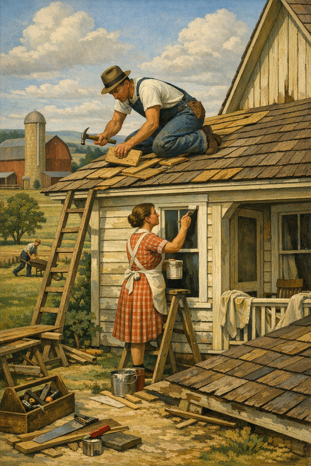
5. Color drenching in selected rooms
One of the boldest trends is color drenching: painting walls, trim, and sometimes ceilings in the same or closely related color. In powder rooms, dens, libraries, and bedrooms, this technique creates a tailored, immersive look. It can feel luxurious, but it also punishes weak execution. If trim is not prepped correctly or the sheen choices are off, the whole effect collapses.
Used with the right palette, color drenching makes a room feel deliberate rather than fragmented. Used carelessly, it makes a room feel dark and heavy. That is why homeowners considering trend-forward palettes should strongly consider a professional color consultation before committing gallons of paint to an idea they only saw on social media.
The best paint trend is not the one getting the most likes online—it’s the one that still looks right at 7 a.m., 2 p.m., and five years from now.
— 1 of a Kind Painting
How Denver Light Changes Paint Color
Colorado light is beautiful, but it is brutally honest. High altitude, abundant sunshine, and large swings in daylight intensity can distort how a color reads compared to the showroom or online inspiration photos. This is one reason national trends should never be copied blindly into local homes.
North-facing rooms
North-facing spaces often pull cooler and flatter. Gray can turn lifeless fast, and white can feel icy. In these rooms, warm whites, greiges, soft taupes, and muted greens often perform better than cold neutrals.
South-facing rooms
South-facing rooms receive stronger, warmer daylight. Soft colors can appear brighter and creamier here. This is a great orientation for layered neutrals, but it can make some beiges look too yellow if not tested properly.
East- and west-facing rooms
These rooms shift more dramatically through the day. East-facing rooms may look crisp in the morning and subdued later. West-facing rooms can gain strong golden light in the evening. That means undertones matter. A paint color that seems balanced at noon may look completely different at sunset.
Why sampling on poster board is better than tiny swatches
Small brush-outs on a wall rarely tell the truth. Larger test areas or movable sample boards allow you to judge color against flooring, cabinetry, trim, and natural light over time. A paint color is not a static object; it is a reaction between pigment, surface, and light.
This is particularly important for homeowners seeking painting services in Denver, CO, where architectural styles vary from historic bungalows to new-construction homes with very different light behavior and finish expectations.
Choosing the Right Finish, Brand, and Application
Color gets the attention, but finish determines whether the job looks expensive or disappointing. Even the perfect shade will underperform if the sheen is wrong, the substrate is poorly prepared, or the product choice does not match the room’s demands.
Best paint finishes by room type
Area
Recommended Finish
Why It Works
Living rooms & bedrooms
Eggshell
Soft appearance with moderate durability and easier touch-up balance
Hallways & family rooms
Satin or low-sheen eggshell
Better washability for high-traffic areas
Kitchens & bathrooms
Satin
Handles moisture, splashes, and cleaning better than flatter sheens
Trim, doors & baseboards
Semi-gloss
Durable, crisp, and highlights architectural details
Ceilings
Flat
Minimizes glare and hides surface imperfections
Brand matters, but not in the way people think
Sherwin-Williams, Benjamin Moore, Behr, and PPG all offer strong products at different tiers. The mistake is assuming brand name alone guarantees a premium result. It does not. Product line, surface prep, primer compatibility, cure time, and application skill all matter more than a label on the can.
For example, premium interior wall paints with strong hide and scrubbability can justify their cost in busy family homes. On trim and doors, leveling and hardness matter more. On cabinets, the system matters most of all: degreasing, sanding, bonding primer, and a durable cabinet-grade coating are not optional steps.
Low-VOC and zero-VOC paints are now mainstream
The old trade-off between healthier indoor air and good performance has narrowed dramatically. Many low-VOC and zero-VOC options now deliver excellent coverage, color retention, and washability. That makes them a practical choice for occupied homes, nurseries, bedrooms, and households sensitive to odor.
Homeowners often ask whether environmentally friendlier products are always the right answer. Usually, yes—but only when paired with proper prep and realistic curing expectations. Premium coatings still need the correct temperature, humidity conditions, and dry time to perform as designed.
Application quality is what people actually notice
Most homeowners cannot identify the exact product used on a wall after the job is complete. They can, however, instantly see lap marks, roller stipple inconsistency, rough repairs, brush drag on trim, and missed caulk lines. Bad prep is the silent killer of paint jobs.
That same standard applies outdoors. Many clients updating interiors also begin planning future curb-appeal improvements through exterior painting services, especially when they want a cohesive interior-exterior palette that feels updated rather than disconnected.
Where Homeowners Still Get Color Selection Wrong
The paint industry still oversimplifies color choice. Too much advice boils down to “pick what you like,” which sounds empowering but is often useless. Good color selection is about fit, not impulse.
Mistake 1: Choosing from a phone screen
Digital inspiration is useful, but device settings, photography filters, and room lighting make online color references unreliable. A warm greige on Instagram can turn muddy in real life, and a soft green can become far more saturated on your walls than expected.
Mistake 2: Ignoring fixed elements
Flooring, countertops, tile, stone fireplaces, cabinetry, and even exterior views all affect how paint reads. Color should support those elements, not fight them. This is especially true in renovation-heavy neighborhoods throughout Glendale and Centennial, where updated paint often needs to bridge older finishes with newer materials.
Mistake 3: Following trends without understanding longevity
Not every statement color belongs in a whole-home palette. Deep aubergine, dramatic oxblood, and ultra-dark brown may trend in designer content, but most homeowners should use them selectively. A trending color is not automatically a smart color.
Mistake 4: Underestimating sheen interaction
A color can look refined in matte and completely different in satin or semi-gloss. Homeowners often approve one sample and then dislike the final result because the sheen changed. That is not the paint “going wrong”; that is the finish revealing more light and surface detail.
Mistake 5: Trying to make every room identical
Flow matters, but sameness is not sophistication. A strong whole-home palette often uses related tones with purposeful variation. Bedrooms may need more calm, offices more focus, and dining rooms more depth. The best homes feel connected without feeling monotonous.
For anyone unsure how to balance trend, architecture, and personal style, a professional process backed by real-world experience and verified results matters. Before hiring, homeowners should review what our clients are saying and compare not just price, but consistency, communication, cleanliness, and finish quality.
When to Hire a Professional Painter Instead of Guessing
DIY painting is not always a bad idea. DIY color decisions often are. There is a difference between painting a guest room and managing a full-home color update involving ceilings, trim transitions, repairs, cabinet refinishing, and multiple lighting conditions.
Projects that usually justify professional help
Whole-home repaints where color flow matters from room to room
High ceilings, stairwells, and open-concept spaces that are difficult to cut cleanly
Dark or highly saturated colors that expose every flaw
Cabinets, trim, and doors requiring specialty prep and smoother finishes
Homes going on the market where strategic color choices affect buyer perception
Why professional prep changes everything
Professionals do more than apply paint. They identify substrate issues, repair nail pops, manage texture transitions, caulk gaps, prime stains, and sequence the job so that walls, ceilings, and trim all read cleanly together. That is what creates a finished look rather than a painted look.
Homeowners in the Denver metro area are also increasingly selective about contractor reliability. They want punctuality, communication, dust control, clear scopes of work, and crews that respect occupied homes. That expectation is reasonable, and frankly, overdue.
The strongest results come from strategy, not guesswork
If your project involves trend-driven colors, challenging natural light, or multiple rooms with different uses, it makes sense to involve professionals early. That does not mean handing over all design control. It means getting expert input before expensive mistakes happen.
Whether you are refreshing a historic Denver bungalow, updating a suburban family home in Brighton, or modernizing a condo with sharper contrast and cleaner trim lines, the process works best when color, prep, product choice, and application are all treated as one system. If you want to talk through your options, you can get in touch with our team to discuss timing, goals, and the right approach for your space.
Frequently Asked Questions
Q: What interior paint colors are trending most right now?
The strongest current trends include warm whites, earthy greens, soft taupes, clay-inspired neutrals, and selective use of deep blues or charcoal accents. These colors feel more grounded and livable than the cooler grays that dominated for years. The best choice depends on your home’s lighting, flooring, and architectural style.
Q: Do paint colors look different in Denver than they do elsewhere?
Yes. Denver’s bright, high-altitude sunlight can make colors appear sharper, brighter, or cooler depending on the room orientation and time of day. That is why larger samples and in-room testing are so important before committing to a full paint job.
Q: What is the best paint finish for interior walls?
Eggshell is often the best all-around choice for most living spaces because it balances softness and durability. Satin is better for higher-moisture or higher-traffic areas like kitchens, bathrooms, and hallways. Flat is usually best for ceilings, while semi-gloss is ideal for trim and doors.
Q: Are low-VOC paints worth it for interior projects?
In most cases, yes. Modern low-VOC and zero-VOC paints offer excellent performance while reducing odor and improving indoor comfort during and after application. They are especially valuable in occupied homes, bedrooms, nurseries, and households with sensitivity to strong smells.
Q: Should I follow paint trends if I plan to sell my house soon?
You should follow trends selectively. Broadly appealing warm neutrals, soft whites, and muted natural tones can make a home feel current without alienating buyers. Highly personal or very dark colors are better used sparingly unless the architecture strongly supports them.
Q: Is professional color consultation really necessary?
Not every project requires it, but it can save time, money, and frustration on larger or more design-sensitive repaints. Professional guidance is especially helpful when your home has challenging light, open-concept flow, fixed finishes, or you are choosing between several similar undertones.
The real trend is discernment. Homeowners are moving away from automatic gray, random online inspiration, and lowest-bid painting. They want interiors that feel tailored, durable, and relevant to how they live. That means understanding not just which colors are popular, but why certain colors work better in specific rooms, light conditions, and architectural contexts.
For homes across Denver, Centennial, Glendale, Brighton, and surrounding communities, the strongest results come from combining thoughtful color planning with disciplined preparation and skilled application. Whether the goal is a quieter whole-home refresh, a bolder statement room, or a coordinated interior-exterior update, 1 of a Kind Painting brings the practical experience to execute those decisions with precision.
If you are weighing paint colors, finishes, or the scope of an upcoming repaint, the smartest next step is not guessing harder. It is getting clarity from professionals who understand local homes, current products, and what quality should actually look like once the ladders are gone and the room is back in use.
Ready to Transform Your Space?
Whether you’re refreshing your home’s interior, updating your exterior curb appeal, or tackling a commercial repaint anywhere in the Denver metro area, 1 of a Kind Painting has the experience, craftsmanship, and attention to detail to deliver results that truly stand out.