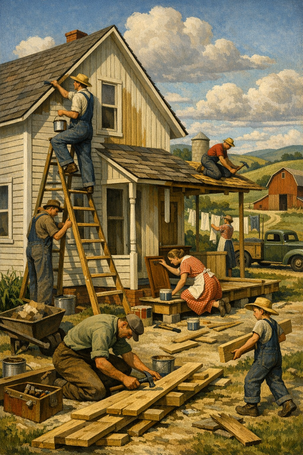
Safe beige is losing its grip on modern homes, and that is not a bad thing. The biggest shift in interior paint color trends 2026 is not just about picking prettier shades; it is about choosing colors that work harder, feel warmer, and actually fit how people live. Across the Denver metro area, homeowners are moving past flat gray walls and leaning into grounded greens, complex neutrals, earthy reds, and high-performance finishes that look better for longer.
Why Interior Paint Color Trends Are Changing in 2026
The era of one-color-fits-all interiors is over. For years, homeowners were told that the safest move was to paint everything a cool gray and hope staging culture would do the rest. That advice aged badly. Gray-heavy interiors can feel sterile, especially in homes that already get intense Colorado sun or have a lot of builder-grade finishes competing for attention.
The strongest interior paint color trends in 2026 are being driven by a few practical realities. First, people want homes that feel more personal and less like temporary resale boxes. Second, paint brands such as Sherwin-Williams, Benjamin Moore, Behr, and PPG continue to push warmer, more nuanced palettes because buyers are responding to them. Third, homeowners are much more educated now. They understand that undertones matter, light changes everything, and the right finish can make a wall feel expensive even before you add furniture.
There is also a local factor. In Colorado, especially around painting services in Denver, CO, natural light is bright, dry conditions are common, and homes range from historic brick bungalows to newer suburban builds in Centennial, Glendale, Brighton, and Aurora. That mix makes color selection more technical than many people realize.
When clients ask for trend-forward interiors, what they usually want is not “the color of the year.” They want a home that feels current without becoming dated in twelve months. That is exactly where professional color consultation earns its value. Strong color strategy is less about chasing a swatch on social media and more about matching the room, the light, the architecture, and the finish system.
The Top Interior Paint Color Trends 2026 Homeowners Are Choosing
The most important 2026 trend is complexity. Flat, obvious colors are fading. Shades with depth, subtle warmth, and shifting undertones are taking over because they feel more sophisticated and more forgiving in real homes.
Warm whites that actually feel livable
Crisp hospital whites are no longer the default. Homeowners are gravitating toward warm whites and soft off-whites with creamy, mineral, or greige undertones. Think Sherwin-Williams Alabaster, Benjamin Moore White Dove, or similar tones that soften hard edges without making a room feel yellow.
These colors work especially well in open-concept homes where walls need to connect kitchens, living rooms, and hallways without feeling cold. They also pair better with natural oak, brass, black fixtures, and stone surfaces than the icy whites that dominated recent years.
Earthy greens and nature-driven midtones
Muted green is no longer a niche choice. It has become a mainstream design move because it balances calm with personality. Sage, olive, eucalyptus, and deeper moss tones are showing up in bedrooms, home offices, powder rooms, and even kitchen walls. Brands like Behr and PPG continue to lean into organic, restorative palettes because they perform well across traditional and modern interiors.
In Denver-area homes, green often works because it reflects the region’s broader design language: natural materials, mountain-inspired palettes, and a desire for interiors that feel grounded rather than glossy.
Rich browns, clay tones, and red-infused neutrals
One of the boldest interior paint color trends 2026 is the return of warmth with backbone. Soft terracotta, cinnamon, clay, cocoa, and mushroom tones are making a serious comeback. These shades are not the heavy Tuscan colors of the early 2000s. They are more edited, more muted, and far more versatile.
Used correctly, these colors create spaces that feel tailored and high-end. Used badly, they can look muddy. That is why test samples matter so much. A clay tone that looks elegant in a magazine can turn orange under bright west-facing Colorado light.
Color-drenched rooms
Accent walls are losing influence; full-room immersion is gaining it. More homeowners are painting walls, trim, and sometimes even ceilings in closely related tones for a deeper, more designed effect. This approach works particularly well in dining rooms, offices, libraries, and smaller bedrooms where drama is an advantage, not a risk.
Color drenching can make builder-grade rooms feel custom. It also hides awkward transitions better than the old formula of white trim everywhere. When paired with quality prep and sharp cut lines, the result looks intentional instead of trendy.
Moody blues and charcoal alternatives
Deep navy still has a place, but it is being challenged by softer ink tones, stormy blue-grays, and warm charcoals that are easier to live with. These shades are excellent for media rooms, built-ins, and primary bedrooms where contrast is welcome but black would feel too severe.
The paint industry spent too long selling “safe” neutrals that made homes feel forgettable. The smartest interiors in 2026 are warmer, moodier, and far more intentional.
— 1 of a Kind Painting
How Denver Light and Architecture Affect Color Choice
Ignoring natural light is one of the fastest ways to waste money on paint. A color that looks balanced in a showroom can shift dramatically once it is on a wall in Denver, where sunlight is bright and often unforgiving. High altitude light tends to reveal undertones more aggressively, which means subtle beige can turn pink, cool gray can read blue, and green can suddenly look far stronger than expected.
North-facing rooms
North-facing rooms often read cooler and flatter, so they usually benefit from warmer neutrals, creamy whites, or earth-inflected colors that add visual heat. This is where many gray paints fail. They do not just look neutral; they look drained.
South-facing rooms
South-facing rooms receive generous light, which gives homeowners more flexibility. Warm whites, greiges, greens, and clay tones all tend to perform well here. The caution is oversaturation. Strong pigments can intensify quickly, especially in the afternoon.
Historic homes vs. newer builds
Older Denver and Glendale homes often have architectural details worth emphasizing, such as plaster texture, wood trim, built-ins, or defined room layouts. These homes can handle richer, more layered color stories. Newer homes in Centennial or Brighton often need color to create separation and warmth because the architecture is more open and visually simplified.
This is also why trends should never be copied blindly. A color that sings in a dark, moody East Coast dining room may feel completely different in a bright Colorado great room. Homeowners who want proof of what refined paintwork looks like can browse our project gallery to see how color and finish interact in real spaces.
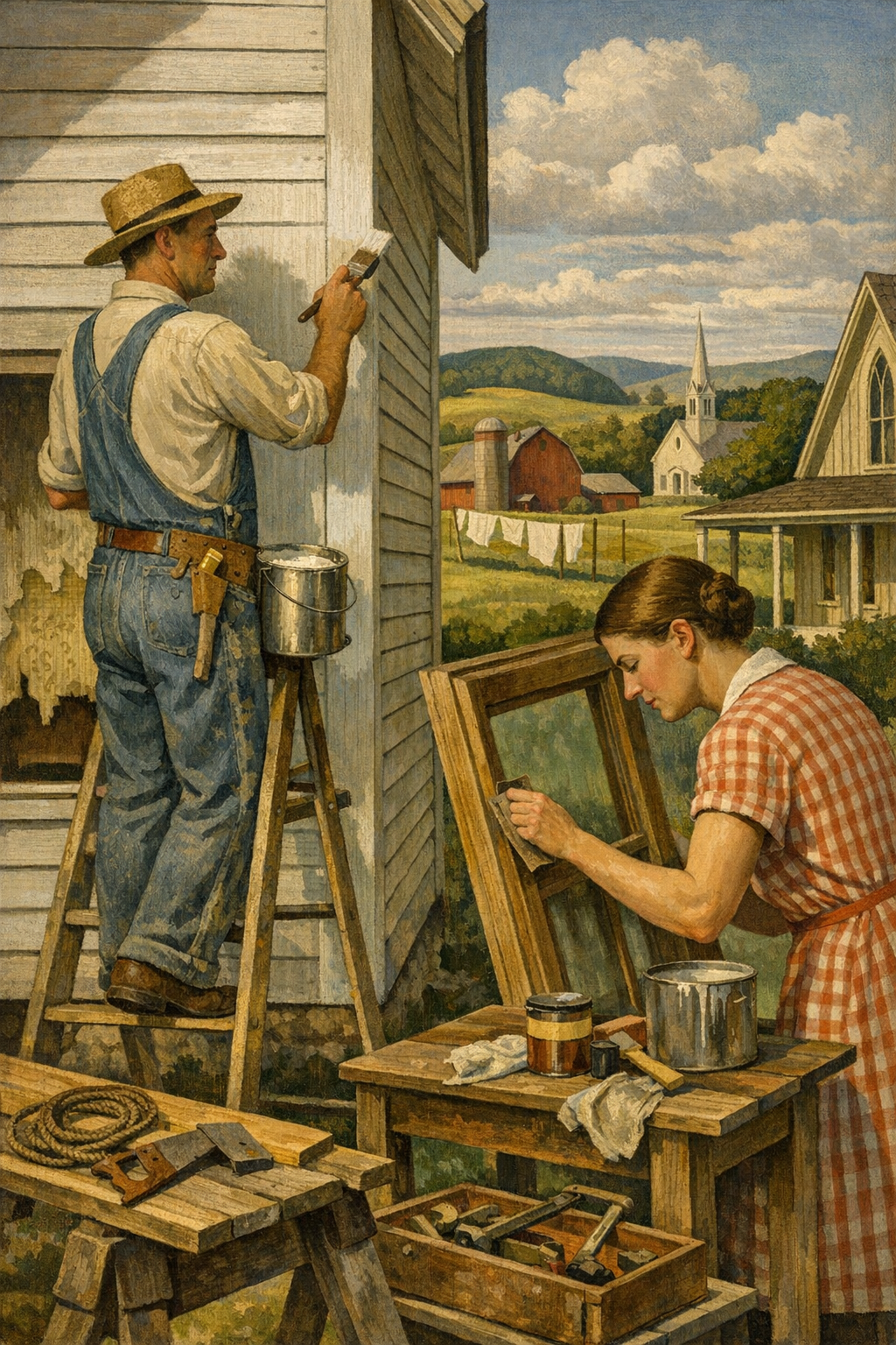
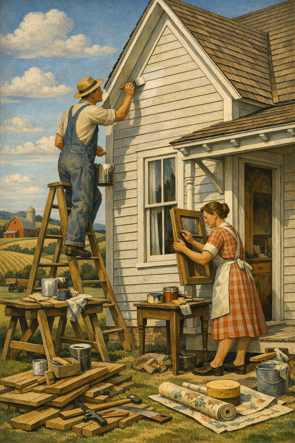
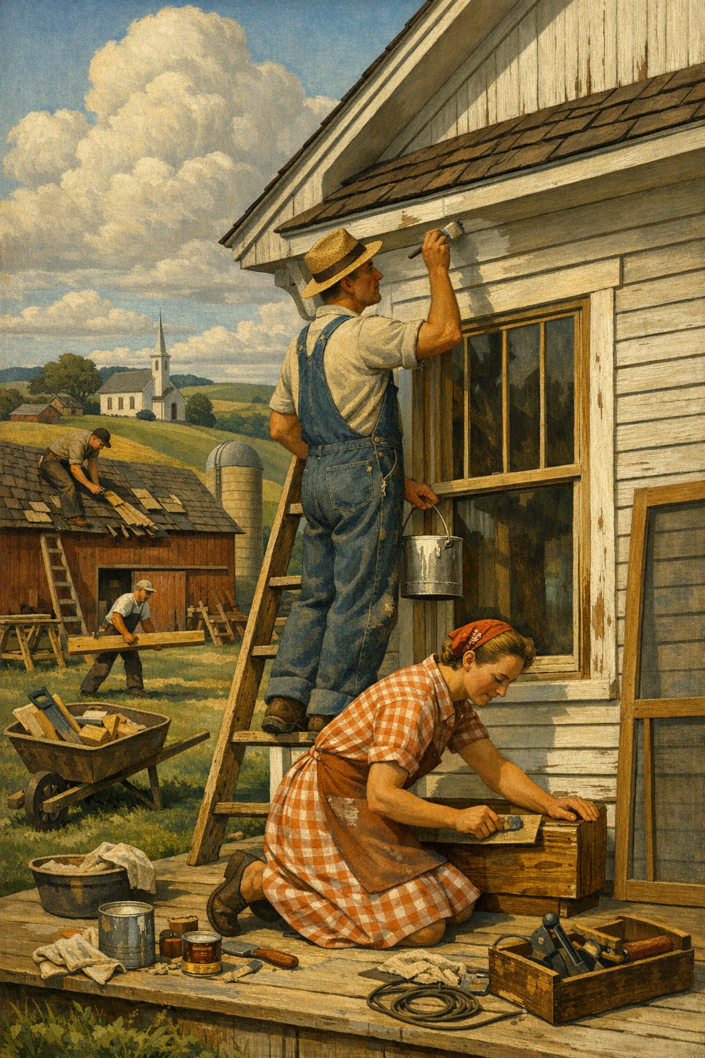
The Finishes, Products, and Prep Work That Make Trend Colors Last
Color gets the attention, but prep and product quality determine whether the result feels premium or cheap. This is the part many painters undersell because it is less glamorous than a fresh color palette. That is a mistake. Even the best interior paint color trends 2026 will fail if they are applied over poor patching, glossy contamination, or the wrong primer.
Why low-VOC and premium formulas matter
Today’s better paints do more than cover. Premium low-VOC and zero-VOC options from Sherwin-Williams, Benjamin Moore, Behr, and PPG offer improved scrub resistance, richer hide, and better color retention than bargain coatings. For occupied homes, especially those with kids, pets, or sensitive occupants, lower-odor products are a practical improvement, not just a marketing line.
Sheen selection is still wildly misunderstood
Higher sheen does not automatically mean better durability. In fact, too much sheen can magnify every drywall flaw and roller mark. The right finish depends on the room, the wall condition, and the expected wear.
Room Type
Recommended Finish
Why It Works
Living Rooms & Bedrooms
Matte or Eggshell
Soft look, good touch-up performance, hides minor surface flaws
Hallways & Family Rooms
Eggshell or Satin
Better washability for high-traffic areas
Kitchens & Bathrooms
Satin
Moisture resistance and easier cleaning without excessive shine
Trim & Doors
Semi-Gloss
Durable surface with crisp contrast and easier maintenance
Ceilings
Flat
Minimizes light reflection and hides imperfections
Prep is the difference between “freshly painted” and “professionally finished”
Proper prep includes more than filling a few nail holes. It can involve sanding glossy surfaces, caulking trim gaps, repairing drywall damage, spot-priming stains, and ensuring previous coatings are stable. Dark trend colors and warm whites are both unforgiving in different ways. Deep shades reveal lap marks if application is weak. Light neutrals expose every patch if the substrate is uneven.
This is why homeowners often turn to experienced interior painting services when they want a trend-driven result that still looks sharp a year later. Good painting is not just color placement; it is systems thinking.
DIY vs. Professional Painting for Trend-Driven Interiors
DIY painting is not always cheaper once you count mistakes, rework, and wasted product. That is especially true with color-drenched rooms, dark tones, repaired walls, or multi-surface projects involving trim, doors, and ceilings. The internet often reduces painting to rollers and confidence. Real projects involve sequencing, masking, sheen coordination, drying times, surface diagnosis, and a lot of detail work.
Where DIY can work
Small bedrooms with light color changes and minimal wall damage
Simple accent areas where a perfect finish is not critical
Homeowners with time to patch, sand, tape, and apply multiple coats correctly
Where professionals usually win
Open-concept interiors where consistency matters across multiple spaces
Dark, moody colors that require careful coverage and edge control
Cabinet-adjacent and trim-heavy rooms where cut lines define the quality level
Occupied homes where cleanliness, scheduling, and efficiency matter
Hiring a professional also reduces the odds of trend fatigue caused by a bad application. Homeowners often blame the color when the real issue is flashing, lap marks, poor repairs, or the wrong sheen. If you are comparing your options, what our clients are saying offers a useful reality check on what people actually value after the work is done: clean lines, reliable communication, respectful crews, and results that hold up.
And while this article focuses on interiors, many homeowners making color updates indoors are also thinking about curb appeal. Coordinating interior palettes with trim, front doors, and siding can create a more cohesive overall look, which is where professional exterior painting services often become part of the bigger plan.
How to Use 2026 Color Trends Room by Room
The smartest way to use trends is selectively. Not every room should make the same statement, and not every trending shade belongs in every house. A strong color plan balances continuity with contrast.
Living rooms
Living rooms are leaning toward warm whites, mushroom tones, and soft olive-greiges that make upholstery, wood, and stone look richer. These shades photograph well, but more importantly, they feel stable throughout the day. In Denver homes with intense natural light, they tend to hold their character better than cooler grays.
Kitchens
Kitchens are seeing more color confidence, especially around pantries, breakfast nooks, and adjacent walls. Dusty green, muted blue, and mineral-inspired neutrals are outperforming bright whites because they add depth without fighting cabinetry. If the kitchen opens directly into other rooms, this is where coordinated color planning matters most.
Bedrooms
Bedrooms are ideal for the softer side of interior paint color trends 2026. Think sage, warm taupe, smoky blue, or cocooning clay neutrals. The goal is not dramatic impact for guests. It is comfort, visual quiet, and enough depth to make the room feel finished.
Home offices
Home offices continue to justify bolder choices. Midtone green, inky blue, and warm charcoal all work well here because they reduce glare and create focus. A properly painted office can feel more productive than a generic white box, which matters now that remote and hybrid work are standard for many households.
Bathrooms and powder rooms
Small rooms are where bold color often looks best. Powder rooms are perfect candidates for color drenching, deeper jewel tones, or earthy reds with personality. These spaces can handle more risk because the scale is controlled and the payoff is high.
Hallways and transitions
Hallways are too often treated as afterthoughts. In reality, they determine how cohesive the whole house feels. Warm neutral bridge colors, not generic contractor beige, are doing the heavy lifting in 2026. They connect stronger room colors without flattening the home’s personality.
For homeowners in Aurora, Centennial, Glendale, Brighton, and greater Denver, the best approach is usually to start with the most visible shared spaces, establish a neutral anchor, and then build outward. That is how trend-forward homes stay elegant instead of chaotic.
Frequently Asked Questions
Q: What are the most popular interior paint colors for 2026?
The strongest interior paint color trends 2026 include warm whites, earthy greens, clay neutrals, soft browns, and moody blue-charcoal tones. Homeowners are moving away from flat cool grays and toward colors with more warmth and depth. The most successful choices depend on your lighting, flooring, and architecture.
Q: Are gray walls still in style for 2026?
Gray is not completely gone, but cool, blue-based gray is losing popularity fast. Warmer greiges, mushroom tones, and taupe-infused neutrals are replacing it because they feel more natural and work better with current finishes and furnishings. In bright Colorado light, many cool grays can feel stark or dated.
Q: What paint finish is best for interior walls?
For most interior walls, matte or eggshell gives the best balance of appearance and performance. High-traffic areas like hallways, kitchens, and bathrooms often benefit from eggshell or satin for easier cleaning. The right finish also depends on wall condition, because more sheen can highlight flaws.
Q: How do I choose the right paint color for Denver sunlight?
Test large samples on multiple walls and check them at different times of day. Denver’s bright natural light can exaggerate undertones, making colors appear warmer, cooler, or more saturated than expected. A professional color consultation helps prevent expensive mistakes, especially with trend colors.
Q: Is it worth hiring professionals for interior painting instead of doing it myself?
If the project involves dark colors, multiple rooms, visible repairs, trim work, or a high-end finish, hiring professionals is usually worth it. Proper prep, clean lines, consistent coverage, and correct sheen selection have a major impact on the final look. DIY can work for simple spaces, but trend-driven interiors leave less room for error.
Q: Do low-VOC paints perform as well as traditional paints?
Yes, many premium low-VOC and zero-VOC paints now perform extremely well in terms of coverage, scrub resistance, and durability. Top-tier products from major brands often match or outperform older high-odor formulas. Product selection still matters, especially in kitchens, bathrooms, and high-traffic spaces.
The best trend is not a color chip. It is better decision-making. Homeowners are getting smarter about how interior paint affects mood, resale, maintenance, and the overall quality of a home. That is why the strongest interior paint color trends 2026 are less about novelty and more about depth, warmth, and technical fit.
For homeowners across Denver, Centennial, Glendale, Brighton, and nearby communities, thoughtful paint selection can completely reshape how a home feels without changing a single wall or cabinet. Whether the goal is a calm whole-home palette, a moody office, or a warmer alternative to outdated gray, professional execution matters just as much as color choice. 1 of a Kind Painting brings that balance of craftsmanship, product knowledge, and real-world experience to every project, from carefully planned interiors to complete residential transformations.
If you are weighing colors, finishes, repairs, or the scope of your next project, the smartest next step is simply to get in touch with our team. A well-painted home should not just look current this season. It should feel right every day you live in it.
Ready to Transform Your Space?
Whether you’re refreshing your home’s interior, updating your exterior curb appeal, or tackling a commercial repaint anywhere in the Denver metro area, 1 of a Kind Painting has the experience, craftsmanship, and attention to detail to deliver results that truly stand out.
Most homes don’t look outdated because they’re old; they look outdated because their paint colors are playing defense instead of making a statement. The biggest paint color trends 2026 are moving away from safe-but-forgettable beige and toward warmer, moodier, more architectural choices that actually change how a room feels. In the Denver metro area, where intense sunlight, open-concept layouts, and indoor-outdoor living all shape design decisions, color selection is no longer a minor detail—it’s the finish line between average and exceptional.
Why 2026 Paint Color Trends Are Warmer, Richer, and More Intentional
The conversation around paint has changed. For years, homeowners were pushed toward hyper-neutral, ultra-safe palettes that photographed well but often felt lifeless in person. That era is fading fast. The dominant paint color trends in 2026 are warmer, more grounded, and more emotionally intelligent.
Major manufacturers like Sherwin-Williams, Benjamin Moore, Behr, and PPG have all been signaling the same broad direction: soft earthy colors, atmospheric blues, muted greens, clay-inspired neutrals, and deeper grounding accents. That doesn’t mean every room needs to be dark or dramatic. It means people want their homes to feel curated rather than generic.
The trend is less about “bold” and more about “believable”
Many homeowners hear the word “trend” and imagine flashy colors they’ll regret in a year. That’s the wrong lens. The strongest 2026 palettes are not gimmicky. They’re rooted in natural materials, wellness design, and a reaction against cold gray overload. Think:
Warm whites instead of stark whites
Mushroom and greige-taupe blends instead of flat gray
Sage, olive, and eucalyptus greens instead of minty pastels
Dusty blue-grays and stormy blue-greens instead of bright nautical blues
Terracotta, clay, and muted rust accents instead of loud orange statements
These colors work because they bring softness and depth without feeling chaotic. In practice, they pair well with oak floors, black windows, brass hardware, natural stone, and the mixed-metal finishes that still dominate kitchen and bath design.
Why homeowners are rejecting the old gray formula
Cool gray had a long run, but much of it was a design shortcut, not a design strategy. In many homes, especially in Colorado, cool gray walls can read sterile under strong daylight and flat under LED lighting at night. That’s why more homeowners are turning to warmer undertones that create comfort without sacrificing sophistication.
If you’re planning a repaint and want guidance beyond a tiny fan deck square, a professional color consultation can prevent the single most common mistake in residential painting: choosing a color in theory rather than in the actual room where it has to live.
The Top Interior Paint Colors Homeowners Are Actually Choosing
Let’s get specific. The most in-demand paint color trends 2026 can be grouped into a few practical categories. These are not abstract design ideas; these are the kinds of colors homeowners are using in living rooms, kitchens, bedrooms, offices, and whole-home repaints.
1. Warm off-whites that don’t feel clinical
Stark white is losing ground because it can feel harsh, especially in homes with intense natural light. Homeowners are leaning into creamy whites and nuanced off-whites such as Sherwin-Williams Alabaster, Benjamin Moore White Dove, and similar shades with a touch of warmth. These tones still feel clean, but they don’t punish the room.
They’re especially effective in open floor plans where the wall color needs to flow through multiple spaces without becoming invisible.
2. Greige is back—but smarter this time
Not all neutrals are equal. The best 2026 greiges are richer, softer, and less cold than the builder-grade colors that dominated years past. Homeowners are choosing shades with taupe, mushroom, or putty undertones because they create dimension and pair beautifully with wood cabinetry, textured fabrics, and matte black accents.
These colors are ideal for whole-home repaints because they provide flexibility without looking generic. For homeowners considering interior painting services, this category often offers the safest balance between trend-forward and timeless.
3. Green is now a core neutral
Muted green is no longer an “accent color”—it’s becoming a foundational design choice. Soft sage in bedrooms, olive in powder rooms, and smoky green in cabinetry all feel current because they connect interiors to nature without becoming overly rustic. Denver-area homes in particular benefit from these tones because they complement the region’s landscape, stone, and wood-heavy architecture.
4. Blue is going moodier and more architectural
Forget bright beach-house blues. The modern version is more complex: dusty slate, stormy blue, blue-green, and mineral-inspired tones that shift with the light. These colors are especially effective in dining rooms, offices, and primary bedrooms where a little depth makes the space feel more intentional.
5. Earth tones are replacing “safe” accent walls
Accent walls used to be a default move. Too often, they felt random. The better alternative in 2026 is to use richer earth tones in places that deserve definition: a library wall, built-ins, a dining nook, mudroom cabinetry, or a powder room. Clay, cinnamon, adobe, caramel, and muted rust can all work beautifully when they’re balanced with the right trim, flooring, and lighting.
Color Family
Best Rooms
Why It Works in 2026
Watch Out For
Warm Off-White
Living rooms, hallways, open layouts
Feels clean without looking sterile
Can turn yellow if paired with overly warm lighting
Greige / Mushroom
Whole-home repaints, bedrooms, basements
Flexible and sophisticated
Wrong undertone can look muddy
Sage / Olive Green
Bedrooms, bathrooms, kitchens
Grounded, calming, nature-driven
Can feel dull in low-light rooms if undersaturated
Dusty Blue / Blue-Green
Offices, dining rooms, primary suites
Adds depth and architectural character
Can read too cool if trim is stark white
Clay / Terracotta Accent
Powder rooms, niches, built-ins
Warm, distinctive, high-design look
Easy to overdo in large spaces
How Denver Light Changes Everything
Homeowners in Colorado often underestimate one major factor: paint colors do not behave the same way in Denver as they do in flatter, cloudier, or more humid climates. The region’s bright elevation light can expose undertones instantly. A gray that looked sophisticated on a sample card may suddenly read blue. A beige can go peach. A white can feel almost blinding at midday.
Natural light is your biggest design partner—or your biggest critic
In the Denver metro area, large windows and abundant sunlight are design assets, but they also create less room for error. South-facing rooms can intensify warmth. North-facing rooms can flatten already cool colors. East and west exposures create dramatic shifts from morning to evening.
That’s why paint color trends 2026 must be interpreted locally. A shade that works beautifully in a catalog photo may need to be adjusted for your specific home in Aurora, Centennial, Glendale, or Brighton. If you’re comparing palettes for a Front Range property, local experience matters just as much as brand reputation.
Homeowners looking for painting services in Denver, CO are often surprised by how much the final result depends on light direction, sheen choice, and surface texture—not just the color itself.
Exterior color trends are shifting too
Although this article focuses on interiors, exterior palettes are moving in a parallel direction: warmer whites, richer charcoal accents, olive undertones, and more natural body colors that work with stone, brick, and native landscaping. The old formula of bright white with black trim still has a place, but it’s no longer the only luxury option.
For homeowners updating curb appeal alongside interior spaces, exterior painting services should be planned as part of a broader color strategy rather than an isolated project.
The biggest painting mistake homeowners make is treating color like decoration when it actually functions like architecture.
— 1 of a Kind Painting
Where These Color Trends Work Best in Real Homes
Good color selection is not about chasing whatever shade is hottest on social media. It’s about placing color where it improves the room’s purpose, scale, and atmosphere. That’s where trend becomes value.
Living rooms and open-concept areas
Warm off-whites, mushroom tones, and nuanced greiges dominate here because they create continuity without draining the room of personality. In open layouts, one wrong undertone can make the entire main floor feel disconnected. Softer warm neutrals keep kitchens, dining areas, and family rooms visually tied together.
Kitchens and cabinets
Cabinet color is where homeowners are getting more confident. Painted cabinetry in muted green, soft blue-gray, or warm taupe continues to gain traction. This works particularly well when paired with quartz counters, aged brass hardware, or natural wood islands. A trendy cabinet color can elevate the room, but only when the prep, primer, and topcoat system are handled correctly.
If you want to see how dramatic a professional transformation can be, browse our project gallery. Before-and-after work tells the truth faster than any color swatch ever will.
Bedrooms and primary suites
Bedrooms are becoming softer, moodier, and more restful. Sage, muted blue-green, warm taupe, and cozy off-white tones are popular because they support lower visual stress. People are no longer designing bedrooms to impress guests; they’re designing them to recover from the day.
Bathrooms and powder rooms
This is where homeowners are taking smart risks. Powder rooms are ideal for dramatic earth tones, saturated green, or moody blue because the smaller footprint can handle more personality. The key is balance: good lighting, thoughtful sheen selection, and crisp lines around trim and tile transitions.
Home offices
Remote and hybrid work permanently changed home office design. These rooms are no longer afterthoughts. More homeowners are choosing colors with a little gravity—dusty blue, olive gray, or deep taupe—because they create focus and photograph well on video calls without looking cold.
What the Paint Industry Still Gets Wrong About Trendy Colors
Too many painters still talk about color as if the hard part is choosing the shade. It isn’t. The hard part is choosing the right shade for the right substrate, light, finish, and adjacent materials—and then applying it well enough that the color reads the way it was intended.
Sample cards are not decision tools
A one-inch printed swatch is useful for narrowing options, not making a final call. Real color testing should involve large painted samples or peel-and-stick samples observed across different times of day. This sounds obvious, yet countless disappointing paint jobs start with a rushed decision made under store lighting.
Cheap paint can sabotage expensive design
Not every project requires the most expensive coating on the shelf, but bargain paint often creates more labor, weaker coverage, poorer washability, and less consistent finish. That false economy is especially painful with trendy colors, which often have more complex pigments and require better hiding performance.
Brands like Sherwin-Williams Emerald, Benjamin Moore Regal Select, and other premium low-VOC interior lines continue to be popular for a reason. They tend to level better, hold color more consistently, and stand up better in high-contact zones.
Sheen mistakes ruin otherwise great color choices
The wrong sheen can exaggerate drywall flaws, create glare, or make a refined color look plastic. Flat and matte finishes have become more popular in main living areas because they create a more elevated look, while eggshell and satin still have their place in rooms needing a little more durability. The best color in the wrong sheen is still the wrong finish.
DIY confidence often collapses at the prep stage
Many homeowners can roll paint onto a wall. Fewer can properly patch, sand, caulk, prime, cut clean lines, maintain wet edges, manage flashing, and understand when a surface needs specialty products. That gap is exactly why professionally painted rooms look sharper, last longer, and create cleaner color presentation.
When people compare hiring a pro versus doing it themselves, trust matters. Reading what our clients are saying often reveals the same pattern: homeowners expected paint, but what they really valued was the finish quality, communication, and problem-solving behind it.
Professional Application Matters More Than the Color Chip
Paint color trends 2026 may get the attention, but execution decides whether the finished room feels high-end or half-done. Professional painting is less about speed and more about control.
Surface prep creates the real luxury look
Nail pops, minor dents, rough texture transitions, hairline cracks, failed caulk lines, and patch flashing all become more visible with today’s refined neutrals and moody colors. Sophisticated palettes demand disciplined prep. Without it, the room can look tired even with brand-new paint.
Modern colors demand better cut lines and cleaner transitions
Warm whites, green-grays, and deep accent colors expose sloppiness fast. Wavy lines at ceilings, heavy brush marks on trim, and uneven roller texture can make a premium color feel amateur. That’s one reason homeowners turn to experienced crews for projects that involve trim contrast, cabinetry, stairwells, vaulted ceilings, or whole-home repaints.
Commercial spaces are following the same logic
This shift isn’t limited to houses. Offices, retail interiors, hospitality spaces, and tenant improvements are also moving toward warmer and more brand-conscious environments. If a workspace still relies on lifeless gray walls and harsh fluorescent logic, it’s already behind. Businesses wanting more polished results often benefit from dedicated commercial painting services that understand durability, scheduling, and presentation.
Local expertise beats trend chasing
A painter who understands Denver-area housing stock, climate, and light conditions can save homeowners from expensive missteps. Whether the property is a historic home in Glendale, a newer build in Brighton, or a remodel in Centennial, local context shapes the right paint strategy.
That’s why broad trend awareness should be paired with site-specific execution. A great painter doesn’t just know what’s popular. A great painter knows what will actually work in your space.
Frequently Asked Questions
Q: What are the biggest paint color trends for 2026?
The biggest paint color trends 2026 include warm off-whites, mushroom-toned neutrals, muted sage and olive greens, dusty blue-greens, and earthy clay-inspired accents. These colors are popular because they create more depth and comfort than the cooler grays that dominated previous years.
Q: Are gray paint colors out of style?
Not completely, but many cool grays are losing favor. Homeowners are moving toward warmer gray-beige blends, taupes, and softer greiges because they feel more natural and less sterile, especially in bright homes with lots of daylight.
Q: What paint colors work best in Denver homes?
Denver homes often benefit from colors with balanced undertones because the region’s strong natural light can exaggerate coolness or warmth. Warm whites, greige, muted greens, and soft blue-grays usually perform well, but they should always be tested in the actual room before final selection.
Q: Should I use the same paint color throughout my whole house?
A whole-home color can work very well, especially in open-concept layouts, but it should be chosen carefully. Many homeowners use one main neutral for flow and then add distinct supporting colors in bedrooms, bathrooms, offices, or feature areas for more personality.
Q: Is it worth hiring a professional painter for trendy colors?
Yes, especially if the project involves nuanced neutrals, dark accent colors, cabinetry, or detailed trim work. Trend-forward colors often reveal surface flaws, roller marks, and poor cut lines more easily, so professional prep and application make a noticeable difference.
Q: What is the best way to test a paint color before committing?
Use large painted sample boards or high-quality peel-and-stick samples and view them in morning, afternoon, and evening light. Compare them next to flooring, countertops, cabinets, and trim, because surrounding materials can change how the color is perceived.
The real lesson from paint color trends 2026 is simple: homeowners want more than a fresh coat. They want spaces that feel warmer, smarter, and more aligned with how they actually live. That means choosing color with intention, respecting the influence of light, and refusing the old one-size-fits-all neutral formula that made so many homes feel interchangeable.
For homeowners across Denver and surrounding communities like Centennial, Glendale, Brighton, and Aurora, the best results come from combining trend awareness with disciplined craftsmanship. A well-painted room should do more than look current for a season—it should feel right every day you walk into it.
If you’re ready to update your home with colors that feel current without feeling disposable, 1 of a Kind Painting brings the local experience, product knowledge, and finish quality needed to get it right the first time. Whether you’re planning a full interior refresh, coordinating exterior updates, or simply trying to avoid an expensive color mistake, get in touch with our team to talk through your next project.
Ready to Transform Your Space?
Whether you’re refreshing your home’s interior, updating your exterior curb appeal, or tackling a commercial repaint anywhere in the Denver metro area, 1 of a Kind Painting has the experience, craftsmanship, and attention to detail to deliver results that truly stand out.
Most homes do not need more color—they need better color decisions. That is the real story behind today’s interior paint color trends. In Denver-area homes, the shift is no longer about chasing a viral shade from social media; it is about using warmer neutrals, grounded greens, muted blues, and low-sheen finishes in ways that actually improve how a room feels, performs, and ages over time.
The era of icy gray walls is not just fading—it is being actively rejected. Homeowners are realizing that many of the “safe” colors pushed over the last decade made rooms feel flat, cold, and interchangeable. The current movement in interior paint color trends is a reaction to that fatigue. People want warmth, depth, and a stronger connection between color and architecture.
The shift from sterile to livable
Major paint brands like Sherwin-Williams, Benjamin Moore, Behr, and PPG have all leaned into warmer, softer, more nuanced palettes. That does not mean dark or dramatic colors are disappearing. It means homeowners are becoming more selective. Instead of painting every wall the same generic greige, they are using color to solve specific design problems: brightening north-facing rooms, softening open-concept layouts, or giving older homes more character.
This is a smarter trend cycle than the industry usually delivers. Better color selection is being driven by function as much as aesthetics. In kitchens, warmer whites and putty tones hide real-life wear better than stark whites. In bedrooms, muted blue-greens and clay neutrals support a calmer atmosphere. In living areas, earthy mid-tones create contrast without making a room feel heavy.
Why paint trends matter more now
Paint is still one of the highest-impact, lowest-disruption upgrades a homeowner can make. That matters in a market where many Denver homeowners are improving the homes they already have instead of moving. A well-planned repaint can modernize trim, update cabinetry, improve resale presentation, and make everyday spaces feel more intentional without the cost of a full renovation.
That is why interior painting services have become such a practical design tool. Paint is no longer the finishing touch at the end of a remodel. In many homes, it is the strategy that makes everything else work.
The Colors Homeowners Are Actually Choosing
Trends sound glamorous, but the winning colors are usually the ones that survive morning light, evening shadows, fingerprints, and second thoughts. The shades gaining traction now are versatile, layered, and more forgiving than the hyper-trendy tones that dominate social feeds.
Warm whites and off-whites
Warm whites remain dominant, but the best versions are not yellow or creamy in the outdated sense. They have subtle undertones that soften walls and trim without looking dingy. Shades similar to Sherwin-Williams Alabaster, Benjamin Moore White Dove, and Behr Blank Canvas keep showing up because they adapt well to changing natural light and mixed finishes.
These whites also pair better with natural wood, matte black hardware, brushed brass, and stone surfaces than bright blue-based whites. That flexibility is exactly why they keep winning.
Grounded greens
Soft sage, olive-gray, eucalyptus, and moody heritage greens have moved from “accent color” into mainstream use. They work in offices, dining rooms, cabinetry, mudrooms, and even entire living spaces when balanced correctly. Green is popular because it feels restorative without being predictable.
For homeowners who want color without chaos, green is often the best bridge. It feels current, but it also has staying power. That is especially true when paired with a professional color consultation that considers flooring, exposure, and fixed finishes instead of treating the wall color as an isolated choice.
Muted blues and stormy neutrals
Blue has matured. The loud coastal blues and trendy navy overload of past years have given way to more complex shades: dusty slate, gray-blue, mineral blue, and softened denim tones. These shades can make bedrooms, studies, and bathrooms feel layered and calm without becoming theme-driven.
Earth tones with modern restraint
Clay, mushroom, taupe, sand, and brown-based neutrals are back, but in a much cleaner form. They are less orange than older Tuscan palettes and less flat than generic beige. The best of these colors feel architectural. They add warmth without stealing attention from millwork, furniture, or art.
Color Family
Best Rooms
Why It Works
Common Mistake
Warm White
Living rooms, kitchens, hallways
Bright, flexible, pairs with most finishes
Choosing a white that turns gray or yellow in local light
Sage/Muted Green
Bedrooms, offices, cabinets, dining rooms
Calm, natural, current without feeling trendy
Using too much yellow-green in bright sun
Dusty Blue
Bathrooms, bedrooms, studies
Creates depth and softness
Going too dark in low-light rooms
Greige/Taupe
Open floor plans, transitional spaces
Bridges warm and cool elements
Picking a muddy undertone that clashes with flooring
Clay/Mushroom
Accent walls, dining rooms, powder rooms
Adds warmth and character
Overcommitting without testing against trim and ceiling color
If you want to see how these palettes look in real projects rather than filtered mockups, browsing our project gallery is far more useful than guessing from a phone screen.
How Finish, Light, and Surface Prep Change Everything
A trend color can fail spectacularly if the sheen is wrong, the drywall is rough, or the prep work is lazy. This is where too many painting conversations fall apart. People debate colors endlessly while ignoring the technical choices that make those colors look expensive.
Finish matters more than most people think
Flat and matte finishes are more popular now because they create a softer, more contemporary look. They reduce glare and help rich colors read as more sophisticated. But not every room should be painted dead flat. High-traffic areas, bathrooms, kitchens, and family spaces may need an eggshell or washable matte product that balances durability with aesthetics.
Cheap advice often sounds like this: “Use eggshell everywhere.” That is not a strategy. That is a shortcut. Room use, wall condition, natural light, and product quality all matter.
Denver light changes color dramatically
Homes in the Denver metro area often get strong, shifting light because of elevation, exposure, and large window layouts. A color that looks creamy in one room can look nearly beige in another. A gray-green can suddenly appear blue. A warm neutral can go pink against certain flooring.
That is why sample boards, large-format test patches, and room-by-room evaluation matter. A color selected under store lighting can mislead you badly once it hits your walls in real conditions.
Prep separates premium work from average work
No trend survives bad prep. Nail pops, uneven texture, flashing, roller marks, telegraphing seams, and weak cut lines will make even premium paint look cheap. Professional painters spend real time on patching, sanding, caulking, priming, dust control, masking, and product matching because surface preparation is not optional overhead—it is the job.
This same principle applies outside. If your project also includes curb appeal upgrades, quality exterior painting services require the same discipline in prep, repair, and coating selection.
The paint color gets the credit, but the prep work earns the result.
— 1 of a Kind Painting
What Denver Homes Need From Color Right Now
National trends do not automatically translate to Colorado homes. Interior paint color trends need local interpretation. Denver, Centennial, Glendale, Brighton, and Aurora all include a mix of newer builds, mid-century homes, remodel-heavy neighborhoods, and investment properties. The architecture varies, the light varies, and the design goals vary.
Open-concept homes need visual structure
Many newer homes in the metro area have large open layouts where the kitchen, dining area, and living room flow together. That creates flexibility, but it also creates sameness. One washed-out neutral across every wall can make the entire main floor feel undefined.
Better solutions include:
Using tonal variation between connected rooms instead of one flat color everywhere
Painting trim, built-ins, or islands in a contrasting but coordinated tone
Using softer ceilings and wall colors to reduce glare in bright spaces
Selecting colors based on exposure rather than trend charts alone
Older homes benefit from depth, not just brightness
In established neighborhoods, homeowners often assume they must use pale colors to modernize a home. That is not always true. Older homes can look far more refined with medium-depth neutrals, historic-inspired greens, or warm mineral tones that complement original trim, plaster texture, or wood details.
That is especially relevant for homeowners exploring painting services in Denver, CO, where many neighborhoods reward character more than generic resale-safe choices. The strongest color plans usually respect the architecture instead of trying to erase it.
Commercial spaces are following the same pattern
Even in offices, retail spaces, and hospitality environments, the trend is toward calmer, more human palettes. Harsh white boxes and overly branded accent walls are losing ground to warmer neutrals, strategic contrast, and low-odor coatings that allow faster reoccupancy. For businesses planning tenant improvements or image updates, professional commercial painting services can help align aesthetics, durability, and scheduling without shutting down operations longer than necessary.
DIY vs. Professional Results in Trend-Driven Interiors
DIY painting is not automatically a mistake, but trend-sensitive painting exposes every weakness. The more refined the color, the more obvious the flaws. That soft green you loved online can look blotchy on a poorly primed wall. That luxe matte finish can highlight every patch seam if the substrate was not corrected properly.
Where DIY often goes wrong
Most DIY issues are not dramatic disasters. They are small technical misses that add up:
Skipping primer when changing from dark to light colors
Using low-quality rollers that leave stipple or lint
Choosing a sheen based on habit instead of room use
Cutting in slowly and leaving visible banding
Underestimating how much prep trim, doors, and repairs require
Picking paint from a sample chip without testing it at scale
Why homeowners still hire professionals
Professional painting is not just about saving time. It is about reducing expensive uncertainty. An experienced crew understands product compatibility, moisture issues, patching standards, line quality, masking discipline, and how colors shift under real light. That is why homeowners often check what our clients are saying before trusting someone with a full interior repaint. They want to know whether the final result actually matched the promise.
The truth is simple: trend-forward interiors leave less room for average workmanship. If you are repainting a primary living area, cabinetry, stairwell, or vaulted space, a professional team often saves money by preventing rework, wasted material, and disappointing color outcomes.
How to Choose a Trend Without Regretting It in Two Years
The best trend choices are edited, not copied. Homeowners get into trouble when they treat a paint trend as a universal formula. A color can be popular and still be wrong for your home. The goal is not to mimic a showroom. The goal is to create a finished environment that feels intentional in your space.
Use trends as direction, not commands
If warmer neutrals are trending, that does not mean every room should become beige. If green is having a moment, that does not mean your whole main floor needs olive walls. Use the broader movement to guide undertones and mood, then choose specific colors based on your home’s conditions.
Test colors with discipline
A smart process looks like this:
Identify fixed elements such as flooring, counters, tile, stone, and large furniture
Narrow the palette by undertone, not just by lightness or darkness
Sample in multiple rooms and check morning, afternoon, and evening light
Choose trim and ceiling strategy early so the palette feels cohesive
Match the sheen to the wall condition and room use
Think beyond the wall color
One of the strongest interior paint color trends is not a color at all. It is the move toward whole-room coordination. Walls, trim, ceilings, doors, built-ins, cabinetry, and accent elements are being treated as a system. That is how homes get the polished look people admire in magazines and custom remodels.
For homeowners in surrounding areas such as Centennial, Glendale, Brighton, and Aurora, the same rule applies: the best paint plan is one that fits the architecture, the lifestyle, and the light. If you are weighing ideas and want expert guidance on product choice, finish, and sequencing, the most efficient next step is to get in touch with our team.
Frequently Asked Questions
Q: What are the most popular interior paint colors right now?
The most popular choices right now include warm whites, soft greiges, muted sage greens, dusty blues, and earthy taupe or mushroom tones. These colors feel more livable and layered than the stark grays that dominated past trend cycles. They also adapt better to changing light and mixed materials.
Q: Are gray walls out of style?
Not completely, but cool, flat grays have lost momentum. Gray still works when it has warmth, complexity, or is used strategically with the right trim, flooring, and natural light. The bigger shift is away from default gray as the automatic safe choice.
Q: What paint finish is best for interior walls?
For many living areas, a quality matte or low-sheen eggshell offers the best balance of appearance and durability. Kitchens, bathrooms, and high-traffic zones may need a more washable product. The right finish depends on wall condition, room use, and the look you want to achieve.
Q: Should I test paint colors before painting an entire room?
Yes, always. Paint colors can shift significantly based on natural light, artificial lighting, surrounding materials, and sheen. Large samples viewed at different times of day are far more reliable than tiny swatches or online photos.
Q: Is it worth hiring a professional painter for interior color changes?
If the project involves large living spaces, detailed trim, repairs, difficult color transitions, or premium finishes, hiring a professional is often worth it. Pros deliver better prep, cleaner lines, more consistent coverage, and fewer costly mistakes. That matters even more when using nuanced trend colors that show imperfections easily.
Q: How do Denver’s light and climate affect interior paint color choices?
Denver homes often receive strong natural light that can make colors appear brighter, cooler, or more washed out depending on exposure. Because of that, undertones matter more than many homeowners expect. Testing colors in the actual space is essential before making a final decision.
Interior paint color trends are getting better because homeowners are getting smarter. The strongest palettes today are warmer, more nuanced, and more responsive to how people actually live. They are not about blindly following the annual “color of the year.” They are about choosing shades, finishes, and preparation methods that make a room feel complete.
That is especially true across the Denver metro area, where strong natural light, varied architecture, and active households demand more than generic paint advice. Whether the goal is updating one room or coordinating a full-home transformation, thoughtful planning makes the difference between a trendy paint job and a lasting improvement.
At 1 of a Kind Painting, that work is approached with the seriousness it deserves—from color guidance and meticulous prep to clean application and durable finishes. If you are ready to move beyond guesswork and create a home that feels intentional, refined, and built for the way you live, the next step is simple.
Ready to Transform Your Space?
Whether you’re refreshing your home’s interior, updating your exterior curb appeal, or tackling a commercial repaint anywhere in the Denver metro area, 1 of a Kind Painting has the experience, craftsmanship, and attention to detail to deliver results that truly stand out.
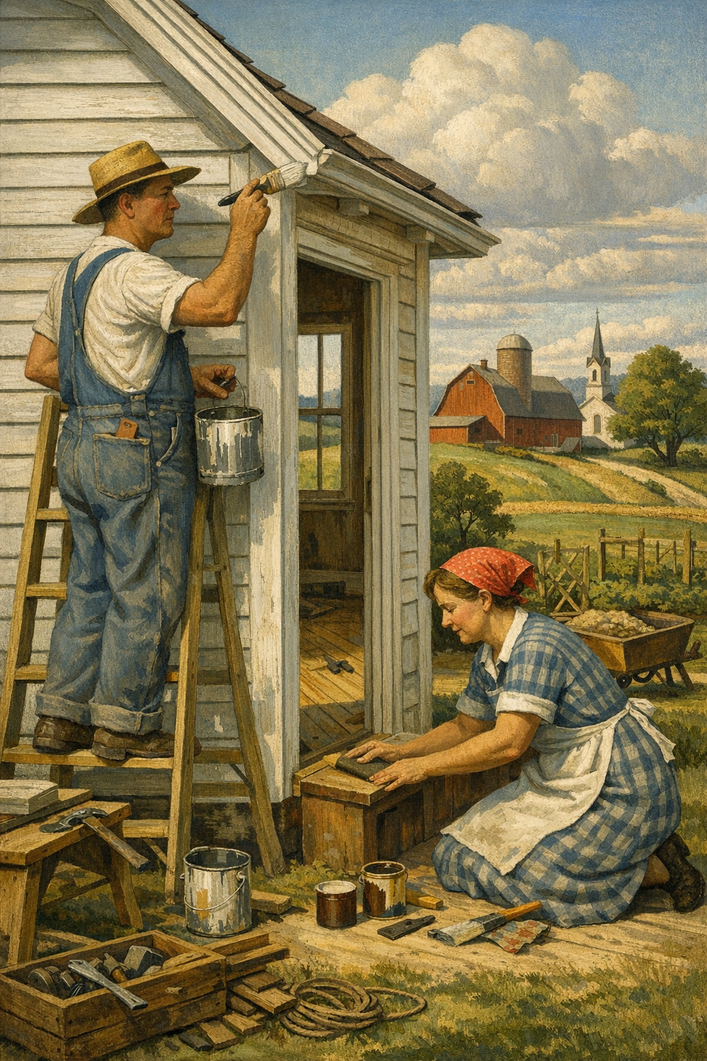
White walls are no longer the safe choice they once were. The biggest shift in interior design right now is color drenching: painting walls, trim, doors, and even ceilings in one cohesive hue to create a richer, more intentional room. For homeowners in Denver who are tired of flat, builder-grade interiors, this trend is less about being bold for the sake of it and more about making a space feel finished, custom, and emotionally powerful.
Color drenching is not just “painting a room dark.” That misunderstanding is exactly why some projects look elegant and immersive while others feel heavy and accidental. True color drenching means using one color, or closely related tonal variations of the same color, across multiple surfaces in a room. That often includes walls, trim, crown molding, baseboards, doors, built-ins, and sometimes the ceiling.
The result is a space with fewer visual interruptions. Your eye stops bouncing between bright white trim, off-white ceilings, beige walls, and stained doors. Instead, the room reads as a complete composition. Designers have embraced the approach because it creates mood, depth, and architectural unity without requiring expensive structural changes.
Paint brands such as Sherwin-Williams, Benjamin Moore, Farrow & Ball, PPG, and Behr have all leaned into this direction with richer palettes and nuanced neutrals. Deep greens, warm taupes, smoky blues, moody clays, and earthy charcoals are dominating trend forecasts because they work beautifully in a drenching strategy.
That matters because paint is now doing more of the design work. Instead of relying on endless decor purchases to make a room interesting, homeowners are using finish, tone, and surface continuity to create atmosphere. When done right, it can make an ordinary bedroom feel boutique-hotel polished or turn a bland home office into a space with real presence.
What surfaces are usually included?
Walls for the main color field
Trim and molding for seamless continuity
Doors and frames to avoid visual breaks
Ceilings when a fully immersive effect is desired
Built-ins, shelving, and cabinetry for a custom look
If you are considering this look for a living room, bedroom, office, or dining area, professional prep and application matter enormously. Uneven sheen, rough trim work, and poor cut lines become far more obvious in a monochromatic room. That is where experienced interior painting services make a visible difference.
Why the Trend Is Exploding in Denver Homes
Denver-area homeowners are gravitating toward color drenching for a simple reason: our homes need warmth, character, and flexibility. Many properties across Denver, Centennial, Glendale, Brighton, and Aurora have open layouts, strong natural light, and builder-era finishes that can feel sterile. A carefully selected saturated color helps counter that flatness without a full remodel.
Colorado light is beautiful, but it is also unforgiving. Bright sun can wash out weak colors and expose every shortcut in surface prep. That is one reason ultra-safe pale gray walls are losing ground. They often read colder than expected, especially during winter months or in north-facing rooms. A warmer, more enveloping palette tends to perform better visually throughout the day.
There is also a practical design reason this trend works locally. Many Denver homes blend modern architecture with rustic or natural materials: wood floors, black windows, stone accents, matte metal fixtures. Color drenching gives those elements a stronger backdrop. Instead of competing with the architecture, the paint supports it.
We are also seeing homeowners become more confident about customization. The old resale panic is fading. People are realizing that a beautifully painted room in a sophisticated tone can be more marketable than a forgettable sea of white. Buyers respond to homes that feel intentional, not generic.
Why it works especially well in the Denver metro area
In neighborhoods where homes share similar floor plans, paint becomes a major differentiator. A powder room in deep olive, a study in moody blue-gray, or a bedroom wrapped in warm taupe feels more elevated than standard contractor beige. Homeowners looking for painting services in Denver, CO are increasingly asking for that designer finish rather than a basic color swap.
Color drenching also pairs well with local renovation priorities. Many homeowners start with interiors, then move to trim refreshes, kitchen cabinet painting, and eventually curb-appeal upgrades through exterior painting services. The trend is part of a broader shift toward more cohesive, personalized homes.
The era of painting every room the same neutral and calling it “timeless” is over. Timeless design is not bland design; it is design with enough confidence to feel intentional for years.
— 1 of a Kind Painting
Best Colors, Finishes, and Rooms for Color Drenching
Not every color works equally well for color drenching. The best choices tend to have depth, undertone balance, and versatility under changing light. Flat, lifeless colors often collapse when spread across every surface. Complex shades with subtle undertones hold up better.
Popular color families for 2026
Earthy greens like sage, olive, eucalyptus, and forest tones
Warm browns and taupes that feel grounded rather than muddy
Blue-grays with enough softness to stay livable
Clay, terracotta, and muted rose-browns for warmth and depth
Charcoal and softened black for offices, dining rooms, and dramatic accent spaces
Brands are responding with exactly these kinds of colors. Sherwin-Williams continues to push earthy, livable saturation. Benjamin Moore remains strong in nuanced neutrals and blue-green blends. Farrow & Ball still sets the tone for ultra-curated, architectural color use. Behr and PPG offer accessible versions of the same mood-forward movement.
Best rooms for the trend
Home offices are ideal because a deeper, consistent palette reduces visual distraction and makes the room feel more focused. Dining rooms benefit from the intimacy. Bedrooms can become much more restful when harsh white contrast is removed. Even powder rooms are perfect testing grounds because smaller spaces can handle stronger personality.
Large open-concept main areas can also work, but they require better planning. Undertones must coordinate with flooring, cabinetry, countertops, and furniture. If there is one area where guessing is expensive, it is here. A professional color consultation can save homeowners from choosing a shade that looked perfect on a swatch and wrong on four walls and a ceiling.
Finish selection matters more than most people think
Sheen is where many color-drenching projects succeed or fail. Using the same color does not mean every surface needs the same finish. In fact, slight finish variation often creates the best result.
Surface
Recommended Finish
Why It Works
Walls
Matte or eggshell
Softens light reflection and keeps the room feeling rich, not shiny
Trim and doors
Satin or semi-gloss
Adds durability and subtle contrast without breaking the monochromatic look
Ceilings
Flat or matte
Reduces glare and helps the ceiling blend into the overall envelope
Built-ins/cabinetry
Satin, semi-gloss, or specialty cabinet finish
Improves cleanability and gives millwork a refined, furniture-like appearance
That balance is one reason professional application matters. The room should feel unified, not like someone accidentally used leftover paint on every surface.
The Mistakes That Make This Trend Look Cheap
Color drenching is unforgiving. It exposes sloppy prep, inconsistent texture, bad patching, and mediocre product choices faster than traditional white-trim painting ever did. If the industry has a bad habit, it is pretending that premium-looking results come from average execution. They do not.
Common errors homeowners and low-bid painters make
Skipping surface repair before applying saturated color
Using builder-grade paint with weak coverage and poor leveling
Ignoring sheen strategy and making every surface equally reflective
Choosing the wrong undertone for the room’s natural light
Painting old trim without proper sanding and bonding primer
Cutting in by hand on large jobs where spray finishing would produce a cleaner result
Prep is non-negotiable. Nail pops, hairline cracks, damaged caulk, old drips, and rough transitions all become more visible when a unified color wraps the room. On trim and doors, that means sanding, caulking, filling, priming where needed, and using the right enamel or urethane-modified product for a smooth finish.
There is also a color science problem many people underestimate. A gray-green that looks calm online may turn icy under strong morning light. A warm taupe may suddenly read pink against certain flooring. That is why mockups, test swatches, and sampling at different times of day are essential. Homeowners often discover this too late, after purchasing gallons of paint and investing labor into a color that was never right.
Product quality is not a luxury line item
For walls, premium products from Sherwin-Williams or Benjamin Moore often deliver better hide, scrub resistance, and touch-up performance than bargain options. For trim and doors, quality enamels are even more important. Cabinet-grade or trim-specific coatings level better and resist blocking, sticking, and premature wear.
If you want to see the difference between routine painting and true finish work, browse our project gallery. The detail work is what separates a room that photographs well for one day from a room that still looks sharp years later.
DIY vs. Hiring a Professional Painter
Some painting projects are DIY-friendly. Color drenching usually is not the one to gamble on. The more surfaces you include, the more coordination, prep, product knowledge, and finish control the project demands. Homeowners often assume the challenge is simply “more painting.” In reality, it is more precision.
When DIY can work
A small powder room with smooth walls, minimal trim, and no ceiling color change might be manageable for an experienced DIY homeowner. If you already understand surface prep, cut lines, masking, and finish differences, the risk is lower. Even then, product choice and color testing should be taken seriously.
When hiring a pro is the smarter move
If the room has extensive trim, built-ins, doors, repaired drywall, textured surfaces, stairwells, or high ceilings, professional painters will almost always produce a better result. The same goes for occupied homes where cleanliness, scheduling, and furniture protection matter. A trend this design-forward should not be undermined by roller marks, lap lines, or rough trim edges.
Professional painters also know when to spray, when to brush and roll, and when to combine methods. They understand dry-time windows, humidity effects, primer compatibility, and how low-VOC products behave in real spaces. Those details do not sound glamorous, but they determine whether the finished room feels crisp and intentional.
Trust is part of the equation too. Before hiring anyone, homeowners should look at finished work, ask about products, and review client experiences. Reading what our clients are saying can reveal whether a company consistently delivers the kind of detail-focused craftsmanship this trend demands.
How Color Drenching Connects to Cabinets, Exteriors, and Commercial Spaces
Although color drenching is most often discussed as an interior trend, its influence extends far beyond one room. The larger movement is toward visual cohesion. Homeowners no longer want isolated updates that fight each other. They want cabinetry, trim, walls, and even exterior palettes to feel connected.
Cabinets and built-ins
Kitchen islands, mudroom lockers, libraries, and home office built-ins are increasingly being painted in the same color family as the surrounding room. That creates a higher-end, custom millwork feel. It also helps bulky storage blend into the architecture instead of dominating it. Deep green cabinetry, warm taupe shelving, and muted blue built-ins are especially strong choices right now.
Exterior influence
The same appetite for richer color is showing up outside. Homeowners are moving away from flat, lifeless beige exteriors and choosing more complex body colors with coordinated trim and accent doors. The principle is similar: fewer disconnected elements, better curb appeal, and more confidence. That is why many interior-focused projects eventually lead to broader upgrades through exterior painting services.
Commercial spaces are following the same path
Offices, boutiques, restaurants, and hospitality environments have embraced monochromatic and tonal painting schemes because they influence perception. A well-painted commercial interior can feel more premium, calmer, or more branded without a massive renovation budget. For businesses rethinking customer experience or employee environments, strategic coatings matter. That is where expertly planned commercial painting services can do far more than refresh worn walls.
Even within the trades, there is growing demand for craftspeople who can execute these higher-design finishes correctly. As design expectations rise, so does the need for skilled applicators and finish specialists, which is one reason the industry continues to create subcontractor opportunities for professionals who take workmanship seriously.
Local relevance across the metro area
From updated bungalows in central Denver to newer homes in Centennial and family properties in Brighton, homeowners are using paint more strategically than they did even a few years ago. The trend is not about copying social media. It is about creating rooms that feel more expensive, more personal, and more complete. Whether you are planning a single office refresh or a full-home palette redesign, the same principle applies: intentional color beats default color every time.
Frequently Asked Questions
Q: What is color drenching in interior painting?
Color drenching is the technique of painting multiple surfaces in a room the same color or closely related tones. That usually includes walls, trim, doors, and sometimes the ceiling. The goal is to create a cohesive, immersive look with fewer harsh visual breaks.
Q: Does color drenching make a room look smaller?
Not necessarily. In many cases, color drenching can actually make a room feel more expansive because it removes contrast lines that visually chop up the space. The key is choosing the right undertone and finish for the room’s natural and artificial light.
Q: What are the best paint finishes for a color-drenched room?
Matte or eggshell often works best on walls, while satin or semi-gloss is usually better for trim and doors. Using the same color with slightly different sheen levels keeps the room unified while improving durability. Ceilings are commonly finished in flat or matte to reduce glare.
Q: Is color drenching a good idea for Denver homes?
Yes, especially in homes with strong natural light or builder-grade finishes that feel plain. Richer, more intentional colors can add warmth and sophistication that many Denver-area homes need. The important part is testing color carefully because Colorado light can change how undertones appear.
Q: Can I color drench trim and ceilings with low-VOC paint?
Yes, many premium low-VOC and zero-VOC products now perform very well for walls and certain trim applications. However, product selection matters because not every low-odor paint levels well on doors, trim, or cabinetry. A professional painter can recommend the right system for each surface.
Q: Should I hire a professional for color drenching?
If the project includes trim, ceilings, doors, built-ins, or repaired surfaces, hiring a professional is usually the better investment. Color drenching highlights flaws more than conventional painting does. Skilled prep, clean lines, and the right finish strategy are what make the result look high-end instead of heavy-handed.
Color drenching is not a passing gimmick. It reflects a broader shift in how people think about paint: not as a maintenance item, but as a design tool with the power to reshape mood, architecture, and value. The homeowners who get the best results are the ones who treat color selection, prep, and finish quality as part of one system rather than a collection of shortcuts.
For homeowners across Denver, Aurora, Centennial, Glendale, and Brighton, that means choosing colors with real depth, testing them in local light, and applying them with discipline. A dramatic room should still feel balanced. A bold choice should still feel livable. That balance is where craftsmanship matters most.
If you are planning a room refresh, a full interior update, or a coordinated palette that connects your inside and outside spaces, 1 of a Kind Painting brings the technical skill and design awareness to execute it properly. From immersive interiors to polished trim packages and refined curb appeal, the goal is always the same: results that feel intentional, durable, and distinctly yours. If you are ready to talk through colors, finishes, or project scope, get in touch with our team.
Ready to Transform Your Space?
Whether you’re refreshing your home’s interior, updating your exterior curb appeal, or tackling a commercial repaint anywhere in the Denver metro area, 1 of a Kind Painting has the experience, craftsmanship, and attention to detail to deliver results that truly stand out.
Most homes do not need a full remodel to feel dramatically different—they need smarter paint decisions. In 2026, interior paint color trends are shifting away from safe-but-forgettable gray and toward warmer, more layered palettes that make homes in the Denver metro area feel intentional, livable, and current. Homeowners who ignore that shift risk spending real money on paint jobs that already look dated the moment the tape comes off.
The era of default gray is fading. That does not mean gray disappears completely, but it no longer dominates every wall, cabinet, and open-concept living room the way it did for more than a decade. Homeowners are asking for spaces that feel warmer, calmer, and more personal, and major brands like Sherwin-Williams, Benjamin Moore, Behr, and PPG have all responded with collections that lean into earth tones, softened neutrals, moody greens, and nuanced blues.
There is a practical reason for this shift. A lot of post-2015 interiors were painted to appeal to resale photography, not daily living. They looked clean online, but many felt flat in person. People are now choosing color based on how a room actually feels at 7 a.m., 3 p.m., and 9 p.m. That is a much smarter standard.
Another factor is the broader design movement toward natural materials. White oak floors, warm countertops, plaster-inspired textures, unlacquered brass, matte black hardware, and handmade tile all pair better with warmer paint than with cold blue-grays. If your wall color fights the finishes in your home, the room never feels settled.
That is especially true in Colorado. Natural light in the Denver area can be bright, sharp, and highly variable depending on elevation, orientation, snow reflection, and seasonal sun angles. A color that looks rich in a showroom can look washed out in an Aurora great room or unexpectedly icy in a south-facing home near the foothills. This is one reason homeowners increasingly seek professional color consultation before committing to an entire interior repaint.
Color forecasting is influencing real-world painting choices
Annual color announcements used to feel like marketing theater. Now they genuinely influence purchasing, staging, cabinetry updates, and even commercial interiors. Sherwin-Williams has continued leaning into grounded, livable hues. Benjamin Moore remains strong with layered neutrals and heritage-inspired shades. Behr and PPG have both embraced colors that feel restorative rather than flashy. The common thread is clear: comfort, depth, and authenticity are winning.
That does not mean every home should chase the latest “color of the year.” Trend awareness matters, but blind imitation is how homeowners end up repainting too soon. The smarter move is to understand what the trend is actually signaling, then apply it to the architecture, lighting, and function of your own house.
The Top Interior Paint Color Trends for 2026
The strongest interior paint color trends right now are not louder—they are more refined. The popular shades are complex enough to change with the light and subtle enough to live with for years.
Warm off-whites are replacing stark whites
Bright, clinical whites still have a place, but they are losing ground to creamier, softer whites with a touch of warmth. Think Sherwin-Williams Alabaster, Benjamin Moore White Dove, or similar low-contrast whites that make trim, walls, and ceilings feel cohesive instead of harsh. In Denver homes with intense daylight, these shades often feel more balanced and less glaring.
Stark white can make a beautiful home feel unfinished. Warm whites, by contrast, tend to flatter wood flooring, soften shadows, and make furnishings look more expensive. That is not hype. It is simply what happens when undertones work with the space rather than against it.
Earthy greens remain a powerhouse
Muted sage, olive, and gray-green tones continue to dominate bedrooms, offices, dining rooms, and cabinetry. They read as calm without being boring. They also bridge modern and traditional styles in a way few colors can. Shades in the family of Sherwin-Williams Evergreen Fog, PPG olive-toned greens, and Benjamin Moore’s quieter botanical hues are especially versatile.
These colors work because they connect interiors to the outdoors, which matters in Colorado. Homes around painting services in Denver, CO often benefit from palettes that echo the Front Range landscape without feeling rustic or themed.
Dusty blues are becoming the new dependable neutral
Blue is no longer just an accent-wall color. More homeowners are using smoky, softened blue on bathroom vanities, bedroom walls, studies, and built-ins. The best versions are muted and mineral-based rather than nautical or juvenile. A good dusty blue can function like a neutral while still giving a room real personality.
Clay, mushroom, and taupe are back for a reason
Here is an unpopular opinion in some design circles: beige never really failed. Cheap beige failed. Flat contractor beige failed. But layered taupes, mushroom tones, clay-inspired neutrals, and rosy browns are returning because they create warmth and dimension. They also pair exceptionally well with stone, leather, natural fiber rugs, and mixed-metal fixtures.
These shades are particularly effective in open floor plans where homeowners want continuity without making every room feel identical. The best neutral schemes today use tonal variation rather than one generic wall color everywhere.
Moody accent rooms still work—when used with discipline
Deep charcoal, aubergine, saturated navy, and near-black green are still in demand for powder rooms, dining rooms, libraries, and offices. But there is a catch. Dark paint only looks luxurious when the prep, cut lines, and finish quality are excellent. Sloppy patching, flashing, roller marks, and inconsistent sheen become more visible, not less.
This is where true craftsmanship matters. If you are considering a dramatic room transformation, quality application is just as important as color selection. You can see the difference in properly executed transitions, trim details, and finish consistency in our project gallery.
How Denver Homes Should Adapt National Color Trends
National trend reports are useful, but copying them without adjusting for local light and architecture is a mistake. Denver-area homes range from historic bungalows and mid-century ranches to new-build suburban properties in Centennial, Glendale, Brighton, and Aurora. One palette does not fit all of them.
High-altitude light changes everything
Colorado light has a way of exaggerating undertones. A greige may look pinker than expected. A white may look bluer. A green may turn muddy if it lacks enough clarity. Sampling is not optional here. Large format swatches and on-wall test areas are far more reliable than fan-deck decisions made under store lighting.
This is one reason trend-savvy homeowners often combine paint planning with professional execution through dedicated interior painting services. It reduces the risk of expensive misfires and helps create a palette that works from room to room.
Open-concept homes need restraint, not more colors
Many newer homes in the Denver suburbs have open layouts with long sightlines across kitchens, dining areas, entryways, and living rooms. That does not mean every space should be the same white. It means the palette needs a hierarchy. A primary neutral, one secondary supporting tone, and a few strategic accents usually outperform a house full of disconnected “statement” colors.
The best interiors feel composed, not busy. Trendy does not mean chaotic. In fact, the most current homes often use fewer colors, but they use them more deliberately.
Exterior and interior color should still relate
Even when this conversation centers on interior paint color trends, exterior context matters. A mountain-modern home with charcoal siding, warm wood, and black windows should not have an interior palette that feels disconnected from the architecture. The same principle applies to brick homes, stucco homes, and traditional suburban facades.
That is why many homeowners planning a broader update review both their interior and exterior painting services needs together. A coordinated strategy almost always produces a more cohesive result than treating the inside and outside as unrelated projects.
The Finishes, Materials, and Techniques That Matter Now
Color gets the headlines, but finish selection is where many paint jobs succeed or fail. The wrong sheen can cheapen a great color, magnify wall imperfections, or create maintenance problems.
Low-sheen, washable finishes are leading the market
Manufacturers have improved paint technology enough that many premium matte and eggshell products now offer better scrub resistance than older formulas. That matters because homeowners want softer, more sophisticated surfaces without sacrificing durability. Premium interior lines from Sherwin-Williams, Benjamin Moore, and Behr now make it easier to achieve that balance.
Area
Recommended Finish
Why It Works
Living rooms and bedrooms
Matte or low-sheen eggshell
Soft appearance, hides minor surface flaws, modern look
Not every wall should be a faux-finish experiment, but there is no question that texture is back. Limewash, Roman clay looks, Venetian plaster-inspired surfaces, and subtle brush-applied mineral finishes are gaining traction because they add movement without relying on loud color. People are tired of interiors that look like blank staging sets.
That said, texture should be handled carefully. Poorly executed decorative finishes look contrived fast. When done well, they create depth and softness; when done poorly, they scream trend-chasing. The difference is product knowledge, substrate prep, and application skill.
Low-VOC and zero-VOC products are now a baseline expectation
Eco-conscious paint choices are no longer niche. Families want lower odor, better indoor air quality, and coatings that do not leave a house smelling harsh for days. Thankfully, many premium low-VOC and zero-VOC formulations now perform at a high level. But product selection still matters. Some lower-odor paints sacrifice coverage or touch-up performance, which is why brand and line selection should be based on use case, not just label claims.
The painting industry still talks too much about color chips and not enough about preparation, sheen, and substrate condition—the three things homeowners notice after the excitement wears off.
— 1 of a Kind Painting
Common Color Mistakes Homeowners Still Make
The same errors keep costing homeowners time and money. Most are avoidable.
Choosing paint from a phone screen
Digital inspiration is useful, but a phone screen is not a color-matching tool. Screen brightness, filters, and photography style distort undertones constantly. If you choose a whole-house palette from social media saves, you are guessing.
Ignoring fixed finishes
Flooring, countertops, tile, fireplace stone, and cabinetry are not background elements. They are the framework the paint has to support. A beautiful trend color can be the wrong choice if it clashes with warm wood tones or cool stone veining already in the home.
Using one “safe” neutral everywhere
This is one of the laziest habits in residential painting. Homeowners often assume consistency means sameness. It does not. A cohesive home can still shift subtly in depth, undertone, and contrast depending on room function and light exposure.
Underestimating prep work
Even the best interior paint color trends will look mediocre on walls with visible patches, failed caulk lines, rough drywall repairs, or residue from old finishes. Paint is not a disguise for bad surfaces. It is a magnifier. Better prep almost always beats a more expensive paint.
Hiring on price alone
The lowest bid often excludes the labor that actually makes a paint project look premium: masking, sanding, priming, surface correction, proper dry times, and detailed cut-in work. If you are comparing painters, reputation matters. Reviewing what our clients are saying is often more revealing than comparing estimates line by line.
DIY vs. Hiring a Professional for Trend-Driven Interiors
DIY painting is not always a bad idea. A small guest room with straightforward walls and a forgiving color can be a realistic weekend project. But many trend-driven interiors are less forgiving than people assume.
Where DIY can work
Single rooms with minimal wall damage
Standard-height ceilings and simple trim profiles
Lighter colors that do not highlight application flaws as aggressively
Homeowners with time to patch, sand, prime, and apply multiple coats correctly
Where professionals earn their value fast
Whole-home repaints that require color continuity
Dark or saturated colors where lap marks and flashing are obvious
Cabinets, trim, and doors that need a refined sprayed or fine-finish result
Textured or repaired walls that need prep before paint even starts
Occupied homes where efficiency, cleanliness, and scheduling matter
The biggest myth in painting is that labor is just labor. It is not. Skilled painters are making hundreds of small technical decisions that affect how the finish looks and how long it lasts. That includes caulk compatibility, patch compound selection, primer choice, moisture awareness, sheen control, masking discipline, and product-specific application technique.
For homeowners balancing style, durability, and local conditions, working with an experienced team offering painting services in Centennial, CO or throughout the wider Denver metro often means fewer surprises and better long-term value. It also means you have someone accountable if touch-ups, transitions, or product behavior need attention.
And if you are planning a repaint around current interior paint color trends but are unsure where to start, the smartest move is usually simple: get in touch with our team before buying ten sample quarts you may never use.
Frequently Asked Questions
Q: What interior paint colors are most popular in 2026?
The most popular interior paint colors in 2026 include warm off-whites, muted greens, dusty blues, mushroom neutrals, and clay-inspired earth tones. These shades feel softer and more natural than the cool grays that dominated previous years, and they tend to work better with wood tones, stone, and layered textures.
Q: Are gray walls out of style now?
Gray is not completely out, but cold, flat grays are losing relevance in many homes. Warmer grays, greiges, and taupe-based neutrals are still useful when they complement the flooring, cabinetry, and natural light in the space.
Q: What paint colors work best in Denver homes with bright natural light?
Denver homes often look best in colors with balanced undertones because high-altitude light can exaggerate coolness or wash out subtle shades. Warm whites, earthy greens, and grounded neutrals usually perform better than icy whites or overly blue grays, but every room should still be sampled before final selection.
Q: What finish is best for interior walls?
For most interior walls, a matte or low-sheen eggshell finish offers the best balance of appearance and durability. Kitchens, bathrooms, and higher-traffic zones often benefit from satin because it handles moisture and cleaning more effectively.
Q: Is it worth hiring a professional painter instead of doing it yourself?
If the project involves multiple rooms, dark colors, cabinets, trim, repairs, or a whole-home color strategy, hiring a professional is usually worth it. Professional painters deliver better prep, cleaner lines, more consistent finishes, and faster completion with less disruption to your home.
Q: How do I choose a paint color that will not look dated too quickly?
Choose colors with subtle complexity instead of extremes. Warm neutrals, softened greens, and muted blues usually age better than ultra-trendy statement shades, especially when they fit the home’s permanent finishes and architectural style.
The smartest response to interior paint color trends is not to chase every new shade—it is to understand why the market is moving. Homes feel better when color supports light, architecture, furnishings, and daily life. That is why warmer whites, earthy greens, dusty blues, and layered neutrals are resonating so strongly right now.
For homeowners across Denver, Centennial, Glendale, Brighton, and Aurora, paint choices are never just aesthetic. They affect resale perception, room comfort, maintenance, and the overall quality a home communicates. When those choices are paired with proper prep, correct sheen selection, and professional application, the result lasts longer and looks more intentional.
1 of a Kind Painting helps homeowners navigate those decisions with the kind of practical expertise that trend reports alone cannot provide. Whether you are refining a single room, planning a full interior update, or coordinating inside and outside improvements across the metro area, there is real value in working with a team that understands both current style and long-term performance.
Ready to Transform Your Space?
Whether you’re refreshing your home’s interior, updating your exterior curb appeal, or tackling a commercial repaint anywhere in the Denver metro area, 1 of a Kind Painting has the experience, craftsmanship, and attention to detail to deliver results that truly stand out.