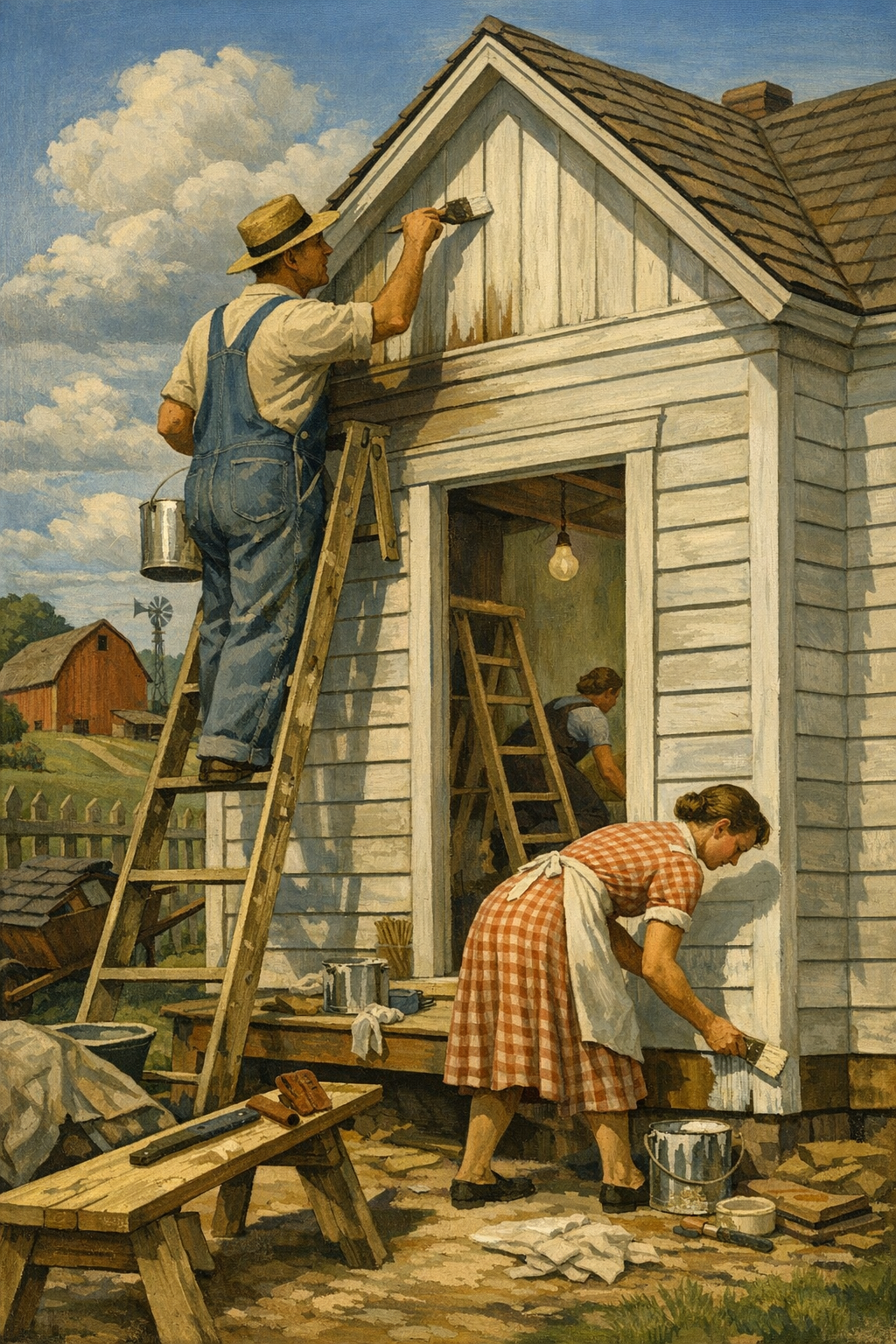
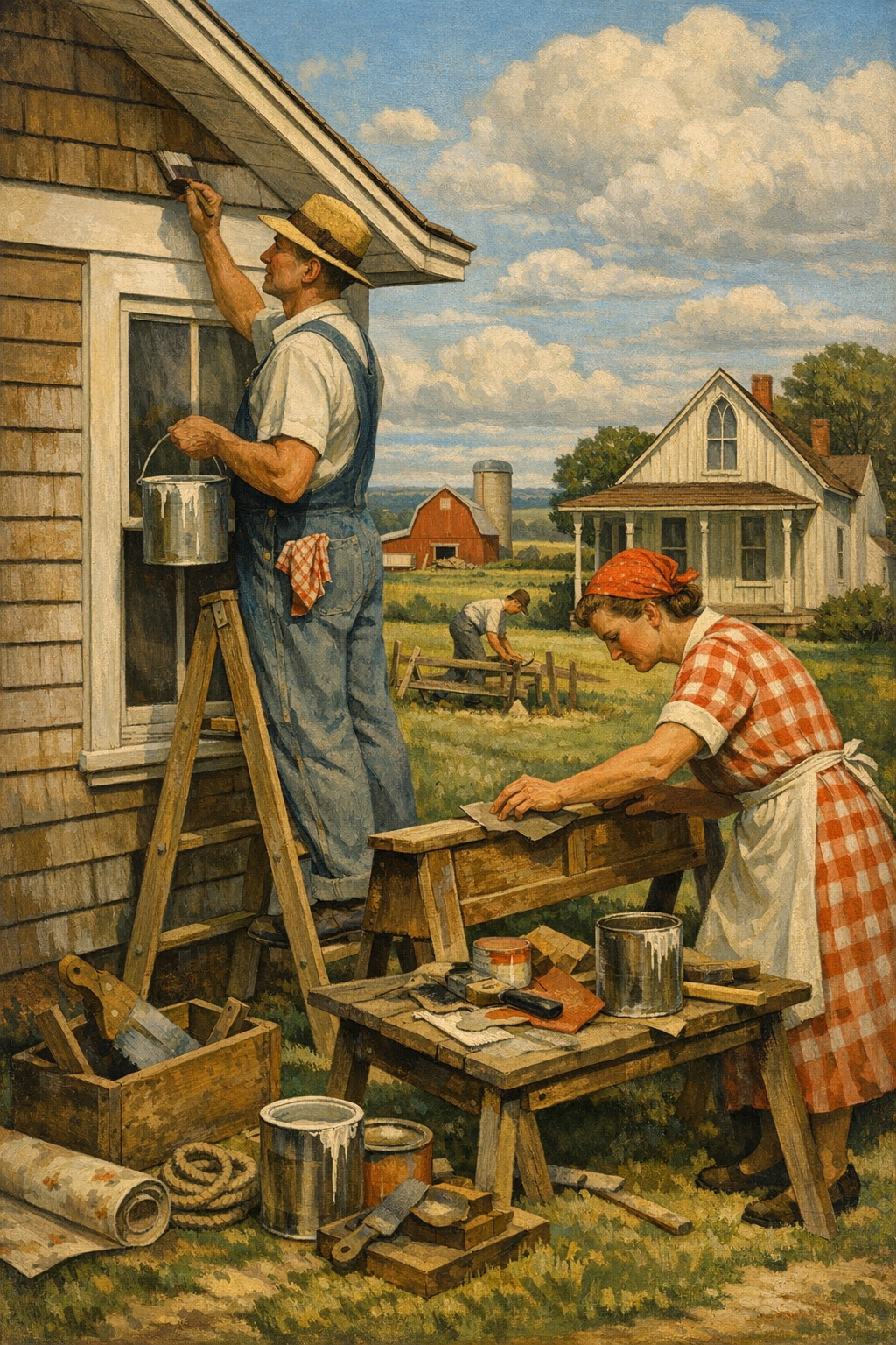
Most paint jobs don’t fail because of bad paint colors—they fail because homeowners chase trends without understanding how those colors actually live in a room. The biggest shift in interior paint color trends right now is away from cold, safe neutrals and toward warmer, more grounded palettes that feel better in real Denver homes, not just on social media. If you are planning a repaint in 2026, the smart move is not copying a showroom wall—it is choosing color, finish, and application strategy that fit your light, architecture, and daily life.
The era of icy gray walls is not just fading—it is being actively replaced. Homeowners are realizing that cool grays, especially the blue-leaning versions that dominated the 2010s, can make living spaces feel flat, sterile, and oddly lifeless. That is especially true in Colorado, where intense natural light can exaggerate undertones and make the wrong neutral look harsher than expected.
The new direction is warmer, softer, and more architectural. Think clay, mushroom, greige, muted olive, creamy white, dusty terracotta, and complex taupes that shift throughout the day. Major brands like Sherwin-Williams, Benjamin Moore, Behr, and PPG have all leaned into this movement because it reflects how people actually want their homes to feel: calm, grounded, and less disposable.
Why the trend has staying power
Warm neutrals and earthy colors are not a short-term fad because they solve real design problems. They work with wood floors, mixed metals, stone surfaces, and both modern and traditional furniture. They also layer well with accent colors, which means a homeowner can update décor without repainting every two years.
Warm whites soften natural daylight instead of fighting it
Greige and taupe bridge cool and warm finishes
Muted greens bring color without visual chaos
Earth reds and clay tones add depth in dining rooms, offices, and powder rooms
For homeowners considering a full-home update, this is where professional planning matters. A trend color on one wall chip is meaningless if the full palette does not transition properly from entry to hallway to living room. That is exactly where professional color consultation becomes far more valuable than guessing from online inspiration boards.
The 2026 Paint Colors Homeowners Are Actually Using
Paint trend articles often make one big mistake: they talk about “color of the year” picks as if homeowners repaint entire homes around a headline. They do not. What matters is which color families are proving versatile, livable, and resale-friendly while still feeling current.
Warm whites that do not look yellow
Homeowners still want light walls, but they want them with depth. Shades similar to Sherwin-Williams Alabaster, Benjamin Moore White Dove, and other soft off-whites remain popular because they create a clean backdrop without the starkness of pure bright white. In open-concept homes, these shades often outperform trendier colors because they make transitions between rooms feel intentional.
Greige is evolving, not disappearing
Greige is still relevant, but the best versions now have more body and less chill. The strongest performers are those that lean toward mushroom, linen, or putty rather than silver. That subtle change is the difference between a room feeling designed and a room feeling rented.
Muted green is the safest bold choice
From kitchens to studies to bedroom accent walls, muted green continues to gain traction. Think sage, olive-gray, eucalyptus, and smoky green rather than bright botanical tones. These colors pair beautifully with natural wood cabinetry, black fixtures, brass hardware, and creamy trim.
Clay, rust, and terracotta are moving upscale
Used carefully, these tones feel rich and custom rather than heavy. They work especially well in powder rooms, dining spaces, and feature walls where a little more personality is welcome. Combined with matte finishes and textured materials, they create an intentionally collected look.
Blue is becoming more selective
Blue is not gone, but it is being used more strategically. Deep blue-green, stormy navy, and soft mineral tones are outperforming bright coastal blues in the Denver market. That is because they feel more sophisticated and better suited to four-season interiors.
If you want to see how current palettes translate into real residential results, browsing our project gallery is far more useful than staring at generic stock photography. Real homes tell the truth about color.
The best trend color is the one that still looks right at 7 a.m., 2 p.m., and 9 p.m.—not just under perfect influencer lighting.
— 1 of a Kind Painting
How Denver Light Changes Everything
Denver-area homes do not experience color the same way homes in Seattle, Chicago, or Atlanta do. Higher elevation, strong sunlight, and dramatic daily light shifts can make paint appear brighter, flatter, or more contrasty than expected. That is one reason homeowners in neighborhoods across Denver, Centennial, Glendale, Brighton, and Aurora often feel blindsided after choosing a seemingly safe color.
South-facing rooms can wash out subtle shades
A soft beige or pale greige may look beautiful on a sample card but feel nearly white on a sun-drenched wall. In those spaces, slightly deeper tones often produce the balanced effect people were originally chasing.
North-facing rooms expose undertones fast
Cooler natural light can pull gray, green, or violet undertones to the surface. This is where cheap sample decisions become expensive repaint decisions. If a neutral is even slightly off, north light will expose it.
Open-concept homes need palette discipline
Many newer homes throughout the metro area have long sightlines. That means colors are not experienced one room at a time. A paint choice in the kitchen affects the living room, hallway, and stairwell whether you intended it to or not. Coordinated transitions matter more than ever.
That is why homeowners looking for painting services in Denver, CO should think beyond isolated room colors and plan whole-home flow. A technically sound palette feels effortless because every surface works together, including trim, ceilings, doors, and built-ins.
Exterior light influences interior perception too
Homes with lots of reflected light from snow, concrete, neighboring structures, or expansive windows can shift color perception inside. Even landscaping matters. Green reflections from mature trees and warmer reflections from nearby brick can subtly alter wall color throughout the day.
That local complexity is one reason professionally executed interior painting services consistently outperform rushed, one-weekend repaints. Getting color right is not only about taste. It is about lighting, finish, prep, and application quality working together.
The Finishes, Surfaces, and Prep Work That Make Color Look Expensive
Bad prep can ruin a great color faster than bad taste. This is the part of the industry many contractors underplay because it takes time, labor, and discipline. But if walls are patched poorly, sanded inconsistently, or painted with the wrong sheen, even premium paint from Farrow & Ball, Benjamin Moore, or Sherwin-Williams will look second-rate.
Sheen choice matters more than people think
Color is only half the story. Sheen determines how light hits the wall, how flaws read, and how washable the surface becomes. The wrong sheen can make a carefully selected color feel cheap or overly reflective.
Area
Best Common Sheen
Why It Works
Living rooms and bedrooms
Eggshell
Soft finish with light durability and low glare
Hallways and family rooms
Satin
Better cleanability for high-traffic walls
Bathrooms and laundry rooms
Satin or semi-gloss in select areas
Handles moisture and frequent wiping
Trim, doors, and baseboards
Semi-gloss
Creates crisp contrast and durability
Ceilings
Flat
Minimizes reflection and hides imperfections
Surface prep is where professionals earn their keep
Proper prep includes filling dents, repairing drywall damage, caulking gaps, deglossing when needed, spot priming stains, sanding transitions smooth, and managing dust before finish coats go on. That sounds basic, but many paint crews still rush it. The result is a job that looks decent for two weeks and disappointing for five years.
Low-VOC products are now the baseline, not a bonus
Eco-conscious paint choices are no longer niche. Low-VOC and zero-VOC products from major manufacturers have improved dramatically in coverage, durability, and color depth. For occupied homes, especially those with kids, pets, or sensitive occupants, these products are often the smarter default. The idea that environmentally preferable paint means weaker performance is outdated.
Texture and specialty finishes are back—but only when used with restraint
Limewash, Roman clay, Venetian plaster, and other decorative finishes are seeing renewed interest because they add movement and softness that flat paint alone cannot create. But here is the hard truth: most rooms do not need them. Specialty finishes are most effective as focal elements, not as blanket solutions. Overuse quickly turns sophisticated texture into design noise.
Interior trends often spill outdoors too. Homeowners modernizing their indoor palette frequently realize their curb appeal no longer matches the updated interior, which is why many projects naturally extend into exterior painting services for trim, siding, stucco, or front-door upgrades.
Where Bold Color Belongs—and Where It Usually Goes Wrong
Bold color is not the problem. Indiscriminate bold color is. When homeowners say they are afraid of strong paint colors, what they usually mean is they have seen too many bad applications of them.
Best places for saturated color
Bold colors tend to perform best in spaces with a clear function and a contained footprint. That includes:
Powder rooms where high contrast feels intentional
Dining rooms where mood and depth matter
Home offices where color can shape focus and identity
Cabinetry and built-ins where color adds custom character
Front doors where a strong hue boosts curb appeal fast
Where bold color often fails
Huge open living areas, low-light basements, and rooms with too many competing finishes are common trouble spots. Strong color in those spaces can feel oppressive or disconnected unless the entire palette is planned around it. Social media often shows dramatic paint moments without revealing the broader context, and that is how expensive mistakes get normalized.
Cabinets are a smarter place to get adventurous
Cabinet painting remains one of the strongest value plays in residential remodeling. Deep green, charcoal, navy, warm white, and mushroom tones can transform kitchens and bathrooms without the cost of full replacement. But cabinet work is also where weak workmanship gets exposed instantly. Adhesion, cleaning, degreasing, sanding, and the right bonding primer are not optional.
Commercial spaces are seeing a similar shift. Offices, boutiques, and hospitality interiors are moving away from generic builder beige and toward brand-driven color stories that support mood, customer perception, and wayfinding. For businesses considering strategic updates, professionally planned commercial painting services can do more than refresh walls—they can reshape how a space performs.
DIY vs. Professional Painting for Trend-Driven Interiors
DIY painting is not automatically a bad idea. But trend-driven painting is less forgiving than people assume. The more nuanced the color, the more obvious sloppy cutting, roller lap marks, flashing, or poor surface prep become. Warm neutrals, dark accent walls, and specialty finishes all demand better technique than basic off-white repaints.
When DIY can work
A simple bedroom with sound walls, limited trim detail, and a straightforward eggshell finish can be a realistic DIY project for a careful homeowner. The key word is careful. Good results still require proper prep, quality tools, enough paint, and patience between coats.
When hiring a professional is the smarter move
Professional help is usually worth it when you are dealing with:
Open-concept spaces with visible transitions
Dark or highly pigmented colors
Cabinet refinishing or trim-intensive rooms
Drywall damage, stains, smoke, or water issues
Occupied homes where speed and cleanliness matter
There is also a trust factor. Homeowners hiring painters are not just buying labor. They are buying judgment, process, product knowledge, and accountability. Reading what our clients are saying is often the fastest way to separate true professionals from low-bid operators who cut corners on prep, materials, and crew quality.
The cheapest bid is often the most expensive outcome
This industry still has a pricing problem. Too many contractors win jobs by minimizing prep, using watered-down scopes, or skipping critical details until the homeowner notices issues later. That is not savings. It is deferred disappointment. Quality painting looks simple only because skilled crews do the complicated parts well.
That standard matters across the metro area, whether someone is updating a historic home in central neighborhoods, a newer build in the suburbs, or a family property needing modernized finishes through painting services in Centennial, CO. Local conditions, architecture, and light all influence the final result.
Frequently Asked Questions
Q: What are the most popular interior paint colors right now?
The strongest interior paint color trends are warm whites, greige, taupe, muted green, and earthy clay tones. Homeowners are moving away from cold gray and toward colors that feel softer, more natural, and easier to live with over time.
Q: Do paint colors look different in Denver homes?
Yes. Denver’s strong sunlight and high-altitude light can make colors look brighter, flatter, or more contrasty than expected. Undertones also show up faster, which is why sampling and room-specific color planning matter so much in this market.
Q: Is eggshell or satin better for interior walls?
Eggshell is often best for living rooms and bedrooms because it offers a soft look with moderate durability. Satin works better in hallways, kids’ spaces, and other higher-traffic areas where easier cleaning matters more.
Q: Are low-VOC paints worth it?
Absolutely. Modern low-VOC and zero-VOC paints offer excellent performance, wide color availability, and fewer odor concerns during application. For occupied homes, they are often the smartest choice rather than a premium add-on.
Q: How do I choose a paint color that will not go out of style quickly?
Choose colors with balanced undertones that work with your flooring, fixed finishes, and natural light instead of chasing dramatic trend picks. Warm neutrals, soft greens, and layered off-whites tend to hold up well because they are flexible and timeless.
Q: Is hiring a professional painter worth it for interior repainting?
For simple rooms, DIY can work, but professional painting is usually worth it when color accuracy, clean lines, repairs, trim detail, or long-term durability matter. A quality crew also saves time, reduces disruption, and avoids expensive repaint mistakes.
The smartest interior paint projects in 2026 are not the loudest ones—they are the most intentional. Warm, layered color palettes are winning because they create comfort without feeling dull, and because they adapt better to the way people actually use their homes. When color selection, sheen, prep, and lighting are handled together, the result feels elevated rather than trendy.
For homeowners across the Denver metro area, that means treating paint as a design system, not a last-minute finish. Whether you are updating a single room, repainting an entire home, or pairing interior changes with exterior improvements, experienced craftsmanship still makes the difference between a color that merely covers and one that truly transforms. If you are weighing options or ready to start, get in touch with our team to talk through your goals, timeline, and space.
1 of a Kind Painting brings the kind of detailed planning and execution these projects demand, from nuanced color selection to meticulous prep and polished final coats. Homeowners looking for lasting results—not rushed shortcuts—can rely on a process built around clarity, professionalism, and finishes that look right long after the trend cycle moves on.
Ready to Transform Your Space?
Whether you’re refreshing your home’s interior, updating your exterior curb appeal, or tackling a commercial repaint anywhere in the Denver metro area, 1 of a Kind Painting has the experience, craftsmanship, and attention to detail to deliver results that truly stand out.
Most paint jobs do not fail because of color—they fail because homeowners chase trends without understanding how those colors behave in real rooms, real light, and real climates. In 2026, interior paint color trends are moving beyond safe gray and into warmer, moodier, more intentional territory, and that shift matters if you want a home in the Denver area that looks current for more than a single season. The smartest color choices now balance design fashion, architectural character, natural light, and long-term livability.
Why 2026 Interior Paint Color Trends Look Different
The era of flat, lifeless gray is fading fast. Homeowners are asking for color that feels grounded, restorative, and architectural rather than sterile. That is not a random style swing. It is a reaction to years of overly cool interiors, mass-market flips, and social-media design that looked polished on a screen but felt cold in daily life.
The strongest 2026 interior paint color trends are being driven by a few clear forces. Paint leaders such as Sherwin-Williams, Benjamin Moore, Behr, and PPG continue to push warm neutrals, earthy greens, softened blues, clay-inspired tones, and richer statement colors. At the same time, homeowners want rooms to feel personal again. People are no longer painting every wall the same agreeable greige and calling it design.
The major shift: emotional color over generic resale color
For years, the industry sold the same message: keep everything neutral for resale. There is truth in that, but it became lazy advice. A well-chosen warm white, muted green, mineral blue, or mushroom taupe can feel both current and broadly appealing. What hurts resale more often is not color itself, but poor execution, cheap paint, skipped prep, and a palette that ignores the home’s materials and lighting.
That is why more homeowners are turning to professional color consultation before committing. Color forecasting gives direction, but a trend report cannot see your north-facing living room, your red oak floors, or the way Denver sunlight changes by the hour.
Trend forecasting now rewards nuance
Design brands are moving toward colors with complexity: undertones that shift softly, muted shades that layer well, and pigments that work with stone, wood, tile, and metal finishes. Think less “loud accent wall,” more “whole-home color story.” Even dramatic shades are becoming more livable—deeper olive instead of neon green, smoky blue instead of bright navy, plaster pink instead of bubblegum.
If you are planning a full refresh, this is also the moment to think beyond one room. A cohesive color plan matters just as much as the individual shade. That is especially true for larger homes or open-concept layouts where hallways, stairwells, kitchens, and great rooms connect visually. Professional interior painting services can help translate trend inspiration into a palette that actually works from room to room.
The Colors Taking Over Homes in Denver
Denver-area homes are uniquely positioned for warm, layered color. Between strong sunlight, changing seasons, mountain-influenced design, and a mix of contemporary and traditional architecture, the local market responds especially well to colors with depth and natural character. In neighborhoods across Aurora, Centennial, Glendale, Brighton, and central Denver, homeowners are choosing shades that feel grounded rather than glossy.
Warm whites that do not feel yellow
Cool white is losing ground. The better choice for many interiors now is a soft, warm white with enough body to feel intentional. Popular examples often fall into categories similar to Sherwin-Williams Alabaster, Benjamin Moore White Dove, and Behr Swiss Coffee-style palettes. These shades work well on walls, trim, and cabinetry when handled carefully.
The catch is undertone control. A white that looks creamy and elegant in one home can turn dingy or peachy in another. Denver’s bright natural light can magnify undertones, so sampling is non-negotiable.
Earthy greens and olive-based neutrals
Muted sage, eucalyptus, moss, and olive-inflected neutrals are among the most durable color directions right now. They pair beautifully with wood floors, black windows, brass hardware, natural stone, and textured textiles. They also bridge modern and traditional styles better than many trend colors of the past decade.
These shades are especially effective in:
Kitchens with white or wood cabinetry
Home offices where reduced visual harshness improves focus
Bedrooms that need a calmer, more restorative tone
Entryways where a stronger first impression matters
Clay, terracotta, and mineral warmth
Call it desert influence, Mediterranean revival, or simple color fatigue from gray overload—either way, warm mineral shades are rising. Soft terracotta, rosy beige, dusty adobe, and muted cinnamon tones bring life to spaces without screaming for attention. They also reflect the broader movement toward limewash looks, plaster-inspired texture, and organic materials.
Used well, these shades feel sophisticated. Used badly, they feel trendy in the worst way. The difference usually comes down to restraint. Better results come from muted, earthy versions rather than saturated orange-browns.
Smoky blues and inkier statement colors
Blue is not gone. It is just getting smarter. Instead of bright coastal blues, homeowners are choosing stormy, gray-inflected, or green-leaning blues that read as architectural. These work well in dining rooms, powder rooms, built-ins, and offices. Deep charcoal-blues and inky blue-greens are also showing up on cabinets and interior doors.
If you want to see how these richer tones translate from sample chip to finished room, browsing our project gallery can help clarify the difference between trendy inspiration and professionally executed results.
How Light, Elevation, and Architecture Change Color
This is where most online paint advice falls apart. A color is never just a color. It is a reaction between pigment, sheen, surface texture, window orientation, surrounding materials, and light quality. In the Denver metro area, that equation becomes even more pronounced because of bright high-altitude sunlight.
North-facing rooms need more warmth than people think
North light tends to flatten and cool color. That means crisp whites can feel icy, grays can look gloomy, and some blue-based neutrals can lose all personality. In these rooms, warm whites, greige-with-beige influence, soft green-grays, and mushroom tones often perform better.
South- and west-facing rooms can exaggerate warmth
Generous sun exposure sounds ideal, but it can push creamier colors too yellow or too pink by afternoon. That does not mean you need to avoid warm shades. It means you need balance. Testing large samples at different times of day is essential before committing to full application.
Open floor plans demand palette discipline
One of the worst habits in residential painting is selecting colors room by room with no transition logic. A whole home should read like a conversation, not a playlist on shuffle. Open-concept spaces need coordinated undertones so that one wall color does not make the next one look dirty or disconnected.
That is one reason homeowners looking for painting services in Denver, CO often benefit from planning the entire palette before the first can is opened. The strongest interiors are built on continuity, not impulse.
Architecture still matters more than trend lists
A 1990s suburban home, a Washington Park bungalow, a Glendale condo, and a new-build in Centennial do not all want the same palette. Vaulted ceilings, stone fireplaces, alder trim, red oak floors, black fixtures, and natural brick all influence the best direction. The most successful color plans respect the bones of the home instead of fighting them.
The fastest way to make a home feel dated is not choosing an old color—it is choosing a fashionable color that ignores the architecture.
— 1 of a Kind Painting
Trend vs. Timeless: Where Homeowners Get It Wrong
Timeless does not mean boring, and trendy does not mean brave. A lot of disappointing paint projects happen because homeowners misunderstand both terms. They think timeless means beige everywhere, or they think trend means one dramatic wall copied from social media. Neither approach creates a finished, high-end interior.
The accent wall is no longer the default answer
Accent walls are not dead, but they are often a shortcut for indecision. In many rooms, painting all four walls in a nuanced color looks stronger, calmer, and more expensive than isolating one wall in a darker shade. The same applies to ceilings, trim, and millwork. A room with integrated color often feels more intentional than one with a single “feature wall” that does all the work.
Resale-safe color has become an excuse for weak design
There is a major difference between broad appeal and visual sameness. Buyers respond to homes that feel clean, cohesive, and professionally finished. They do not necessarily demand blank-box white walls. In fact, overly cold or generic interiors can make a property feel cheaper, not more flexible.
If trust matters in your decision, reading what our clients are saying is useful because it often reveals the same pattern: homeowners are happiest when they stop guessing and start planning.
Cabinets, trim, and walls should not all be treated the same
Another common mistake is using one trendy color everywhere without considering function and finish. Cabinet painting, trim repainting, and walls each have different durability demands, sheen requirements, and prep needs. A beautiful wall color can look completely wrong on cabinetry if the undertones clash with counters or flooring.
That is why trend-led projects still need technical discipline. If you are updating both interiors and curb appeal, coordinating interior work with exterior painting services can also help create a more unified overall appearance, especially for homes preparing for market or full renovation.
The Finishes, Prep, and Products That Make Trends Last
Color gets the attention, but finish quality decides whether the result looks premium or amateur. This is the part many contractors underbid and many DIYers underestimate. You can buy an excellent Sherwin-Williams, Benjamin Moore, Behr, or PPG color, but if the substrate is flawed or the sheen is wrong, the room will still disappoint.
Prep is not optional
Surface preparation should include some combination of patching, sanding, caulking, stain blocking, dust removal, and priming. On older walls, this is where quality is won or lost. Trend colors with depth—especially greens, blue-grays, and warm whites—can highlight surface imperfections if the wall is not corrected first.
The industry loves to talk about premium paint, but too many crews still skip premium prep. That is backwards. A great coating cannot hide poor workmanship.
Low-VOC products are now the baseline, not a bonus
For occupied homes, low-VOC and zero-VOC options are no longer niche. Many premium interior lines now deliver strong durability, excellent coverage, and reduced odor. That matters for families, pet owners, remote workers, and anyone repainting bedrooms, nurseries, kitchens, or high-use living areas.
Choose finish by function, not habit
Many homeowners still default to the same sheen in every room. That is inefficient and often unattractive. Finish should respond to traffic, moisture, cleanability, and surface condition.
Area
Best Typical Finish
Why It Works
Living rooms and bedrooms
Matte or eggshell
Soft look with enough washability for normal use
Hallways and family rooms
Eggshell or satin
Better durability in higher-traffic spaces
Kitchens and bathrooms
Satin or pearl
Improved moisture resistance and easier cleaning
Trim, doors, and baseboards
Semi-gloss
Durable finish that highlights detail and resists scuffs
Cabinetry
Specialized cabinet enamel
Smoother cure and better hardness than standard wall paint
Decorative texture is rising, but only when executed well
Limewash, Roman clay looks, and Venetian plaster-inspired finishes are gaining traction because homeowners want walls with depth. These techniques can be beautiful, particularly in dining rooms, powder rooms, and feature spaces. But this is not a category for rushed application. Decorative finishes expose weak craftsmanship faster than standard paint ever will.
When to DIY and When to Hire a Professional Painter
DIY painting is not always a mistake, but false confidence is expensive. If you are repainting a small guest room with straightforward walls and a forgiving color, a careful homeowner can get decent results. If you are tackling tall stairwells, heavy repairs, cabinet refinishing, dark-to-light transitions, or a whole-home palette change, the risk goes up fast.
DIY works best under limited conditions
Small rooms with minimal trim complexity
Similar-color repaints that do not require major stain blocking or multiple coats
Homeowners with time to prep carefully and let products cure properly
Professional painting is the better investment when precision matters
Complex masking, clean cut lines, substrate repair, sprayer control, premium finish consistency, and project sequencing all benefit from experience. That is especially true in occupied homes where dust control, furniture protection, and schedule efficiency matter just as much as appearance.
Commercial spaces raise the stakes even more. Businesses need coatings that perform, schedules that minimize disruption, and crews who understand durability, liability, and workflow. For offices, retail, multifamily, and specialty environments, commercial painting services bring a level of coordination most in-house teams cannot replicate.
The labor shortage is real, and skill still matters
The painting trade has a quality gap right now. Plenty of companies sell “fast” and “affordable,” but too few invest in craftsmanship. That is one reason the best painting companies protect standards in hiring, training, and field execution. For professionals interested in the trade side of the industry, there are also subcontractor opportunities with companies that take finish quality seriously.
In local markets such as Centennial and Brighton, homeowners are becoming more discerning for exactly this reason. They have seen what bargain painting looks like six months later: flashing, lap marks, peeling caulk lines, and walls that looked better before the project started. Cheap paint jobs rarely stay cheap once they need to be corrected.
What professional execution looks like
It looks like thorough prep, clean transitions, proper drying times, accurate sampling, and products matched to the surface. It also looks like realistic guidance. A trustworthy painter should tell you when a trendy color will not work in your room, not just nod and invoice it.
If you are comparing providers for painting services in Centennial, CO or elsewhere in the Denver metro, ask harder questions about prep, primers, product lines, and sheen strategy. The answers usually tell you more than the estimate total.
Frequently Asked Questions
Q: What are the most popular interior paint colors for 2026?
The strongest 2026 interior paint color trends include warm whites, earthy greens, mushroom taupes, muted clay tones, and smoky blues. These colors feel softer and more architectural than the cool grays that dominated previous years. The best choice still depends on your lighting, flooring, and the style of your home.
Q: Are gray walls out of style?
Not completely, but many flat, cold grays feel dated compared with warmer and more nuanced neutrals. Gray can still work if it has balanced undertones and fits the room’s materials and light. The bigger issue is relying on gray as a default instead of choosing a color with purpose.
Q: Which paint colors work best in Denver homes?
Denver homes often respond well to warm whites, soft greige, earthy green neutrals, and muted mineral colors because bright natural light can make cool shades feel harsher. High-altitude sunlight also intensifies undertones, so testing samples on multiple walls is essential. Local architecture and flooring should guide the final palette.
Q: Should I paint my whole house one color?
Usually no, but your home should still have a coordinated color story. Using one color everywhere can feel flat, while choosing unrelated colors room by room can feel chaotic. A better approach is to select a small palette with compatible undertones and use it strategically throughout the house.
Q: Is matte paint a bad idea for busy households?
Not necessarily. Many modern premium matte paints are more durable than older formulas, especially in lower-traffic rooms like bedrooms and formal living spaces. For hallways, kitchens, bathrooms, and family areas, eggshell or satin is often a safer choice for easier cleaning.
Q: How do I know if I should hire a professional painter instead of doing it myself?
If your project includes repairs, tall walls, cabinet painting, major color changes, detailed trim, or multiple connected rooms, hiring a professional usually delivers better value. Professionals manage prep, product selection, finish consistency, and workflow in a way that reduces visible flaws. DIY makes the most sense for simple, low-risk rooms and homeowners with time to do proper prep.
The smartest paint decisions in 2026 are not about chasing the loudest trend. They are about choosing color with enough warmth, depth, and context to make a home feel finished, comfortable, and current for years rather than months. That means respecting light, architecture, surface condition, and the very real difference between a stylish swatch and a successful room.
For homeowners across Denver, Aurora, Glendale, Centennial, and Brighton, that level of decision-making is where professional guidance becomes genuinely useful. Whether the goal is a single-room update, a whole-home repaint, or a broader design refresh, a carefully executed color plan paired with disciplined prep will always outperform impulse-driven painting.
If you want help sorting through trend noise and choosing colors that actually work in your home, 1 of a Kind Painting brings the technical skill and local perspective to do it right. To discuss your project, compare options, or schedule an estimate, get in touch with our team.
Ready to Transform Your Space?
Whether you’re refreshing your home’s interior, updating your exterior curb appeal, or tackling a commercial repaint anywhere in the Denver metro area, 1 of a Kind Painting has the experience, craftsmanship, and attention to detail to deliver results that truly stand out.
Most paint jobs fail before the first wall is even coated. That sounds harsh, but it is true: the biggest mistake homeowners make with interior paint color trends is chasing a swatch instead of understanding how light, architecture, and finish work together. In Denver-area homes, where elevation, sunlight, and open-concept layouts can dramatically shift color from morning to evening, trend-driven painting only works when it is grounded in real design and technical discipline.
Why Interior Paint Color Trends Matter More Than Ever
Color has stopped being background decoration. It now drives how a room feels, how large it appears, and even how expensive a home looks. That shift is why interior paint color trends are getting more attention from homeowners, designers, real estate professionals, and business owners alike.
Major brands such as Sherwin-Williams, Benjamin Moore, Behr, and PPG continue to push warmer, more grounded palettes, and that direction is not random. People are moving away from sterile gray boxes and toward spaces that feel human again. Soft earth tones, muted greens, clay-inspired neutrals, creamy whites, smoky blues, and complex off-blacks are replacing the flat, cold shades that dominated the previous decade.
The old “safe color” mindset is fading fast. Plain builder beige and lifeless gray are no longer the automatic answer for resale or broad appeal. Buyers and homeowners want character, but they also want color choices that age well. That is the sweet spot where professional execution matters. A warm greige can feel elegant in one house and muddy in another. A rich olive can look curated in a dining room and oppressive in a poorly lit hallway.
That is why homeowners exploring interior painting services are asking more sophisticated questions than they used to. They want durability, design coherence, cleaner indoor air, and a finish that looks intentional instead of impulsive.
Why trend awareness is useful when handled correctly
Following trends is not automatically shallow. In fact, current color direction can help homeowners avoid outdated choices and make smarter updates. The problem is not the trend itself. The problem is applying a trend without considering undertones, surfaces, and room function.
Living rooms benefit from warm neutrals and layered contrast.
Kitchens are leaning into painted cabinetry, creamy walls, and moody islands.
Bedrooms are moving toward softer greens, blue-grays, and muted taupes.
Home offices increasingly use deeper colors to create focus and visual separation.
In other words, color is no longer just a finish decision. It is a planning decision.
The Biggest Interior Paint Color Trends Shaping 2026
If you still think white walls are the universal premium look, you are already behind. White still matters, but today’s best interiors use whites more selectively and with much more nuance. The top interior paint color trends for 2026 are less about novelty and more about depth.
Warm whites and soft creams are replacing stark whites
Cool, blue-based whites can feel clinical, especially under LED lighting. That is why warmer whites from brands like Sherwin-Williams Alabaster, Benjamin Moore White Dove, and Behr Swiss Coffee-style palettes keep winning. These shades soften modern interiors without making them feel yellow.
The goal is not “bright.” The goal is balanced. In homes with abundant Denver sunlight, a harsh white can create glare and make trim, ceilings, and walls feel disconnected. A warmer white creates cohesion and makes natural materials like oak, walnut, brass, and stone look better.
Earthy greens are the new sophisticated neutral
Muted sage, eucalyptus, olive, and moss tones have become some of the strongest interior paint color trends because they bridge traditional and modern design. They also work across cabinets, bathrooms, bedrooms, and accent walls without screaming for attention.
These greens pair especially well with natural wood, matte black hardware, and off-white trim. They also connect indoor spaces to outdoor landscapes, which makes them especially appealing in Colorado homes where mountain views, landscaping, and natural light play a bigger visual role.
Clay, terracotta, and mineral-inspired tones are gaining traction
Homeowners are craving warmth, and not the fake kind. That is why clay-beige, muted terracotta, dusty rose-brown, and sand-based hues are showing up in design-forward spaces. Farrow & Ball, PPG, and boutique designers have pushed this look for years, but now it is reaching mainstream interiors.
Used well, these colors feel elevated. Used badly, they feel dated almost instantly. That is why placement matters. Powder rooms, dining rooms, reading nooks, and feature walls are often better candidates than large, poorly lit living spaces.
Deep blues and soft black accents are replacing generic gray contrast walls
The once-popular charcoal accent wall has lost a lot of its edge. Today’s stronger move is a more nuanced deep tone: inky blue, carbon green, soft black, or richly pigmented brown-black. These shades work especially well on built-ins, doors, stair railings, and selective accent spaces.
When clients want a dramatic but timeless look, a professional color consultation can prevent the most common problem: choosing a dark color that reads flat instead of luxurious.
The paint industry’s dirtiest little secret is that most “timeless” color advice is just fear dressed up as professionalism. The best interiors do not avoid character; they control it.
— 1 of a Kind Painting
How Denver Light Changes Everything
Denver homes do not behave like homes in coastal markets, the Midwest, or the Southeast. Higher altitude, strong sunlight, shifting seasonal brightness, and open floor plans make color selection more complicated than a paint chip suggests.
In the Denver metro area, including Aurora, Centennial, Glendale, and Brighton, it is common to see paint colors read noticeably warmer or cooler depending on orientation and time of day. South-facing rooms often intensify warm undertones. North-facing rooms can flatten color and make some neutrals feel cold. West-facing spaces can exaggerate yellow and orange casts late in the day.
Why sample cards are not enough
A tiny sample under store lighting tells you almost nothing about full-room performance. The smarter approach is large-format sampling directly on the wall or on movable poster boards. That allows homeowners to evaluate a shade in morning light, afternoon light, and under evening lamps.
This is where many DIY projects go off the rails. People choose a color in isolation, paint an entire room, then realize the undertone clashes with flooring, cabinets, countertops, or furniture. Repainting is far more expensive than testing properly in the first place.
Open-concept homes require a strategy, not a favorite color
Many Denver-area homes have sightlines that connect kitchens, dining spaces, great rooms, entryways, and hallways. In those layouts, a single color decision can affect half the home. A trendy shade might look fantastic in one corner and completely wrong when viewed against adjoining spaces.
That is one reason homeowners using painting services in Denver, CO often benefit from a full-home palette plan instead of room-by-room guesswork. Cohesion does not mean monotony. It means each color supports the next.
Interior and exterior color decisions should not fight each other
Another overlooked factor is how your interior palette relates to exterior tone and natural light. If your home’s curb appeal is being updated at the same time, interior and exterior choices should complement one another. Homeowners planning broader upgrades often combine interior updates with exterior painting services so the entire property feels intentional, not pieced together over time.
Choosing the Right Finish, Product, and Prep
Color gets the attention, but finish and preparation determine whether the result looks premium or painfully average. Even the best interior paint color trends will disappoint if the surface is patched badly, the sheen is wrong, or the product choice ignores the room’s actual use.
Finish selection is not a minor detail
Too much shine can expose every drywall flaw. Too little can create maintenance issues in high-traffic spaces. Here is a practical guide:
Room/Surface
Recommended Finish
Why It Works
Living rooms and bedrooms
Eggshell
Soft appearance with moderate washability
Hallways and kids’ rooms
Satin
Better durability for scuffs and regular cleaning
Bathrooms and laundry rooms
Satin or semi-gloss
Handles moisture and repeated wipe-downs
Trim, doors, and baseboards
Semi-gloss
Sharper contrast and stronger durability
Ceilings
Flat
Minimizes reflection and surface imperfections
Low-VOC and premium paints are no longer optional luxuries
High-quality coatings from Sherwin-Williams, Benjamin Moore, Behr Marquee, and PPG’s premium lines offer better hide, more durable film formation, and lower odor than many bargain paints. For occupied homes, especially with children, pets, or sensitive indoor air concerns, low-VOC or zero-VOC options are often the smarter choice.
Cheap paint is expensive once you count extra coats, premature wear, and a weaker final appearance. That is not sales talk. It is simple math.
Prep work separates professionals from pretenders
No color trend can hide poor workmanship. Nail pops, uneven texture, greasy kitchen walls, flashing patches, and unprimed repairs will all show through. A professional process should include cleaning where needed, patching, sanding, caulking, spot priming or full priming when necessary, and protecting floors and furnishings properly.
Homeowners who want to see what that level of finish looks like in real spaces can browse our project gallery to compare polished results against the rushed work that too often passes for “done.”
DIY vs. Professional Results: Where Trends Go Wrong
There is nothing wrong with DIY painting—until the room matters. Accent walls, spare bedrooms, and quick cosmetic refreshes may be manageable for a careful homeowner. But when you are working with nuanced colors, cabinetry, high-visibility living areas, or whole-home transitions, the margin for error gets very small.
The hidden risks of trend-based DIY painting
Undertone mistakes that only appear after full coverage
Inconsistent cut lines that cheapen otherwise elegant colors
Incorrect sheen selection in bathrooms, kitchens, and hallways
Patch flashing and roller marks on darker or more saturated shades
Inadequate priming when covering old colors or repaired drywall
Dark greens, warm whites, clay tones, and soft black accents are especially unforgiving. These shades reveal weak surface prep, inconsistent application, and poor coverage strategies faster than generic beige ever did.
Professional painters do more than apply paint
A strong contractor helps with sequencing, product selection, color flow, surface evaluation, and finish consistency. That is particularly valuable when repainting occupied homes or coordinating multiple spaces at once. For businesses updating offices, retail interiors, or tenant spaces, the same principle applies through commercial painting services where downtime, durability, and brand appearance all matter.
Hiring a pro is not just about convenience. It is about risk control. The right team can keep a fashionable color choice from becoming an expensive regret.
Trust still matters in a trend-heavy market
Anyone can post a dramatic before-and-after on social media. What matters is repeatable workmanship, communication, and accountability. If you are comparing contractors, spend time reviewing what our clients are saying and look for specific comments about cleanliness, schedule reliability, color guidance, and final finish quality.
Where These Trends Work Best in Real Homes
The smartest use of interior paint color trends is targeted, not random. Not every trending color belongs in every room. The strongest interiors use the right trend in the right place.
Living rooms and great rooms
Warm whites, mushroom-toned neutrals, and muted greiges remain strong choices here, especially when paired with architectural contrast on trim, built-ins, or fireplaces. In large open areas, these shades create flexibility while still feeling current.
For Denver and Glendale homes with intense daylight, a creamy white often performs better than a crisp white because it softens the space without dulling it. In Centennial homes with larger transitional layouts, layered neutrals can help bridge traditional woodwork and more modern furnishings.
Kitchens and cabinets
Painted cabinets continue to dominate, but the all-white kitchen is finally giving up some ground. Soft green lowers, warm greige perimeter cabinets, deep navy islands, and mushroom-toned built-ins are all gaining momentum. The key is pairing these colors with the right enamel product and meticulous prep.
Cabinets are not walls. They require more technical coating systems, cleaner sanding and degreasing, and much tighter finishing standards. Trendy color on poorly finished cabinets looks worse than dated color on properly finished cabinets.
Bedrooms and home offices
This is where calming greens, dusty blues, and cocooning taupes perform best. Bedrooms benefit from lower visual contrast and softer saturation. Home offices, by contrast, often look better with more depth. A darker green or blue-gray can create focus and visual identity without feeling gimmicky on video calls.
Small rooms that can handle bold decisions
Powder rooms, entryways, dining rooms, and reading corners are ideal places to experiment with richer interior paint color trends. These smaller areas can carry a saturated hue, limewash-inspired finish, or moody palette more successfully than a large multi-use room.
Brighton and Aurora homeowners, in particular, often use these spaces to add personality while keeping the main living areas more neutral. That balance works well. Bold does not need to mean chaotic.
When decorative finishes make sense
Limewash, Roman clay-inspired textures, and Venetian plaster looks are getting more attention, but they are not universal upgrades. These finishes work best when the architecture supports them and the installer actually understands the technique. Textured decorative painting is one of the most overpromised services in the industry. When done well, it is stunning. When rushed, it looks like a failed experiment.
Homeowners in suburban communities exploring painting services in Centennial, CO often ask how to add character to newer construction homes. Thoughtful color layering, trim contrast, and selective decorative finishes can do exactly that without overcomplicating the house.
Frequently Asked Questions
Q: What are the most popular interior paint color trends right now?
The strongest current trends include warm whites, creamy neutrals, muted greens, earthy clay tones, and deeper blue-black accents. These shades feel more natural and layered than the cool grays that dominated previous years. The best choice depends on your lighting, architecture, and how each room is used.
Q: Are gray walls officially out of style?
Not entirely, but many flat, cool grays now feel dated. More homeowners are moving toward warmer greiges, taupes, and mineral-inspired neutrals with better depth. If you still want gray influence, choose a shade with balanced undertones and test it in your actual lighting.
Q: Which paint finish is best for interior walls?
Eggshell is often the best all-around finish for most interior walls because it offers a soft look with reasonable durability. Satin is better for higher-traffic areas such as hallways, bathrooms, and children’s rooms. Flat paint works well on ceilings, while trim and doors usually perform best in semi-gloss.
Q: How do I choose paint colors for a Denver home with lots of sunlight?
Start by sampling colors in the room itself, not just from a chip or store display. Denver’s bright light can intensify undertones and make some colors appear much warmer or cooler throughout the day. Larger test areas and professional guidance usually lead to more accurate decisions.
Q: Is it worth hiring a professional painter for interior color updates?
Yes, especially when using nuanced or darker colors, repainting multiple connected rooms, or updating cabinets and trim. A professional painter improves prep, finish consistency, color flow, and product selection. That usually prevents the expensive mistakes that happen when trend choices are applied without technical planning.
Q: What interior paint colors help with resale value?
Warm neutrals, soft off-whites, and balanced greiges tend to appeal to the widest range of buyers while still feeling updated. The safest resale strategy is not choosing the blandest color; it is choosing a polished, cohesive palette that works with flooring, cabinetry, and natural light. Clean execution matters just as much as the shade itself.
Interior paint color trends are useful only when they are filtered through real experience. The right color can make a home feel brighter, calmer, more current, and more valuable. The wrong one can expose flaws, fight the light, and age the room faster than the previous paint ever did.
For homeowners across Denver, Aurora, Centennial, Glendale, and Brighton, the smartest approach is to treat paint like a design system, not a product purchase. That means considering lighting, finish, durability, prep, and how one room connects to the next. It also means knowing when a trend supports your home and when it is just noise.
At 1 of a Kind Painting, that balance between style and craftsmanship is where the real transformation happens. If you are ready to update your interiors with colors that feel current without feeling disposable, or you want guidance on larger residential or exterior projects, you can get in touch with our team for expert help grounded in the realities of Colorado homes.
Ready to Transform Your Space?
Whether you’re refreshing your home’s interior, updating your exterior curb appeal, or tackling a commercial repaint anywhere in the Denver metro area, 1 of a Kind Painting has the experience, craftsmanship, and attention to detail to deliver results that truly stand out.
Safe paint colors are officially losing the room. The biggest shift in paint color trends is not a single trendy shade, but a more confident approach to using color with purpose, depth, and architectural intent. Homeowners and property managers across the Denver metro area are moving away from flat, forgettable palettes and toward richer interiors, smarter exteriors, and finishes that actually respond to how a space is used.
The era of default gray is fading. That does not mean neutral paint is dead, but it does mean homeowners are demanding more personality from their walls, cabinets, and exterior color schemes. Major brands like Sherwin-Williams, Benjamin Moore, Behr, and PPG have all leaned into warmer neutrals, earthy greens, moody blues, clay tones, and soft off-blacks because people want homes that feel intentional rather than staged for resale.
Part of that shift is emotional. People now spend more time noticing how a room feels at 7 a.m., at midday, and under lamps at night. A cold gray that once looked “clean” can now feel sterile, especially in open-concept homes with hard flooring and limited texture. Color psychology matters more than trend forecasting alone. Soft olive can calm a bedroom, deep navy can ground a dining room, and warm beige can make a north-facing living room feel far more welcoming than a standard builder white.
The other reason trends are changing is practical. Better paints, better primers, and more informed consumers have raised expectations. Clients are asking sharper questions about sheen, washability, low-VOC options, and whether a color will hold up under Denver’s bright natural light. That is a healthy development. Paint should not just look good on a swatch; it should perform on an actual wall.
What the major brands are signaling
While annual color forecasts vary, a few clear themes keep showing up:
Warmer whites replacing stark, blue-based whites
Earth-driven greens inspired by sage, olive, and eucalyptus
Deep blues and blue-grays for cabinetry, offices, and exteriors
Muted terracotta and clay tones for accent walls and front doors
Complex neutrals with undertones that shift beautifully in daylight
These directions are not random. They reflect a broader move toward homes that feel layered, tactile, and less disposable. If you are exploring professional color consultation, this is exactly where expert guidance pays off: not in chasing trends blindly, but in identifying which trend actually fits your home’s architecture, lighting, and finishes.
The Top Interior Paint Color Trends Homeowners Are Choosing
Interior paint color trends are becoming more immersive. Instead of treating walls as background, homeowners are using paint to define mood, create contrast, and make basic rooms feel custom. That includes color drenching, tone-on-tone trim packages, darker cabinet colors, and subtle decorative finishes that add character without becoming gimmicks.
Color drenching is no longer a designer-only move
Color drenching means using one color across walls, trim, doors, and sometimes even ceilings. Done badly, it can feel oppressive. Done well, it makes a room feel deliberate, high-end, and surprisingly calm. This works especially well in studies, powder rooms, dining rooms, and primary bedrooms where a cocooning effect is welcome.
In Denver homes with strong natural light, color drenching often performs better than people expect. Bright daylight reveals depth and prevents rich shades from turning muddy. In the evening, the same room becomes more intimate. That range is a feature, not a flaw. Flat, one-note paint colors cannot do that.
Warm whites are replacing cold whites
One of the clearest paint color trends is the move toward warm whites like Sherwin-Williams Alabaster, Benjamin Moore White Dove, and other soft whites with creamy or greige undertones. Homeowners still want a fresh backdrop, but fewer are willing to live with a white that feels clinical against wood flooring, stone counters, or black fixtures.
Warm whites are particularly effective in kitchens, hallways, and living spaces because they play better with mixed materials. They also work beautifully in homes preparing for a refresh through interior painting services, especially when the goal is a clean update that still feels livable.
Green is no longer “risky”
Sage, olive, moss, and smoky green have moved from trend reports to real-world walls. Green works because it behaves almost like a neutral when the undertone is balanced. It complements wood, brass, black, and natural stone, and it feels at home in both traditional and modern interiors.
We are also seeing green used more often on cabinets, built-ins, and entry doors. That makes sense. Color belongs on surfaces that deserve emphasis. A kitchen island in a muted green or a mudroom built-in in a deeper olive can carry more visual weight than an accent wall that feels like an afterthought.
Decorative finishes are returning, but with restraint
Yes, decorative painting is back. No, not in the faux-Tuscan way people regretted twenty years ago. Limewash, Venetian plaster-inspired finishes, and subtle mineral looks are gaining traction because they add movement and softness that standard paint sometimes lacks.
These finishes are especially effective in dining rooms, feature walls, boutique commercial spaces, and upscale residential projects where clients want distinction without loud pattern. If you want to see how nuanced finish work transforms a space, browsing our project gallery can help you understand the difference between a color on paper and a finish executed correctly in a real room.
A trend is only worth following if it survives real light, real traffic, and real daily use.
— 1 of a Kind Painting
Exterior Paint Color Trends in Denver’s Climate
Exterior color selection in Colorado is not just about style. It is about sun exposure, altitude, substrate condition, and how a color reads against roofing, masonry, landscaping, and snow glare. A color that looks elegant in a coastal market can look washed out or oddly harsh in Denver’s intense light.
That is why current exterior paint color trends in the region favor grounded palettes: warm whites, softened taupes, charcoals, muted greens, blue-grays, and darker accent trim. Homeowners want curb appeal, but they also want stability. Wild exterior color decisions age fast. Balanced, climate-aware palettes age much better.
What works in Denver, Aurora, Centennial, Glendale, and Brighton
The Denver metro area includes a wide range of home styles, from classic brick ranches to newer suburban builds in Centennial and Brighton. In Glendale and Aurora, mixed architectural styles make context even more important. A strong exterior palette should account for:
Brick and stone undertones
Direct UV exposure
HOA restrictions
Dust, weather swings, and seasonal contrast
Trim, fascia, soffit, and door relationships
Warm greige siding with a charcoal front door often performs better than trendy high-contrast black-and-white schemes that can look overly stark in bright Colorado sun. Likewise, muted greens and earthy taupes tend to integrate well with natural landscapes and mountain-adjacent aesthetics.
If your home needs a full exterior refresh, professional planning matters as much as application. A quality exterior project starts long before the first coat, and homeowners looking for durable results should explore exterior painting services that prioritize washing, scraping, repairs, priming, and climate-appropriate products.
Commercial properties are trending cleaner and more brand-aware
Commercial painting trends are also shifting. Retail, office, hospitality, and mixed-use properties are moving toward color systems that feel cleaner, more modern, and more aligned with brand identity. Flat beige commercial interiors are being replaced with strategic contrast, durable eggshell or satin systems, and accent zones that help with wayfinding and customer experience.
For property managers and business owners, the smartest trend is not dramatic color. It is consistency, maintenance planning, and coatings that support the actual function of the building. For offices, medical spaces, retail environments, and tenant improvements, commercial painting services should focus on durability, low-odor scheduling, and minimal disruption to operations.
Local conditions matter here too. Whether you need painting services in Denver, CO or are coordinating work in nearby communities, the right color strategy should balance branding, traffic, and long-term maintenance.
How Finish, Light, and Surface Prep Change the Final Result
Most color failures are not actually color failures. They are prep failures, sheen mistakes, or lighting misreads. The same paint color can look refined in one home and disappointing in another depending on substrate condition, texture, and the amount of natural or artificial light hitting the surface.
Sheen can make or break a trend color
A beautiful color in the wrong finish will expose every flaw. Higher sheen highlights texture, patches, lap marks, and drywall imperfections. Lower sheen softens surfaces but may reduce scrub resistance in high-traffic spaces. Here is a practical overview:
Finish
Best Use
Pros
Potential Drawback
Flat/Matte
Bedrooms, ceilings, low-traffic walls
Soft look, hides imperfections well
Less washable in busy areas
Eggshell
Living rooms, hallways, dining rooms
Balanced appearance and durability
Can still reveal poor patchwork
Satin
Kitchens, baths, trim in some homes
More washable, slightly luminous
Shows surface flaws more readily
Semi-Gloss
Trim, doors, cabinets
Durable and easy to clean
Highlights dents and brush marks
Trend-forward colors need disciplined prep. Deep blues, greens, and off-blacks are less forgiving than generic beige. They can flash, streak, or absorb light unevenly if the wall is not sanded, patched, and primed correctly. The same goes for cabinet painting, where adhesion systems, degreasing, and cure time separate durable work from a peeling mess six months later.
Low-VOC and zero-VOC products are now the expectation
Eco-friendly paint is no longer a niche preference. Homeowners routinely ask for low-VOC and zero-VOC products because they want better indoor air quality, especially in occupied homes with children, pets, or sensitive occupants. Fortunately, many premium lines from leading brands now offer excellent coverage, durability, and lower odor without sacrificing appearance.
That said, “eco-friendly” is sometimes used as a lazy marketing label. The real conversation should include total system performance: primer compatibility, cure time, washability, touch-up behavior, and how the product performs on repaired surfaces. Good paint helps, but good process matters more.
DIY vs. Professional Results: Where Paint Trends Go Wrong
The internet has made painting look easier than it is. Watching a thirty-second transformation video is not the same as understanding substrate prep, moisture issues, product selection, masking, cut lines, or dry-time windows. This is where many trend-driven projects go sideways.
The biggest DIY mistakes with modern paint trends
Skipping test samples in the actual room
Choosing color from a phone screen instead of real light
Using the wrong nap, brush, or sprayer setup
Painting over glossy or damaged surfaces without proper prep
Underestimating the importance of primer and caulking
Assuming one coat is enough for saturated colors
Many of the boldest paint color trends demand tighter execution, not looser. Dark trim requires crisp lines. Cabinet refinishing requires controlled environments and coating discipline. Exterior transformations require moisture awareness, substrate inspection, and weather timing. Cheap shortcuts are painfully visible in paint.
This is also why reputation matters when hiring a contractor. A polished estimate means very little if the crew cuts corners on prep or rushes cure time. Before committing to a company, read what our clients are saying and look for proof of consistency, cleanliness, communication, and follow-through.
Professional painters are not just applying color
A true professional is solving a chain of problems before they become visible. That includes identifying failing caulk, hairline cracks, water staining, peeling coatings, tannin bleed, drywall inconsistencies, and sheen mismatches from prior work. When trend colors are involved, that expertise becomes even more valuable because stronger colors and specialty finishes expose weak workmanship quickly.
The painting industry also depends on skilled labor, training, and accountability. When the conversation turns to craftsmanship and the future of the trade, workforce quality matters. Strong companies invest in systems and people rather than treating painting like unskilled labor. That is one reason conversations around subcontractor opportunities and trade standards are increasingly important in maintaining quality across the industry.
How to Choose a Trend That Still Looks Good in Five Years
The smartest way to use paint color trends is selective adoption. Do not ask whether a color is trending. Ask whether it belongs in your home, on your architecture, under your lighting, and alongside your fixed finishes. Trend relevance matters far less than contextual fit.
A practical framework for choosing paint colors
Before finalizing a color, consider these five filters:
Light: How does the color look morning, afternoon, and evening?
Undertone: Does it fight your flooring, counters, tile, or brick?
Sheen: Will the finish support the room’s traffic and wall condition?
Scale: Is the color best for a whole room, trim, cabinets, or one focal area?
Longevity: Will you still like it once the trend cycle moves on?
For many homeowners, the answer is not to avoid bold color. It is to place it strategically. A moody office, a richly painted powder room, or a sophisticated front door can satisfy trend appetite without overcommitting the whole house. Meanwhile, the main living envelope can stay anchored in complex neutrals that adapt well over time.
That balanced approach is especially helpful in fast-moving local markets. Whether you are renovating in Aurora, refreshing a family home in Centennial, or updating a property near Glendale or Brighton, thoughtful paint choices can increase perceived quality without making the home feel overly personalized.
Paint should never feel accidental. The best projects look effortless only because someone made disciplined decisions about color, prep, finish, and application. If you want a result that feels current without becoming dated next season, the right process matters every bit as much as the right swatch.
Frequently Asked Questions
Q: What are the biggest paint color trends right now?
The strongest paint color trends include warm whites, earthy greens, deep blues, clay-inspired accents, and complex neutrals with soft undertones. Homeowners are also embracing color drenching and richer cabinet colors instead of relying on flat gray palettes.
Q: Which exterior paint colors work best in Denver, Colorado?
In Denver’s bright sunlight and variable climate, warm whites, greiges, muted greens, blue-grays, and balanced charcoals tend to perform well. The best choice depends on your roof color, masonry, landscaping, and how intense sun exposure affects the way the paint reads.
Q: Is color drenching a good idea for smaller rooms?
Yes, especially in powder rooms, offices, and bedrooms where a cohesive, enveloping feel is desirable. Using one color across walls, trim, and sometimes the ceiling can make a room feel more intentional and architectural rather than chopped up.
Q: Are low-VOC paints durable enough for busy homes?
Yes, many premium low-VOC and zero-VOC products now offer excellent durability, coverage, and washability. Performance still depends on proper surface preparation, the right primer, and using the appropriate finish for the room.
Q: Should I follow paint trends if I plan to sell my home?
Yes, but selectively. The best strategy is usually a timeless base palette with carefully placed trend-forward accents, because that keeps the home feeling current without narrowing buyer appeal.
Q: When should I hire a professional painter instead of doing it myself?
Hire a professional when the project involves exterior work, cabinets, dark colors, damaged surfaces, large square footage, or a finish that needs to look consistently sharp. Those situations demand stronger prep, better tools, and more precise application than most DIY jobs can deliver.
The real lesson behind current paint color trends is simple: people are no longer satisfied with paint that merely covers. They want paint that shapes mood, improves curb appeal, respects architecture, and holds up under real use. That means warmer neutrals, smarter bold colors, better exterior palettes, and a much sharper understanding of how light, sheen, and preparation affect the final outcome.
For homeowners and property managers across the Denver metro area, that shift is a good thing. It rewards thoughtful decisions and exposes lazy workmanship. Whether the project is a subtle interior refresh, a full exterior transformation, or a commercial repaint, the details matter. The right team can help translate a trend into something more durable, more functional, and more personal than a generic color forecast ever could.
If you are weighing options for your next project, from whole-home updates to targeted improvements in Centennial, Glendale, Aurora, Brighton, or Denver, 1 of a Kind Painting brings the kind of preparation, craftsmanship, and product knowledge that trend-driven projects actually require. If you are ready to compare ideas, review finishes, or plan your next repaint, get in touch with our team to start the conversation.
Ready to Transform Your Space?
Whether you’re refreshing your home’s interior, updating your exterior curb appeal, or tackling a commercial repaint anywhere in the Denver metro area, 1 of a Kind Painting has the experience, craftsmanship, and attention to detail to deliver results that truly stand out.
Most paint trend articles get one thing completely wrong: they obsess over a color chip and ignore the way people actually live. In 2026, paint color trends are less about chasing a viral shade and more about creating homes that feel grounded, flexible, and durable enough for real life in Denver’s bright sun, dry air, and fast-moving housing market.
Why 2026 Paint Color Trends Are More Practical Than Trendy
The biggest shift in 2026 is simple: homeowners are tired of disposable design. After years of hyper-white interiors, gray-everything flips, and social-media trend cycles that lasted about six months, people want paint colors that still look right in the morning, at night, in winter, and under Colorado’s intense daylight.
That is especially true across the Denver metro area, where architecture varies wildly from historic brick homes to new suburban builds in Aurora, modern townhomes in Glendale, and family homes in Centennial and Brighton. A paint color that looks sophisticated on a curated Instagram post can look flat, sterile, or overly yellow once it hits a real wall with western exposure.
The most relevant 2026 paint color trends are rooted in livability. That means warmer neutrals, earthy greens, nuanced blues, softened clay tones, and exterior palettes that feel architectural instead of flashy. Homeowners are also asking smarter questions about sheen, washability, VOC levels, and long-term maintenance. That is a good thing. Paint is not wallpaper for your feed. It is a finish system that has to perform.
If you are planning an update, the smartest place to start is with the room, the light, and the surface condition, not a trend board. That is why many Denver-area homeowners begin with professional color consultation before committing to a palette that may look very different once it is actually on the wall.
Why Denver changes the conversation
Colorado light is brutally honest. It reveals undertones, lap marks, drywall flaws, and cheap cut-rate paint jobs faster than softer climates do. A color that feels calm in a showroom can turn icy, pink, or muddy in a Denver living room, especially with big windows and snow-reflected winter light.
That local reality is why trend-driven decisions need to be tested against:
Natural light direction
Existing flooring, cabinetry, stone, and trim
Room function and traffic level
Desired maintenance level
Exterior sun exposure and weathering
For homeowners researching painting services in Denver, CO, this is where professional guidance separates a polished result from an expensive repaint six months later.
The Biggest Interior Paint Color Trends for 2026
Warmth is back, but not the muddy beige of the early 2000s. The best interior paint color trends of 2026 are refined, layered, and intentionally soft. Think mineral-inspired neutrals, muted olive, smoked blue, warm off-whites, and earthy tones that create depth without making a room feel dark or heavy.
1. Warm off-whites are replacing stark whites
Bright white still has a place, but cold, clinical white walls are losing ground. Homeowners want interiors that feel cleaner and calmer, not harsher. Shades with subtle cream, greige, or beige undertones are winning because they work better with wood floors, warmer countertops, and black or bronze fixtures.
Popular directions include colors similar to Sherwin-Williams Alabaster, Benjamin Moore White Dove, and softer Behr and PPG whites that avoid the blue cast many homeowners regret after installation. These tones pair beautifully with modern trim, natural textiles, and painted cabinetry.
2. Earthy greens have moved from accent wall to whole-home color
Green is no longer the “risky” option. In 2026, it is one of the most versatile. Sage, olive, eucalyptus, and muted moss tones are dominating bedrooms, offices, mudrooms, and kitchen cabinetry. They read as restful, elevated, and surprisingly neutral when balanced with stone, white oak, matte black, or brushed brass.
The mistake amateurs make is choosing a green that is too pastel or too saturated. The strongest results come from dirty, complex greens with gray or brown depth. That complexity helps the color stay sophisticated as light changes throughout the day.
3. Soft blues are becoming the new neutral
Blue used to be treated as a “kid room” or “bathroom” color. That thinking is outdated. Dusty blue-grays and slate-adjacent blues are now acting like neutrals in dining rooms, studies, and primary bedrooms. They create mood without screaming for attention.
This is one reason premium interior painting services matter so much. Deep or nuanced blues show surface flaws, roller marks, and poor cut lines more than safe off-whites do. If the prep and application are weak, the color will expose it.
4. Clay, sand, and muted terracotta are getting more sophisticated
Homeowners are warming up to desert-inspired colors, but the good versions are subtle. The trend is not orange walls. It is soft clay, sunbaked beige, dusty tan, and mineral terracotta used with restraint. These shades work exceptionally well in homes that need warmth but cannot handle yellow undertones.
They also align with a bigger design movement toward tactile finishes, including limewash-inspired textures and matte surfaces that add softness without relying on loud color.
5. Dark trim and moody rooms are still relevant, but only when done well
Moody rooms are not dead. They are just harder to fake. Deep charcoal, brown-black, aubergine, and dark green still look exceptional in dining rooms, powder baths, libraries, and offices. But dark paint punishes bad prep. Nail pops, rough patches, caulk shrinkage, and sheen inconsistency become impossible to ignore.
Room Type
Trending 2026 Color Direction
Recommended Finish
Why It Works
Living Room
Warm off-white or greige
Eggshell
Soft, versatile, and forgiving in changing light
Kitchen
Muted green, warm neutral, or soft white
Satin
Better cleanability with balanced sheen
Primary Bedroom
Dusty blue or earthy green
Eggshell
Creates a calm, grounded mood
Bathroom
Mineral blue, soft greige, or pale clay
Satin or semi-gloss trim
Handles moisture while keeping visual depth
Home Office
Moody green, charcoal, or muted blue
Eggshell
Improves focus and adds sophistication
Exterior Paint Color Trends Taking Over Denver Neighborhoods
Exterior paint color trends in 2026 are getting smarter, not louder. Homeowners are moving away from high-contrast gimmicks and toward palettes that feel tied to the home’s structure, roofline, masonry, and landscape. That is especially important in Colorado, where strong UV exposure can make an aggressive palette feel even more aggressive after a few months outdoors.
Nature-based neutrals are leading the way
Warm taupe, stone gray, soft mushroom, mineral beige, and muted olive are showing up across neighborhoods because they complement both natural and manufactured materials. They work on stucco, wood, engineered siding, brick accents, and composite trim without feeling trend-chased.
Flat gray exteriors are fading fast. They often looked “modern” for about a year and then started to feel cold, generic, and disconnected from the landscape. In Denver and surrounding communities, homes usually benefit from more warmth and more material sensitivity.
Dark exteriors still work, but the details matter
Charcoal, deep bronze, and blackened green exteriors remain attractive, but they are not universal solutions. South- and west-facing elevations absorb serious heat, and darker colors can amplify surface stress if prep, caulking, primer selection, and product choice are poor. A dramatic color does not forgive a weak coating system.
That is why homeowners considering bold curb appeal upgrades should pay close attention to product quality and prep through experienced exterior painting services. Sun exposure, altitude, substrate condition, and prior coating failure all matter more outside than most trend articles admit.
Trim contrast is becoming more restrained
One of the clearest exterior shifts is the move away from extreme white trim against dark body colors. The newer approach is lower contrast: soft trim, tonal layering, stained wood accents, and front doors that add color without hijacking the whole elevation. It looks more custom because it is more architectural.
For homeowners in communities such as Centennial and nearby suburbs, balanced palettes often age better than trend-heavy combinations. If you are planning a repaint in the south metro area, exploring painting services in Centennial, CO can help you evaluate which colors will hold up visually and physically in local conditions.
The worst reason to choose a paint color is that it looked good on someone else’s house. Light, materials, elevation, and craftsmanship decide whether a color feels custom or completely wrong.
— 1 of a Kind Painting
What the Major Paint Brands Are Signaling
If you watch Sherwin-Williams, Benjamin Moore, Behr, and PPG closely, the message is consistent: the market is moving toward complex, comforting, nature-driven color. The exact “Color of the Year” may vary, but the broader direction is unmistakable.
Sherwin-Williams
Sherwin-Williams has leaned into rich neutrals, grounded greens, and nuanced earth tones that feel usable rather than theatrical. Their stronger palettes recognize that homeowners want flexibility. A living room color cannot just look current. It has to coordinate with adjacent spaces, trim packages, cabinetry, and resale expectations.
Benjamin Moore
Benjamin Moore continues to influence high-end residential interiors with balanced, designer-friendly hues that read soft but layered. Their best trend-adjacent colors tend to have subtle undertones and excellent adaptability, which makes them favorites for whole-home repaints and premium finish work.
Behr and PPG
Behr and PPG are also tracking the same consumer preference: softer warmth, natural influence, and versatile depth. Their broad retail visibility matters because it reflects what everyday homeowners are actually buying, not just what designers are posting. The mainstream market has clearly moved past icy gray.
Why brand matters less than execution
Good paint is essential, but brand alone does not save a bad process. Surface prep, moisture management, patching quality, primer compatibility, sheen selection, and application technique determine whether a beautiful color looks expensive or disappointing.
For commercial spaces, this becomes even more critical. Offices, retail environments, multifamily properties, and light industrial settings often need coatings that balance appearance, durability, low odor, and tight scheduling. That is where experienced commercial painting services can make color strategy and logistics work together instead of competing.
How to Choose the Right Trend for Your Home
Trend awareness is helpful. Blind trend adoption is expensive. The right paint color is never chosen in isolation. It has to respond to the architecture, finishes, lighting, and purpose of the space.
Start with fixed elements first
Your flooring, countertops, tile, brick, fireplace surround, and cabinetry should drive the conversation. If those elements are warm, a cool white may fight them. If your home has a lot of gray stone or black metal, a warm neutral may need enough depth to avoid looking dingy.
Test large samples in real conditions
Small chips are almost useless for nuanced colors. Paint large sample boards and move them around the room at different times of day. Morning, afternoon, evening, and lamplight can all shift the perception dramatically. If you skip this step, you are guessing.
Think in transitions, not isolated rooms
One of the biggest mistakes homeowners make is choosing each room independently. A better approach is to think in sequences. Hallways, sightlines, stairwells, and connected open-plan areas need visual flow. That does not mean every room has to match. It means the palette should make sense as you move through the home.
Know where to spend and where to simplify
Accent walls are often a distraction from bigger design problems. In many homes, it is more effective to improve trim contrast, repaint ceilings, refinish cabinets, or unify an awkward floor plan with a stronger whole-home palette. If you want to see how cohesive color planning changes a property, browse our project gallery to compare surface updates that rely on strategy, not gimmicks.
Trust reactions, not hype
A good color should keep getting better as you live with it. It should not feel exciting for one day and exhausting by the end of the week. The best trend is the one that still feels intentional a few years from now.
Why Application Matters More Than the Color Itself
This is the part the internet usually skips. Paint color trends do not fail because the colors are bad. They fail because the execution is bad. Even premium paint cannot hide poor drywall repair, dirty surfaces, rushed caulking, flashing patches, or mismatched sheen.
Prep is the real luxury
Homeowners often assume “high-end” means designer colors. It usually means something less glamorous: better sanding, sharper lines, smoother patching, cleaner masking, better primer decisions, and proper dry times. That is what makes a finish look expensive.
For exteriors, prep includes scraping failures, repairing substrate damage, sealing vulnerable joints, and choosing products that can tolerate Colorado’s freeze-thaw cycles and intense sun. For interiors, it includes stain blocking, texture blending, and understanding when to spray, brush, or roll.
Low-VOC and zero-VOC products are now standard expectations
More homeowners want lower-odor, lower-emission products, especially for nurseries, occupied homes, and commercial settings that cannot shut down for long. Fortunately, many modern low-VOC and zero-VOC paints perform well when selected correctly. Eco-conscious does not have to mean lower quality anymore. But product choice still has to match the substrate and use case.
DIY has limits that trend articles rarely admit
There is nothing wrong with a DIY spirit. But dark colors, cabinet refinishing, stairwells, exterior elevations, high-visibility trim, and large open interiors are where DIY shortcuts become obvious. Many homeowners end up paying twice: once for the initial attempt and again to fix it.
That is one reason trust matters. Before hiring any painter, look closely at finish quality, consistency, and client experience. Reading what our clients are saying can reveal whether a company communicates well, protects the property, and follows through when the details get demanding.
For painting contractors and skilled tradespeople following industry shifts, workforce quality remains a major issue. The companies that invest in craftsmanship will keep winning while the low-bid crowd keeps apologizing. If that side of the trade interests you, 1 of a Kind Painting also shares subcontractor opportunities for professionals who take the work seriously.
Frequently Asked Questions
Q: What are the most popular paint color trends for 2026?
The strongest 2026 trends include warm off-whites, earthy greens, dusty blues, mineral-inspired neutrals, and softened clay tones. These colors are popular because they feel calmer, more flexible, and more natural than the stark whites and cool grays that dominated previous years.
Q: Are gray walls still in style in 2026?
Pure cool gray is losing relevance in many homes, especially when it feels flat or sterile. Warmer grays, greiges, and more complex neutrals still work well, but they need to coordinate with the home’s lighting and fixed finishes to avoid looking dated.
Q: What exterior paint colors work best in Denver, Colorado?
In the Denver area, warm neutrals, muted earth tones, soft greiges, and carefully chosen dark colors tend to perform best visually. Colorado’s strong sun can exaggerate undertones, so exterior colors should always be tested on-site before full application.
Q: Should I follow paint trends or choose timeless colors?
The smartest approach is a blend of both. Use current trends as direction, then select colors that fit your architecture, light, and lifestyle so the result still feels right years from now rather than looking like a short-lived design experiment.
Q: Do I need a professional color consultation before painting?
If you are painting multiple rooms, updating an exterior, or working with challenging light, a professional color consultation is often worth it. It helps you avoid undertone mistakes, improves whole-home cohesion, and reduces the risk of repainting after the job is complete.
Q: Is it better to hire a painter for dark or trendy colors?
Yes, especially for deep greens, blues, charcoals, and large open walls. Trend-forward colors often reveal surface flaws and application mistakes more easily, so professional prep, priming, and finish work make a noticeable difference.
Paint color trends in 2026 are finally moving in the right direction. They are less performative, more grounded, and far better suited to the way people actually use their homes. The real winners are not the loudest colors or the most viral posts. They are the palettes that respect light, materials, architecture, and finish quality.
For homeowners across Denver, Aurora, Centennial, Glendale, and Brighton, that means choosing colors with more intention and applying them with more discipline. Whether the goal is a warmer interior, a more refined exterior, or a full-property refresh, professional process matters just as much as color selection.
1 of a Kind Painting helps clients navigate those decisions with the kind of craftsmanship that keeps trend-driven choices from becoming expensive regrets. If you are ready to test colors, compare finishes, or plan your next repaint with confidence, get in touch with our team to talk through your project.
Ready to Transform Your Space?
Whether you’re refreshing your home’s interior, updating your exterior curb appeal, or tackling a commercial repaint anywhere in the Denver metro area, 1 of a Kind Painting has the experience, craftsmanship, and attention to detail to deliver results that truly stand out.